

posters

Seen in the subway: this lovely know-your-rights poster for rent-stabilized tenants by the Center for Urban Pedagogy, CAAAV and IntraCollaborative
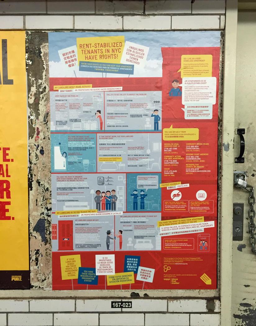
More info here →
More info here →
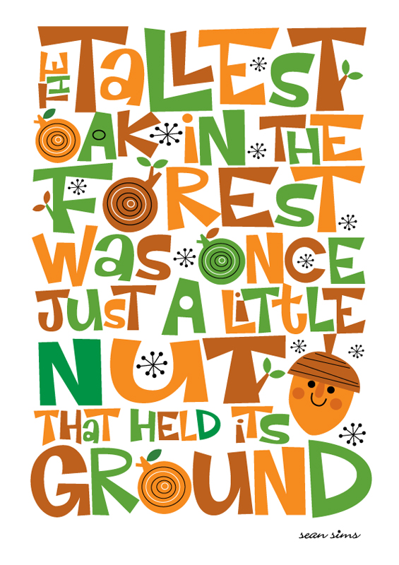
“The tallest oak in the forest was once just a little nut that held its ground.” Lovely poster from @Simsillustrator
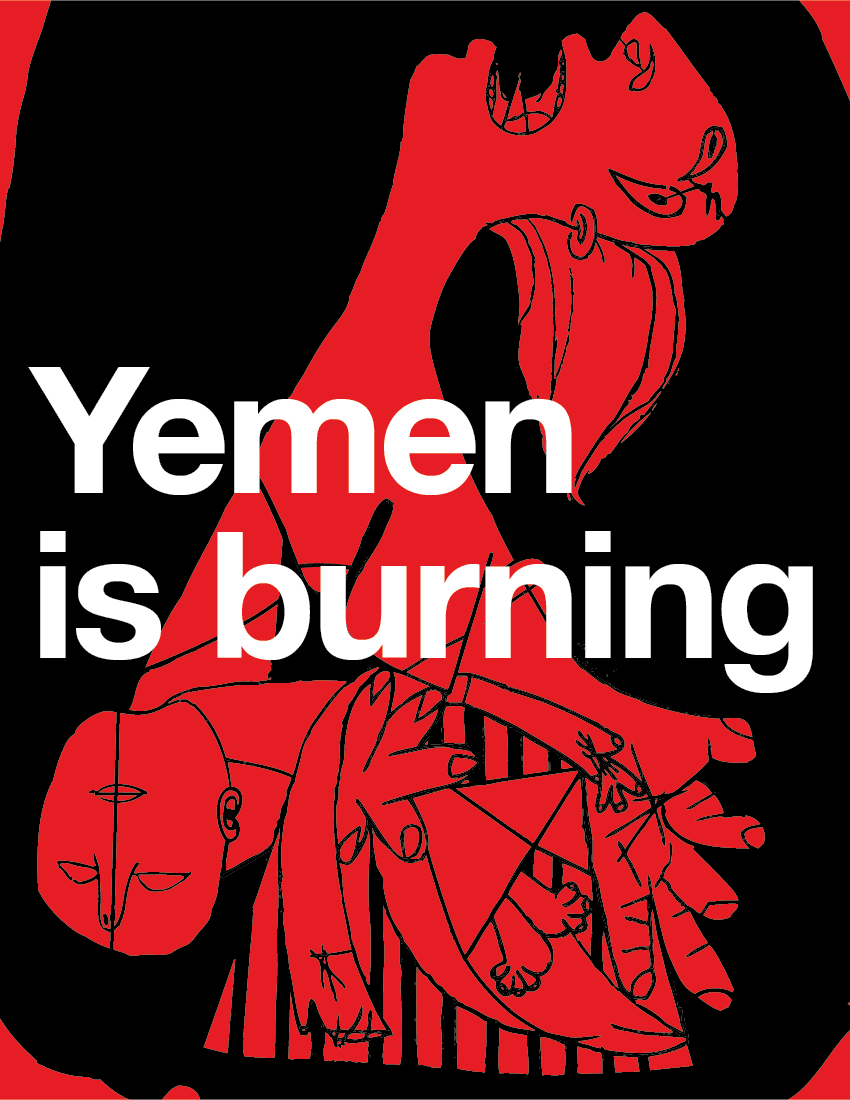
Yemen is Burning
Les Casseroles
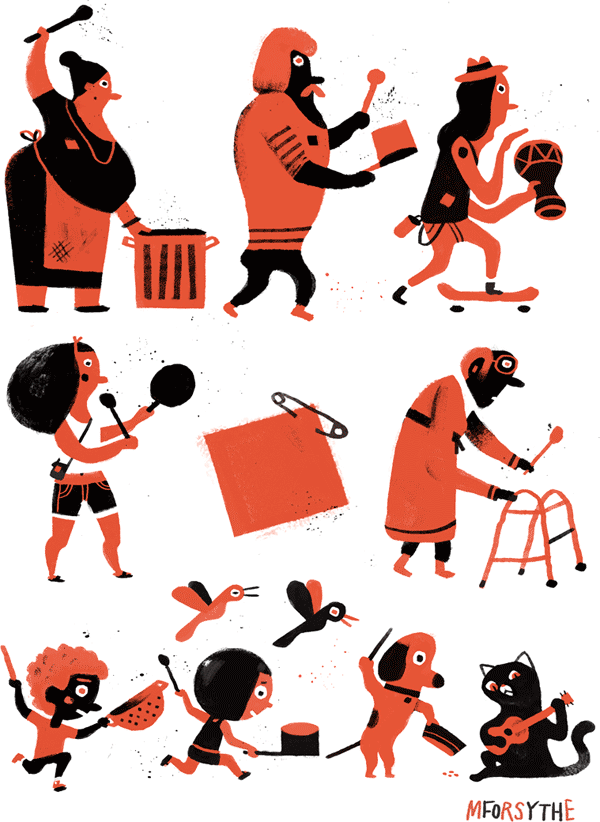
I love this image by illustrator Matt Forsythe. It nicely captures the spirit of the protests in Montréal last May. As The Globe and Mail notes:
“Those clanging pots, known as les casseroles, were initially seen as just another tactic, but a remarkable thing happened: Ordinary citizens armed only with kitchenware took back their streets from rock-throwers and riot police. They also pushed student and government leaders back to the negotiating table with fresh hope the conflict might end.”
You can download a high resolution version of the image from Matt’s website.
Here’s a nice video of les casseroles in action.
page 19 18 17 16 15 14 13 12 11 10 9 8 7 6 5 4 3 2 1 Older »