

interface
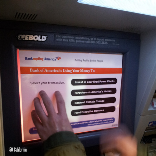
Influencing Behavior through Design
“All design influences our behaviour, but as designers we don’t always consciously consider the power this gives us to help people, (and, sometimes, to manipulate them).”
Dan Lockton has posted a fantastic resource, Design with Intent. Formerly known as Architecture of Control, this book of cards features 101 design patterns for influencing behavior through form, feedback, and interface. The techniques span media from architecture and product design, to signage, interaction and graphic design and influence users by making choices easy, difficult, confusing or fun in sometimes subtle or provocative ways. The cards are organized by mode as follows:
You can download the complete set here. It’s a great primer on interaction design in the real world and a useful lens for looking at the politics of access and usability and the quiet frameworks of design and power that shape our daily lives.
Forms of Control
From Jan van Toorn, Introduction, Design beyond design: critical reflection and the practice of visual communication:
“Design has become the instrument par excellence for the achievement of social cohesion through form — form as surface, a casing in which an apparent social consensus is created that hides the reality of the cultural condition in a reassuring and entertaining manner.…
In the case of visual journalism and communication design, this means adaptation to the social relations of power, collaborating with and promoting the depoliticization of the media through the primacy of aesthetics as beauty, of visual and other rhetoric that erodes the promise of democracy and participation. The main consequence of all this is that we live in a world in which, to quote Rem Koolhaas, ‘the reality of the socio-economic condition is camoflaged by the decorative glorification of the inevitable.’”