

Printing Without A License
I knew about the role of printing and English coffee houses in germinating the seeds of the British Enlightenment, but today I learned about the 1662 Licensing Act "An Act for preventing the frequent Abuses in printing seditious treasonable and unlicensed Books and Pamphlets and for regulating of Printing and Printing Presses."
The Act expired in 1695, which allowed unlicensed printing presses to flourish, reduced the price of printing, eliminated government censorship, and opened the UK to books printed abroad.
Feels like the regulatory context is too often left out of our histories of innovation.
From Museum Bot to Catalog Bot
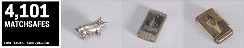
Running a handful of museum bots that post random images to Twitter, one quickly gets a sense of the eccentricities of of various collections and catalogings: the MoMA bot has surfaced many Louise Bourgeoise prints, the Victoria & Albert bot found an awful lot of snuff bottles, the Tate bot counts every page of Turner’s sketchbooks (even a few blank ones,) while the Cooper Hewitt bot has unearthed an large number of matchsafes. 4,267, in fact.
So when I saw this video interview with designer Irma Boom it gave me an idea. Irma Boom and her studio create books that flout convention: books with blank covers, books printed without ink, little books, and a book to last 500 years. They are rigorous, stylish, absurd, and inspiring. Her new catalog for the Cooper Hewitt showcases 1,300 carefully selected color illustrations across 912 pages. But that’s only so many matchsafes.
I decided to rectify this by generating an absurd catalog of my own. Using the Cooper Hewitt API, I pulled records for all matchsafes with images and produced a 4,390 page book purely devoted to the art: 4,101 pages of matchsafes accompanied by a 256 page index. Download the unofficial Cooper Hewitt matchsafe catalog as a 479Mb PDF. Please consider the environment before printing.
My Saturday morning has nothing on the several years invested by Irma Boom and the Cooper Hewitt team in their catalog design, but I’m pleased with the results. I’ve posted my source code of the layout and though written as a one-off, the mind wanders: why not an app where any search query could automatically generate a catalog PDF, perhaps available to print on demand? How about OpenCV to automatically generate random spreads of objects with visual similarities across different departments? Print period objects alongside text from WikiPedia? Programming print FTW!
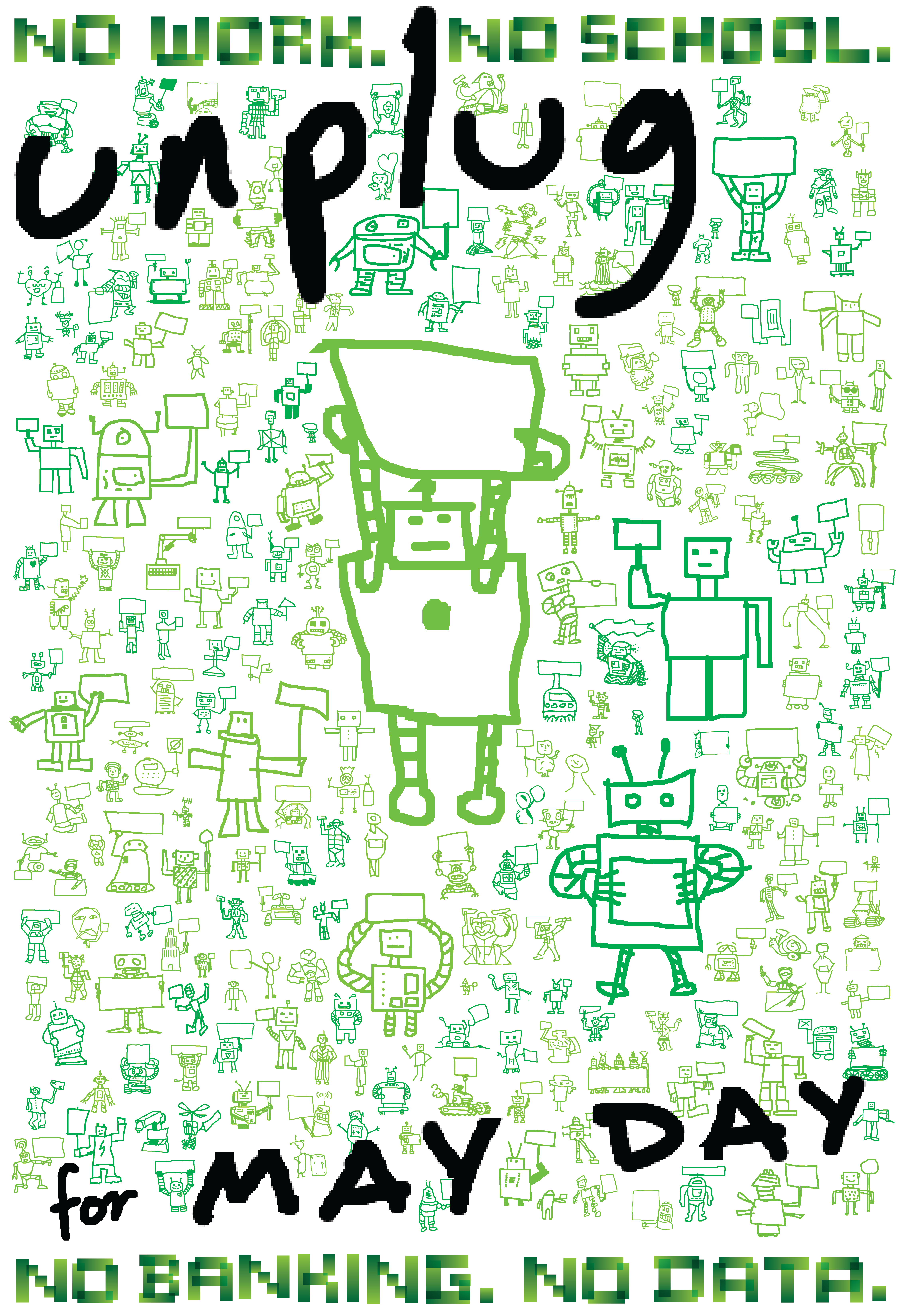
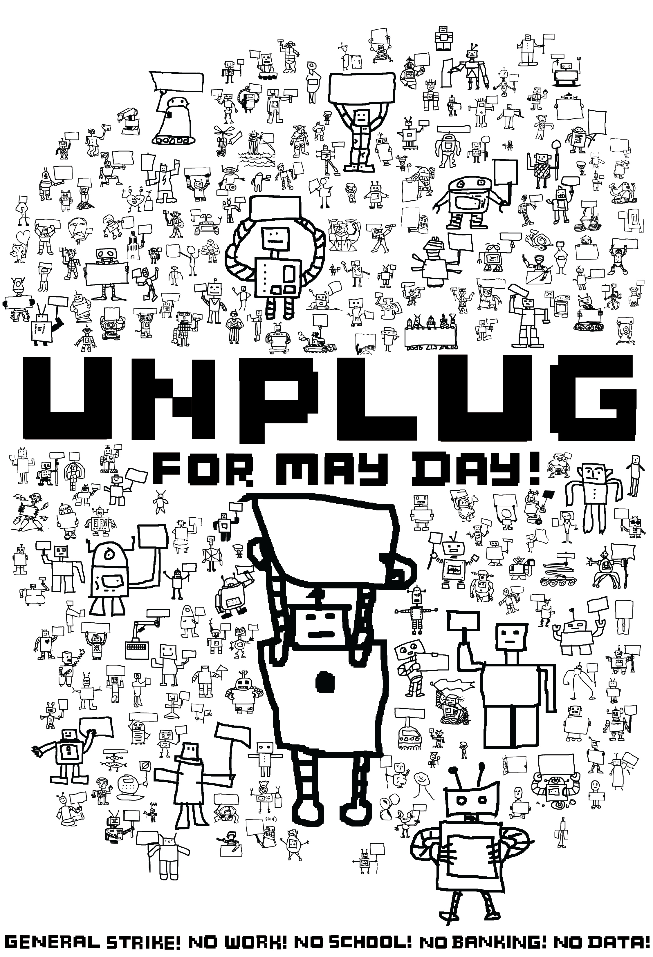
Crowdsourced Poster for May Day
I crowdsourced a crowd scene for a May Day poster using Mechanical Turk, Facebook and Twitter friends inviting them to draw a robot holding up a sign. In just five days, I assembled a protest scene with 250 unique characters. It was great fun. Here are the results in color and black and white.
Click below for high resolution versions.
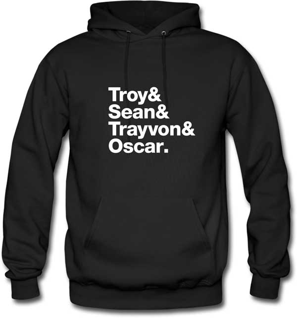
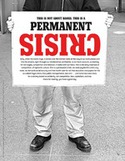
Million Hoodie March
 The 4th printed issue of The Occupied Wall Street Journal was a special edition composed entirely of posters. 20,000 copies were printed and distributed throughout the movement. Since then, the project website has attracted a growing number of poster submissions from around the world, each available as a printable PDF.
 The site will soon post DIY suggestions, how-to videos, and other resources for anyone who wants to open a free occupation PrintLab.
The Occupy Wall Street Journal
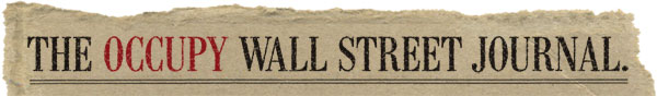
Occupy Wall Street is gaining momentum and supporters. But what are they calling for? Read all about it in the forthcoming edition of The Occupy Wall Street Journal:
“We want to be the people’s media. Our first project is The Occupy Wall Street Journal, a four-page broadsheet newspaper with an ambitious print run of 50,000. It’s aimed at the general public. The idea is to explain what the protest is about and profile different people who have joined and why they joined. We will explain the issues involved and how the general assembly process operates at Liberty Plaza. It will also offer resources and ways to join. The emphasis will be on quality content, design, photography and artwork that uses incisive humor to make it a lively read.
Future projects include longer editions of the newspaper, bold stickers, edgy posters, colorful palm cards and inspiring flyers.
This project is a volunteer effort: every penny you donate will go directly to printing and distribution.”
Help fund printing and distribution (and get a copy for yourself) on Kickstarter until October 9, 2011.
Update 10/6/11: You can see the first edition here.
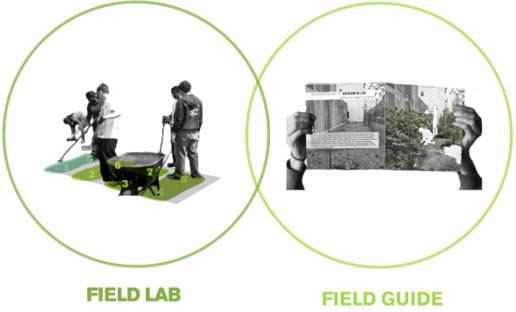
Field Guide to Phytoremediation
New York City contains over 30,000 vacant lots covering a combined 11,000 acres (nearly the size of Manhattan itself.) Much of this space can not be reused because of toxic contamination and the expense of excavating it. Enter the sunflowers.
Phytoremediation is the use of plants to remove contaminants from the environment. This Kickstarter campaign hopes to both publicize and demonstrate phytoremediation in NYC:
“In 2010, youarethecity created the Field Guide to Phytoremediation, a DIY handbook to cleaning up toxic soils in your own backyard, neighborhood vacant lot, or other urban space. Working with soil scientists, urban farming activists, community groups, and others interested on (and in) the ground, we have expanded this research. We need your help to make this process more visible and accessible to anyone. We want to print 2,000 copies of the field guide, to distribute for free, and to create on-site installations that illustrate and explain the process of phytoremediation at field lab sites throughout New York City.”
I’m in.
Free Postcard Printing
 Know a campaign that could use some free postcards?
Next Day Flyers does beautiful postcard printing and is offering one of my readers 250 free 4"x6" postcards, printed in full color both the front and back. They will include ground shipping to anywhere in the continental U.S.
To enter, just leave a comment on this post before midnight EDT Monday, June 27, 2011. You must be 18 or over to enter and must include your email address. (It will not show publicly on the site.) One commenter will be chosen at random to win the free printing.
Update: Comments are now closed. Congratulations Catherine!
Free Palm Card Printing
 The holidays are coming! Could you use 100 full-color palm cards? Perhaps an end of year greeting or donation appeal? A little agit-prop or calling card? And don’t travel without your atheism cards!
Next Day Flyers is offering one of my readers free printing of 100 1/6 page flyers (4.125 x 3.375 inches) printed on 14 PT card stock, with full color on the front and black on the back. They will print with next day turnaround and include ground shipping to anywhere in the Continental U.S.
Next Day Flyers is an offset printing company that prints posters, flyers and business cards.
 To enter, just leave a comment on this post before midnight EST Friday, November 26, 2010. You must be 18 or over to enter and must include your email address (though it will not show publicly on the site.) One commenter will be chosen at random to win the free printing.
Update: Comments are now closed. Congratulations Jesse!