

Guns, Butter, and Ballots
An article of mine is running in January/February 2005 issue of Communication Arts.
If any of you were wondering what all that Nixon bit on the Federal Design Assembly was about, it was background research for this.
Guns, Butter and Ballots
Citizens take charge by designing for better government
What did the President know and when did he know it? In April 2004, the White House declassified one of the President’s daily intelligence briefs issued just a month before September 11, 2001. The brief specifically states that Al-Qaeda and Bin Laden were planning attacks on the United States with hijacked airplanes.
Graphic designer Greg Storey was horrified. Not just because the information was all right there, but by the design. It’s no wonder the information could be ignored. The document is an uninflected, grey mash of sans serif type. Might thousands have been saved if the information design had been better?
“Nothing in the text is emphasized, making it difficult to scan,” Storey noted on his Weblog. “It would be much better if keywords, names and places were in bold and/or in a different color. Make it so that within seconds the President can see how serious of a threat it is.” Mouse in hand, Storey created a redesigned brief of his own (below right), adding a larger headline, highlighted key terms and, most prominently, a large colored number indicating the level of the threat.
Though no one in government ever contacted Storey, readers of Storey’s blog clamored for a document template they could use themselves. He dutifully responded. (Visit http://airbagindustries.com/archives/002868.php.) “My intentions were nothing more than to rant about what I saw to be a problem with how our government works day to day,” he wrote. “I thought I would spend a few minutes in front of Photoshop to see what I could come up with.”
Alas, President Bush does not actually read the daily briefs, the Director of Intelligence summarizes them to him out loud. Nonetheless, Storey’s redesign is a dramatic example of how information design might affect the government and the public.
But the truth is, graphic designers across the country are already hard at work collaborating with local, state and national government officials to harness the power of design in the public interest. Their work affects the lives of millions of Americans by improving public safety, promoting public health and facilitating democracy on a massive scale — often at the initiative of the designers themselves.
That government agencies use graphic design is nothing new. From posters to packaging, identity and, of course, forms, the federal government is one of the largest purchasers of design services in the world. But much of this work is less than inspiring — even obscure or downright misleading. For a variety of reasons, government designers may be stifled by bureaucrats and lawyers. And sometimes it seems like the lawyers and bureaucrats do the designing themselves.
The late 1960s and 1970s, however, saw a number of seminal graphic design projects sponsored by the U.S. Government. To name just a few: Vignelli Associates’s graphic standards for National Park Service publications; Danne & Blackburn’s NASA “worm” logo; and Chermayeff & Geismar’s logos for the Park Service, Environmental Protection Agency and U.S. Bicentennial.
Continuing a wave of public art initiatives at the time, Richard Nixon even asked Congress to triple the budget of the National Endowment for the Arts and created the Federal Design Improvement Program to help upgrade government architecture and graphics.
But by the end of the 1970s, faced with an energy crisis and an economic recession, the new leadership shifted the government’s priorities. By the 1980s, a backlash raged against public arts funding. Budgets were cut and interest in public design projects waned.
Still, during this period, two masterpieces of modern infor- mation design were developed, both of which have had a demonstrable impact on public safety.
Burkey Belser’s company usually designs communications materials for law firms and other services companies. But in 1978, he was asked to design the EnergyGuide label for the Federal Trade Commission. The frustrated regulators had become desperate after a top-shelf New York design firm had failed — and submitted a hefty bill in the process. The EnergyGuide that Belser designed is a bright yellow informational sticker that must be displayed by retailers on all major appliances (like air conditioners, refrigerators and washing machines). The Guide shows the estimated yearly operating cost and energy consumption on a scale from least to most efficient. Consumers actually used it to consider not just purchase price, but cost over the life of the appliance. The success of the label convinced government regulators that you could modify consumer behavior through clear, friendly information design, gently pushing them towards more environmentally friendly, if slightly more expensive, purchases. Multiplied by millions of refrigerators, the energy savings have been enormous.
Belser’s 1994 redesign of the Nutrition Facts label also attempts to influence consumer decisions. But the label, the most widely reproduced graphic in the world, very nearly had no designer at all.
In 1991, Congress mandated that the science behind the label be revisited. Originally developed in the 1960s, the previous label was based on a culture of famine during the Great Depression and two World Wars. Hunger was an epidemic. Food was scarce and the country lacked an interstate highway system to move fresh fruits and vegetables to market. The government’s priority in the first label design was to fend off malnutrition, rickets and scurvy, and so the label highlighted essential vitamins and minerals. In 1991, Congress realized we were living in a different culture — a culture of plenty...and of fat. They tasked the Food and Drug Administration (FDA) to develop a new labeling scheme to fend off an epidemic of obesity.
The Center for Food Safety and Applied Nutrition at the FDA was well equipped with top scientists, nutritionists and epidemiologists, but lacked experience in public communication. The Center had hired another big New York design firm, but was dissatisfied with the results. And so they prepared to go it alone.
Sharon Natanblut had a background in marketing and public relations, and had just started at the FDA as advisor to the Commissioner for strategic initiatives. When she found out that the scientists were designing the label themselves, she intervened. “The scientists saw graphic design as a trivial thing,” she recalls. “They thought more information is better. But ultimately, it is the design that helps you understand it.”
Natanblut knew Belser from his work on the EnergyGuide and knew he could communicate with both scientists and government officials, and would ensure that the design reflected the goals of the project.
Belser offered to do the job for free (though was able to charge for some expenses.) “If ever there was a call for pro-bono work,” says Natanblut, “this was it.” Belser comments, “Designers should really take on public projects as a part of citizenship. That’s why we did it. How often do you get a chance to affect so many people? Anyway, I didn’t want to mess with the government procurement process at the time.”
Belser and his staff put in countless hours and, after designing 30 variations, learned there is no such thing as a universal symbol. They found that literacy is more complex than they had imagined. The label had to be accessible to both poor and fluent readers. They found that poor readers stumbled over commas, dashes and semicolons, and that graphs, icons, pie charts are more sophisticated than they’d thought, requiring a relatively high degree of visual literacy. In focus groups and in public comment, designs that used these elements were slaughtered.
Eventually Belser and his team developed the current layout. The generic and anonymous looking design is anything but. The placement and grouping of information and the use of boldface create a visual hierarchy. To combat increasing obesity, the new design highlights calories, fat and cholesterol. And the resulting label is used by health-conscious shoppers to count calories and monitor their cholesterol intake. As former FDA Commissioner David A. Kessler recalled, “The nutrition facts label has within the space of a few years become a standard that many Americans use to make basic decisions about their diet and nutrition.”
The apparent lack of “marketing devices” is also misleading. The space is branded with a kind of “look of truth” — neutral, scientific, institutional and authoritative.
Nonetheless, obesity continues to rise at a dangerous rate — fast becoming the number one cause of death in the United States. In response, Belser is currently working with concerned advisors to government to further modify the design.
One might argue that it’s not the government’s place to interfere with people’s behavior or engage in “social engineering.” Belser responds, “I don’t think that there’s any government, corporation, or anybody that is not trying to influence somebody else. We have a Constitution and body of laws that say certain areas are off limits...But what the government is willing to do, and what, I believe, has a perfect right to do is to manage issues of public health and safety.”
Citizen action
The Nutrition Facts and EnergyGuide labels show the reach of government sponsored information design. Recently, however, the design process seems to be shifting.
Whether designers are tired of commercialism or were awakened by the 2000 butterfly ballot fiasco, there seems to be increasing interest in civic engagement. As portrayed in the 2000 reissue of the First Things First Manifesto and the AIGA’s recent Voice conference, designers are increasingly thinking about social responsibility and looking for ways to get involved.
In fact, several recent government design projects have been driven from the bottom up rather than the top down. Redesigns of the 2000 census, voting materials, New York City’s ubiquitous choking victim poster and the 1040 tax form were all initiated by designers themselves. In some cases starting out as class projects.
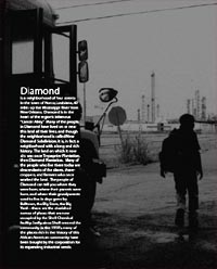
Japan at War
![]()
Antiwar activists found not guilty over flier distribution
“The Tokyo District Court found three peace activists not guilty Thursday of trespassing at a Self-Defense Forces housing facility in the western suburbs of Tokyo and distributing leaflets in mailboxes expressing opposition to the SDF deployment in Iraq.
They were arrested Feb 27 after trespassing Jan 17 at the SDF residential quarters in Tachikawa, Tokyo, to distribute the fliers urging SDF personnel and their families to consider the appropriateness of sending Japanese troops to Iraq.”
The three spent nearly 2 1/2 months in detention.
Japanese police have become increasingly agressive in their crackdown on peaceful protestors distributing political leaflets.
More from the Japan Times:
“The Feb. 27 arrest of the three, members of local citizens’ group Tachikawa Jieitai Kanshi Tentomura (Tachikawa Tent Village to Monitor the Self-Defense Forces), shocked many civic groups and legal experts, who see it as an attempt by authorities to silence antiwar activists.
The handbills say SDF personnel may inevitably be forced to kill Iraqis and call on the service members to critically assess the government’s decision to dispatch troops to Iraq....
After returning home Tuesday night, one of the three, a 47-year-old worker at a public school in Tokyo, said the arrest and subsequent detention caused irreparable damage to his social reputation and career.
He said that on the day of his arrest, some media reported his name as a criminal suspect, and that he must stay away from work as long as his trial is ongoing.
Established in 1972, the group, which currently has seven members, has been posting handbills at the complex for the past two decades, but members claimed there had never been problems until they posted the handbills in January, drawing complaints from the residents.
...
In April last year, a 25-year-old bookstore employee was arrested for vandalism, after writing antiwar graffiti on the wall of a public lavatory at a park in Suginami Ward, Tokyo. The man said he was questioned by public security police, who grilled him over his political background.
His arrest was unusual, his counsel said, in that instead of the ward initiating a criminal complaint, police approached the ward to do so.
In February, the man was handed a suspended 14-month prison term. He has appealed the case to higher court, claiming his sentence is too harsh for the crime.
In March, a 50-year-old Social Security Agency employee was arrested and charged with violating the National Public Service Law by posting copies of the Japanese Communist Party organ Akahata in more than 100 mailboxes in Tokyo’s Chuo Ward during campaigning for November’s general election.
It is illegal for civil servants to engage openly in election-related activities, but no one has been charged with such an offense since 1967, according to legal experts, although over the years a few have been arrested.
His lawyer said it is unprecedented for a public servant to be arrested for merely posting leaflets. This case was also handled by public security investigators, who raided the man’s home, workplace and the JCP’s office in Chiyoda Ward.
‘Posting leaflets is the most peaceful means and one of the few tools powerless citizens have to convey their message,’ said Katsuko Kato, a 66-year-old cram school teacher who heads the Tachikawa citizens’ group. She added that peace activists targeting SDF bases widely employ the tactic.
‘This (renewed) oppression of citizens’ voices and the rights of those in the military to have wide access to information was something that was prevalent during the war. It reminds me that Japan is again at war,’ she added.”
Of course, article 9 of Japan’s Constitution forbids the country from engaging in war:
“Aspiring sincerely to an international peace based on justice and order, the Japanese people forever renounce war as a sovereign right of the nation and the threat or use of force as means of settling international disputes. 2) In order to accomplish the aim of the preceding paragraph, land, sea, and air forces, as well as other war potential, will never be maintained. The right of belligerency of the state will not be recognized.”
That is, the same Constitution drafted by the occupation government of the United States military in 1946.
Read more about the history of Tachikawa Tent Village to Monitor the Self-Defense Forces.
See this previous post on recruiting graphics for Japan’s Self-Defense Force.
Half Empty
Profile of Graphic Designer Tibor Kalman
by Thomas Frank, from ArtForum, February 1991:
“Tibor Kalman is a graphic designer, a crafter of corporate logos, a producer of presentation materials, a maker of menus and restaurant posters. But Tibor Kalman is so much mere than that.
 According to most of those who judge such things (with whom I concur, by the way), he is accomplished, even brilliant at what he does. He may even be the greatest graphic designer of his generation. Certainly his output of the last twenty years, just collected in the three-and-a-half-pound book Perverse Optimist (Princeton Architectural Press), sparkles with witty solutions to the problems typical of corporate presentation. But why stop there? Kalman is, we are told, a radical — a breaker of rules, a dealer in astonishment, a deft questioner of the corporate order. In a manifesto co-authored in 1990, he insisted that graphic designers be ‘bad,’ ‘disobedient,’ ‘insubordinate,’ that they refuse to be ‘a cog in the machine,’ that they must make clients ‘think about design that’s dangerous and unpredictable.’ It’s no surprise that accounts of Kalman’s oeuvre take pains to note his SDS exploits in the late ’60s.
The question that inevitably arises, though, is why a corporation should be so keen to hire a ‘radical’ graphic designer. What makes Kalman’s radicalism, such as it is, a desirable quality in what is possibly the most constrained branch of creative endeavor? What does ‘radicalism’ even mean in such a field? It certainly isn’t readily apparent from his work. What impresses one first about Perverse Optimist is not Kalman’s radicalism but his weird omnipresence in the most modish precincts of corporate-sponsored culture of the last two decades.
To the Streets
I wrote the essay below for the Design Issues column in the May/June 2004 issue of Communication Arts. I profile a couple of folks using graphic design for advocacy. I didn’t call it out explicitly in the text, but it’s of some relevance that the projects here are generally not pro-bono projects “for charity,” but are organizations started by designers generally working with broader communities. Check it out.
Taking it to the Streets
Graphic design for advocacy
Walking the streets of New York City in February 2003, one couldn’t help but notice all these little blue stickers. Stuck to walls, phone booths, bus stops, scaffolding, mail boxes — they popped up everywhere to announce the February 15 march against President Bush’s invasion of Iraq.
The blue stickers were just one of the many anti-war graphics circulating at the time. Around the Web, activists were posting free, easy-to-print designs using a variety of techniques: clever slogans, typographic play, dramatic photos and the ironic use of vintage propaganda imagery.
But the February 15 stickers on the streets of New York were different — simple and bold, a little blue banner announcing the time and place of the march. They did not make an emotional appeal with pictures of scarred and armless Iraqi children or U.S. soldiers, nor was there any argument about why the war was wrong.
The February 15 posters were not intended to change people’s minds in a direct way, but to notify the public about the upcoming protest — and to make dissent visible. The mainstream media had entirely avoided covering the anti-war movement prior to February 15. In the face of this de facto censorship and police obstruction over the route of the march, the stickers acted as thousands of little acts of civil disobedience. And with the urban landscape as a medium, the stickers set the stage for even larger acts of defiance.
The Republicans are Coming...
Save the Date: Sunday, August 29, 2004.
Spread the Word: Download this graphic as a 176 Kb PDF, or a
100 px or
50 px square Web button.
Buy a T-Shirt: At http://www.cafepress.com/nornc/
Find Out More: Visit counterconvention.org, rncnotwelcome.org, or unitedforpeace.org.
Your Tax Dollars at Work
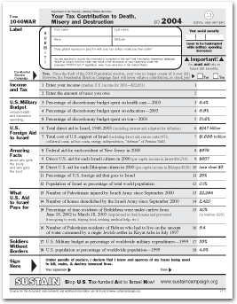
SUSTAIN is an acronym for “Stop U.S. Tax-Funded Aid to Israel Now.” They are:
“a group of women and men who have come together in cities across the country by our responsibility and concern as U.S. taxpayers. We understand that our tax-dollars fund Israeli violations of Palestinian national and human righ.”
They publish the 1040WAR Form, a one-page fact-sheet handout that parodies the IRS’s 1040EZ income tax form and provides information about U.S. support for Israel. Download the PDF. Sources for the information on the form are available here.
Report Design as an Activist Tool
Good-looking printed documents can complement protests, lobbying, and media work.
This Saturday, Anne Rolfes and Iris Carter Brown from the Louisiana Bucket Brigade spoke about their campaign against Shell to stop polluting their neighborhood.
They talked about a few of the ways reports and Web sites made a difference to people campaigning on the ground.
 Sophisticated graphics convey the impression of an organized, sophisticated movement. One that can overcome its opponents.
- Reports give people pride in their issue, people who have been blown off by governments and powerful corporate opponents. It validates what you think when you see it in print. It makes you ready to take on the man.
- Reports document oral history that may not continue to be passed down. The elders of the community grew up with and around a big old oak tree. Now it’s fenced off, a part of Shell’s industrial property.
- Reports create oral history. Ruth Jones’s son was killed by gas explosion in early 1970s. After the funeral, Shell gave her a check for $500. Ruth agreed to let this be published. The story affirmed the sense of injustice in the community, and the anniversary of his death became an occasion marked by the community annually .
- Reports put the peoples’ side of the story into the mainstream media. Printed reports reach journalists who do not go into the field. The reports tell the details that might not otherwise be told. The documents are also posted on the Web and citations enter electronic press archives. The LABB report began to be cited journals and studies from afar.
- Reports help catalyze the campaign, framing the issues strategically at each phase of the campaign.
- Reports educate different audiences, including elected officials. It makes people in power take the issues seriously. It also encourages people involved in other campaigns, including overseas via the Web site.
- Reports creates room for artistry. Powerful photos and visuals tell the story, and move the emotions.
- Reports create a forum for people in the community. People being poisoned can tell their own stories, put their words into print.
See some of the Louisiana Bucket Brigade’s reports here. They were designed by the Design Action collective and printed by Ink Works Press.
Protest and New Media, 1787
Building on this blog post, more on globalization, graphic agitation, and public relations.
From “Against All Odds,” by Adam Hochschild, Mother Jones, January/February 2004
“The superbly organized anti-slavery committee also pioneered several techniques used ever since. For example, they periodically printed copies of ‘a Letter to our Friends in the Country, to inform them of the state of the Business’ — the ancestor of many a newsletter, print or electronic, published by activist groups today. They also agreed on a piece of text delivered to every donor in greater London appealing for another contribution, at least as big as the last. This may have been history’s first direct-mail fundraising letter.
When the famous one-legged pottery entrepreneur Josiah Wedgwood joined the committee, he had one of his craftsmen make a bas-relief of a kneeling slave, in chains, encircled by the legend ‘Am I Not a Man and a Brother?’ American anti-slavery sympathizer Benjamin Franklin, impressed, declared that the image had an impact ‘equal to that of the best written Pamphlet.’ Clarkson gave out 500 of these medallions on his organizing trips. ‘Of the ladies, several wore them in bracelets, and others had them fitted up in an ornamental manner as pins for their hair.’ The equivalent of the lapel buttons we wear for an electoral campaign, this was probably the first widespread use of a logo designed for a political cause. It was the 18th century’s ‘new media.’
Within a few years, another tactic arose from the grassroots. Throughout the length and breadth of the British Isles, people stopped eating the major product harvested by British slaves: sugar. Clarkson was delighted to find a ‘remedy, which the people were... taking into their own hands.... Rich and poor, churchmen and dissenters.... By the best computation I was able to make from notes taken down in my journey, no fewer than three hundred thousand persons had abandoned the use of sugar.’ Almost like ‘fair trade’ food labeling today, advertisements quickly filled the press: ‘BENJAMIN TRAVERS, Sugar-Refiner, acquaints the Publick that he has now an assortment of Loaves, Lumps, Powder Sugar, and Syrup, ready for sale... produced by the labour of FREEMEN.’ Then, as now, the full workings of a globalized economy were largely invisible. The boycott caught people’s imagination because it brought these hidden ties to light. The poet Robert Southey spoke of tea as ‘the blood-sweetened beverage."
Slavery advocates were horrified. One rushed out a counterpamphlet claiming that ‘sugar is not a luxury; but... a necessary of life; and great injury have many persons done to their constitutions by totally abstaining from it.’
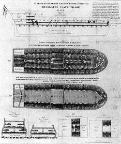 The abolitionists pioneered another key organizing tool as well, and you have seen it. Rare is the TV program or illustrated book about slavery that does not show a detailed, diagramlike top-down view of rows of slaves’ bodies packed like sardines into a ship. The ship is a specific one, the Brookes, of Liverpool, and Clarkson and his colleagues swiftly printed 8,700 copies of the diagram, and it was soon hung on the walls of homes and pubs throughout the country. Part of its brilliance was that it was unanswerable: What could the slave interests do, make a painting of happy slaves on shipboard? Precise, understated, and eloquent in its starkness, it was the first widely reproduced political poster....
Meanwhile, something else feeding the country’s growing antislavery fervor was Olaudah Equiano’s autobiography, a vivid account of his life in slavery and freedom. At seven shillings a copy, it became a best-seller. For an extraordinary five years, he promoted his book throughout the kingdom, winning a particularly friendly reception in Ireland, whose people felt that they, too, knew something about oppression by the British. Equiano’s was the first great political book tour....
The slave interests’ tactics bore a fascinating resemblance to the way industries under assault try to defend themselves today. When, for instance, there were moves in Parliament to try to regulate the treatment of slaves, the planters hastily drew up a lofty-sounding code of conduct of their own and insisted no government interference was necessary. They considered other P.R. techniques as well. ‘The vulgar are influenced by names and titles,’ suggested one pro-slavery writer in 1789. ‘Instead of SLAVES, let the Negroes be called ASSISTANT-PLANTERS; and we shall not then hear such violent outcries against the slave-trade.’”
If, as the author suggests, so many of these grassroots tactics were pioneered here, what was it that made the tactics suddenly possible? Might it have something to do with the increasing availability of cheap paper and printing? A sea change in popular mood and political will fueled by access to decentralized publishing, and direct action in the fields?
Tailored Communication for Public Health
A doctor in St. Louis is improving public health with customized graphic design.
From the BBC:
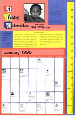 “A scheme which hands out a personalised calendar complete with pictures of your child is boosting vaccination rates in the US.
In St. Louis, where as few as a quarter of eligible children get all their [shots], uptake rose by 50% on average.
The calendars have key dates ringed so that parents find it easy to work out when to visit the doctor....
There are a plethora of different vaccinations offered to babies in their first two years of life, and the confusing sequence sometimes means that [shots] are missed.
St. Louis physician Dr. Matthew Kreuter came up with the idea of generating immunisation reminders tailored for each baby by computer.
To ensure that parents hung on to these calendars, they included a high quality image of their baby - as many patients in deprived inner-city St. Louis cannot afford to have professional photographs taken.
After one year, 82% of the ‘calendar babies’ were up to date with their immunisations — compared with 65% of children that did not receive calendars.
After two years, two-thirds of those with calendars were up to date, compared with 47% of those without....
Dr Kreuter said: ‘Getting babies immunised is very important for families and the community.
‘But it’s also difficult for many parents because of challenges with transportation, busy work schedules and finding childcare for other children.
‘We want to reward their efforts with this unique reminder to keep them coming back over time.’
Every time a child attends an immunisation session, the photograph is updated with a new one - so at the end of the process, the parents will have a varied selection of good quality photographs.
The whole process costs the public health system approximately $1,200 per child, but Dr Kreuter says this is worthwhile.”
Dr. Kreuter is the Director of the Health Communication Research Laboratory at St. Louis University. The program strives to “enhance the health of individuals and populations through the research, development, and dissemination of innovative and effective health communication programs.”
Dr. Kreuter has conducted extensive research in tailored communication, using new technologies to produce customized information for patients, both online and offline.
Road Kill
Courtesy of Ken Avidor:
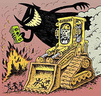 “Highway expansion in America is big business. The Highway Expansionists enjoys the support of both Democrats and Republicans and sometimes Greens. Millions of dollars are spent on propaganda to support the notion that the destruction of the People Zone for the Auto Zone is an inevitable and desirable part of “Progress.” If you add the billions of dollars the auto and oil industry spends on advertising and public relations, it is no wonder that opponents of highway expansion face a public wall of apathy and suspicion. It is not easy to break through that wall of conditioning. Words alone cannot correct the positve mental images people have of automobiles and highways from acquired from a lifetime of viewing TV commercials.
STRIDE (Southside Traffic Reduction Initiative to Determine our Environment) uses photos, art and comics on its website to counter the industry PR images. Comics and satire are also a fun way to convey complex ideas. They can also attract attention to more serious stuff. We are hoping to add music and animation to the STRIDE site in the near future.
These are some sites that have art and comics against highway expansion [in Minnesota]:
http://www.Stride-mn.org
http://www.roadkillbill.com
http://www.andysinger.com
http://www.carbusters.org/