

September 2002
Danger Mines!
“Chrissy Levett, is a London-based designer and campaigner for Mines Awareness Group... a nongovernmental organisation which aims to clear mines and unexploded ordnance which are bombs dropped from aircraft, in war-torn countries. Levett created an accessible and effective visual system in order to reduce incidents of injury and death through land mines.”
There are a few images here, perhaps of her work.
Global Information Networks in Education is an international NGO whose Land Mine Awareness Education program produces posters, brochures, T-shirts, and other materals as part of its educational campaigns. Click on the country names here for region specific examples.
See also UNICEF’s International Guidelines for Landmine and Unexploded Ordnance Awareness Education.
And while on the subject, check out MineFinder, a Palm Pilot application from FedSoft.
“MineFinder lets you visually identify over 150 different types of landmines. An easy to use, graphic based system allows you to quickly determine critical information about any mine. Includes scaled drawings and detailed descriptions including size, weight, fuze type, and explosive content/type. Sort mines by type, characteristics, or country of origin.”
Not convinced? A testimonial on the product page from LT. Joseph Danilov, June 25, 2002:
“This is a great app. A must have for a NATO peacekeeping units stationed over-seas. I am no demolition expert but this manual was worth its weight in gold about 2 weeks ago. A 7 year old afghan child had found a M-22 AP mine, a.k.a. stepped on. The manual identified this mine and I defused it. Thank you very much to the maker of this application. Go Army.”
As the page says, use this software at your own risk.
Images from the Iranian Revolution
NYU’s Grey Art Gallery is showing some of its photos and posters from the Iranian Revolution in Between Word and Image: Modern Iranian Visual Culture.
“While the posters were produced by a wide range of political groups, most make direct appeals to action by defying power, subverting authority, and inverting icons as a means to authorize oppositional ways of thinking and behavior....
As social discontent increased throughout the 1970s, some of Iran’s leading contemporary artists assumed an active role in the production of political posters. Inspired by the French student movement of 1968, a group of Iranian artists opened a workshop at the University of Tehran in 1978. The workshop provided the materials and equipment for printing posters to members of various political groups. Professional artists worked alongside amateurs. Their results were displayed throughout Tehran — in schools, in factories, and on the walls of other buildings, often defacing public monuments built by the Pahlavi regime as symbols of its authority and grandeur. As government agents tore them down or covered them with paint, protesters would replace them with replenished supplies.”
The show juxtaposes some modern painting and sculpture from Iran in the 1960s and ’70s.
See other photos, murals and posters from Staging Revolution: The Art of Persuasion in the Islamic Republic of Iran. (Annotation but no thumbnails at the last link, just keep clicking ‘next image.’)
More posters (with a nice thumbnail index) at islamicdigest.net.
Grey link found via American Samizdat.
Talking Signs
“Talking Signs technology is an infrared wireless communications system that provides remote directional human voice messages that make confident, independent travel possible for vision impaired and print-handicapped individuals....
The system consists of short audio signals sent by invisible infrared light beams from permanently installed transmitters to a hand-held receiver that decodes the signal and delivers the voice message through its speaker or headset. The signals are directional, and the beam width and distance can be adjusted. The system works effectively in both interior and exterior applications.
Talking Signs may be used wherever landmark identification and wayfinding assisstance are needed. To use a Talking Signs system, the user scans the environment with the hand-held receiver. As individual signals are encountered, the user hears the messages. For example, upon entering a lobby, one might detect ‘information desk’ when pointing the receiver directly ahead, ‘public telephones’ when pointing to the right and ‘stairs to the second floor’ when pointing to the left.
Messages are unique and short, simple and straightforward. The messages repeat, continuously identifying key features in the environment.”
The site notes that the San Francisco City Council has passed a resolution calling for the installation of talking signs at all public facilities, including 600 in the San Francisco Airport. The devices have already been installed in several San Francisco public spaces including subway stations, crosswalks, libraries, and public toilets. The Japanese government is installing 2,000 signs at key intersections throughout Japan.
Here’s a diagram of how it works.
Talking Signs’s Ohio representative writes:
“With remote infrared audible signage we [the vision impaired] can independently become oriented to unfamiliar places, cross streets safely while staying in the crosswalk, create mental maps that translate to a broader orientation and enjoy a type of freedom that the sighted community just takes for granted. Orientation to public places is a civil right, as surely as getting into the building or using the telephone. Yet, when you look around you, where are the talking signs?... As the old saying goes, we have the technology. What we now need is the advocacy.”
2002 MacArthur Fellows
The 2002 MacArthur Fellows were announced today. Here are a couple of bios of folks involved in projects I’d consider “social design”:
“Camilo Jose Vergara is a photographer-ethnographer who uses time-lapse images to chronicle the transformation of urban landscapes across America. Trained as a sociologist, he reaches into the disciplines of architecture, photography, urban planning, history, and anthropology for tools to present the gradual erosion of late 19th- and 20th-century architectural grandeur in urban neighborhoods, their subsequent neglect and abandonment, and scattered efforts at gentrification. Repeatedly photographing, sometimes over the course of decades, the same structures and neighborhoods, Vergara records both large-scale and subtle changes in the visual landscape of cities and inner cities in the United States. Sequences reveal, for example, trees growing in abandoned libraries and decrepit laborer housing swallowed by advancing foliage. Over the years, Vergara has amassed a rich archive of several thousand photographs that are a rare and important cache of American history. These images, monuments to the survival and reformation of American cities, are a unique visual study; they also inform the process of city planning by highlighting the constant remodeling of urban space.”
See some of his World Trade Center related photos on the New York Historical Society site or a couple of photos from the New American Ghetto series.
“Paul Ginsparg is a theoretical physicist widely known for creating a computer-based system for physicists and other scientists to communicate their research results. Ginsparg’s document server represents a conscious effort to reorganize scientific communications, establishing a marketplace of ideas of new submissions with minimal editorial oversight and abundant opportunity for commentary, supporting and opposing, from other investigators. Ginsparg circumvented traditional funding and approval mechanisms by developing the software in his spare time and running it on surplus equipment. This system [is] informally known as “the xxx archive,” currently hosted at Cornell University at http://arxiv.org.... All documents are available without charge worldwide through the internet, making the latest results available even for those without access to a good research library. Ginsparg has deliberately transformed the way physics gets done — challenging conventional standards for review and communication of research and thereby changing the speed and mode of dissemination of scientific advances.”
See some remarks about the project he delivered in 1994.
“David B. Goldstein is a physicist with a passion for... improving global energy efficiency. His work, which consistently refutes suggestions of inherent conflict between economic growth and environmental quality, touches on a broad spectrum of energy-related issues — from appliance design, to building construction, to governmental policies in developing industrial nations, to housing and transportation planning — and on developing effective policies to address these issues. Goldstein recognized, for example, that early refrigerators wasted a significant fraction of U.S. electrical output due to poor design. He led the effort to hold an efficiency design contest and then successfully lobbied regional and national regulatory agencies to establish energy consumption standards based on the new design, thus creating a market for the more efficient devices. More recently, he has initiated a project to encourage people, through mortgage lending incentives, to minimize the amount of energy they waste driving unnecessarily. Over the last decade, moreover, he has sought to influence and improve building efficiency standards in Russia and China. Throughout his work, Goldstein draws from his scientific training to eliminate political and economic obstacles to greater energy efficiency, with constant attentiveness to the environmental penalties of energy waste....
Since 1980, he has co-directed the Energy Program at the Natural Resources Defense Council (NRDC) in San Francisco.... In addition to his work at the NRDC, Goldstein serves on the boards of the Consortium for Energy Efficiency, the Institute for Market Transformation, the New Buildings Institute, the Appliance Standards Awareness Project, and the Institute for Location Efficiency.”
The mortages mentioned above are run through the Institute for Location Efficiency. The Location Efficient Mortgage is designed for “people who would like to purchase a home in an urban neighborhood and who would be willing to rely on public transportation and to use locally available services and amenities rather than own a personal vehicle.” Definitely not your typical envrionmental NGO.
“Brian Tucker is a seismologist whose work focuses on preventing readily avoidable disasters in the world’s poorest countries by using affordable civil engineering practices. He founded GeoHazards International (GHI) after recognizing that multi-story residences, schools, hospitals, stores, and offices built from adobe, stone, or unreinforced masonry in many regions of the world are death traps when earthquakes strike. GHI is the only not-for-profit, non-governmental agency dedicated to preventing structural failures in developing countries. Tucker works on-site with local governments, artisans, and citizens to implement cost-effective measures to construct or upgrade schools and other public service buildings and to educate residents about damage-prevention measures. He is an expert at adapting techniques used by developed countries in risk-mitigation projects so that they fit within the social, political, and economic constraints of at-risk communities in the developing world. GHI’s principal focus on schools is particularly important because their typically poor construction makes them a common source for earthquake casualties. His current work to develop and apply a Global Earthquake Risk Index is designed both to estimate risk and to motivate risk-reduction measures. His efforts have dramatically reduced the potential for death and injury to children and others from earthquakes in vulnerable cities around the world.”
Stanley Nelson is a documentary filmmaker with over 20 years’ experience as a producer, director, and writer.
“His award-winning film, The Black Press: Soldiers without Swords, synthesizes biography and history, bringing clarity and dimension to the often neglected role of black journalists in chronicling American history. In Marcus Garvey: Look for Me in the Whirlwind, Nelson examines an enigmatic African-American icon, illuminating character and cultural context. With Puerto Rico: Our Right to Decide, he probes still farther afield, considering the implications for political democracy arising from the historical trajectory of confluence and conflict among Anglo, Spanish, African, and indigenous social structures. He is currently working on a documentary about the murder of Emmett Till; other projects include the heritage of the African-American middle class on Martha’s Vineyard and on the international anthropology of the transatlantic slave trade.”
More of his film credits are listed here.
Universal Design New York
“New York City has a long history of protecting the rights and enhancing the opportunities of the disabled. In fact, our Human Rights Law contains provisions for the disabled that go above and beyond the Americans with Disabilities Act. I am proud that our City is continuing its leadership role by becoming the first in the Nation to release a book to help architects, designers, urban planners, and developers make their structures equally accessible to all.
Universal Design New York was created by the Mayor’s Office for People with Disabilities and the Department of Design and Construction, in cooperation with the New York City Chapter of the American Institute of Architects. It describes the concept of universal design and illustrates many useful examples of this innovative design philosophy. This guide also addresses myths associated with the cost of this approach and provides a model for other municipalities to follow.
From a letter by former Mayor Rudolph Giuliani in the introduction to Universal Design New York. Kind words of support from the Mayor, unless of course you need a public toilet or are disabled and poor, in which case Mr. Giuliani would deny you social security, housing or shelter.
In the preface to the book, Catherine Paradiso, Executive Director of the Mayor’s Office for People with Disabilities and Kenneth R. Holden, Commissioner of the NYC Department of Design and Construction, write:
This book was developed to help the community of people who develop the City’s real estate and infrastructure learn about universal design. When implemented properly it removes many of the problems associated with trying to meet requirements of both the NYC building code and the Federal Americans with Disabilities Act. In fact, when designing from this paradigm, some regulations are met with ease. For example, a pedestrian pathway that is gradually sloped from the curb to the entrance eliminates the need for a ramp. Another example would be installing automatic doors instead of manual doors. Distributing and integrating accessible seats throughout a theater is yet another. These examples demonstrate how access and regulations come together to create a better environment for everyone when using universal design criteria.
This book contains many examples that make accessibility easier for the general population. When all aspects of designing in a space are universal, everything becomes easier for everyone. Children, people who have learning/cognitive, vision or hearing impairments, people who use wheeled mobility devices, senior citizens, people of short stature, parents carrying children or packages - we all benefit from universal design.
Universal Design New York is intended for two audiences. Public agencies and environmental design and construction professionals hired by the City make up the first group. They can use it to design sidewalks and street crossings, parks, community centers, shelters, museums, and any of the many other types of buildings and facilities that the City builds. The second audience consists of developers and designers of privately constructed facilities in the City. These include hotels, office buildings, restaurants and theaters, to name just a few. Any designer can apply the principles of universal design to any project....
Information in this book demonstrates how demographic trends will increase demand for universal design. Looking to get ahead of that trend, the Mayor’s Office for People with Disabilities and the Department of Design and Construction believe that now is the time to implement universal design practices. Many of the products the City buys and virtually all of the buildings the City builds today are going to be here for a long time. We should be planning today for the time when the need for universal design will be obvious to all.
Check out the table of contents. As stated above, the site is chock full of examples with photos.
This guidebook purposely avoids recommending prescriptive design standards for the universal design of buildings. Instead, it provides general guidelines designed to broaden and enhance the usability of buildings for everyone.
This guidebook’s visual illustrations of successful applications of certain universal design guidelines are not meant to be copied or imitated. Rather, they are provided to promote a general understanding of the concept - i.e., to stimulate extension of the principles to other building applications.
Many thanks to the Inclusive Design and Environmental Access School of Architecture and Planning at University at Buffalo for posting the book online.
Green Roofs
“Choosing an environmentally responsible roofing material can be one of the greatest challenges of green building. Roofing materials tend to be expensive, damage- and failure-prone, and often contribute to demolition waste. An option which has long been popular in Europe, and is gaining increasing favor in the United States, is the vegetative-cover, or green, roof. Designing a roof with plant cover has several environmental benefits. It can reduce rooftop temperature, in turn reducing building cooling costs and even preventing urban heat islands. Additionally, green roofs are an important tool in stormwater management, because they prevent runoff. Finally, plant-covered roofs can play a role in providing urban habitat for songbirds and butterflies, and in improving air quality.”
From the U.S. Department of Energy.
So what exactly is a green roof?
Linda Velazquez writes by email that “a traditional roof garden is a roof deck (concrete, wood, etc.) with potted plants in various types of free standing containers,” while green roof is an extension of the existing roof which involves a special root repelling membrane, a drainage system, a lightweight growing medium, and plants.
“All the green roof component layers cover the entire roof deck surface. Specifically, the roof deck, insulation, waterproofing membrane(s), root resistant layer, drainage, non-woven filter fabric, engineered soil mix, plants (and sometimes a biodegradable erosion control blanket). So, the entire deck has unimpeded drainage over the entire roof, and the weight of soil and plants is more evenly distributed over the entire roof. And the plants are planted directly into the soil, which in effect, looks like the roof deck.
And there will be a few additional layers (protection, vapor barrier board, etc.) that are applied over an intensive green roof system, as the soil depths are deeper, weights are greater, etc. You can also add architectural accents, like paths, arbors, fountains, etc., but these are built onto the roof deck before the layers are put on the roof deck.”
In an article on green roofs, Katrin Scholz-Barth writes:
There are two distinctly different types of green roofs: intensive and extensive. Intensive green roofs require a minimum of one foot of soil depth to create a more traditional roof garden, with large trees, shrubs and other manicured landscapes. They are multi-layer constructions with elaborate irrigation and drainage systems. Intensive green roofs add considerable load (from 80 to 150 pounds per square foot) to a structure and require intensive maintenance. These roof gardens are, however, designed to be accessible and are used as parks or building amenities.
In contrast, extensive green roofs range from as little as 1 to 5 inches in soil depth. Depending on the soil depth and type of substrate, loads can vary from 15 lbs/sf to 50 lbs/sf. For instance, historic green roofs in Berlin, Germany, built around 1900, weigh about 42 lbs/sf. Extensive green roofs are not designed for public use but can be accessed for routine maintenance walks, generally performed once per year. Extensive green roofs are primarily built for their environmental benefits.
Although everything from earth-bermed [partially underground] houses to balconies with potted plants has conveniently been termed a ‘green roof’ at one point or another, this article strictly defines extensive green roofs as elevated roof surfaces that are entirely covered with a thin soil and vegetation layer. They are not necessarily sod or grass roofs... Additionally, the term eco-roofs is not used in this context because products such as wood shingles are also made of natural, renewable materials, and would thus qualify as an eco-roof.
Green roofs can create recreational space while simultaneously address urban environmental issues like smog, climate change, stormwater management, and energy conservation, though there is the additional upfront expense for builders. Europe is far ahead of the U.S. Green Roofs for Healthy Cities:
“In North America, the benefits of green roof technologies are poorly understood and the market remains immature, despite the efforts of several industry leaders. In Europe however, these technologies have become very well established. This has been the direct result of government legislative and financial support, at both the state and municipal level. Such support recognizes the many tangible and intangible public benefits of green roofs. This support has led to the creation of a vibrant, multi-million dollar market for green roof products and services in Germany, France, Austria and Switzerland among others.”
From City Farmer, Canada’s Office of Urban Agriculture:
“In some parts of Germany, new industrial buildings must have green roofs by law; in Swiss cities, regulations now require new construction to relocate the area of greenspace covered up by the building’s footprint to the rooftop - and even existing buildings, some hundreds of years old, must convert 20% of their roofspace to pasture.”
Green roofs also cool down urban areas in summer, saving energy. The combination of dark surfaces and less vegetation in cities creates what’s called the heat island effect:
“On warm summer days, the air in urban areas can be 6-8°F hotter than its surrounding areas. Scientists call these cities ‘urban heat islands.’ The higher temperatures in urban heat islands increases air conditioning and raises pollution levels.”
Free U.S. Military Photos
Military photos in the public domain. That’s right, copyright free high-rez images of Bush & chums, fearsome gear, and our boys in action, all courtesy of the U.S. taxpayer. Great for patriotism, procurement, or parody.
Found via Barnbrook Design.
Which Way to Manhattan?
In 1999, Paul Mijksenaar was hired by the New York and New Jersey Port Authority to change the old and confusing wayfinding systems at the La Guardia, JFK, and Newark airports to more user-friendly systems. His Amsterdam-based firm, Bureau Mijksenaar, is responsible for the signs at Schiphol Airport in the Netherlands, which is consistently rated by travelers as the most well-organized airport in the world. Work for the Port Authority “will ultimately replace more than 5,000 dated and confusing ones, easing the way for some 90 million travelers each year.”
From The New York Times, June 7, 2001:
“His arrival in New York was precipitated by a survey for the Port Authority three years ago by J. D. Power & Associates, a marketing firm. It revealed that among the vast spectrum of bêtes noires at the three major New York airports, getting lost because of confusing directions was second only to unclean restrooms as the most irksome problem.
At Kennedy, for instance, there was no sign telling newcomers how to get to Manhattan. ‘No sign to Manhattan!’ Mr. Mijksenaar recalled. ‘Only to the Van Wyck Expressway! What is this Van Wyck? You didn’t see the word “Manhattan” until the Midtown Tunnel.’...
At the three airports, his mission is daunting: 17 separate terminals with some 300 directional signs each, including signs for garages, airport roads and parking lots. Most terminals are leased to individual airlines with competing agendas and graphics.
The old signs, dating from the early 70’s to late 80’s, almost always had white letters on dark backgrounds, and were indistinguishable from one another. ‘Most airport people don’t have the experience of clients,’ he said. ‘Their solution was to put up more signs and more signs and more signs. So it ended up being a contradictory mess.’...
The new designs are backlit and color-coded into three different modes that peg color contrast to urgency: black letters on bright yellow for “flying mode, the panic mode, the most nervous mode,” used to direct passengers to the gate and from the plane to their baggage; white letters on green for exits, the “the ‘I want to go home’ mode” (based on the color of American road signs); and yellow letters on dark gray, the “waiting mode, the time-to-kill mode,” directing travelers to the restrooms and shopping areas.
Eliminating jargon was [also] a major part of his New York mandate. He replaced the words ‘courtesy van,’ for instance, with ‘free hotel shuttle,’ ‘because that’s what it is,’ he said. ‘Long term’ and ‘short term’ parking were replaced with ‘daily’ and ‘hourly.’ Information areas are now marked with a double pictogram that combines the question mark typically used in the United States with the ‘i’ used in Europe, resulting in a rather existential new sign: ‘i?’...
Mr. Mijksenaar sometimes finds himself at odds with architects. ‘Architects fear visual clutter,’ he said. ‘So there will always be some tension. They think their buildings should speak for themselves. But how can you find a restroom that speaks for itself?’...
In 1963, while Mr. Mijksenaar was an art student at Gerrit Rietveld Academy in Amsterdam, the British highway authority introduced road signs that offered elegantly simple depictions of complex roundabouts. ‘It was a shock for me that road signs could be nice and good-looking,’ he said. ‘Most people think that road signs... are made by civil servants, not designers. That was a real eye-opener.’
Mr. Mijksenaar, now a professor at Delft University of Technology, designed the signs for Schiphol Airport in 1991. Other public spaces bearing his mark are the subways in Amsterdam and Rotterdam, and the Dutch railway, Nederlandse Spoorwegen. He is currently redesigning immigration identity forms, with pictograms that eliminate language barriers, and is studying the ‘tax form of the future’ for the Dutch government.”
Europeans may share familiarity with a common pictogram vocabulary, but as suggested above by the use of the two different symbols for ‘information,’ it remains to be seen how well the imigration form graphics will ‘eliminate language barriers.’ As with any language, systems of symbols must be learned.
Thanks to Stephanie for the heads up.
Art Attack
“I make satirical paintings of bureaucrats and political figures the old-fashioned way: oil paint on canvas. I then transform the paintings into thousands of street posters generated through a offset litho process. Basically I poke fun of ugly old men in suits and ties, like members of the Reagan administration and his cabinet who were abusing their power in the name of representative democracy....
Guerrilla volunteers plaster them onto construction site walls and other surfaces in major cities across the U.S. These poster-plasterings are midnight raids: non-sanctioned, nonscheduled rock-n-roll-garage-band-total-loss poster tours. The volunteers meet in the middle of the night in an all-night coffee shop and plaster my posters all around the streets to surprise people on their morning commute. The posters provide commuters ‘info-tainment’ about politicians that I feel are abusing their power. This allows me to put art in unexpected spaces....
I feel it is an art way to communicate directly to regular people on the street versus a mediated form of distribution, like showing in art galleries.... I am not trying to change people’s minds about issues important to them, instead I try to get people to think along with me and entertain them at the same time. It is not rocket science, I simply try to irritate the powers that be as much as possible without having them squash me like the bug that I am. But it’s the visual buzz on the street that I try to create, because my art is for the people who don’t have the power.”
From LA based guerilla poster artist Robbie Conal. Visit his Web site, check the poster archive, and guerrilla postering guide.
A Silent Revolution
From The Guardian, Thursday July 11, 2002:
“While the internet has affected most of us somehow, it has transformed the lives of deaf people, especially the young, by overcoming two barriers that make many deaf people feel isolated. One is the geographic barrier separating deaf people from each other: there are about 673,000 severely or profoundly deaf adults in the UK, spread all over the country. They can’t just pick up the phone and talk (although the introduction of textphones has made communication easier.)
...Technologies such as email, instant messaging and chat rooms mean that deaf people can contact old friends and make new ones anywhere in the world. There are plenty of resources on the web specifically targeted at deaf people, such as www.deafclub.co.uk and www.deaf-uk.co.uk - a set of Yahoo-based discussion groups where lively debates take place.
Another language barrier, that which divides speakers of British sign language and American sign language, also melts away. The internet touches almost every aspect of life. It’s much easier to shop online if you’re deaf than to make a shop assistant understand what you want. Similarly, the educational opportunities of deaf people, few of whom go on to higher education, could be transformed by distance learning. Even more significant is the chance to work. ‘Email has the potential to revolutionise the employment prospects,’ says Nathan Charlton, a consultant at the Royal National Institute for Deaf People. Email gives deaf people, who have twice the unemployment rates of hearing people, the ability not only to communicate with hearing colleagues easily, but to share in news they might otherwise be excluded from.”
While TDD, Telecommunications Device for the Deaf, and TTY, Text Telephone or TeleType, have been around since the 60’s, compatibility issues and competing standards have slowed widespread adoption. No doubt the expense of an additional technology to service a minority population has been a factor as well.
Electronic text messaging, however, is already integrated into most cellphones. The deaf, hard-of-hearing and speech are widely using Short Messaging Service (SMS) text messaging. Reuters reports that a survey carried out with the Birmingham Institute of the Deaf showed that 98 percent of hearing-impaired people in the UK use SMS text messaging. Following the survey, a British police department adopted SMS to let hearing- and speech-impaired people report emergencies. This article tells of Chieko Takayama, an employee of Japanese cellphone company J-Phone, and her work at a store in Tokyo that specifically markets to hearing-impaired customers.
Guardian article found via plep.
Art from the Great Depression
Found via Coudal Partners.
Grapus
“An offspring of the May ‘68 student revolt, Grapus design collective was founded in 1970 by Pierre Bernard, Gerard Paris-Clavel and Francois Miehe. They were joined in 1974-5 by Jean-Paul Bachollet and Alex Jordan; with Miehe’s departure in 1978, the main core was set.
All members of the French Communist Party (PCF), they concentrated their early efforts on the new society visions of the Left, producing cultural and political posters for experimental theatre groups, progressive town councils, the PCF itself, the CGT (Communist trade union), educational causes and social institutions. At the same time, they rejected the commercial advertising sphere....
For 20 years they provided inspiration to graphic design students all over the world, with their idealistic principles (of brining culture to politics, and politics to culture), and their highly distinctive form of image-making: an accessible and unpredictable mixture of child-like scrawl, bright colors, sensual forms and high-spirited visual pranks.
Throughout their history, Grapus remained Communists and idealists and continued to operated collectively: all work left the studio signed ‘Grapus’ even when their studio numbers had grown to around 20, operating in three separate collectives. They finally disbanded in January 1991, splitting into three independent design groups.”
From Liz McQuiston, Graphic Agitation: Social and Political Graphics since the Sixties, Phaidon, p. 56.
This article on the AIGA NY Web site emphasizes role of “the artistic” at the expense of “the political” in the breakup of the organization. Instead, I read it as the group wrestling with their relationship to the State and the establishment. Grapus member Pierre Bernard, on his design for the Louvre:
“‘I didn’t want to support the cliché that the Louvre was a place of order, reverence, and boredom,’ says fifty-six-year-old Bernard, ‘At the same time, I wanted to claim the wealth of the museum as the property of the French people, not the property of a cultural elite.’
Although he is a former member of the Communist party, this is not strident leftist rhetoric. Bernard’s approach to graphic design is more artistically than politically driven....
The Louvre assignment was a turning point in Bernard’s career. His fellow designers at Grapus believed the collective should turn down the job. ‘We used to argue all the time about who we should work for,’ he says. ‘Unlike other members of the group who only wanted to design for political causes, I believed that graphic communication could be an instrument of social change when applied to cultural institutions and so, in 1991, I went my way and formed the ACG, short for Atelier de Creation Graphique.’”
The piece further attributes the the downfall of the collective to the adoption of social design by the mainstream:
“The 1980’s were a time of cultural euphoria in socialist France. Jack Lang, minister of culture, supported a wide range of avant-garde art projects, and graphic expression was one of them. Every socialist city, town and village had to have its logo. All the government agencies felt compelled to acquire a graphic identity. And the Georges Pompidou Center had just mounted an exhibition called Images d’utilite publique (Images for Public Use) that defined, for the first time, the role of graphic design in modern democracies. Most important for French Designers, a coherent graphic design theory was beginning to emerge. But instead of helping Grapus mainstream its revolutionary message, this sudden surge of public interest in graphic design challenged their very raison d’etre. No longer in the opposition, the members of the collective felt that they were betraying their subversive mission. Like the [Situationist International], who disappeared as a group in the confusion of the student uprising they had fostered, Grapus dissolved when it’s confrontational ideology was successfully co-opted by the cultural establishment....
Today, the members of the Grapus collective are practicing their craft, each on their own terms. None have sold out. Paris Clavel designs award-winning, leftist posters under the Ne pas plier monkier (a pun on the "Do Not Fold" warning on mailing envelopes containing graphic material, the name suggests an inflexible state of mind), Miche teaches at the Ecole de Arts Décoratifs. Alex Jordan, who had joined Grapus in 1976, formed Nous travaillons ensemble (We Work Together), another design collective known for it’s social involvement. Fokke Draaijer and Dirk Debage, two Dutch graphic designers who stayed on with Pierre Bernard to form ACG, also eventually left to create their own studios.”
See also Hundreds of Grapus Posters Online!
Self Help Graphics
“Incorporated in 1973, Self-Help Graphics & Art has been the leading visual arts center serving the predominantly Chicano community of Los Angeles. Self Help Graphics’ mission is to (1) To foster and encourage the empowerment of local Chicano artists, (2) To present Chicano art to all audiences through its programs and services, and (3) To promote the rich cultural heritage and contribution of Chicano art and artists to the contemporary American experience.
Key artistic programming endeavors include Self-Help’s Printmaking Atelier, which offers resources for artists to create and produce unique serigraphs; the Exhibition Print Program, which brings print-work exhibitions to local, regional, national and international audiences, and the Professional Artists Workshop Program, which provides artists with the opportunity to develop professional experience while experimenting with a variety of techniques and mediums. Self-Help’s services are free of charge. Without these efforts, many local artists would not have the exposure and resources to be self-supporting.”
Work from the Printmaking Atelier is in museum collections around the world. Self Help Graphics has also exhibited more Chicano Art in Mexico than any other U.S. center.
Ana Bahib New York
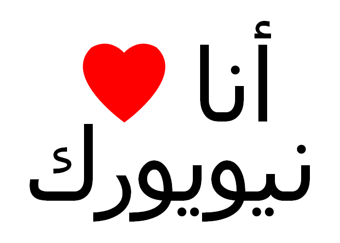
One year ago, a few days after September 11, someone had stapled a sign to a lamp post on 7th street in the East Village. I was taking basic Arabic at the time and could just make it out: I Love New York. The next day it was gone. It was half torn when I saw it. No doubt someone finished the job. There was a lot of misdirected anger in the streets then. There still is.
Click on the graphic above for a larger version you can print out and post on a lamp post near you.
Coloring Books
From Common-Place Book:
“In a scheme so wacky, it could only be COINTELPRO, the FBI sent something called The Black Panther Coloring Book to families across the United States, in an effort to subvert white support for black civil rights. The drawings are fabulously blaxploitation-meets-the-revolution.
‘This coloring book, which was purported to be from the Black Panthers, had actually been rejected by them when it was brought to them by a man later revealed to have intelligence connections. Not to be troubled by the fact that the Panthers found the coloring book revolting, the FBI added even more offensive illustrations, and mass mailed it across America... [The truth was revealed] in the Congressional inquiry into COINTELPRO.’ [source]
The Cunt Coloring Book by Tee Corinne was first published in 1975. It was a Judy Chicago kind of feminist gesture, became a cult favorite in the lesbian community, and in still in print. It was controversial enough on first publication for Corinne to change the title to Labia Flowers. It continues to be controversial enough to send to US Senators.
‘Last September, one of her pioneer efforts, The Cunt Coloring Book (1975), was the subject of a right-wing political attack on James Hormell’s nomination as a U.S. Ambassador. The Traditional Values Coalition sent a packet of materials (including Corinne’s book) to all 100 U.S. Senators, noting that the materials were in the collection of the Hormell Gay and Lesbian Center at the San Francisco Public Library. Her photocopied book and a pack of crayons were sent in an attempt to discredit Hormell, an openly gay man, who had helped to fund the Center.’ [source]”
Reprinted with permission.
Uncle Sam Wants You
- The National Security Agency Kids’ Page
- CIA’s Homepage for Kids
- Whitehouse Kids
- NORAD Tracks Santa
- Department of Justice for Kids & Youth
- FBI Kids' Page
- Air Force Link Jr.
- Overseas Private Investment Corporation for Kids
- U.S. Department of the Treasury for Kids
- IRS’s Tax Interactive
- Social Security Administration Youth Link
- Bureau of Alcohol, Tobacco, and Firearms Kid’s Page
See also the Army’s free video game America’s Army: Operations. Article here.
Scarcity of Pencil Wood
“The day is not far distant,” remarked a Florida gentleman not long since, when talking with a reporter, “when the term ‘cedar pencil’ will become quite a misnomer. At the present time the average annual consumption of lead pencils is at the rate of about four for every man, woman and child in the country. During the last ten years the quantity of cedar which has been cut in our state to supply the demand of the American and German pencil makers has been enormous, the product of more than 2,000 acres of ground being consumed every year. The cedar of the state will not hold out many years longer against demands of this kind, and already experiments are being tried with other wood. Very cheap pencils are generally made of poplar, which answers fairly well, but which will never be so valuable for the purpose as the old-fashioned and long-tried cedar. Of course, Florida has not a monopoly on the supply of cedar wood, but in adjoining states, where some is to be found, the work of the destruction has been going on quite as fast as in our little commonwealth, and I doubt very much whether any of our children will use pencils made out of the most durable and most easily polished and trimmed wood we know of at the present time.”
Minnetonka News, December 14, 1894
Reprinted from Wrote.
Work Safely
56 posters on health and safety at work from 1910-2000, from the collections of the International Institute of Social History in Amsterdam. The posters warn, inform, and try to change worker behavior. The page is in Dutch, so here’s a crude translation of the four sections:
- Traditional safety posters, 1922-1963, primarily concerned with preventing accidents.
- Posters on safety and working conditions, 1955-2000, addressing broader working conditions such as those is laid down in the Working Conditions Act.
- Foreign safety posters from outside the Netherlands.
- Historical overview of industrial safety in the Netherlands. An essay in Dutch with links to a few posters.
The Poster that Won the Election
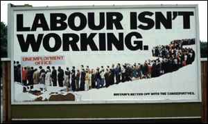
From The Guardian:
“The Conservative party’s 1978 poster of a snaking line of people queuing for the unemployment office under the slogan ‘Labour isn’t working’ has been voted the poster advertisement of the century [by the trade magazine Campaign].
Created by the Saatchi brothers, the poster is cited as instrumental in the downfall of James Callaghan’s Labour administration in the 1979 election and the rise of Margaret Thatcher, partly because he rose to the jibe and complained [about the poster in Parliament]. It also marked a sea-change in political advertising as, aiming at traditional Labour supporters who feared for their jobs, it was the first to adopt the aggressive marketing tactics which characterise modern elections.
The BBC has a story on the background of the Labour poster and how the photo was faked.
“News that people in the advert were ‘actors’ and not genuinely unemployed had leaked and Healed said the Conservatives were dishonest, reaching a new low by ‘selling politics like soap-powder’.
But Labour politicians were not hawk-eyed enough to spot that the basic ‘deceit’ was compounded by using the same few people over and over. Walsh had ensured that the volunteers’ faces were out of focus and could not be recognised.
Since then the tactic of putting up a deliberately controversial poster on a few bill-boards - and then reaping millions of pounds of free publicity as TV and newspapers report the fuss has become a standard and cost-effective tactic for advertisers.
When the election was delayed until the spring of 1979 the Saatchis brought out a second version of the poster with the legend ‘Labour still isn’t working’.
After the election Lord Thorneycroft, Tory party treasurer at the time, claimed that the poster had ‘won the election for the Conservatives’.”
Found via coudal partners.
What Do Women Want?
From “Beauty Tips and Politics” by Lauren Sandler in the The Nation:
“‘The error that we tend to make is that we think that women’s magazines are what editors want and what their readers want—and thus are are social inidicators—when in fact they are what advertisers want,’ says Gloria Steinhem. ‘They’re just advertising indicators.’ Steinham says this is why she pulled all ads from Ms.”
Actually, says Steinem, Ms. started turning a profit, or at least breaking even, when it stopped taking advertising. And, not just refusing advertising, the magazine ran a monthly feature called “No Comment” that drew attention to offensive advertising campaigns and practices.
Still, writes Sandler:
“The ad pages that accompany domestic and international rights abuse stories are getting top dollar in Marie Claire, largely because readers polled say these are among the pages they read most.”
Of course, polls can be misleading indicators in their own right.
Subvertise!
“This shared web-gallery of radical arts exists to document, develop and promote the artform of the post-corporate millennium - subvertising.
Subvertising is the Art of Cultural resistance. It is the ‘writing on the wall’, the sticker on the lamppost, the corrected rewording of Billboards, the spoof T-shirt; but it is also the mass act of defiance of a street party. The key process involves redefining or even reclaiming our environment from the corporate beast. Subvertising is allot like good modern art - they both involve finding idiots with too much power and wealth, and taxing them.”
A mixed collection of images from corporate logos to propaganda posters on issues from Animal Rights to War & Peace. Most of the images are “CopyLeft” or “Anti-Copyrighted.”
“CopyLeft means copyright except for non-profit making initiatives/organizations where the it is used to positively portray what it set out to do. If you are not sure what it originally set out to do you must ask its creator. This means that you can use the (graphics, article etc.) If you are not making money out or it and do not have the intention of doing go. If you are you must get permission from the creator to use it. This is a slightly reduced form of anti-copywrite.”
The concept resembles the more developed idea of Copyleft put forward by the Free Software Foundation. On the other hand:
“Anti-Copyright means use freely for whatever you want, and comes from the perspective that copyright should not exist at all or that there is no need to copyright the information/image as you wish it to be distributed freely and reused.”
Got any images to contribute?
SUV It
“As a part of Massachusetts Bike Week, May 2001, three Somerville artists got together and created the SUV ticket, recruited an army of cyclists, pedestrians and greens to ticket ALL SUVs!
The movement continued this year with our National Ticketing Effort, targeting 50 cities in 50 States on May11 -19, 2002. Now ticketing actions are being planned and carried out by local folks near you!”
See the ticket here (26K PDF). The campaign has generated a bit of local media coverage, made a few enemies, and even affected a purchasing decision or two. See some responses here. Of course, one good ticket deserves another.
Thanks to Jamie Leo for the tip.
Cuban Links
“Cuba has a long tradition of producing unique and powerful posters. After the revolution in 1959, posters took on a vital social role in promoting the wide range of issues facing a small country struggling for self-determination and identity. Three agencies emerged as the primary producers of an enormous output of visual material - OSPAAAL, the Organization in Solidarity with the People of Asia, Africa, and Latin America; ICAIC, the Cuban film industry, and Editora Politica, which was the publishing department of the Cuban Communist Party.”
From the Cuba Poster Project, a collaboration between the National Library of Cuba and the Bancroft Library at the University of California, Berkeley to catalogue, preserve, digitize, and exhibit printed material from Cuba. This essay on the history of Cuban poster art touches on OSPAAAL and its distribution of posters as a means of international solidarity:
“Among its many activities has been the publication of Tricontinental magazine since 1967. At its peak its circulation was 30,000 copies, produced in 4 different languages and mailed to 87 countries. Included in most issues were folded-up solidarity posters, thus establishing the most effective international poster distribution system in the world.”
Images:
- A huge collection of OSPAAAL posters organized by region.
- Posters for sale, organized by artist
- Another collection of OSPAAAL posters for sale
- A small collection from the International Institute of Social History in Amsterdam, with short bios of some of the artists.
- Posters of Cuban Cinema
Smokey, the Forest Fire Bear
“Created in 1944, the Smokey Bear campaign is the longest running public service campaign in US History. Smokey’s forest fire prevention message remained unchanged for 50 years until April 2001, when the Ad Council updated his message to address the increasing number of wildfires in the nation’s wildlands. As one of the world’s most recognizable fictional characters, Smokey’s image is protected by US Federal Law and is administered by the USDA Forest Service, the National Association of State Foresters and the Ad Council.”
The site features notes on the history and real-life inspiration for the character as well as vintage audio and imagery from the campaign. Yet, despite public education to prevent forest fires, fires have become more frequent and more severe. In fact, because of U.S. forest policy. From the U.S. Bureau of Land Management:
“Fire suppression had been the general Government policy for most of this century. A series of very destructive fires from 1871 until about 1945 had a powerful impact on the public, which was alarmed by the destruction of human life, property, and resources (like forest products and livestock food) caused by the conflagrations. The fact that loggers carelessly ignited most of these fires had little sway on public opinion. The Government policy, then, generally called for fires to be suppressed, despite the fact that as early as 1933 research was showing the absolute necessity of periodic fire for ecosystem health. This policy was effectively reinforced by the familiar icon of Smokey the Bear admonishing that ‘only you can prevent forest fires’, and by such potent images as Bambi fleeing from fire.
Yet despite determined efforts over the years to suppress naturally ignited fires, wildfires have become more numerous, severe and difficult to control. Wildland fire experts contend that this is the inevitable result of well-intended but misguided fire suppression efforts, which consequently have created vast tinderboxes in many parts of the West.
Fire ecologists say they expect many more seasons of severe wildfires because there are millions of acres that have been affected by our management actions that have not yet burned. Managers can intervene and begin restoring the natural fire regime. They have two principle tools: letting naturally-caused fires burn, and deliberately setting ‘prescribed’ fires.”
Prevention, of course, is the reason George W. Bush is easing restrictions on logging to “give loggers greater leeway to cut larger, more commercially valuable trees... and deny environmentalists legal tools they have used to block such logging.”
Smokey site found via MetaFilter.
La Lutte Continue
“The posters produced by the ATELIER POPULAIRE are weapons in the service of the struggle and are an inseparable part of it. Their rightful place is in the centers of conflict, that is to say, in the streets and on the walls of the Factories. To use them for decorative purposes, to display them in bourgeois places of culture or to consider them as objects of aesthetic interest is to impair both their function and their effect. This is why the ATELIER POPULAIRE has always refused to put them on sale. Even to keep them as historical evidence of a certain stage in the struggle is a betrayal, for the struggle itself is of such primary importance that the position of an ‘outside’ observer is a fiction which inevitably plays into the hands of the Ruling Class. That is why these works should not be taken as the final outcome of an experience, but as an inducement for finding, though contact with the masses, new levels of action, both on the cultural and the political plane.”
Statement by the Atelier Populaire, Paris, 1968.
Kyoto No Space at All
“These photographs, which are from a series entitled ‘No Space at All’, were taken in Kyoto during the bubble and post-bubble eras of the last decade. They document spaces in the city that are defined by concrete, asphalt, cars, metal or chain-link fencing and the absence of what once occupied them — usually an old house or traditional Kyoto machiya. These spaces, which more often than not are used as parking lots to accommodate the growing number of cars, are replacing the warmth of traditional Kyoto blocks with a kind of emptiness. Such spaces are rapidly increasing and can be seen in every part of the city. They are now becoming a characteristic feature of Kyoto’s urban landscape.”