

africa
ICC Indictments
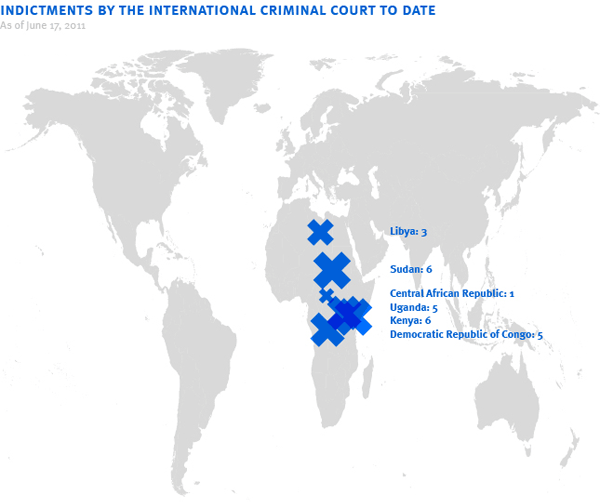
Since its founding in 2003, the International Criminal Court has issued 26 indictments. Not saying the charges aren’t warranted, but there seems to be a geographic pattern here. See also.
My Stories
In July 2009, I noted a study concluding that Brazil’s telenovelas have inspired both a drop in birth rate and rise in divorce. Via the Communication Initiative Network, I found a a few other items on soap operas and public health:
- A German report looks at TV soap operas in Kyrgyzstan, the Dominican Republic, and Côte d’Ivoire as vehicles for HIV/AIDS education.
- A radio soap opera in Vietnam reached millions of farmers changing their attitudes and practices managing rice pests, fertilisers, and seeds.
- Authors of a 2006 paper on a radio soap opera in Bihar, India document how it spurred fundamental, sustainable shifts in people’s values and beliefs.
- A May 2008 Master’s thesis looks at the effect of two Ethiopian radio dramas on attitutde towards reproductive health and spousal abuse.
- Fans of a radio drama in Sudan learned about, or were reinforced in, the importance of abandoning female circumcision, giving girls more control of their reproductive health, having a small family, and staying away from drugs and alcohol.
And though I couldn’t find a study on its impact, straphangers in New York City may remember Julio and Marisol: Decision, an episodic comic strip soap opera dealing with AIDS that ran in English and Spanish in NYC subway cars from 1989 through 2001.
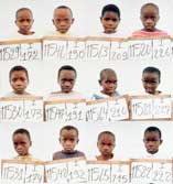
Have You Seen This Child?
Despite Apple’s high-profile use of figures like Martin Luther King, Jr and Ghandi in their Think Different ad campaign, I find Apple’s profiles of pro users fairly conventional.
The profile of Seamus Conlan, however, is a bit more socially engaged:
In Rwanda in 1994 covering a notoriously lethal civil war, photojournalist Seamus Conlan found himself suddenly and unexpectedly reassigned, not by a magazine or newspaper editor, but by his conscience. “I was working in Rwanda as a freelance photographer doing documentation on the lost children, a very big problem and a huge story,” says Conlan. “As I was riding in the back of a truck, photographing the orphans and collecting them at the same time, I decided to take a photo of every child as a means of tracing them.”
Conlan dropped out of photojournalism to complete his self-assigned new mission, photographing 21,000 orphans over a period of a year and a half. But because the children were known by ambiguous names such as Child of Hope or No Man Should Dishonor Me — “There were no John Smiths” — Conlan completed his tracing solution by posting the photographs on billboards sorted by place of origin. “If a child came from Kigali, the parents would go to that billboard, point to the child, give the ID number to the Red Cross and take that child home.”
Conlan’s photographic tracking method is now used by all major relief agencies.
See this 2006 piece on CNN, Camera reunites Rwandan children, families, and Seamus’s own site.
 “In our attempt to bring this story [about the war in eastern Congo to access gold deposits] to the attention of these international gold traders, Human Rights Watch and I worked together to create an exhibit of my mining photographs in Geneva, Switzerland, where Metalor Technologies, one of the leading gold mining companies, has its corporate offices. We invited to the exhibit’s opening night gold buyers and mining company executives as well as financiers, stockholders and journalists. Immediately after seeing this exhibit, Metalor Technologies halted its purchases of Congolese gold.…
At about the time I was teaching these young students, I was collaborating with a comic artist, Paul O’Connell, on an article for Ctrl.Alt.Shift. Our partnership revolved around the idea of us combining our various skills to create new ways of delivering messages. What this meant is that Paul took my photographs from places like the Congo and transformed them into a comic strip to tell the story to a different audience.” (via)
Designism 4.0

The Art Directors Club hosted Designism 4.0 this Wednesday night in their New York City gallery. This was the fourth annual event on design and social change there, and after last year’s ambitious program was cut short by the Vice-Presidential debate this year’s program was significantly streamlined — four slideshows, a roundtable, and one big question: how to do good work and still eat.
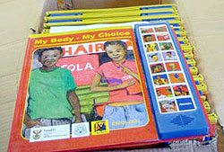 “Books of Hope partnered with the South African Depression and Anxiety Group, to design and produce interactive, multilingual Speaking Books that can be seen, read, heard and understood by the reader regardless of their reading ability.
The Speaking Book combines the latest sound chip technology featuring a sound track read by well-known local celebrities in the local language, with a durable laminated hard backed book, to take the reader on a step-by-step guide to wellness. Books of Hope has successfully created an effective means to present complex health care issues by adapting to the culture, skills and needs of communities while encouraging them to build self confidence with a simple action plan.”