africa
Tiny Nationalisms
 Eleanor Roosevelt famously wrote, “Where, after all, do universal human rights begin? In small places, close to home.“ By implication, the same could be said for racism, nationalism and other ideologies.
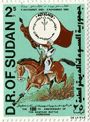
Official Representations of the Nation: Comparing the Postage Stamps of Sudan and Burkina Faso looks at the ideology of stamps:
“Sudan’s stamps focus on the political center and dominant elite (current regime, Khartoum politicians, and Arab and Islamic identity) while Burkina Faso’s stamps focus on society (artists, multiple ethnic groups, and development). Sudan’s stamps build an image of the nation as being about the northern-dominated regime in Khartoum (whether military or parliamentary); Burkina Faso’s stamps project an image of the nation as multi-ethnic and development-oriented.”
Ethnic identity is, of course, a tool in the Sudan government’s repression of Darfur.
The Invisible War
On February 21, 2009 Bob Herbert published a column in the New York Times calling the war in the Democratic Republic of Congo “The Invisible War.” After a decade of bloodshed, millions killed and displaced, and an active UN peacekeeping force, why is Africa’s World War so invisible? He actually doesn’t speculate.
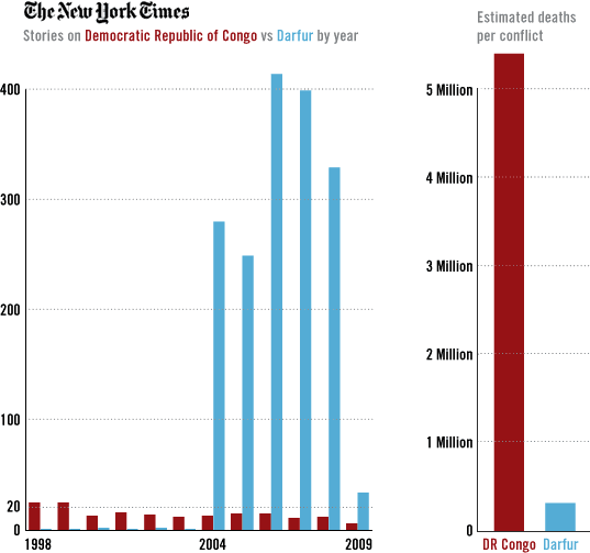
Perhaps Mr. Herbert should inquire at the editorial desk. Using the NY Times Article Search API I ran a query by year on the term “Democratic Republic of Congo.” The Times averaged 13.5 stories per year on DR Congo from 1998 through 2008. On the face of it, one story per month seems a nice steady focus. But by comparison, the Times published an average 151.6 stories on Darfur per year during the same period — even though the war in Darfur only started in 2003. In January 2008, the International Rescue Committee published a study reporting the war in DR Congo had claimed 5.4 million lives. In March 2008, the UN estimated the number of deaths in Darfur at 300,000.
Here are the counts of New York Times articles by year, as of February 24, 2009:
| 1998 | 1999 | 2000 | 2001 | 2002 | 2003 | 2004 | 2005 | 2006 | 2007 | 2008 | 2009 | |
| On DR Congo | 24 | 24 | 12 | 15 | 13 | 11 | 12 | 14 | 14 | 10 | 11 | 5 |
| On Darfur | 0 | 0 | 1 | 0 | 1 | 0 | 279 | 248 | 413 | 398 | 328 | 33 |
And a graphic I designed to illustrate it:
For those inclined, here’s the perl script I used to query the API. It borrows heavily from this example.
I realize one should be wary of comparing casualty data gathered with different methodologies, and that the conflict in DR Congo has a five year lead. But a million here, a million there, the disparity is still dramatic.
So why does Darfur get so much more coverage than DR Congo? Do the Arab Muslim bad guys in Sudan make a more convenient target for Western Islamophobes? Are China’s competing industrial interests in Sudan easier to finger than US corporate interests in DR Congo? Are the deserts of Darfur simply more accessible than the forests of Northeastern Congo? Or is Darfur a simpler story with clearer victims and perpetrators? A story closer to Western ideas of genocide than Congo’s messier regional war? Certainly the celebrity and NGO pressure on Darfur has helped. I should note that I’m emphatically not arguing that Darfur should be covered less, but that the war in DR Congo should be covered more. Much more.
Update 2/26/2009 — Anneke Van Woudenberg, Senior Researcher at Human Rights Watch sends this response:
“This comparison is both interesting and disturbing. In my ten years of working on Congo I have often wondered why it gets so much less press attention. The difficulties for journalists to get around and the expense of such trips contribute to the problem, but such problems also occur in Darfur or other conflicts that receive more press coverage. The complexities of the Congo conflict - the alphabet soup of armed groups and the constant changing alliances - make it a challenging story to cover. But it is not impossible. So what is it?
I fear that the Congo conflict receives less coverage because many outsiders have bought into the preconception that Congo is the ‘heart of darkness’ as characterized by Joseph Conrad's book by the same title. The book has often been used to refer to Congo’s plight today, as if the country is somehow predisposed to dark atrocities and violence, and hence there is nothing new to report. Yet many have misunderstood the real message of Conrad's book. It is not Congolese barbarism but rather the greed of outsiders that have plagued this country's history. As the narrator of Conrad's book describes, he found in Congo, ‘the vilest scramble for loot that ever disfigured the history of human conscience.’ A situation little changed today. Surely that story is worthy of further press coverage.”
Update 4/16/2009 — Julie Hollar at FAIR points out that The New York Times style does not always refer to DR Congo as “Democratic Republic of Congo,” rather sometimes just “Congo,” which makes the free text search problematic. Instead, I ran an API search for articles by geo tag, comparing documents tagged CONGO (FORMERLY ZAIRE) with documents tagged DARFUR (SUDAN).
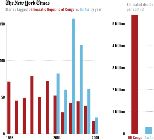
By geo tag, Darfur still shows roughly double the coverage of DR Congo. Not quite as dramatic as my first graph, but still disproportionate. Of course this method depends on the Times for accurate tagging of their own articles. It’s unclear why a free text search for “Darfur” turns up so many more results than the geo tag search.
 “In 1986, the anarchist band Chumbawamba released the album Pictures of Starving Children Sell Records, as well as an EP entitled "We Are the World", jointly recorded with US band A State of Mind, both of which were intended as anti-capitalist critiques of the Band Aid/Live Aid phenomenon. They argued that the record was primarily a cosmetic spectacle, designed to draw attention away from the real political causes of world hunger.”
On Design Altruism
A US design student writes of her work for US AID getting out the vote in Rwanda in 2000:
“... Even something as simple as an image of a person displaying their voter registration card (as was depicted in the instructional voting poster) can have implications that an outsider would never anticipate. After election day, some people expressed strong feelings in response to this image. Apparently, the image of a person holding up their voter card recalled the ethnic identity cards used to divide Hutus and Tutsis and which were later used to target people during the genocide. People feared that the military police stationed at the voting booths might check their voter card for a stamp and look for ink on their thumb and if they were found to be without either, there could be grave consequences. When I initially learned of the reported ninety percent voter turn-out, I was thrilled. However, as I learned more about the politics of fear involved in these elections, I discovered that I might have unwittingly contributed to creating messages I did not intend. The visual is always political. It was a valuable lesson for me to learn. I just wish nobody else had to pay for it.”
Grassroots Comics
“Almost any issue, idea or fact can be expressed in a comic. This kind of visual storytelling is flexible, attention-grabbing and relatively inexpensive.”
World Comics is a non-profit organization in Finland and India that promotes the use of local comics as a means for social change. Grassroots Comics: A Development Communication Tool (PDF) is a free, downloadable manual for other non-governmental organizations about developing comics with community activists for use in their campaigns. See examples of grassroots comics in India and Africa, as well as videos and posters from grassroots comics workshops.
Water Table
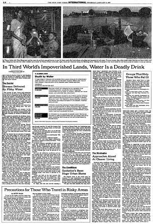
Articles on the New York Times website do not generally retain graphics and photos used in the print edition, particularly among older articles. So for a presentation on information design for advocacy, I went offline and dug up that graphic mentioned here. You know, the one that persuaded Bill Gates to shift his philanthropic strategy from cheap computers to public health? The graphic that “saved more lives in Africa and Asia than any other in history”?
Here’s the text of the 1997 article associated with the graphic, For Third World, Water Is Still a Deadly Drink.
And a view of the graphic within the context of the page:
And finally, the graphic itself:
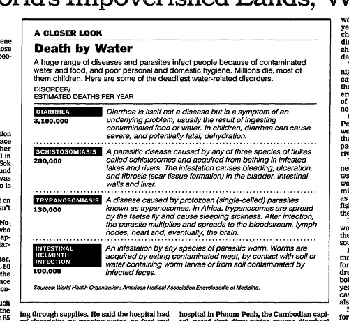
After such an awe-inspiring setup, it’s remarkable to me just how unremarkable the graphic actually is. Particularly compared to many of the examples I used in my little pamphlet on information design, there’s nothing really visually compelling or innovative about this one. But perhaps that’s part of its impact: just a clear, concise table calling out key data. The graphic gets out of the way of the information. And while the numbers themselves are stark, I think its power also comes from its context within the brutality described in the narrative — and that for the most part, clean water and sanitation are not problems we don’t know how to solve.
Persuasion
From a February 2008 interview with Steve Duenes, graphics director for The New York Times:
From: Nicholas Kristof
Subject: the power of artin september i traveled with bill gates to africa to look at his work fighting aids there. while setting the trip up, it emerged that his initial interest in giving pots of money to fight disease had arisen after he and melinda read a two-part series of articles i did on third world disease in January 1997. until then, their plan had been to give money mainly to get countries wired and full of computers.
bill and melinda recently reread those pieces, and said that it was the second piece in the series, about bad water and diarrhea killing millions of kids a year, that really got them thinking of public health. Great! I was really proud of this impact that my worldwide reporting and 3,500-word article had had. But then bill confessed that actually it wasn't the article itself that had grabbed him so much -- it was the graphic. It was just a two column, inside graphic, very simple, listing third world health problems and how many people they kill. but he remembered it after all those years and said that it was the single thing that got him redirected toward public health.
No graphic in human history has saved so many lives in africa and asia.
A little over the top, but it’s a nice story. Though while Mr. Kristof celebrates, this seems as much an indictment of NY Times coverage of rural poverty. (via)
Updated April 28, 2008: I dug up the graphic in question, posted it here, and added a link in the text above.
Puppet Regime
 UNICEF has a brief publication online discussing puppetry as a medium for education and social change. It quotes practitioners in Indonesia, South Africa, Iran, and Hong Kong. Another twenty or so examples from around the world, primarily focusing on public health, are listed here. (via)
See also this brief history of radical puppetry in the U.S. and Europe.
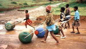
Geometry, 2
Reader sum1 writes in response this post touting the Q-Drum. He notes a similar product also launched in South Africa called the Hippo Water Roller. While a 1997 Time article reports the Q-Drum’s launch in 1994, the Hippo Roller Web site cites a South African Bureau of Standards 1992 Design Award.
Both are rugged, round water containers designed to be rolled on tough rural roads. But while the Q-Drum is shaped like a tubular donut with a hollow inner core, the Hipporoller is notched at both ends for the attachment of a clip-on steel tube one can use to to pull or push.
Pushing the container in front of the user has the additional advantage of acting as a buffer against landmines.