

mapping
Independent Media Centers around the World
Click on a country to zoom. Click and drag to zoom into an region. Click on the ocean to zoom out. Click on a dot to visit that city’s Web site.
Source: http://www.indymedia.org, http://contact.indymedia.org/timezone.php.
Another Flash test with point display (and more apologies to the RSS readers.)
Download it yourself and add your own data.
State Parties to the Convention on the Elimination of All Forms of Discrimination against Women
As of January 5, 2005. Source: The United Nations.
Testing out a Flash piece (with apologies to all the RSS readers). Click on a country to zoom. Click and drag to zoom into an region. Click on the ocean to zoom out.
More about the Flash bit and how to incorporate your own data.
Dimensions of Mind
“You’re traveling through another dimension, a dimension not only of sight and sound but of mind; a journey into a wondrous land whose boundaries are that of imagination.”
 Yesterday sat in on an a lecture on theories of the nation and nationalism. The nation is an imagined community, geography a matter of representations, and both of these are fraught with assumptions.
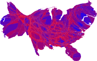
But looking at all the electoral maps and cartograms of the last election one can see the reverse is true as well. The Map Room has cataloged links to several maps: 1, 2, 3, 4.
I’ve read several accounts for the patterns on the map. One can examine north vs. south, heartland vs. fringe, urban vs. rural, plotting various demographics along the way.
Even if one assumes that a few million votes were stolen, a more general insight is unspoken — perhaps because it is a given? Despite increasing consolidated and homogenous media and increasingly pervasive Internet access, ideology exists spatially.
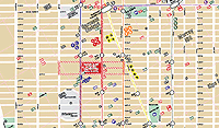
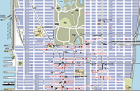
People’s Map of NYC
Several grassroots groups are publishing maps of the New York City to guide visitors and residents who want to participate in the protests and events around the Republican National Convention next week.
From a co-editor of, Peace Signs, a big book of anti-Bush, anti-war posters, comes The People’s Guide to the RNC
 Cited in The New York Times on August 9, 2004:
“Included is information of the sort that could be of use to any traveler: a street map of Manhattan south of 59th Street and addresses of restaurants, bookstores, libraries and places to rent bicycles.
Other elements are specific to the convention: hotels where various state delegations will be staying, sites of official convention events, and times and locations of planned demonstrations. There are also the words of the First Amendment, phone numbers for the New York Civil Liberties Union and information about bail bondsmen.
The three creators said they spent $6,000 of their own money to print the guides, but are distributing them free.
‘The main reason we made the guide is so that people have enough information to get in the way or out of the way,’ Mr. Chan said.
On Thursday, he and his friends began distributing 25,000 copies to bookstores, community groups, churches and other places.”
 You can order or download the map here.
...
The 2004 RNC Protesters Map is more up-to-date, and features a large list of protest, art, and RNC related events, convergence spaces, and trainings. Icons on the map indicate hotels, police stations, navigation landmarks, parks (both active and passive), and the march route and rallying points. Updated on August 20, the map can be download here (792 Kb PDF).
...
 First published in March 2003, the Map of War Profiteers in New York City showed the beneficiaries in our midst, plotting the locations of government and military agencies, corporations, media profiting from the war. At the meeting of the M27 Coalition, the map helped locate the discussion determining a place for the March 27, 2003 action. Rockefeller Center ultimately was chosen for its proximity to several points on the map.
Unlike the other two color multi-page maps, the War Profiteers map has a distinctly low-tech, underground, DIY aesthetic. It is designed to be reproduced in black-and-white on the front and back of an 11"x17" piece of paper. The icons are composed of cut paper, arranged on a found map. The map was available at progressive bookstores around town, and was distributed at organizing meetings for various protest events.
Green Map Systems
Graphic designer Wendy Brawer produced her first Green Map in 1991. The Green Apple Map of New York City charted 143 ecologically and culturally significant sites: community gardens, parks, greenmarkets, eco-centers, green businesses and buildings, transportation options, and toxic hot spots. It was well received and quickly inspired a second edition. Wendy writes:
“This Map encourages people to explore and understand out city — helping expand our community of environmental stewards who understand the interconnections between the natural and built environments. It can help build a network of links among people of different ages and backgrounds by highlighting places that are important to our common future. It promotes and fosters replication of successful projects. Moreover, it challenges the assumption that this intensely urban setting has little redeeming ecological value.”
 Activists and designers in other cities, particularly colleagues in the o2 Global Network, were eager to make their own Green Maps.
Green Map Systems was born in 1995 and became a U.S. registered not-for-profit organization in 2000.
Wendy and her team produced a shared set of icons, and a Mapmakers’ Agreement which sets some parameters and includes small royalty based on the proceeds — 1% to 3% depending on if the project is all volunteers or has paid staff, and 1% of printed maps. Some “scholarships” are available where needed.
After that, the projects are fairly autonomous. Each Green Map is locally organized and designed, and independently produced. The maps may highlight parks and green spaces, bike paths, gay and lesbian resources, notes on wheelchair accessibility, recycling centers, or sites of energy production and consumption.
“Printed and digital Green Maps identify, promote and link eco and social resources. Each merges the ancient art of map making and new media in creating a fresh perspective that helps hometown residents discover great ways to get involved with the urban environment, and guides tourists (especially virtual ones) to special places and successful greening initiatives they can experience, and then replicate back home.
The maps are generated with a wide range of techniques, from GIS to Illustrator, to simple drawings by hand.
As of this writing, there are now there are now 241 Green Map projects, including 45 by youth. 151 different Green Maps have been completed in 39 countries. The maps are listed here.
Map makers can also develop local variations on global set of Green Map Icons (a shrine icon for Japan, a Capoira icon for Brazil.) After a global discussion on the Green Map email list, several of these have been incorporated into the global set. The set of 125 icons and 50 youth icons have been released as digital fonts for easy placement.
Launched on February 29, 2004, the Green Map Atlas highlights the ten map making projects in Asia and North America. With the goal of promoting sustainability and greener living worldwide, the Green Map Atlas showcases the work of diverse Mapmakers in Tokyo, Toronto, Jakarta, Pune (India), Kyoto, Hiroshima and Hakodate (Japan), Robeson County, NC, Milwaukee, and New York City.
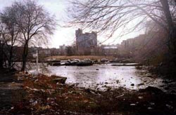
Mapping Environmental Racism
Six out of eight of Manhattan’s diesel bus depots are located in northern Manhattan. Two of the city’s largest sewage treatment plants are there, too — powered by huge diesel engines running 24 hours a day. The area is flanked by highways and two major bridges over which trucks (also running on diesel) deliver goods into city into Manhattan. And the two outdoor train yards and elevated rail lines serve diesel locomotives daily.
In addition to diesel exhaust, northern Manhattan contains brownfield sites, vacant lots, and abandoned buildings posing chemical and social hazards.
On April 19, 2003, the New York Times reported on a study that found that 25.5 percent of children in Harlem have asthma — “one of the highest rates ever documented for an American neighborhood.”
Residents of northern Manhattan are predominantly black and Latino.
...
West Harlem Environmental Action is:
“a non-profit, grassroots organization working to improve environmental quality and to secure environmental justice in predominately African-American and Latino communities.
Since 1988, WE ACT has worked with citizen groups, youth, community residents, environmentalists, local/state/federal governments, and educational & medical institutions.
Based in Northern Manhattan, WE ACT advances its mission through research, public education, advocacy, mobilization, litigation, legislative affairs & sustainable economic development.”
 One of their programs is a mapping initiative using GIS to map health trends, particularly child asthma hospital admissions, air quality, and polluting facilities, as well as waterfront development and access issues.
“The first step toward environmental justice must be an awareness of the hazards. WEACT has an ongoing commitment to enhance community awareness of environmental hazards in northern Manhattan. The maps and ‘tour of hazards’ presented here are an incremental step toward the fulfillment of WEACT’s mission. They are the result of a joint project between WEACT and students from the City and Regional Planning Department at Cornell University. Cornell students created this web page based on interviews with area residents about environmental hazards in their neighborhoods.”
“On January 30, 1999, eight students, part of an Environmental Justice and GIS Workshop class with the Department of City and Regional Planning at Cornell University in Ithaca, New York, met with WE ACT staff and several community leaders to ‘address the dire lack of useful environmental justice information accessible to communities in New York, New Jersey, and Puerto Rico.’ At the time, the nascent GIS system setup in the WE ACT office was a mere four months old, and their collaboration helped to shape its growth to where it stands today!”
Their Toxic Tour links points on the map to photos documenting toxic sites and their proximity to homes and schools.
Feedback Loop
In March, I blogged about MoveOn’s use of interactive maps to illustrate participation in their campaign events. The maps are a great way to visualize the scale of the event and provide feedback to the participants and the media.
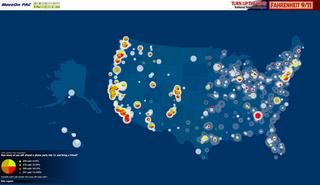 In Stamen Design’s latest project for MoveOn, the map of feedback has itself become the means of participation.
On June 28, over 55,000 people in 4,600 house parties participated in an online conversation with Michael Moore about his film Fahrenheit 9/11. Moore spoke over a live, RealAudio feed while users asked questions via the map interface. User questions and responses to questions were displayed on the map in real time.
From Stamen’s press release:
“Stamen developed a live, map-based, interactive Q&A session that allows thousands of people to communicate visually via a moderated discussion. Visitors logging on can ‘see’ themselves and their submitted questions on the map, along with those of other MoveOn community members. Michael Moore, along with MoveOn directors Eli Pariser and Adam Ruben, will respond to active polls and answer questions from the online audience. The effect is both compelling and empowering. ‘If you can see yourself on the map, so much the better, because you can identify yourself as part of a large group of Americans all working towards the same thing,’ says Michal Migurski, Stamen’s Technical Lead. ‘You can get an immediate visual picture of just how widespread MoveOn’s membership is, and immediately connect with that community.’”
A archived version of the Flash file is in the works, but in the meantime, check out the screenshots in this chronology of the event.
The event also marked the launch of local voter registration and organizing drives around the country.
...
Update: The map was used again for the July 18 house parties and screenings of Outfoxed. Here are some screenshots from that event.
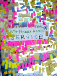
What is Asset Mapping?
I first heard of this in Japan a couple of years ago. A friend who ran a community development initiative in Boston’s Chinatown, was off to Gifu, the butt of all jokes and an industrial city struggling with the long recession and a loss of manufacturing jobs.
It took a while, but I finally had a chance to search around for a decent definition.
Community asset mapping sounds like a good way to begin analyzing and building political power within a community using design and graphics.
From a Michigan State University Best Practices Brief (468 Kb PDF):
“Community Asset Mapping is a capacity-focused way of redeveloping devastated communities. This positive approach is proposed as a substitute for the traditional deficits focus on a community’s needs and problems. Using problems to formulate human service interventions targets resources to service providers rather than residents, fragments efforts to provide solutions, places reliance on outside resources and outside experts, and leads to a maintenance and survival mentality rather than to community development.
 Instead, they propose the development of policies and activities based on an understanding, or ‘map,’ of the community’s resources — individual capacities and abilities, and organizational resources with the potential for promoting personal and community development. This ‘mapping’ is designed to promote connections or relationships between individuals, between individuals and organizations, and between organizations and organizations.
The asset-based approach does not remove the need for outside resources, but makes their use more effective.
The community assets approach
- starts with what is present in the community
- concentrates on the agenda-building and problem-solving capacity of the residents
- stresses local determination, investment, creativity, and control
In this context, spatial mapping may or may not be used. Within any given neighborhood or community, most assets as defined by Kretzmann and McKnight, [who developed the asset mapping approach to development,] do not have a spatial quality. Community Asset Mapping has very little to do with spatial mapping... and much more to do with a community survey and the mobilizing of individuals and organizations to make connections and build capacity. The information obtained through the survey process must be organized and accessed in an inventory format. It can be computerized as a data base inventory. Computerized mapping can be used, showing the location of assets on a geographic map, as well as the attributes attached to each asset.
The Community Asset Mapping process as outlined by Kretzmann and McKnight is intended to initiate a process that will fully mobilize a community to use its assets around a vision and a plan to solve its own problems. Their guidebook provides considerable detail about how this might be accomplished, with numerous examples of the types of connections that can be developed.“
Some forms of mapping include:
Mapping Public Capital
Such as
- social gatherings that enable people to learn about what is happening in the community
- organized spaces for interaction where people can learn about, discuss, and act on community challenges
- catalytic organizations that spur discussion on community challenges and marshall a community’s resource to move ahead;
- safe havens for decision makers to meet for unofficial candid discussions.
From this the community, can fill in gaps and identify action points and obstacles to overcome.
Cultural Mapping
Documenting cultural resources in the community — examining long-term customs, behaviors, and activities that have meaning to individuals and to the community. Information for cultural mapping is gathered by face-to-face interviews. Communities can use cultural mapping as a tool for self-awareness to promote understanding of the diversity within a community and to protect and conserve traditions, customs, and resources.
Community Relationship Mapping
Ecomapping was initially developed as an effective way for a therapist to identify relationships within a family. The mapping of inter-organizational linkages is a form of ecomapping designed to show the relationships that one organization has with other organizations within the community. Relationships with other organizations may relate to funding, referrals, access to resources, joint service planning, collaborative projects with contributed staff or funds, etc. Ecomapping may be undertaken to clarify the place of an organization in the community spectrum, to identify gaps in linkages, to indicate the multiple relationships between organizations, etc.
From the Northwest Regional Educational Laboratory, regarding the Mapping Community Assets Workbook:
“‘From a community development perspective, it helps to think of our communities in terms of their wealth—in people, things, services, and resources that they possess,’ says author Dr. Diane Dorfman. ‘To build from what you have requires asking different kinds of questions to learn different kinds of things about where you live.’
Learning how to ask what communities have to offer begins a process of building and developing. It brings knowledge, skills, and capacities out into the open, where they can work together to everyone’s benefit. As the web of assets grows, so does the potential for the community.
An asset map is an inventory of the strengths and gifts of the people who make up a community. Asset mapping reveals the assets of the entire community and highlights the interconnections among them, which in turn reveals how to access those assets.
The workbook’s engaging, lively style invites active participation on practically every page. Through a series of questions and exercises, readers first learn to uncover their personal assets, both tangible and intangible, material and nonmaterial. Then they expand to take stock of their community, listing all of its special features. Readers also learn how to design a questionnaire to uncover the hidden assets in their community, those from people or places that are not familiar.
‘Connections to people can also become connections to resource-filled institutions. Likewise, a connection to an organization or institution may actually conceal a personal relationship,’ notes Dorfman.
Here’s an annotated resource list on community asset mapping, and a page on asset mapping with youth.
Still there’s something curious about that Michigan State University’s ‘Capable Communities’ center. Why are they offering this particular public service? Is that university campus, like so many in the U.S., surrounded by pockets of poverty? With this image in mind, it occurs to me that Community Asset Mapping is rather “inward” focused. This is the point, I know, but it does not interrogate or confront external actors or institutions, economic or public policies that also give shape to the community. This is, perhaps, a different map. Building a stronger community, however, builds a solid foundation for challenging the status quo.
To the Streets
I wrote the essay below for the Design Issues column in the May/June 2004 issue of Communication Arts. I profile a couple of folks using graphic design for advocacy. I didn’t call it out explicitly in the text, but it’s of some relevance that the projects here are generally not pro-bono projects “for charity,” but are organizations started by designers generally working with broader communities. Check it out.
Taking it to the Streets
Graphic design for advocacy
Walking the streets of New York City in February 2003, one couldn’t help but notice all these little blue stickers. Stuck to walls, phone booths, bus stops, scaffolding, mail boxes — they popped up everywhere to announce the February 15 march against President Bush’s invasion of Iraq.
The blue stickers were just one of the many anti-war graphics circulating at the time. Around the Web, activists were posting free, easy-to-print designs using a variety of techniques: clever slogans, typographic play, dramatic photos and the ironic use of vintage propaganda imagery.
But the February 15 stickers on the streets of New York were different — simple and bold, a little blue banner announcing the time and place of the march. They did not make an emotional appeal with pictures of scarred and armless Iraqi children or U.S. soldiers, nor was there any argument about why the war was wrong.
The February 15 posters were not intended to change people’s minds in a direct way, but to notify the public about the upcoming protest — and to make dissent visible. The mainstream media had entirely avoided covering the anti-war movement prior to February 15. In the face of this de facto censorship and police obstruction over the route of the march, the stickers acted as thousands of little acts of civil disobedience. And with the urban landscape as a medium, the stickers set the stage for even larger acts of defiance.
Rogue State
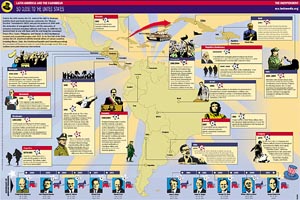
“An understanding of the current crisis requires a sense of Haiti’s history,” notes Paul Farmer, situating the recent coup squarely into the long, brutal history of U.S. economic and military intervention.
The latest Indypendent expands the story to the rest of Latin America and the Caribbean, and does so graphically with this map of U.S. military intervention in the region from 1950 through 2004. Download the PDF here.
The Indypendent, is the biweekly paper of the New York City Independent Media Center. The map is designed by ILC.iNK.
“ILC.iNK develops pages and up-to-date content specifically directed towards the Hispanic community, designed and illustrated with photographs, illustrations and infographics to captivate readers, and always customized to the general format of your publication and the needs of your advertisers. ILC.iNK is the ideal solution to develop special supplements, features, or regularly appearing sections such as Health, Sports, Children, Travel, Food, Music, etc.”