

ufpj
End It Now.
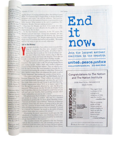
An ad I designed for United for Peace & Justice ran in the September 15, 2008 issue of The Nation. The ad runs along side the cover story on the U.S. government’s shameful treatment of veterans.
It’s nicely bold and direct in print. It’s also the first time UfPJ ran with copy I came up with. In the design process I showed a couple of sketches using the text they’d provided, and a couple without.
Here are a couple of previous projects for UfPJ.
Sloganeering
A year ago, I received an email from “Tony:”
“I have looked all over the web, and just can’t find the simple themes that can be posted to the back of poster board or foam board and used at street vigils. I just need simple stuff for 11 by 17 AND 8 1/2 BY 11 COPYING.
Can you help? The power of one or two people in public holding simple antiwar protest messages is great. I just can’t find anything on the net that isn’t too artsy-fartsy, or too damn pacifist-wimpy.”
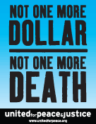
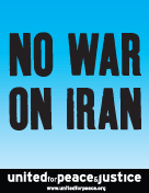
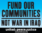
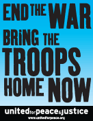
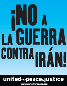
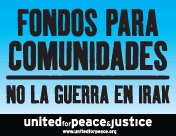
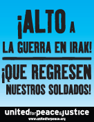
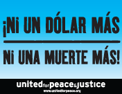
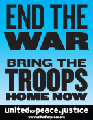
I smacked into this “artsy-fartsy” factor again a few weeks ago when United for Peace and Justice asked if I could turn out some poster designs on short notice. They sent their final copy and I set to thinking about how to represent things iconographically in a beautiful, compelling way. I rummaged through the usual toolbox (coffins, dollars, boots, ribbons, etc.) as well as play with color and typographic notes (big X’s, oversized punctuation, etc.) One slogan in particular raised an interesting problem: how to graphically represent “community” for marches in eleven very different cities.
Nevertheless, over the weekend’s iteration the org requested the gradual removal of all imagery, iconography, and embellishment. I was trying to do something graphically interesting to myself, but the group had a very specific use case in mind. The posters were not intended for pasting on the street, to attract passersby with flourish, humor, or imagery. They wanted something to be carried high and read from a distance, particularly when reproduced in photos, newspaper clippings, or seconds-long TV news highlights. As such, these were props to represent the march in memory as much as in person, to disappear and punch the message through network editing and newspaper cropping. The simpler and bolder the better.
With a little more time I would have refined these further, but here are the results below. Click on a thumbnail to download a printable PDF.
Redacted
Around 3,500 antiwar protesters rallied outside the United Nations in New York City today while President Bush delivered his speech inside. A decent turnout for a business hours on a weekday, and a very last minute call to action.
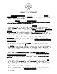
The organizers asked me to design a flyer to hand out at the march. I took it as an opportunity to do something a little different from a typical flyer. The goal here was not to grab the viewer and turn them out to the event, but to make something interesting for them to read while attending the event itself. The front is a statement by the organizers, the back lists upcoming events.
In the end UfPJ wanted something simpler — and something more like a typical flyer — which I delivered. But I like the way this version came out. The text is styled in the form of a redacted government document. It creates a parallel text that plays on themes of secrecy, coverup, and suppression of dissent, as well as seeing through the lies and reading what is erased.
 |  |
| Download 200 Kb PDF | |
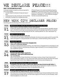
March in April
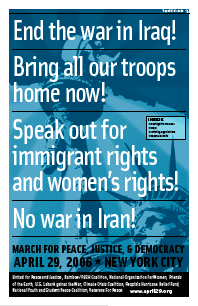
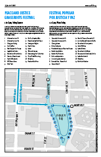
This Saturday, April 29, we take to the streets to end the war in Iraq, support immigrant rights and women’s rights, and to oppose war against Iran. I designed a broadsheet that the organizing coalition will distribute. It’s a two-color, tabloid-sized, eight-page booklet in English and Spanish with statements by the organizers, emergency contact info, and maps of the affinity group assembly areas, march route, and peace festival.
It was a challenge giving the different messages equal weight without flattening out the design. Because of the politics of the coalition, this was a big requirement. It was also my first chance to play with the City’s official NYCMAP data, which was fun. The cover image extends the Statue of Liberty image used in the existing flyers, but pushes it back to make it a little more ambient and less iconographic. It was a rush job and stepping back, some of the type treatment feels a little heavy-handed. But I’m otherwise pleased with it. We’ll see how it works on newsprint. Maybe the heaviness is appropriate.
Was that March?
On a couple of occasions I’ve noted my admiriation for the design used by United for Peace and Justice to publicize anti-war events in New York City. The simple flag and globe motif on a bright blue ground and its bold sans-serif type are eye-catching, clear, and instantly recognizable.
However, the consistency and repetition of such a strong image in the same context (via stickers and flyers) over nearly three years may be diminishing its impact. As one UPfJ organizer notes:
“We love the blue flag standard, but have heard feedback that the design has been the same for too long... folks think it’s for an old demo.”
To the Streets
I wrote the essay below for the Design Issues column in the May/June 2004 issue of Communication Arts. I profile a couple of folks using graphic design for advocacy. I didn’t call it out explicitly in the text, but it’s of some relevance that the projects here are generally not pro-bono projects “for charity,” but are organizations started by designers generally working with broader communities. Check it out.
Taking it to the Streets
Graphic design for advocacy
Walking the streets of New York City in February 2003, one couldn’t help but notice all these little blue stickers. Stuck to walls, phone booths, bus stops, scaffolding, mail boxes — they popped up everywhere to announce the February 15 march against President Bush’s invasion of Iraq.
The blue stickers were just one of the many anti-war graphics circulating at the time. Around the Web, activists were posting free, easy-to-print designs using a variety of techniques: clever slogans, typographic play, dramatic photos and the ironic use of vintage propaganda imagery.
But the February 15 stickers on the streets of New York were different — simple and bold, a little blue banner announcing the time and place of the march. They did not make an emotional appeal with pictures of scarred and armless Iraqi children or U.S. soldiers, nor was there any argument about why the war was wrong.
The February 15 posters were not intended to change people’s minds in a direct way, but to notify the public about the upcoming protest — and to make dissent visible. The mainstream media had entirely avoided covering the anti-war movement prior to February 15. In the face of this de facto censorship and police obstruction over the route of the march, the stickers acted as thousands of little acts of civil disobedience. And with the urban landscape as a medium, the stickers set the stage for even larger acts of defiance.
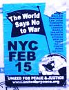
The World Still Says No to War
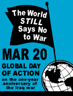 Those little blue stickers are popping on the streets of New York again. This Saturday, on the one-year anniversary of the invasion of Iraq, millions will take to the streets to call for peace. Protests are scheduled in over 50 countries, with over 200 events planned around the United States.
United for Peace and Justice has made variations on their “flag” flyer template available for download with space to add details about your local event or create your own translation, and with rotated globes for events in Africa, Asia, or Europe.
By now there are plenty of downloadable flyers on the Web, but few designed for translation and personalization, while retaining a generally persistent brand. I’ve not seen another organization producing anti-war posters this user-oriented.
Except the Bush-Cheney presidential campaign.
From Wired:
“The Bush-Cheney presidential campaign disabled features of a tool on its website Thursday that pranksters were using to mock the Republican presidential ticket.
The tool originally let users generate a full-size campaign poster in PDF format, customized with a short slogan of their choice. But Bush critics began using the site to place their own snarky political messages above a Bush-Cheney ’04 logo and a disclaimer stating that the poster was paid for by Bush-Cheney ’04, Inc.”
See a handful of sample posters in this nostalgic Fash piece.
Design Against the War
Over a year ago I attended a lecture on design at the Cooper Union. The speaker projected a series of slides illustrating his minimalist design philosophy. One of the images was of the B-2 bomber. I was shocked and disturbed that a design philosophy would fail to take into account social, political, and economic contexts. Particularly of an object which, when used as intended, delivers massive death and destruction.
It prompted me to dig deeper into design and the public interest. And to start this Web log.
On evening of April 16, I arranged a panel discussion at Cooper titled “Design in the Public Interest / Design Against the War.” I invited three panelists to speak about their work as designers involved in the anti-war movement.
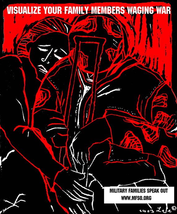 First up was Lee Gough, a printmaker, anti-war activist, and graphic artist based in Brooklyn, NY. She showed a series of prints from a portfolio-in-progress on the Iraq invasion and the war at home, called “The War Went Well.” Some of the images have been used in posters on the Web site Who Dies for Bush Lies“ and for Military Families Speak Out, an organization of people who are opposed to war in Iraq and who have relatives or loved ones in the military.
One image “Fight the War at Home” was inspired by a subway ride home from lower manhattan on September 11. Even as the towers had just been destroyed, there were still, as there had been for many years, homeless persons on the subway appealing to cityfolk to remember them, and to give. The image is a graphic reminder that some have been under domestic attack in our country for a long time, and that funds for the war on poverty pale in comparison to our “defense” budget. Another image, “Visualize Your Family Members Waging War” depicts a despondent soldier with a crutch being embraced by a woman. Lee’s expressive linocut style brings a gravity to the subject matter.
Lee commented on the challenges of choosing one’s message, for instance, noting the different context of “Bring the Troops Home” for troops that have been drafted vs. those who enlisted voluntarily.
One member of the audience raised the question of why U.S. flags and “being American” were the province of the pro-war movement, when large numbers of U.S. citizens were opposed to the war. I noted that I’d seen many anti-war demonstrators holding up flags and patriotism at rallies. On the Web, Who Dies for Bush Lies? effectively tackles effect of the war on U.S. soldiers and U.S. civilians, in addition to Iraqi soldiers and civilians. The danger was raised, though, of the rhetorical trap: the argument over who is “more American” can go back and forth forever, and quickly turning attention away from the crisis at hand.
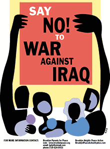 Nancy Doniger has worked as an illustrator for almost 20 years, producing art work for newspapers, magazines, books, posters and T-shirts for both for-profit clients and not-for-profit groups. She is currently a member of Brooklyn Parents for Peace, for whom she created the “Say No to War Against Iraq” poster.
She also helped organize a community/family oriented workshop that gave kids and parents an opportunity to make anti-war art for protest marches. Adults and kids made signs and worked with a puppeteer to create a large paper mache dove, and lots of little doves held aloft on cardboard tubes.
Nancy showed some earlier examples of her work, including a forceful image against the FTAA, a stark two-color poster for a conference on the conflict in Israel and Palestine, and a bright, celebratory “Welcome Back to Brooklyn” poster.
She also showed a couple of iterations of the “Say No to War” poster. One implied the damage of war with flames, but the final version ultimately centered on the mass mobilization. She noted that, in contrast to other illustrations, her work on this piece progressed from representation to geometric abstraction to make the poster more inclusive, using large blocks of color instead of specific depictions of race and gender. She is currently working on a “Hate Free Zone” poster.
Nancy noted the effect of the “Say No to War” poster on her block. The block appeared to be a very pro-war, where “the flags are quick to come out.” But over time, the “Say No to War” poster began to appear in windows and doorways. I certainly noticed it up and down the block where my step-sister lives.
Nancy is also involved in upcoming anti-war event “WEARNICA.” Sponsored by Brooklyn Parents for Peace, on May 3, 2003 a group of artists will present original anti-war art executed on the backs of white cotton dress shirts. The shirts will be worn in public spaces around New York and the world. The event was conceived by Works on Shirts Project whose inspiration for the event came after Colin Powell insisted upon covering the tapestry of Picasso’s Guernica during his warmongering speech to the General Assembly of the United Nations on February 5, 2003.
L.A. Kauffman is a staff organizer for United for Peace and Justice and designer of materials to promote the February 15 and March 22 marches in New York City. Her sticker and poster designs United for Peace and Justice can been seen on the streets across the New York City.
Leslie arrived at design through her work as editor of a progressive journal. She was inspired by the bold, clear graphics of Gran Fury and ACT-UP, and the use of those graphics on the street and at demonstrations, stage managing the events to push its imagery into the mainstream media. She claims she can not draw, so uses clip art in her graphics. The image of the blue pennant flag and black group have become a ubiquitous the city streets.
The idea behind a worldwide day of anti-war marches came out of the European Social Forum held in Florence this past November. At the Forum, the date February 15 was chosen as a date for anti-war demonstrations “in every capital.” What transpired was unexpected and unprecedented.
United for Peace and Justice had only just formed in the November of 2002, but it wasn’t January the group started working on the February 15 march. 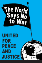 “The World Says No” was the headline of the February 15 flyer design, accompanied by a list of cities taking part in the event. As news of the event travelled across the Internet, marches were planned in more and more cities. Leslie held up various versions of her February 15 design with more and more cities added. Ultimately, marches were held in 793 cities around the world on February 15. Of particular note is virtual absence of communication or coordination between the participating cities.
Leslie spoke of the focused purpose of the posters produced for the event: not to educated, but to mobilize. The flyers lack all superfluous text or argument, just the headline, time and place. The posters and stickers were not trying to change people’s minds, instead to reach out to people who were already against the war but had not yet taken action.
In addition to sticker and flyers, palm cards cut from 1/4 page xerox copies on blue paper were popular and successful. They are both cheaper and more effective — easier to stuff in your pocket, less burdensome on the counter tops of sympathetic shopkeepers.
For the February 15 march, 200,000 stickers were distributed in 5 weeks. For the March 22 march, 200,000 stickers were distributed in 3 weeks. Astonishing numbers, posted around town by a continual flow of volunteers through the office. It’s also a useful bench mark: this is how many it takes to spread the message. A month later, I’m still finding remnants of UPfJ stickers on walls and phone booths. Leslie noted the effect of thousands of little acts of civil disobedience for the spirit of protestors, slowly bolstering a spirit of resistance around in the City and specifically, against the police department ban on marching past the U.N. on February 15.
In total, 1.1 Million pieces of literature distributed. Almost all of the printed materials were bilingual: English on one side, Spanish on the other. However, materials were also produced in Korean, Spanish, French, Creole, and Chinese. Quite a few donations for all these production expenses came online via paypal.
The question was raised about the environmental impact of producing all those printed materials. Her response: it’s also better for the environment if the war is prevented.
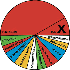 Other examples of design projects were raised by members of the audience: a “Do Not Bomb Iraq” sticker to replace the “Do Not Lean On Doors” sticker in NYC subway cars; colorful logos, charts and imagery designed by Stefan Sagmeister for “Move Our Money,” a campaign to reallocate 15% of the U.S. military budget for education; and flyers handed out to tourists at ground zero with a graphic representation of the number of teachers aides that will be cut from City’s budget. The image leaves it to the viewer to make to the connection to the military expense of a war in Iraq.
Many spoke of the importance of New Yorkers being seen as against the war. September 11 was an attack on New York, and the war is being waged in our name. Others spoke of the urgency of independent media, and the challenge of reaching out beyond “preaching to the converted.”
Overall, I was struck by how spontaneous the designers’ actions were. In almost every case, the designers simply stepped forward and got involved: signs made for a rally were eagerly snapped up; hundreds of thousands of stickers eagerly taken and distributed; and, “Say No to War” posters popped up on an otherwise apparently pro-war street. It seems that one doesn’t necessarily have to change everyone’s minds. There are more “converted” than you think. They just don’t have the graphic materials to display yet.
About 50 people came to the event, a decent turnout despite the announcement from the Pentagon the previous day that “the major fighting” in Iraq was over... and the fact that I’d scheduled the event on the first night of Passover. (Such a Jew am I.) The arc of the event could have used a better closing at the end, as well as a better transition between panelists. I also noted the lack of diversity in the audience. I think next time, I should hold it at different time and place. I’m also quite pleased with the invite design. Peel off the event description and you’re left with an anti-war sticker. Many thanks to Photobition for helping hammer this out in time.
One purpose of the event was to connect artists, designers, and activists. I’m disappointed more Cooper students didn’t show, but after the event quite a few people milled around having these intense little conversations until I kicked everyone out to close the room and return the lights. And quite a few people asked me what was next. Perhaps the start of a new Committee to Unsell the War?
Under the Asphalt, the Cobblestones
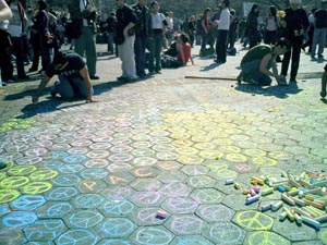
Protestors after the march in New York City yesterday chalked messages around Washington Square Park.
As the U.S. invades Iraq and activists around the world take to the streets, here in New York I’m noticing how the city itself is increasingly used as a medium by the anti-war movement.
 Much of this is nothing new. City streets have always been checkered with posters, graffiti, flyers, and stickers. Subway ads are often annotated with running commentary, sometimes sexual but just as often critical of the ad and advertiser itself (or just blacked out teeth on a too-cheerful model.)
 The anti-war movement has taken advantage of all of this. United for Peace and Justice stickers seem to be everywhere — on pay phones, mailboxes, street lamps, walls, and signage. The letters “STOP BUS” on the street are altered to read “STOP BUSH.” In the Baghdad Snapshot Action activists have simply postered ordinary snapshots from Iraq: “Quiet and casual, the snapshots show a part of Baghdad we rarely see: the part with people in it.”
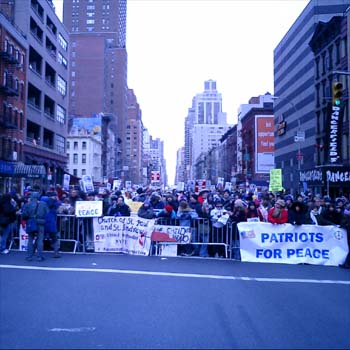
And then there was the march of over 200,000 people down midtown Manhattan yesterday.
But as the war escalates, so do the protests. And so does the reconfiguring of public space. Activists in San Francisco last week shut down traffic throughout the city with autonomous direct actions coordinated online. Activists hauled newspaper kiosks, cafe chairs and tables, and other street furniture into the streets. [article and photos]
What will be the government’s response? Some communities are all too familiar with locked down, fenced in, and video monitored public spaces. Once considered an invasion of privacy, cameras and other measures are increasingly justified as a legitimate response to terrorism. In the name of anti-terrorism, the City recently sought and won a loosening of the law that restricted on police surveillance of political groups. The restrictions were imposed by the settlement of a 1971 lawsuit over harassment of political advocacy groups by the Police Department’s so-called “Red Squad.”
Public amenities and the details of public life are being reshaped elsewhere in the fight against terrorism. In Israel, seating at bus stops is often bolted to the wall (no chair legs to hide things behind), every turnstile will soon have a metal detector installed, and every trash can on the street will be replaced with see-through plastic and wire receptacle. In Washington, D.C., subway trash cans are being replaced with bomb-resistant models. In the Tokyo subway, there are no trash cans at all anymore.
Not to mention Israel’s wall.
This week New York City announced Operation Atlas, additional security measures to try to protect us against terrorist attack during wartime. I’m not opposed to greater inspection of cargo entering the City, but have no doubt that the NYPD will use their new powers to target activists and political dissent. I also note that the plan, which costs $5 million a week comes at a time of severe budget cuts in NYC — and a deficit of nearly $4 billion. Was factored into the costs of the war?
Literature on cities is replete with the metaphor of public space as the site and the physical embodiment of democracy. In the weeks and months ahead, I wonder how our public space will change.
See NYC IndyMedia and Gotham Gazette’s page on New York City and the War.