

mapping
 The World Lung Foundation and the American Cancer Society this week published the Third Edition of the The Tobacco Atlas in print and, for the first time, as an interactive website. The atlas is full of maps, charts, data and narrative describing the global scope of the issue: consumption, health and mortality, economic costs, health education, history and more. Links to campaign materials are woven throughout. The press release summarizes some of the more devastating statistics. Browsing the online map I was surprised to discover the scale of smoking in Russia!
 A free publication to help aid organizations use geospatial tools and methods in their work in emergencies. It’s published by MapAction, an NGO that works specifically on mapping for humanitarian emergencies, deploying volunteer GIS professionals around the globe.
See also Mapping for Advocacy, a collection of 10 case studies, and Maps for Advocacy a more general introduction to geographical mapping techniques for NGOs. Both booklets are free to download. While not specifically oriented for NGOs, Making Maps is an also excellent general primer. The Making Maps blog hosts some interesting discussion as well.
Cartographies
 Some notes.
Critical Cartography
Reading geography and maps as sites of power, deconstructing assumptions and political implications of maps. See http://en.wikipedia.org/wiki/Critical_cartography, Siam Mapped, Spaces of Capital
Radical Cartography
Using and creating maps to challenge power and facilitate social change, often characterized by an oppositional, anti-authoritarian politics. See An Atlas of Radical Cartography, NYC Guide to War Profiteers, Million Dollar Blocks.
Counter Cartography
Producing maps that challenge the dominant, mainstream narrative of a site or history, often from an explicitly political or activist perspective or from the point of view of historically marginalized communities. See DisOrientation Guide, CrashStat, A Threat to Peace, Notes for a People’s Atlas of Chicago.
Community Cartography
Maps produced collaboratively by a geographically local community, often used to promote a social agenda. See Green Map Systems, Asset Mapping, Aboriginal Mapping Network.
Solidarity Maps
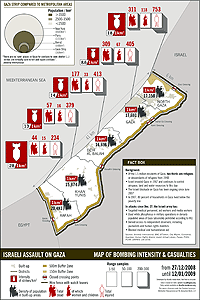
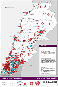
The maps below visualize some of the impact of Israeli attacks on civilians and civilian infrastructure in Lebanon and the Gaza Strip. About the designers:
“We are a group of Lebanese a group of Lebanese, Palestinian, and other activists who have worked together previously, mainly doing media and mapping work during the summer 2006 Israeli attack on Lebanon, and some of us later on advocacy and design for the reconstruction of Nahr el-Bared refugee camp. We have among us designers, architects, researchers, media people, and many other random activists. Although we are not an organised body or politically affiliated with a specific group, we are all pro-Palestinian.”
Gaza - Map of Bombing Intensity & Casualties, December 27, 2008—January 12, 2009
Lebanon - transport & vital sites bombed, July 12—August 12, 2006
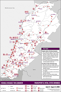
Israeli Assault on Lebanon, July 12—August 12, 2006
New York City Area
 I’m sure I’ve heard this term in passing, but today in a meeting with a foundation that’s historically focused on grassroots groups in New York City it really hit home how gentrification is pushing people to further strata of the urban donut. In the selection of its cover graphic, the organization chose to zoom out, widen the map and refer not to “New York City,” but the “New York City Area.”
The org, it seems, is increasingly working with people who can’t afford to actually live in the City, but who still work or organize there — people living in northeastern New Jersey, north of the Bronx or east of Queens.
It sounds a bit like “Bay Area” vs “San Francisco.” Something larger than the property lines of the five boroughs but smaller than the tri-state region or New York metropolitan area.
Seeing them all together really calls out the collage of visualization techniques: photo montage, 3D computer rendering, painted and vector illustration, maps, all mixed in with charts, graphs and typography.
An Introduction to Information Design
Visualizing Information for Advocacy: An Introduction to Information Design is a booklet I wrote and designed to introduce advocacy organizations to basic principles and techniques of information design. It’s full of examples of interesting design from groups around the world in a variety of media and forms. It has tips, excercises, and even recommended Free Software packages to help polish up your graphics.
I worked with the Tacitcal Tech collective who provided editorial feedback and helped track down reproduction rights for the images. They’re also coordinating printing and distribution to NGOs. The project was funded by the OSI Information Program. The booklet is Creative Commons licensed.
Download the full booklet at http://backspace.com/infodesign.pdf