

typography
Helvetica
On Friday, I caught a screening Helvetica, the film at the New School.
The film is a breezy valentine to type, typography, graphic design, and designers. The editing puts a nice leisurely pace to it, and I thought the sound design, which could have been disastrous in other hands, was suitably sensitive. It’s not a bad first film.
It consists mostly of two types of shots: interviews with bold-face name designers and scenes of type on the street — interspersed with occasional animated renderings of famous posters. The designers talk about the type, its use and origin, and their relationship to it, love or hate. It certainly helps to know who the players are, though most of the personalities sparkle through regardless.
On top of the brief historical survey, the broader question raised by the film seems to be, “How does this typeface come to dominate our visual environment? How did it come to be seen as so ‘neutral’?”
The answer provided by the parade of talking heads is of mostly a matter of taste, period fashion, and eventually a response to the momentum of a critical mass of usage.
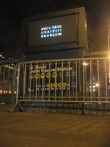
But a look at counter-examples might have been illustrative: why does Gil Sans dominate in the UK? Why does a more condensed gothic sans seem so popular in France? I think a clue is in the usage by the state and the power of its projection. This is alluded to by many shots of the Helvetica-like sans serif on New York City subway signage, and by Paula Scher’s association between the powers that use Helvetica and the powers behind the Viet Nam war.
But mentioned only in passing is, I think, the most important point: bundling. Before desktop publishing, the font was widely available for linotype, as presstype, and for other printing methods. But now the font (and its twisted cousin Arial) comes pre-installed on every new computer sold. The film never really investigates why or how this came to be, or the consequences of it. It’s just assumed that Helvetica was a sufficiently “classic” and popular face. I think this is another case of designers ignoring systemic and structural forces. Its power is invisible, and well, what’s “normal” is just taken for granted. Further evidence of this systemic short sightedness is the fact that of the 21 designers interviewed on screen, nineteen are white men and two are white women.
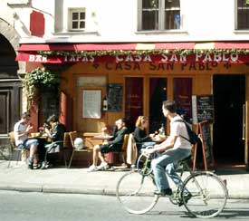
Negative Campaigning
A great action in NYC, taping placards over those outdoor video billboards attached to subway entrances. The typography is composed of holes in the board, illuminated by the video ad beneath.
The project is Light Criticism, brought to you by the Anti-Advertising Agency and the Graffiti Research Lab.
In form, it reminds me of the work of Moose, writing his name on walls by cleaning them.
In context, it’s a lot like this guerilla wayfinding campaign, a grassroots, illegal action for civic improvement.
Type and Nation, 3
This has faded from the NPR site, so here it is for posterity. From NPR: Talk of the Nation, July 3, 2003:
LYNN NEARY, host: When most Americans think of the paper version of the Declaration of Independence, they think of the document kept by the National Archives written in calligraphy and signed by the Founding Fathers. It’s faded and fragile, and for some people not as symbolic of democratic principles as other lesser known works. Here to talk about that is Thomas Starr. He’s a professor of graphic design at Northeastern University. We reached him at his home in Boston.
Thanks for being with us, Professor Starr.
Professor THOMAS STARR (Northeastern University): Thank you, Lynn.
NEARY: All right. Now, Professor Starr, most Americans are familiar with the calligraphy version of the Declaration of Independence, but tell us about the documents that predate it.
Prof. STARR: Well, we really have to start on July 2nd. That was the day that Congress voted in favor of independence, after which it took up editing the Declaration text. That editing took some time. It took two days, and it was quite heavy. Congress deleted about one-third of it and made 39 changes in addition. So on July 4th, when that manuscript was finished, in its form it was taken not to a calligrapher but to a typographer. And that typographer was John Dunlop. He was Congress’ official printer. And I would say he had the most important overnight printing job in history. He set the text in type, so he assembled it for the first time in its complete form, and ran his presses overnight, delivering to Congress on the 5th. So these were then delivered to the 13 colonies, where they were republished and disseminated further. These were the prints that the colonists saw. So the published Dunlop prints are really what did the declaring. And when you think of July Fourth, I mean, it’s a holiday in which the date is emphasized more than any other. And so what it actually celebrates is this day of typesetting and printing.
NEARY: When did the calligraphy document then come along?
Prof. STARR: Well, the calligraphy didn’t actually get ordered by Congress until July 19th. And what’s interesting is by then we know that the Dunlop Declarations had spread so far that they had been republished in 24 newspapers from Maryland to New Hampshire. And, you know, in 1776 Congress still traditionally formed its most important documents in calligraphy. It was a tradition left over from monarchy. But it had to use typography to communicate with the people. Typography really is the medium of democracy. So the calligraphic version now in the National Archives was finished only on August 2nd, so it really can’t be the version we’re commemorating when we think of the Fourth. And the type, for many reasons, is a more democratic version of the Declaration.
Type and Empire, 3
From Reuters via CNN:
20 fined for using letters W and Q
Tuesday, October 25, 2005; Posted: 8:05 a.m. EDT (12:05 GMT)
“DIYARBAKIR, Turkey (Reuters) — A Turkish court has fined 20 people for using the letters Q and W on placards at a Kurdish new year celebration, under a law that bans use of characters not in the Turkish alphabet, rights campaigners said.
The court in the southeastern city of Siirt fined each of the 20 people 100 new lira ($75.53) for holding up the placards, written in Kurdish, at the event last year. The letters Q and W do not exist in the Turkish alphabet.
Under pressure from the European Union, Turkey has improved language and human rights for its Kurdish minority, but the EU says implementation has been patchy and loopholes remain.
The 1928 Law on the Adoption and Application of Turkish Letters changed the Turkish alphabet from the Arabic script to a modified Latin script and required all signs, advertising, newspapers and official documents to only use Turkish letters.”
Somehow the suppression of letterforms (and language) still has not washed away the Kurdish culture or the push for autonomy. And, what about those letters E and U?
More on the switch of writing systems later.
Black Face

New Black Face: Neuland and Lithos as “Stereotypography”:
“How did these two typefaces [Neuland and Lithos] come to signify Africans and African-Americans, regardless of how a designer uses them, and regardless of the purpose for which their creators originally intended them? The investigation of this question has four parts: first, an examination of the environments in which Koch and Twombly created the original typefaces; second, an examination of the graphic culture that surrounded African-Americans prior to the creation of Neuland through a close viewing of tobacco ephemera; third, an examination of the Art Deco (French Modern) style, the graphic culture most prevalent in the United States at the time of Neuland’s release; and finally, an examination of the ways designers use Neuland and Lithos today.”
Type and Nation, 2
“Euskara - which means Basque in the Basque language - refers to all kinds of characters you can find in the Basque country. Indeed each of the seven French and Spanish Basque provinces has its own geographic and cultural characteristics. For instance, those who live on the seaside - itsasoan - differ from those who live in the mountain - itsasmendi. These differences can also be felt from one valley to the other.”
Modern Basque nationalism emerged at the end of the 19th century, marked by the formation of the Basque Nationalist Party in 1895. Part of the political and cultural program of the Party was a revival of a unified Basque language. And related to this was the celebration of a distinct Basque typography.
 In 1888, Louis Colas, a schoolteacher from Baiona, begin his travels across the Basque countryside on muleback on documenting ancient Basque monuments. Colas published his research in a large, heavy volume which cost him a fortune. It initially attracted few readers.
The volume, though:
“is a genuine encyclopedia with more than 500 rough sketches and about 30 photos, tracing monuments and works since lost or destroyed. Unfortunately today, too few originals - some of them in a poor state - can be consulted as unquestioned references to the matter.” [source]
The Basques inherited their method of representing the sounds of language by literal symbols from the Romans.
“At that time, the Basque engravers knew very little about the Roman ironworks technique; their rough tools couldn’t carve deep characters like in the sculptures coming from Rome. So, instead of carving deeply, they scraped the stone around the characters which thus stuck out, creating a new technique. This explains why the Basque letters can hardly resist the passing of time: five-century-old engravings have been rubbed out, for the most part.
Moreover, very few people — such as old families of engravers — could write as well as engrave: such a treasure was to be kept secret. This explains the variety in the Basque characters. Not only did the children inherit the technique from their parents, but they also inherited the family mistakes: sometimes in a village, you may find the same misprints on the old houses fronts. The most powerful family in a valley also caught hold of all the written works. Still today, there are shapes in the carved stone which can be found only in some valleys; and it is the same for the ‘pelote Basque’, the rules of which varied according to the valleys which were the (mass) media of the time!” [source]
Later influence of the continental Celts was felt in particular on capital letters A, S, and N, and in the rare lowercase letters b, p, q, and o.
 Despite this influence and other printing fashions, the Roman influence predominates. There is hardly any Basque written work using cursive script. This results in part from the link between Latin and Christianity: almost all early written works in Basque were religious in content.
The Basque nationalist movement was banned and forced underground in 1923 by the Spanish military dictatorship of Miquel Primo de Reviera, but flourished after proclamation of the Second Republic in 1931 and the lifting of the ban.
Despite military uprisings that divided the Basques, following a large scale campaign for Basque autonomy and a plebiscite in 1932, the Government of the Republic granted autonomy to the Guipuzcoa and Vizcaya regions. The first Aberri Eguna was held on Easter Sunday, March 25, 1932 celebrating the Basque homeland, culture and language, and Catholicism.
In the 1930’s printers and foundries lavished much attention on Mr. Colas’s book which encouraged Euskara’s revival.
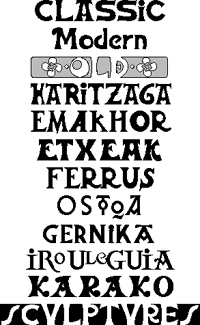
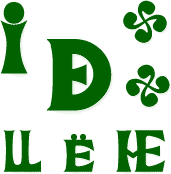
“Euskara consists of large-footed, big-eyed, Roman-styled characters. (See Some Different Basque Letters). You should not use them for a whole text because it would give a sensation of thickness: they were used on mortuary epitaphs and fronts of houses, mostly. The general pattern is rather heavy but the ten existing lowercases makes it look lighter: it seems funny that hardly any lowercase can be found in Euskara, although typically Basque letters can be found (for example, the interpenetrated DE).”
Today Euskara can be found throughout the Basque country on signage, television, newspapers, and packaging.
“Among the various Euskara characters used in offset printing, the LetraSet transfer-types are very well spread, whereas only Spanish printers have still got lead characters. Neuhaus in Hendaye is a worth-mentioning firm: their local roadsigns, printed in Basque characters, help promote tourism. Lately, a young editor from Biarritz has tried to use the Basque culture characters [for computer printing].”
But given its current status as a kind of cultural brand for consumption by tourists and others external to the Basque community, does it still retain a nationalist connotation to the community itself? Or has it become depoliticized, commodified, and folkloric?
Thierry Arsaut designed the fonts displayed above.
Type and Nation, 1
From Paul Shaw, “Fascism on the Facade,” in Print, May/June 2004:
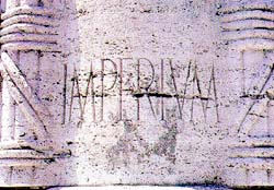 “Tourists may be unaware that Fascist architecture — fountains, monuments, public works, buildings — pervades Rome. Non-Italian guidebooks deliberately ignore these structures, and their modernism makes them seem boringly familiar — even at the most ponderous and grandiose — to anyone visiting from another large city. However, there is one thing above all else that separates Fascist architecture from modern architecture: the conspicuous presence of lettering.
Lettering, inscribed and in relief, had always been an integral part of Western architecture until the Modernists, in their drive for purity and functionality, threw it out along with ornaments, and other decorative motifs. In Italy, lettering survived and flourished in Fascist architecture because it served to advertise the regime’s aims and accomplishments.
While the Nazis settled the centuries-old fraktur oder antiqua (blackletter versus roman) debate in favor of the former, the Fascists never had an official policy regarding letterforms. ‘The idea of an “art of the State” was rejected not only by Mussolini and his minister Giuseppe Bottai, but also by all the official representatives of the regime,’ wrote Rossana Bossaglia in Ritratto di un’Idea (2002). Instead, beginning in 1926, the regime spoke of Fascist art as work that interpreted and represented the spirit of the Fascist movement. But no precise style was defined until the late 1930s. Often overlooked and mistaken for lettering of other periods, the visual language of the Fascists still permeates many of Rome’s most historic buildings.”