

typography

Critical Pictograms
Olympic pictograms have been used since the 1936 Berlin games to create a visual system of signs for navigating (and decorating) the games and host cities across language barriers. See this writeup or animated appraisal for a visual tour of pictograms through the years.
This year’s London games use two sets of pictograms: simple silhouettes for utilitarian communication and a more exuberant version for decorative applications.
In 2004 VirusFonts reinterpreted the Olympic pictogram in a series of satirical icons to puncture the heroism and reflect the bribery, political manipulation, drugs and greed behind the Athens Olympics. Last week they released a new set to reflect on the controversies and accusations leveled at the 2012 London games. The pictograms riff on the iconic style developed by Otl Aicher for the 1972 Munich Olympics.
Below, the full set of 2012 Olympukes:
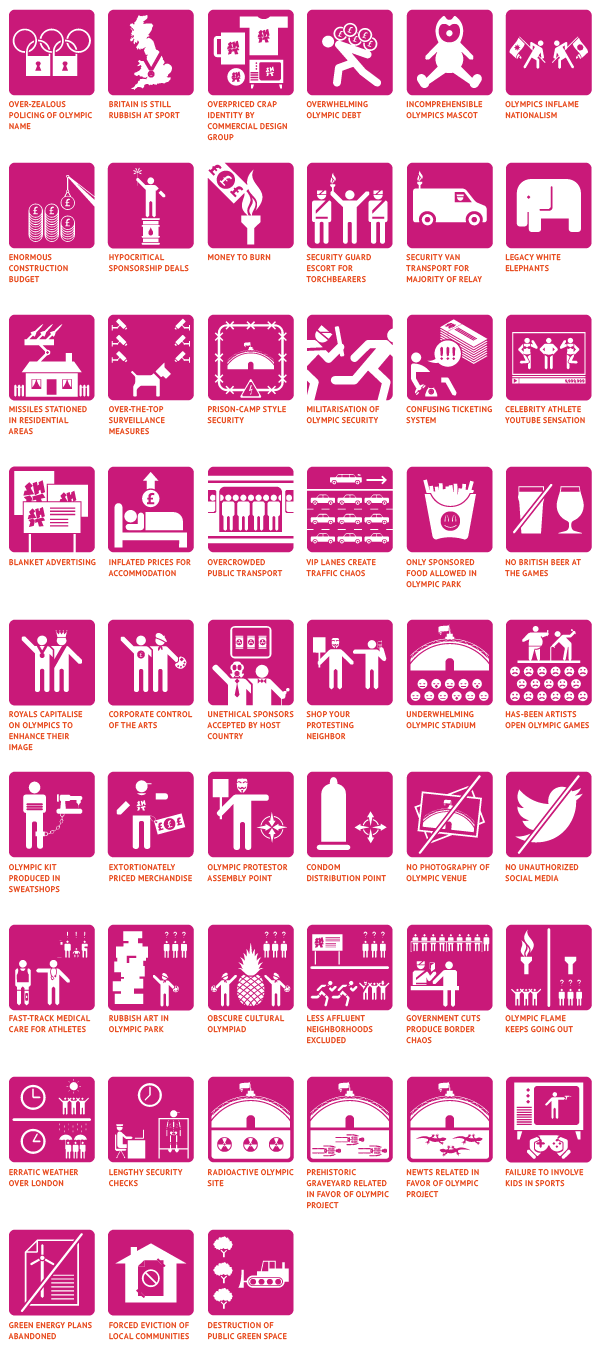
Olympukes 2012 is available for download as a font and is free for personal, non-commercial use.
 “FS Me is [a type family] designed to aid legibility for those with learning disability. FS Me was researched and developed in conjunction with - and endorsed by - Mencap, the UK’s leading charity and voice for those with learning disability. Mencap receive a donation for each font licence purchased.”
Related: Read Regular, a typeface for people with dyslexia.
Type and Nation, 6
In the introduction to Seeing Like a State: How Certain Schemes to Imporve the Human Condition Have Failed, James C. Scott writes:
Originally, I set out to understand why the state has always seemed to be the enemy of “people who move around,” to put it crudely. In the context of Southeast Asia, this promised to be a fruitful way of addressing the perennial tensions between mobile, slash-and-burn hill peoples on one hand and wet-rice, valley kingdoms on the other. The question, however, transcended regional geography. Nomads and pastoralists (such as Berbers and Bedouins), hunter-gatherers, Gypsies, vagrants, homeless people, itinerants, runaway slaves, and serfs have always been a thorn in the side of states. Efforts to permanently settle these mobile peoples (sedentarization) seemed to be a perennial state project—perennial, in part, because it so seldom succeeded.
The more I examined these efforts at sedentarization, the more I came to see them as a state’s attempt to make a society legible, to arrange the population in ways that simplified the classic state functions of taxation, conscription, and prevention of rebellion. Having begun to think in these terms, I began to see legibility as a central problem in statecraft. The premodern state was, in many crucial respects, partially blind; it knew precious little about its subjects, their wealth, their landholdings and yields, their location, their very identity. It lacked anything like a detailed “map” of its terrain and its people. It lacked, for the most part, a measure, a metric, that would allow it to “translate” what it knew into a common standard necessary for a synoptic view. As a result, its interventions were often crude and self-defeating.
It is at this point that the detour began. How did the state gradually get a handle on its subjects and their environment? Suddenly, processes as disparate as the creation of permanent last names, the standardization of weights and measures, the establishment of cadastral surveys and population registers, the invention of freehold tenure, the standardization of language and legal discourse, the design of cities, and the organization of transportation seemed comprehensible as attempts at legibility and simplification. In each case, officials took exceptionally complex, illegible, and local social practices, such as land tenure customs or naming customs, and created a standard grid whereby it could be centrally recorded and monitored.
Standarization of script seems to fit right in line with this. Not just under the pretense of forging national identity, citizen-ship, encouraging citizens to read and participate in the State, but enabling the State to read its citizens.