

July 2004
Green or Black?
“Do you want green tea or black tea?”
In Uzbekistan, tea is the drink of hospitality. Community is all about hanging out in the choyhona (teahouse), talking and drinking tea while sitting on topchan, a kind of raised platform bed with a pad to sit on and a small table in the middle. (Thus, choyhona is also the name of a popular Internet chat network.)
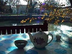 So which tea do you choose?1 The question seems simple, but the answer is fraught with political significance, identifying you as sympathetic to either ethnic Russians or ethnic Uzbeks.
One of the legacies of the Soviet occupation in Central Asia is a population of ethnic Russians living there. Born in Central Asia and raised under Soviet culture, when the USSR fell and the borders rolled back, these ethnic Russians remained. This piece in Slate describes the predicament.
“Clara was a Soviet. Today, she must search for a new vocabulary to define her identity. She has no ties to the land of her ancestors and is neither Kazakh nor Russian.
This search for identity is mirrored in millions of ex-Soviet people of all ethnic groups. One of the more interesting cultural shifts in post-Soviet Central Asia is the status and identity of ethnic Russians. During Soviet rule, the Russians comprised more than half of the population in Kazakhstan, exiled by Stalin during the 1950s and ’60s mass migration under the ‘Virgin Lands’ campaign, when Russians were encouraged to cultivate northern Kazakhstan’s pastures.
So where does this leave ethnic Russians with no ties to the new but living in the place of their birth? Rootless.”
Ethnic Russians used to be identified with the power elite, but are no longer. Since Central Asian independence they are in some ways second-class citizens. Political leaders now promote a form of nationalism using ideas of ethnic authenticity — for instance, promoting local languages and literature supressed under Communism, or in the most extreme example, the President of Turkmenistan has banned all “non-Turkmen” cultural institutions.
In this climate, signs that might otherwise seem insignificant become significant cultural markers.
In Uzbekistan, conventional wisdom holds that Russians drink black tea and Uzbeks drink green tea. When with one group or another, drinking the appropriate tea identifies one as part of the “in group.” The sign, though, can be waved by anyone — an ethnic Russian among Uzbeks may choose green tea to signify that he or she is down with the group.
Ironically, the political leaders pushing the nationalism are often themselves the products of Soviet education and the Soviet system. They speak fluent Russian... and though they’d never admit it, might even prefer black tea.
1 Choosing neither will win you a stern lecture on the important health benefits of tea.
Delerious Beijing
You’re a architect who finally has a chance to build a masterpiece. For years, you’ve built your reputation publishing your theories and experimental models. But now you have a chance to really build it right. You get a big budget and creative control — and no need to worry about urban planning, sustainability, accessibility, community input, or those annoying environmental impact assessments. Existing homes and residents in the way? Not a problem. And plenty of cheap labor, too — let the client take care of that union stuff. Yep, it’s finally your big, big chance.
Except, the client is a repressive government.
Via reluct.com, I found this interview with Rem Koolhaas at Icon magazine.
 Rem seems to have a fine model going — mixing research, theory, and practice. But to design the center for state television in China? The chief propaganda outlet in a country that heavily censors its media? And imprisons and tortures its people for speaking out?
It sounds more like opportunism than constructive engagement.
Beijing is one of the densest cities in the world, and hundreds of thousands of people are being forcibly evicted from their homes to make way for new construction — much of it related to the 2008 Olympics. Developers literally send gangs of thugs into old neighborhoods to beat up elderly people and get them out. Risking arrest and prison, thousands of evicted families are protesting how they can: petitioning government officials, posting anonymously on the Internet, and in a last desperate effort, even setting themselves on fire in Tiananmen Square.
But Rem is not alone. Big name architects like Raimund Abraham, Zaha Hadid, Paul Andreu, Norman Foster, Michael Graves, Jacques Herzog and Pierre de Meuron are also taking advantage of China’s construction boom.
Like much of the party leadership in the former Soviet Union, much of China’s ruling elite have a background in engineering, giving extra caché to massive projects like the three gorges dam and the space program.
From Time Magazine, May 2004:
“Detractors cite the $730 million CCTV project as the ultimate example of the Chinese regime’s tendency to plunder state coffers to glorify its own iron authority and say Koolhaas is an opportunist taking advantage of the country’s unique combination of state power and state capital to realize his own artistic ambitions. Ian Buruma, a writer who is a friend of Koolhaas, wondered aloud in the Guardian, a British newspaper, how the world would have reacted if an architect of Koolhaas’ stature had in the 1970s designed a TV station for Chilean dictator Augusto Pinochet.
But Koolhaas, 59, who was one of the first Western architects to study and write about China’s urban explosion, revels in such intellectual tussles. CCTV, he insists, like the mainland itself, ‘is in mutation’ and the building represents an effort to complement the state-owned company’s desire to keep pace with the times. CCTV’s current headquarters is completely closed to the public. Koolhaas’ design, in contrast, includes a public ‘media park’ in and around the base of the building intended to foster more interaction between commissars and the masses. ‘We are engaged,’ he says, ‘with an effort to support within [China’s] current situation the forces that we think are progressive and well-intentioned... We’ve given them a building that will allow them to mutate.’”
Indeed, how people do mutate.
Mapping Environmental Racism
Six out of eight of Manhattan’s diesel bus depots are located in northern Manhattan. Two of the city’s largest sewage treatment plants are there, too — powered by huge diesel engines running 24 hours a day. The area is flanked by highways and two major bridges over which trucks (also running on diesel) deliver goods into city into Manhattan. And the two outdoor train yards and elevated rail lines serve diesel locomotives daily.
In addition to diesel exhaust, northern Manhattan contains brownfield sites, vacant lots, and abandoned buildings posing chemical and social hazards.
On April 19, 2003, the New York Times reported on a study that found that 25.5 percent of children in Harlem have asthma — “one of the highest rates ever documented for an American neighborhood.”
Residents of northern Manhattan are predominantly black and Latino.
...
West Harlem Environmental Action is:
“a non-profit, grassroots organization working to improve environmental quality and to secure environmental justice in predominately African-American and Latino communities.
Since 1988, WE ACT has worked with citizen groups, youth, community residents, environmentalists, local/state/federal governments, and educational & medical institutions.
Based in Northern Manhattan, WE ACT advances its mission through research, public education, advocacy, mobilization, litigation, legislative affairs & sustainable economic development.”
 One of their programs is a mapping initiative using GIS to map health trends, particularly child asthma hospital admissions, air quality, and polluting facilities, as well as waterfront development and access issues.
“The first step toward environmental justice must be an awareness of the hazards. WEACT has an ongoing commitment to enhance community awareness of environmental hazards in northern Manhattan. The maps and ‘tour of hazards’ presented here are an incremental step toward the fulfillment of WEACT’s mission. They are the result of a joint project between WEACT and students from the City and Regional Planning Department at Cornell University. Cornell students created this web page based on interviews with area residents about environmental hazards in their neighborhoods.”
“On January 30, 1999, eight students, part of an Environmental Justice and GIS Workshop class with the Department of City and Regional Planning at Cornell University in Ithaca, New York, met with WE ACT staff and several community leaders to ‘address the dire lack of useful environmental justice information accessible to communities in New York, New Jersey, and Puerto Rico.’ At the time, the nascent GIS system setup in the WE ACT office was a mere four months old, and their collaboration helped to shape its growth to where it stands today!”
Their Toxic Tour links points on the map to photos documenting toxic sites and their proximity to homes and schools.
Idealist.org Nonprofit Design Contest
Found via kottke.org:
“Enter your work in the First Annual Idealist Nonprofit Design Contest. Winning entries will be showcased in an online gallery on the Idealist.org website and in an exhibition in New York City. In addition, winning entries—gold, silver, bronze, and student in each category—will receive prizes donated by our sponsors.
Gold winning entries will receive Apple laptop computers donated by Aladdin Knowledge Systems. Silver winning entries will receive 15GB iPods donated by Tekserve and other sponsors.
This competition seeks to promote excellence in design in the nonprofit sector and to reward and acknowledge those designers who move beyond limitations to create works that are functional and aesthetically powerful while also promoting social impact.
Any work implemented for a nonprofit that fits in the categories of web, print, or multimedia and was completed between January 1, 2003 to August 31, 2004 can be submitted. Each work MUST be accompanied by its client’s information, including the organization’s name, mission, a copy of the organization’s tax exempt certification or its latest newsletter or brochure, and contact information for a person from the organization.
The entry fee is $25 per entry for those located in the United States. Submissions mailed from outside the U.S. do not require a fee. The deadline is August 31, 2004. Please make your check payable to Action Without Borders and include it with your entry. Entries from the U.S. that are received without payment will not be considered in the contest. Entry fees are nonrefundable.
The jury is being finalized, but will ultimately include both nonprofit and design professionals.
Election Design: Models for Improvement
While the push for verified, electronic voting rages on, in 2004 printed ballots and the ghost of the 2000 butterfly design still flutter through many districts. Activists, designers, and usability professionals are still working to redesign the process.
 In November 2002, I blogged about Design for Democracy, a project to bring graphic designers into the election design process. The project started as a class exercise at the University of Illinois, and is now a registered non-profit corporation backed by the AIGA.
Slate and the Chicago Tribune have both published articles about the effort.
Now, with a grant from Sappi, the Design for Democracy is publishing their findings and process, hoping to inspire action around the country.
From the archives of the AIGA somewhat-monthly newsletter, in the summer of 2003:
“Sappi Fine Papers has announced a major grant to Design for Democracy, AIGA’s initiative to improve the quality of election experience, in order to publish a book of graphic standards, with visual examples, to assist local officials in understanding the opportunities for clear communication. Marcia Lausen, former AIGA Chicago chapter president and design team leader for Design for Democracy, will be the principal author.
Marcia and Ric Grefé, AIGA executive director, presented concepts of election design to state election officials from all fifty states and selected secretaries of state in Portland, Maine in late July. A number of officials expressed an interest in contacting local chapters about how they could work with local designers. Marcia and Ric will send out a follow up letter to all the attendees encouraging them to become involved with a list of chapter presidents. If you are contacted, we can discuss different ways in which we have found it to be productive to work with state officials and will provide all chapters with copies of the templates of work done to date. The most recent states to seek AIGA assistance are Texas and Michigan.”
And from the March 2004 AGIA Communique:
“‘Election Design: Models for Improvement’ is a new, comprehensive graphic design system for improving the quality, legibility and effectiveness of election materials. In November 2000, a group of design professionals, educators and students began a dedicated effort to improve the voting experience. Organized as a program of “AIGA Design for Democracy,” this team worked in association with the University of Illinois at Chicago and directly for election officials in Cook County, Illinois and the State of Oregon. Project teams developed prototypes for improved ballot design, election administration, poll worker training and recruitment, voter registration, polling place signage, vote-by-mail, absentee voting, provisional voting and voter education and outreach.
This publication documents the resulting design system. It includes detailed information, guidelines, visual examples and templates that can be adapted for use by all states and counties. AIGA price: $100. Shipping charges $3 within U.S.A. Place your advance order.
It’s a great idea, but the $100 price tag is astonishing. That’s a big ticket for a grassroots advocacy manual. While the price might not bother AIGA members, it would certainly shut out many grassroots groups working on voting rights. What happened to all that Sappi money? Is the design of the book itself what makes printing so expensive?
Allergic Reactions
Next week the House of Representatives will vote On the evening of July 21, the House of Representatives approved a law requiring new package design standards that may save lives.
From The New York Times, July 10, 2004:
 “Each year, some 30,000 Americans are rushed to emergency rooms because of severe allergic reactions to food. Roughly 200 people die yearly from such reactions. Sound public health legislation passed by the Senate, and heading for House action before the Congressional recess, aims to lessen that toll by requiring that food labels clearly and accurately disclose the presence of the eight most common allergens in various additives: peanuts, eggs, milk, soy, tree nuts, fish, shellfish and wheat.
The bipartisan measure fills a hazardous gap in Food and Drug Administration rules, which do not require that these allergens in spices, flavorings, coloring and other additives be listed on labels even though ingesting the slightest amount can be fatal for some people. And the allergens that are listed on a label are frequently identified only by their formal names instead of in everyday English — as ‘whey’ instead of ‘milk product,’ for example.
The food industry adopted voluntary guidelines to try to fend off legislation. But although some companies now list allergens in clear terms, others still don’t. The government needs to make compliance universal.
First introduced four years ago by Representative Nita Lowey, Democrat of New York, and championed in the Senate by Edward Kennedy, a Massachusetts Democrat, and Judd Gregg, a New Hampshire Republican, the measure also has important backing from the Bush administration. Its expected passage by the House this week, and subsequent signing by the president, will give food manufacturers until 2006 to refashion their labels to list allergens more clearly. It will also give Americans an all too rare example in this election year of bipartisan cooperation to serve the public good.”
The FDA publicly recognized fatal food allergies in 1994, and in 1996 acknowledged the need to label foods containing allergenic substances. However, they were unable to require the labeling because
“Section 403(i) of the [Food, Drug, and Cosmetic Act] provides that spices, flavorings, and colorings may be declared collectively without naming each one. Secondly, FDA regulations (21 CFR 101.100(a)(3)) exempt from ingredient declaration incidental additives, such as processing aids, that are present in a food at insignificant levels and that do not have a technical or functional effect in the finished food.”
The new bill is the result of grassroots pressure and several medical and academic studies on the effects of allergens and interpretations of commercial food labeling.
This study on label interpretation is even cited in the text of House bill.
The Center for Science in the Public Interest also takes some credit, remarking that:
“A major impetus for the legislation was a 2001 article in CSPI’s Nutrition Action Healthletter that publicized a study by the Food and Drug Administration showing that about 25 percent of candy, ice cream, and baked goods from plants in Minnesota and Wisconsin had products with undeclared egg or peanut ingredients.”
I note that the CSPI’s influential document was in part a repackaging, redesign, and republishing of information already available from the FDA.
The Food Allergen Labeling and Consumer Protection Act (FALCPA, or S. 741) was approved by the House Energy and Commerce Committee on June 24, 2004. It was passed by the U.S. Senate on March 8, 2004. The bill now goes to President Bush for his signature.
The new allergen info is likely to be added to the Nutrition Facts label.
Updated July 21, 2004
Instrumental
Following Brian’s travels through Morocco, I ran into this interesting bit from his visit to Marrakesh that relates to exhibition design:
“Captions [in the Museum of Moroccan Art] were available in both French and Arabic. I originally thought I would be able to understand almost everything from my knowledge of the two languages; however, I quickly discovered a flaw in this plan: The explanations were often different.
For example, in discussing a particular musical style, the French caption talked about how it was derived from Greek forms, while the Arabic explained it as going back to the Abbasid court at Baghdad. Both of these could be true - the people at the Abbasid court could have developed it from Greek forms, but the targeted cultural bias of the information presented is an interested insight into the way the tourist industry operates. I once read an article about how tour guides in Israel change what they highlight and the style of their presentation based on the group they are guiding. The Museum of Moroccan Art in Marrakesh seems to unabashedly post written evidence of this as Arab and European tourists wander through having the information presented in a context which affirms their own culture’s past.”
Brian’s interpretation notwithstanding, he’s on to something: given Morocco’s privileged geography between continents and at the nexus of so many trade routes among regions and empires, I suspect its traditional forms were influenced by very many cultural traditions, long before the histories were spun so neatly into “East” and “West.”
Given that the curators are clearly aware of this, it’s all the more interesting that they choose to present the two distinct narratives rather than a more nuanced account of cultural exchange.
Feedback Loop
In March, I blogged about MoveOn’s use of interactive maps to illustrate participation in their campaign events. The maps are a great way to visualize the scale of the event and provide feedback to the participants and the media.
 In Stamen Design’s latest project for MoveOn, the map of feedback has itself become the means of participation.
On June 28, over 55,000 people in 4,600 house parties participated in an online conversation with Michael Moore about his film Fahrenheit 9/11. Moore spoke over a live, RealAudio feed while users asked questions via the map interface. User questions and responses to questions were displayed on the map in real time.
From Stamen’s press release:
“Stamen developed a live, map-based, interactive Q&A session that allows thousands of people to communicate visually via a moderated discussion. Visitors logging on can ‘see’ themselves and their submitted questions on the map, along with those of other MoveOn community members. Michael Moore, along with MoveOn directors Eli Pariser and Adam Ruben, will respond to active polls and answer questions from the online audience. The effect is both compelling and empowering. ‘If you can see yourself on the map, so much the better, because you can identify yourself as part of a large group of Americans all working towards the same thing,’ says Michal Migurski, Stamen’s Technical Lead. ‘You can get an immediate visual picture of just how widespread MoveOn’s membership is, and immediately connect with that community.’”
A archived version of the Flash file is in the works, but in the meantime, check out the screenshots in this chronology of the event.
The event also marked the launch of local voter registration and organizing drives around the country.
...
Update: The map was used again for the July 18 house parties and screenings of Outfoxed. Here are some screenshots from that event.