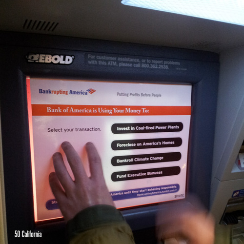
interface

Design by Committee

From the Boston Review:

“During the nineties the PT built on earlier electoral successes by developing a strong record of administrative competence at the local level. Porto Alegre, the capital of Rio Grande do Sul, was the PT’s first great administrative acheivement. In 1990 the PT municipal government introduced ‘participatory budgeting,’ a form of public deliberation on budget priorities with more than 20,000 people participating annually, which quickly emerged as an effective approach to distributing basic public goods — roads, sewers, clean water — at the local level. Participatory budgeting was extended to 103 cities in 1997, and it has been adopted as policy by other political parties in Brazil. In 1994 Cristovam Buarque, the newly elected PT governor of the Federal District, introduced a program called Bolsa Escola, a sort of minimum-revenue policy for poor families with children who attend school. In 1996 participatory budgeting won the United Nations Habitat Award, and Bolsa Escola has also won several international awards.”

More:

“Resource allocation through PB [participatory budgeting] is decided by community representatives, generally from low-income districts. Each city adopts different formats to define investment criteria, to select community representatives and deal with the city government, its bureaucracy and the city councilors. In general, community representatives get together to decide on priorities. There are distributive criteria to assure a progressive distribution of the resources so that poorer areas receive more funding than the well off ones, regardless of what the representatives want. PB affects mostly decisions on infrastructure investment, not the entire budget. Moreover, authorization of expenditure on priorities is a function of the executive; PB allocates budget to agreed priorities.”

>  7 September 2003 | LINK | Filed in , , ,

Ballot Design, 1880

From the Gotham Gazette:

“The concept of gathering signatures on petitions dates back to the late 19th century. It was supposed to help eliminate the political parties’ control of the ballot, according to Douglas Kellner, a commissioner at the Board of Elections. (See timeline of New York election law )

1888 ticket from the Benjamin Harrison election campaign.Before that, there were no printed ballots in New York. Voters simply went to the polls and wrote down the candidates of their choice. To instruct voters on who was running, political parties printed up a slate of candidates, which the voters could take with them to the polls.

This system had many problems, one of which was that political parties often printed counterfeit lists of candidates to deceive supporters of the opposition. "A counterfeit ticket would list a few of the party’s prominent candidates - just enough to fool the unwary - with the rest of the names coming from a rival slate," said Kellner.

To clear up the process, the government began in 1880 to print a uniform ballot that would be presented to voters to fill out at the polls on Election Day. Political parties were allowed to nominate their candidates to be listed on the ballot. But in addition, candidates not selected by the party could get on the ballot anyway if they could submit enough signatures from voters.

To ensure that the signatures were valid, a series of rules were put in place - many of which are still used today.

Ironically, these rules set up over a century ago to assure a more open, honest and democratic process of elections have become just the opposite — a powerful tool for political parties and incumbents to maintain their advantage. To these New York politicos, the best elections are those in which there is only one candidate left on the ballot for voters to choose.

Many incumbents, backed by their political party, have teams of lawyers who will go over a challenger’s signatures, line by line, looking for minor mistakes like missing zip codes, misspellings, and voters who have signed petitions not knowing whether they live in the district or not.

In the past, candidates have been knocked off the ballot for such infractions as writing the abbreviation ‘St.’ instead of ‘Street’ or forgetting to staple a cover sheet.

If the person gathering the signatures - called a petitioner - makes a mistake such as forgetting to write the borough on the bottom of the page, all of the signatures that he collected can be thrown out. If enough signatures are declared invalid, a candidate is eliminated.”

>  2 September 2003 | LINK | Filed in , , , ,

What is Universal Design?

I was working on an item on Universal Design and realized that I hadn’t actually defined what I was talking about. So from the man who coined the phrase:

“Universal design is the design of products and environments to be usable by all people, to the greatest extent possible, without the need for adaptation or specialized design.”
— Ron Mace, founder and program director of The Center for Universal Design

Universal design has its roots in demographic, legislative, economic, and social changes among older adults and people with disabilities after World War II.

Here are some general principles for the evaluation of universal design from the Center for Universal Design. These were drafted in 1997 and refer to design in the physical world, though could be applied broadly to electronic interface design.

  1. Equitable Use
    The design is useful and marketable to people with diverse abilities.
    1. Provide the same means of use for all users: identical whenever possible; equivalent when not.
    2. Avoid segregating or stigmatizing any users.
    3. Provisions for privacy, security, and safety should be equally available to all users.
    4. Make the design appealing to all users.

  2. Flexibility in Use
    The design accommodates a wide range of individual preferences and abilities.
    1. Provide choice in methods of use.
    2. Accommodate right- or left-handed access and use.
    3. Facilitate the user’s accuracy and precision.
    4. Provide adaptability to the user’s pace.

  3. Simple and Intuitive Use
    Use of the design is easy to understand, regardless of the user’s experience, knowledge, language skills, or current concentration level.
    1. Eliminate unnecessary complexity.
    2. Be consistent with user expectations and intuition.
    3. Accommodate a wide range of literacy and language skills.
    4. Arrange information consistent with its importance.
    5. Provide effective prompting and feedback during and after task completion.

  4. Perceptible Information
    The design communicates necessary information effectively to the user, regardless of ambient conditions or the user’s sensory abilities.
    1. Use different modes (pictorial, verbal, tactile) for redundant presentation of essential information.
    2. Provide adequate contrast between essential information and its surroundings.
    3. Maximize “legibility” of essential information.
    4. Differentiate elements in ways that can be described (i.e., make it easy to give instructions or directions).
    5. Provide compatibility with a variety of techniques or devices used by people with sensory limitations.

  5. Tolerance for Error
    The design minimizes hazards and the adverse consequences of accidental or unintended actions.
    1. Arrange elements to minimize hazards and errors: most used elements, most accessible; hazardous elements eliminated, isolated, or shielded.
    2. Provide warnings of hazards and errors.
    3. Provide fail safe features.
    4. Discourage unconscious action in tasks that require vigilance.

  6. Low Physical Effort
    The design can be used efficiently and comfortably and with a minimum of fatigue.
    1. Allow user to maintain a neutral body position.
    2. Use reasonable operating forces.
    3. Minimize repetitive actions.
    4. Minimize sustained physical effort.

  7. Size and Space for Approach and Use
    Appropriate size and space is provided for approach, reach, manipulation, and use regardless of user’s body size, posture, or mobility.
    1. Provide a clear line of sight to important elements for any seated or standing user.
    2. Make reach to all components comfortable for any seated or standing user.
    3. Accommodate variations in hand and grip size.
    4. Provide adequate space for the use of assistive devices or personal assistance.

“Please note that the Principles of Universal Design address only universally usable design, while the practice of design involves more than consideration for usability. Designers must also incorporate other considerations such as economic, engineering, cultural, gender, and environmental concerns in their design processes. These Principles offer designers guidance to better integrate features that meet the needs of as many users as possible.”


In 1998, Ron Mace delivered his final public speech at the first international conference on universal design. He discussed the differences between assistive technology, barrier-free and universal design:

Barrier-free design is what we used to call the issue of access. It is predominantly a disability-focused movement. Removing architectural barriers through the building codes and regulations is barrier-free design. The [Americans with Disabilities Act] Standards are barrier-free design because they focus on disability and accommodating people with disabilities in the environment. In fact, the ADA is the now the issue of access in this country.

So, what is the difference between barrier-free and universal? ADA is the law, but the accessibility part, the barrier-free design part, is only a portion of that law. This part, however, is the most significant one for design because it mandates what we can do and facilitates the promotion of universal design. But, it is important to realize and remember that ADA is not universal design. I hear people mixing it up, referring to ADA and universal design as one in the same. This is not true.

Universal design broadly defines the user. It’s a consumer market driven issue. Its focus is not specifically on people with disabilities, but all people. It actually assumes the idea, that everybody has a disability and I feel strongly that that’s the case. We all become disabled as we age and lose ability, whether we want to admit it or not. It is negative in our society to say “I am disabled” or “I am old.” We tend to discount people who are less than what we popularly consider to be “normal.” To be “normal” is to be perfect, capable, competent, and independent. Unfortunately, designers in our society also mistakenly assume that everyone fits this definition of “normal.” This just is not the case.

Assistive technology to me is really personal use devices—those things focused on the individual—things that compensate or help one function with a disability. Many of you wear eyeglasses because you have limited sight. The assistive technology is your eyeglasses. We could legitimately say that everybody who wears eyeglasses has a disability.”


This is a good starting point, but I read in these principles a disconnect between designer and user. The user is not a part of the design process except as an object of measurement — a consumer rather than a participant. If universal design is intended to be usable by all people without the need for adaptation or specialized design, a more participatory and inclusive design process seems to be one useful way of achieving this. I’ve not yet found a handy list of such principles for the development of universal design.

Also as noted in the conclusion to the principles, these focus on physical interaction and do not address the physical life span of the design or its existence in the broader cultural world. Usability through degradation and reuse fall partially under “sustainable design.” The cultural context, though, surely shapes legibility, user assumptions, and what is considered normative just as much as the physical context.

As Mark Robbins, former NEA Design Director, said on the promotion of universal design principles:

“Central to universal design is a developing awareness of difference that questions normative standards. The sense of what is the norm needs to change.”

Simply put, underlying the principles of interaction listed above is another basic principle. From Leslie Weisman:

“Architects and planners have traditionally defined the ‘user,’ or the ‘public’ in the case of urban planning, in very narrow terms. Rather than recognizing the vast array of ages, cultures, and lifestyles that use buildings and public spaces and that actually exist in communities, architecture and planning theory has been based on a conception of the ‘user/citizen’ that is inherently masculine, and a ‘public’ that tends to be made up of middle-class white people living in nuclear families. So when architects and planners attend to the provision of housing, transportation, and community services, they have tended to design and plan for only a small segment of the population, thereby creating many problems for the ever-increasing numbers of people who do not fit into this assumed definition and life pattern.”

Universal design is vehicle for promoting social equality and justice, environmental sustainability, and human health and well-being. This is as not just design for equal use, but for unemcumberbed participation in everyday life, and in public life. This is design for democrcacy.

>  19 August 2003 | LINK | Filed in , , , ,

ISO

ISO logoThe International Organization for Standardization is an international non-governmental organization that coordinates the development of voluntary technical standards.

ISO is a network of the national standards institutes of 146 countries with a Central Secretariat in Geneva, Switzerland, that coordinates the system. National standards institutes, not governments themselves, are eligible for membership. Each country sends only one member, and each member has one vote.

The ISO does not regulate or legislate. It’s standards are developed by international consensus among “experts drawn from the industrial, technical and business sectors... experts from government, regulatory authorities, testing bodies, academia, consumer groups or other relevant bodies.”

“There are more than 2,850 of working groups in which some 30,000 experts participate annually. This technical work is coordinated from ISO Central Secretariat in Geneva, which also publishes the standards.

Since 1947, ISO has published more than 13,500 International Standards. ISO’s work programme ranges from standards for traditional activities, such as agriculture and construction, through mechanical engineering to the newest information technology developments, such as the digital coding of audio-visual signals for multimedia applications.

Standardization of screw threads helps to keep chairs, children’s bicycles and aircraft together and solves the repair and maintenance problems caused by a lack of standardization that were once a major headache for manufacturers and product users. Standards establishing an international consensus on terminology make technology transfer easier and can represent an important stage in the advancement of new technologies.

Without the standardized dimensions of freight containers, international trade would be slower and more expensive. Without the standardization of telephone and banking cards, life would be more complicated. A lack of standardization may even affect the quality of life itself: for the disabled, for example, when they are barred access to consumer products, public transport and buildings because the dimensions of wheelchairs and entrances are not standardized.

Standardized symbols provide danger warnings and information across linguistic frontiers. Consensus on grades of various materials give a common reference for suppliers and clients in business dealings.

Agreement on a sufficient number of variations of a product to meet most current applications allows economies of scale with cost benefits for both producers and consumers. An example is the standardization of paper sizes.” [source]

The internatinoal technical standards also include international safety standards for products including toys (ISO 8124-1:2000), camping tents (ISO 5912:1993), bicycles (ISO 4210:1996), and contraceptive devices (ISO 8009).


In 1987, the ISO expanded to develop “generic management system standards.” ISO 9000 is set of a quality management guidelines that apply to all kinds of organizations in all kinds of areas. Once the a quality system is in place, an accredited external auditor can certify that your quality system has met all of ISO’s requirements. They can then issue official certification that you can use to publicize that the quality of your products and services is managed, controlled, and assured by a registered ISO 9000 quality system.

ISO 7001

ISO 7001ISO 7001, “Graphical symbols for use on public information signs,” is a set of international symbols based on the “ISOTYPE” system of icons and pictograms introduced by Otto Neurath in the 1936. However, soon after the 7001 was published, it was determined that the standard international symbols did not have a standard meaning or clarity in every country. Published in 1989 and revised in 2001, ISO 9186 is a procedure for user testing of graphic symbols to determine which symbols communicate the intended meaning most readily to most people. There are two main test methods: a comprehensibility judgment test and a comprehension test. [source] Pictograms with exceptionally high comprehensibility in several countries can eventually become part of the ISO 7001 set.

ISO 13407 “Human centred design processes for interactive systems” provide guidelines for the planning and management of usability testing in the development of computer systems.


In 1993, the ISO established a technical committee, ISO/TC 207 to develop standards for “Environmental management.”

“This move was a concrete manifestation of ISO’s commitment to respond to the complex challenge of “sustainable development” articulated at the 1992 United Nations Conference on Environment and Development in Rio de Janeiro. It also stemmed from an intensive consultation process, carried out within the framework of the Strategic Advisory Group on Environment (SAGE). SAGE was set up in 1991 and brought together representatives of a variety of countries and international organizations — a total of more than 100 environmental experts — who helped to define how International Standards could support better environmental management.

Today, national delegations of environmental experts from 66 countries participate within ISO/TC 207, including 27 developing countries. In addition, 35 international non-governmental and business organizations participate as liaison organizations. The national delegations are chosen by the national standards institute concerned and they are required to bring to ISO/TC 207 a national consensus on issues being addressed by the technical committee. This national consensus is derived from a process of consultation with interested parties in each country.” [source]

The committee works in hand with ISO/TC 176, which develops the ISO 9000 family of standards for quality management and quality assurance.

“ISO 14000 refers to a series of voluntary standards in the environmental field under development by ISO. Included in the ISO 14000 series are the ISO 14001 EMS Standard and other standards in fields such as environmental auditing, environmental performance evaluation, environmental labeling, and life-cycle assessment. The EMS and auditing standards are now final. The others are in various stages of development.” [source]

ISO 14001 certification remains valid for three years and requires audits performed at least annually.

While U.S. environmental regulations do not apply outside of U.S. territory, ISO 14001 applies to all of your operations:

“Perhaps the most significant factor accelerating ISO 14001 compliance is the ever-increasing globalization that characterizes the auto industry. More and more, auto manufacturing is mirroring airplane manufacturing: parts and components might be manufactured anywhere, and assembly might occur anywhere.

This means that a single automaker can have multiple facilities all over the world, under the same corporate umbrella, which require a consistent EMS and measurable results in order to operate competitively. ISO 14001 is one of the best ways to ensure that these needs are met.” [source]


UPDATE: See my August 5, 2003 blog post ISO 14001 Reconsidered.

>  24 June 2003 | LINK | Filed in , , , , , , ,

Repurposing Payphones

The Washington Post reports on the demise of the payphone:

“In Washington, as in other parts of the country, pay phones are disappearing from the landscape. The number of them across the country has dwindled from a high of 2.7 million in the mid-1990s to about 1.9 million now, supplanted by the more personal wireless phones that fit in a pocket. The small companies that maintain them are pulling out of the business. Even at the higher price of 50 cents a call, many phones run at a deficit — it costs more to clean, maintain and service them — so people like [technician Andres] Castro are yanking them from their sockets, cutting the lines, and pulling them from shopping centers, gasoline stations, restaurants and street corners where they used to turn a booming profit.”

The Globe and Mail reports that instead of dismantling its pay phones, Bell Canada has started adding WiFi capabilities:

“Aimed at business customers, the service is free until late March and available at several sites in Montreal, Kingston, Ont., and Toronto. The project will also include service at Air Canada airport lounges in Calgary, Montreal, Toronto and elsewhere. The pilot project is intended to measure how customers use the service and how much to charge for it, although some observers wonder if service providers will be able to make much money from so-called wireless fidelity or wi-fi hot spots. For Bell’s hot-spot trial, it’s mostly setting up wi-fi nodes where it has payphones, effectively ‘reinventing’ the payphone business.”

In the United States, massive amounts of cash are being thrown at building a nationwide wireless infrastructure. Adding WiFi to payphones is picks up on an exisitng infrastructure. From Bell Canada’s press release:

“The plan calls for payphones in high traffic areas to be fitted with Wi-Fi technology; typical locations include airports, train stations, hotels, convention centers and corporate campuses.”

Adding WiFi to payphones would be a good way of brining WiFi to underserved neighborhoods — the same neighborhoods that rely on pay phones rather than cell phones.

From the Post again:

“It is much easier — and cheaper — to dial from a cell phone for customers who can afford one. However, pay phones are still profitable in the lowest-income areas of a city, said Terry Rainey, president of the American Public Communications Council Inc., an industry group representing independent pay phone operators around the country.

‘There are a great number of people in this country without a phone,’ Rainey said — 4 and 5 percent, which is more than the 1 or 2 percent of the U.S. population that lacks television sets.

‘Some lower-income areas rely on [pay phones] for regular communications, as well as, in some cases, emergency calls,’ said Mason Harris, president of Robin Technologies and of the Atlantic Payphone Association.”

Compare this map of median household income from the 1990 U.S. Census with this 2002 map of WiFi hotspots in Manhattan. From the Public Internet Project:

Map of WiFi vs Income in Manhattan

Click here for a larger version.


Update: On May 10, 2003, the New Jersey Star-Ledger reported that Verizon plans to put WiFi transmitters in pay phones across New York City. No mention of how much it will cost to use.

Also of note is this May 5 article from the International Herald Tribune which describes plans by the city of Paris to build a WiFi network along the subway system. Two or three antennas could be places outside each of Paris’s 372 Metro stations.

>  4 May 2003 | LINK | Filed in , , , , ,

Data

From iaslash:

“The current media spectacle that is the ‘war on Iraq’ produces a lot of good and bad infographics. I was surfing the web looking for them and a few thoughts struck me:

Infographics are somewhat expensive and time-consuming to produce, and are therefore in their nature providing context to whatever is going on on the ground. It is, however, _not_ in their nature to provide afterthought and analysis.

The policy concerning infographics of NRK (Norwegian equivalent of the BBC) is that it is important to not overuse infographics because they can create the impression that this is a computer game and not real war with real people really being blown into little pieces.”

...

This MSNBC graphic on the number of U.S. and U.K. deaths in Iraq is an improvement on this chart

Civilian casualties update
of U.S. and allied casualties in Afghanistan. The former provides an overview at a glance of times, places, and causes of death, but the lists of ranks and service branches attached to generic icons are abstract and unreal.

The maintainers of Iraqbodycount.net comb the media and publish an estimate of Iraqi casualties via a banner you can include on your Web page. A number of bloggers have picked it up, but the raw numbers, particularly in this layout, just read like a score.

On the flip side are the graphic photos of U.S. and Iraqi corpses [warning: strong content] you won’t see on CNN. The images overwhelm with horror.

Yet, to me neither are as heart rending as this list of names, ages, and U.S. hometowns.

>  30 March 2003 | LINK | Filed in , , ,

Routing

NYC transit help in the wings

Transit Application
Transit Application
Transit Application
Click for a full size view.

“New York City averted a public transit strike recently, saving commuters and residents a metropolitan-size headache of getting around. But if it had come to that, the city was ready to help idle people find their way.

A week before the scheduled strike, the city’s Office of Emergency Management, the Department of Information Technology and Telecommunications, and Frankfort, Ky.-based PlanGraphics Inc. designed and developed an interactive online map that enabled users to view various alternative transportation options and vehicular restrictions.

The application, which took about a half-day to design and a week to develop, was activated from Friday evening, Dec. 13, to Monday noon, Dec. 16, the deadline for the strike, said Mike Wiley, a project manager for PlanGraphics in New York City. During that time, users viewed more than 70,000 custom maps with a peak of about 6,000 maps served up Sunday evening. Although the application was subsequently deactivated, it’s available should a similar situation occur in the future.

The system can highlight bicycle and pedestrian access sites, carpool staging areas, rail lines and stations, ferry stops and routes, including contingencies, as well as carpool-only routes and other road restrictions.

The application is based on the city’s Emergency Management Online Locator System, which allows New Yorkers to find hurricane evacuation routes or cooling centers during a heat wave.

PlanGraphics, which has a seven-year working relationship with the city, also helped develop an online map of the area around the World Trade Center shortly after the Sept. 11, 2001, terrorist attacks. Sometimes twice daily, the company or the city would update what areas were accessible by motor vehicles or pedestrians in the area and provide other information.

The company is also planning to update the city’s “My Neighborhood Statistics” application, which allows users to view 14 selected performance statistics about their community, such as air and noise complaints, structural fires, infant mortality, clean sidewalks, felonies and certified teachers. By the end of January, the system, which went live in September 2002, will show 80 different metrics.

The city also recently awarded PlanGraphics a three-year, $15.4 million contract to continue to develop and upgrade the city’s GIS data repository, and provide greater access as well as more customized applications for the public and city agencies.”

Other non-interactive maps were posted, but the site vanished from the Web as quickly as it was posted.

MapQuest has driving instructions, Staphangers .org used to have a working subway route finder, and the Department of Transportation has PDF of NYC bicycle routes, but I’ve not found anything that ties together NYC’s many transportation alternatives into one online application.

In a struggle that shook the City, the Transport Workers Union stood up to the Mayor’s intimidation and successfully fought cuts. They also pushed the City into developing the most comprehensive New York City route finder I’ve seen. The screen shots I found indicate that the target audience were those who work in lower Manhattan and Wall Street, but such a tool would be useful for everyone — and would indicate which neighborhoods are underserved. I hope they put it back online, with subway and bus info added.


Update, 9/12/2003: The lack of a integrated route finding system in NYC has prompted one New York City resident to build his own. It needs work, but integrates bus and subway connections quite nicely.

>  28 February 2003 | LINK | Filed in , , , , , , ,

Korea’s Internet Election

In South Korea, it’s the mouse that roars

New breed of politician taps the country’s love affair with high tech

“The winning candidate in last week’s South Korean presidential election had little need for mass rallies or traditional campaign tactics.

When Roh Moo-hyun’s organizers wanted supporters to vote on election day, they simply pressed a few computer keys. Text messages flashed to the cellphones of almost 800,000 people, urging them to go to the polls.

During his campaign, millions of voters absorbed Mr. Roh’s message from Internet sites that featured video clips of the candidate and audio broadcasts by disc jockeys and rock stars. Half a million visitors logged on to his main Web site every day to donate money or obtain campaign updates. More than 7,000 voters a day sent him e-mails with policy ideas. Internet chat groups buzzed with debate on the election....

Almost half of South Korean voters are below the age of 40 — a prime demographic for users of the Internet and cellphones. Until this year, many were apathetic politically, put off by the country’s traditional political machinery. But Mr. Roh reached out to voters with one of the world’s most sophisticated Internet campaigns, and the vast majority of the younger population voted for him.

Until a year ago, Mr. Roh was best known for his repeated failures to be elected to parliament. Self-educated, he came from a poor family and had been jailed for helping dissidents fight the military regimes of the past. But young voters admired the lawyer for his integrity and his image as an independent outsider, and they formed an Internet fan club to promote his future.

The Internet allowed Mr. Roh to liberate himself from ‘black money’ — corporate donations that are South Korea’s traditional form of campaign financing. Largely through Internet-based campaign groups, Mr. Roh raised the equivalent of about $1-billion from more than 180,000 individual donors.”

President-elect Roh checks his email
President-elect Roh checks his email under the headline “Who should be first minister? Internet recommendations exceed 300 within first 24 hours.”

I’m impressed by the apparent influence of the grassroots fan club site. And 7,000 users a day sent the guy policy ideas? It will be interesting to see how President Roh fulfills his promise “to use the Internet to make the government more open and transparent.”

Otherwise, though tech angle is interesting, the article totally takes it out of context. Who else was running? What issues were being discussed? Mr. Roh’s popularity is not just due to his “repeated failures to be elected to parliament” but to the fact that he repeatedly chose to run in districts where he knew he would lose in order to make a statement about the regional election machine. Many Koreans vote for candidates based primarily on what district they are from. Mr. Roh’s campaign runs were a principled stand against this.

Cartoon
Cartoon from the ultra-conservative newspaper Chosun Ilbo criticizing online participation in Government as a generational conflict. The title says “Netizen Government.” The sign above the kiosk says “Participaing in Government Affairs.” On screen President-elect Roh says: “Please type in ID and password.” The old people are grumbling because they are computer illiterate.

Mr. Roh’s popularity is also due to the fact that he was a leader in the pro-democracy movement against the dictatorship of Chun Doo-hwan, was imprisoned for his political activism, and has a solid record as an advocate of human rights. As a lawyer he could have chosen a much more lucrative career instead of defending labor unions, students, and the poor. And, unlike his political rivals, wants to engage more with North Korea. (See the BBC’s profile.)

The real shock of the election is that a liberal candidate was elected after decades of conservative rule. In the past, the three powerful conservative newspapers have pushed hard against liberal candidates, for instance playing up skirmishes in the DMZ around election time to scare voters away from liberal candidates who might not be as tough on the North. In Korea, the “liberal” label has even more sting than in the U.S. Being associated with Communism in the press could end your political career.

But the younger generation does it have the same relationship to the War or the military dictatorship as the older generation. And the under-30 crowd seems to have less aversion to leftist ideas or engagement with the North. The relevance of the Internet is part of the generational and ideological shift of the voting population in Korea.


In addition to a few facts about the Internet in Korea, the Globe article is a lot like typical U.S. election reporting. All tactics, no substance. Who displayed the most charisma? How much did they spend? Who endorsed them? Meanwhile, the chat rooms in Korea are buzzing with debate. I look forward to the day when the decentralized, online discussion is as influential as our mainstream election coverage.

>  10 January 2003 | LINK | Filed in , , , , ,

Design for Democracy

Misleading ads, voter intimidation, malfunctioning and confusing ballots... problems continue to plague U.S. elections. And designers are starting to step up.

Design for Democracy is an non-profit organization in Illinois . It’s mission is to:

“Improve the informational and physical systems involved in the American voting experience through education and user-centered research, evaluation, strategic design, and implementation, in order to support an environment in which every voter counts.”

vote!From the about page:

“The team is national. Our focus is local. We approach election issues with a unique perspective: as designers. To do that we have specialists in graphic design, industrial design, interface design, Web site development, anthropology, and usability, all of whom understand the human factors in the voting.

We are objective and independent, and we are valued for our ability to consider all possible solutions without preference to a particular technology, ideology or organization. Our commitment is to the public good and we adhere to standards and practices that preserve our client-focused point of view. Our recommendations and the materials we create will be based on meeting election code requirements and understanding what will be easily implementable by those who operate elections.

Design for Democracy... is not aligned or associated with any corporations, organizations or entities that advocate a specific voting product or service.

Design for Democracy works directly with election officials in both large and small jurisdictions to maximize their resources and achieve specific goals.

For large jurisdictions, we can comprehensively study singular issues and determine areas for improvement in processes, procedures and materials. Then we can apply our knowledge and experience to recommend and implement those improvements.

With smaller jurisdictions, we can apply proven strategies and solutions, including templates that can be easily adapted to a particular need. These templates have already been used successfully in two Cook County, Illinois elections.”

Affiliated organizations include the Industrial Designers Society of America, the American Institute of Graphic Artists, the Usability Professionals Association, and the University of Illinois at Chicago.

Thus far they’re primarily active in Chicago, with a project in Oregon. After a proposed redesign of Chicago’s butterfly ballot, the group then worked to change the Illinois Election Code to implement the redesign and legally allow the use of lowercase letters in candidate names. Student projects include the design of a more universally accessible voting booth and a more efficient document handling system.

Also, the nod to “user-centered research” in the mission statement refers mainly to field research and documentation rather than actual participation by voters and poll workers in the design process. At minimum, the usability professionals should be able to incorporate user feedback and testing into the process rather than just at the initial data gathering phase.

Once the voting process is redesigned, a hard look at how design can facilitate public participation in other processes (such as candidate making, ballot initiatives, campaign financing, city planning, etc.) would be much welcome.

Otherwise, this seems like a good first step towards engaging designers in civic affairs.

A follow up to this brief blog item on ballot design from May 2002.

>  16 November 2002 | LINK | Filed in , , , ,

Images of Universal Design

“[In 1996,] the National Endowment for the Arts and the National Building Museum sponsored the first national search and collection of images showing examples of universal design excellence in the fields of architecture, graphic design, industrial design, interior design and landscape architecture. This collection was completed in September of 1996 and is intended to encourage and assist universal design by providing examples that can be used in design practice and education. The jury selected images feature and credit the work of designers who are reaching beyond compliance with the Americans with Disabilities Act to create products and environments that are usable by people with the broadest possible range of abilities throughout their lifespan.”

The project was managed by Universal Designers and Consultants of Takoma Park, MD. The list of winners links to four project profiles:

adaptiveenvironments.org links to four others:

Read the introduction for an overview of universal design principles and the project selection process.

>  1 October 2002 | LINK | Filed in , ,


page 6 5 4 3 2 1 Older »