

election
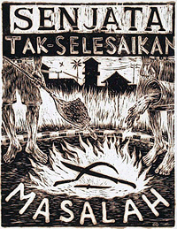
Taring Padi
Taring Padi in Bahasa Indonesia refers to the sharp tip, or “teeth,” of the rice plant. For the members of the Taring Padi Artists collective it is a metaphor for people power.
Fragments of the old Taring Padi Web site live on in the Internet Archive:
“taring padi is an independent non-profit cultural community which is based on the concept people’s culture. taring padi is committed to using its artistic and cultural pursuits to contribute actively to the democratisation process in indonesia and elsewhere. taring padi will continue to struggle for social justice and liberation from oppression for all peoples, and the environment.”
The collective creates posters and murals, publishes a newsletter, and participates in street performance with puppets, poetry, and musical groups.
From Inside Indonesia:
 “Yogyakarta [a city in central Java] is renowned historically as a centre for radical cultural protest, particularly in the visual arts. Radical Yogya artists have embraced anti-colonial and revolutionary causes since early in the twentieth century. Like their predecessors, Taring Padi artists promote the concept of people’s art - seni kerakyatan — a loose term that defines the artist’s social commitment and popular orientation. Taring Padi attempt to put this credo into practise through concrete action, rather than just aesthetic empathy for the plight of the ‘oppressed masses.’
Mainstream art, the conventional system of curators, galleries and art collectors, is something Taring Padi avoid. Rather, they cultivate relations with other progressive organisations including students, farmers, and the urban poor. Such was the case for the World Food Day action, when Taring Padi collaborated with Mbah Seko and his group of organic farmers called Petani Lestari (Conservation Farmers), as well as with activists from the environmental non-government organisation Keliling. At the demonstration, activists shared out the protest wayangamong themselves. The cast of wayang figures symbolised the various ‘actors’ involved in the pesticide ‘drama’....
In the period before the June 1999 elections, a number of Indonesian cities experienced heightened unrest. Political commentators predicted ‘civil war,’ and the media fuelled the volatile pre-election atmosphere by nurturing perceived religious, ethnic and racial tensions. As a response, Taring Padi began to produce a series of woodcut posters which carried messages promoting solidarity and peaceful social interrelations. Between March and June 1999, they distributed approximately 10,000 woodcut posters throughout major cities in Java, Sumatra and South Sulawesi. The woodcuts, hand-printed on draft paper, were pasted on city streets, on churches and mosques, on village notice boards, in food stalls, in market places.
Among their other artwork, Taring Padi issue a popular pamphlet called The People’s Trumpet. A series of banners and murals resemble the work of Mexican muralist Diego Riviera. Taring Padi banners are often commissioned by other organisations. The women’s division of the National Human Rights Commission ordered a series of them. Titled The evacuation, the banners depict the harsh realities of the refugee crisis in Aceh by focusing on women’s daily struggles.
![]() But Taring Padi also use banners and murals for community purposes, and invite local people to be part of the painting process. Taring Padi’s creative ethos involves a collective, process-oriented production of artwork. They want to eliminate illusive notions of the artist as ‘genius’ or ‘eccentric’ individual, and of the artwork as somehow ‘sacred.’ Taring Padi artwork does not carry recognition of the ‘individual’ artistic creator. It is stamped instead with the Taring Padi ‘kerakyatan’ insignia — a sprig of rice, red star and cogwheel.”
But Taring Padi also use banners and murals for community purposes, and invite local people to be part of the painting process. Taring Padi’s creative ethos involves a collective, process-oriented production of artwork. They want to eliminate illusive notions of the artist as ‘genius’ or ‘eccentric’ individual, and of the artwork as somehow ‘sacred.’ Taring Padi artwork does not carry recognition of the ‘individual’ artistic creator. It is stamped instead with the Taring Padi ‘kerakyatan’ insignia — a sprig of rice, red star and cogwheel.”
See a collection of linocut prints and paintings.
Guns, Butter, and Ballots
An article of mine is running in January/February 2005 issue of Communication Arts.
If any of you were wondering what all that Nixon bit on the Federal Design Assembly was about, it was background research for this.
Guns, Butter and Ballots
Citizens take charge by designing for better government
What did the President know and when did he know it? In April 2004, the White House declassified one of the President’s daily intelligence briefs issued just a month before September 11, 2001. The brief specifically states that Al-Qaeda and Bin Laden were planning attacks on the United States with hijacked airplanes.
Graphic designer Greg Storey was horrified. Not just because the information was all right there, but by the design. It’s no wonder the information could be ignored. The document is an uninflected, grey mash of sans serif type. Might thousands have been saved if the information design had been better?
“Nothing in the text is emphasized, making it difficult to scan,” Storey noted on his Weblog. “It would be much better if keywords, names and places were in bold and/or in a different color. Make it so that within seconds the President can see how serious of a threat it is.” Mouse in hand, Storey created a redesigned brief of his own (below right), adding a larger headline, highlighted key terms and, most prominently, a large colored number indicating the level of the threat.
Though no one in government ever contacted Storey, readers of Storey’s blog clamored for a document template they could use themselves. He dutifully responded. (Visit http://airbagindustries.com/archives/002868.php.) “My intentions were nothing more than to rant about what I saw to be a problem with how our government works day to day,” he wrote. “I thought I would spend a few minutes in front of Photoshop to see what I could come up with.”
Alas, President Bush does not actually read the daily briefs, the Director of Intelligence summarizes them to him out loud. Nonetheless, Storey’s redesign is a dramatic example of how information design might affect the government and the public.
But the truth is, graphic designers across the country are already hard at work collaborating with local, state and national government officials to harness the power of design in the public interest. Their work affects the lives of millions of Americans by improving public safety, promoting public health and facilitating democracy on a massive scale — often at the initiative of the designers themselves.
That government agencies use graphic design is nothing new. From posters to packaging, identity and, of course, forms, the federal government is one of the largest purchasers of design services in the world. But much of this work is less than inspiring — even obscure or downright misleading. For a variety of reasons, government designers may be stifled by bureaucrats and lawyers. And sometimes it seems like the lawyers and bureaucrats do the designing themselves.
The late 1960s and 1970s, however, saw a number of seminal graphic design projects sponsored by the U.S. Government. To name just a few: Vignelli Associates’s graphic standards for National Park Service publications; Danne & Blackburn’s NASA “worm” logo; and Chermayeff & Geismar’s logos for the Park Service, Environmental Protection Agency and U.S. Bicentennial.
Continuing a wave of public art initiatives at the time, Richard Nixon even asked Congress to triple the budget of the National Endowment for the Arts and created the Federal Design Improvement Program to help upgrade government architecture and graphics.
But by the end of the 1970s, faced with an energy crisis and an economic recession, the new leadership shifted the government’s priorities. By the 1980s, a backlash raged against public arts funding. Budgets were cut and interest in public design projects waned.
Still, during this period, two masterpieces of modern infor- mation design were developed, both of which have had a demonstrable impact on public safety.
Burkey Belser’s company usually designs communications materials for law firms and other services companies. But in 1978, he was asked to design the EnergyGuide label for the Federal Trade Commission. The frustrated regulators had become desperate after a top-shelf New York design firm had failed — and submitted a hefty bill in the process. The EnergyGuide that Belser designed is a bright yellow informational sticker that must be displayed by retailers on all major appliances (like air conditioners, refrigerators and washing machines). The Guide shows the estimated yearly operating cost and energy consumption on a scale from least to most efficient. Consumers actually used it to consider not just purchase price, but cost over the life of the appliance. The success of the label convinced government regulators that you could modify consumer behavior through clear, friendly information design, gently pushing them towards more environmentally friendly, if slightly more expensive, purchases. Multiplied by millions of refrigerators, the energy savings have been enormous.
Belser’s 1994 redesign of the Nutrition Facts label also attempts to influence consumer decisions. But the label, the most widely reproduced graphic in the world, very nearly had no designer at all.
In 1991, Congress mandated that the science behind the label be revisited. Originally developed in the 1960s, the previous label was based on a culture of famine during the Great Depression and two World Wars. Hunger was an epidemic. Food was scarce and the country lacked an interstate highway system to move fresh fruits and vegetables to market. The government’s priority in the first label design was to fend off malnutrition, rickets and scurvy, and so the label highlighted essential vitamins and minerals. In 1991, Congress realized we were living in a different culture — a culture of plenty...and of fat. They tasked the Food and Drug Administration (FDA) to develop a new labeling scheme to fend off an epidemic of obesity.
The Center for Food Safety and Applied Nutrition at the FDA was well equipped with top scientists, nutritionists and epidemiologists, but lacked experience in public communication. The Center had hired another big New York design firm, but was dissatisfied with the results. And so they prepared to go it alone.
Sharon Natanblut had a background in marketing and public relations, and had just started at the FDA as advisor to the Commissioner for strategic initiatives. When she found out that the scientists were designing the label themselves, she intervened. “The scientists saw graphic design as a trivial thing,” she recalls. “They thought more information is better. But ultimately, it is the design that helps you understand it.”
Natanblut knew Belser from his work on the EnergyGuide and knew he could communicate with both scientists and government officials, and would ensure that the design reflected the goals of the project.
Belser offered to do the job for free (though was able to charge for some expenses.) “If ever there was a call for pro-bono work,” says Natanblut, “this was it.” Belser comments, “Designers should really take on public projects as a part of citizenship. That’s why we did it. How often do you get a chance to affect so many people? Anyway, I didn’t want to mess with the government procurement process at the time.”
Belser and his staff put in countless hours and, after designing 30 variations, learned there is no such thing as a universal symbol. They found that literacy is more complex than they had imagined. The label had to be accessible to both poor and fluent readers. They found that poor readers stumbled over commas, dashes and semicolons, and that graphs, icons, pie charts are more sophisticated than they’d thought, requiring a relatively high degree of visual literacy. In focus groups and in public comment, designs that used these elements were slaughtered.
Eventually Belser and his team developed the current layout. The generic and anonymous looking design is anything but. The placement and grouping of information and the use of boldface create a visual hierarchy. To combat increasing obesity, the new design highlights calories, fat and cholesterol. And the resulting label is used by health-conscious shoppers to count calories and monitor their cholesterol intake. As former FDA Commissioner David A. Kessler recalled, “The nutrition facts label has within the space of a few years become a standard that many Americans use to make basic decisions about their diet and nutrition.”
The apparent lack of “marketing devices” is also misleading. The space is branded with a kind of “look of truth” — neutral, scientific, institutional and authoritative.
Nonetheless, obesity continues to rise at a dangerous rate — fast becoming the number one cause of death in the United States. In response, Belser is currently working with concerned advisors to government to further modify the design.
One might argue that it’s not the government’s place to interfere with people’s behavior or engage in “social engineering.” Belser responds, “I don’t think that there’s any government, corporation, or anybody that is not trying to influence somebody else. We have a Constitution and body of laws that say certain areas are off limits...But what the government is willing to do, and what, I believe, has a perfect right to do is to manage issues of public health and safety.”
Citizen action
The Nutrition Facts and EnergyGuide labels show the reach of government sponsored information design. Recently, however, the design process seems to be shifting.
Whether designers are tired of commercialism or were awakened by the 2000 butterfly ballot fiasco, there seems to be increasing interest in civic engagement. As portrayed in the 2000 reissue of the First Things First Manifesto and the AIGA’s recent Voice conference, designers are increasingly thinking about social responsibility and looking for ways to get involved.
In fact, several recent government design projects have been driven from the bottom up rather than the top down. Redesigns of the 2000 census, voting materials, New York City’s ubiquitous choking victim poster and the 1040 tax form were all initiated by designers themselves. In some cases starting out as class projects.
What Color are You?
Those political symbols, even for specific elections, don’t just rally the base — they reach far beyond their borders.
For instance, elections in Kyrgyzstan take place next month.
Kyrgyz Leaders Eye Ukraine Nervously, December 21, 2004:
“Speaking at a conference on democracy in Bishkek, [President Akayev] warned that no ‘colour’ revolutions would be permitted in Kyrgyzstan, referring to Georgia’s ‘rose revolution’ which brought down President Eduard Shevardnadze in November 2003, and the recent post-election turmoil in Ukraine, where Yuschenko supporters wore distinctive orange scarves.”
“Kyrgyz opposition responds to President Akayev’s warning of possible coup,” December 22, 2004, BBC Monitoring Central Asia:
“The united opposition in Kyrgyzstan denies the suggestion that it has ties to the West and does not believe that any revolutionary scenarios will be played out during the parliamentary election campaign. The deputies representing opposition parties and movements in Kyrgyzstan’s parliament even issued a lengthy statement to assure the public that they ‘do not applaud the events occurring in Ukraine’ and that they are not planning to organize a ‘tulip revolution’ in Kyrgyzstan, because ‘it could cause disparities in the country’s system of government’. Furthermore, the statement underscored the opposition’s intention to prevent any kind of outside intervention in the electoral process in Kyrgyzstan.”
KYRGYZINFO, January 13, 2005:
“President of Kyrgyzstan Askar Akaev urged the population of the republic to oppose the provocateurs and exporters of ‘velvet revolutions’. This was stated in his address to the people, to the parliament, to the government, to representatives of international organizations, to accredited diplomats and journalists.”
“Kyrgyz youth movement says no to ‘export of revolutions,’” January 18, 2005, BBC Monitoring Central Asia:
“The leader of the KelKel youth civil movement said: ‘Lemon is our symbol. We have chosen the lemon colour. We are against a party of the orange orange [Russian: oranzhevyy apelsin]. We are against the export of revolutions from abroad. We want to build our house on our own. We want to live in a sovereign and independent state.’”
Could this be the end of the one-color state?
Voter Turnout
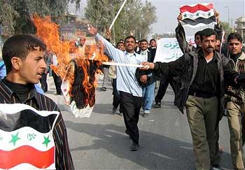
“Iraqi policemen burn election posters of Interim Prime Minister Allawi, as they rally through the streets of Najaf, some 160 kilometers (100 miles) south of Baghdad, Monday, Jan. 17, 2005. Policemen demanded their salaries for last several months. (AP Photo/Alla al-Marjani)”
How quickly propaganda is turned on itself.
Election Design, Afghanistan
The United Nations Office for Project Services currently seeks a graphic designer and cartoonist to facillitate elections in Kabul, Afghanistan.
“The Afghan Government has announced the holding of elections for Parliament in July 2005. The Joint Electoral Management Body (JEMB) consists of Afghan Electoral Commissioners, UN appointees, and the Secretariat of the JEMB supported by UNOPS who are responsible for the electoral process.�
“Under the supervision of the Chief of Public Outreach and the Senior Designer the incumbent will be expected to work with the team to conceptualize, design and produce nation wide print campaigns for civic education, voter registration, training and elections. These materials will be produced in English, Dari and Pashto. The materials will include posters, brochures, flip charts, manuals and other printed materials. Specific tasks include: �
- Working with Public Outreach officers, training and procurement officers and senior designers to conceptualize the print campaigns.
- Design and layout print materials in Quark Xpress, Photoshop, Illustrator and Word.
- Design and layout Dari and Pashto versions of printed materials.
- Provide illustrations for designs where needed.
- Assist in providing direction and assistance to local artists/illustrators.
- Prepare materials for printing.”
Cartoonist:
“In close consultation with the Chief of Public Outreach, Civic educators and the Senior Designer from the Graphic Design Unit and the National Illustrators the incumbent will be expected to undertake the following tasks:
- To work as a team member to develop the concepts of print materials for Civic Education, Public Information and Training.
- To execute initial cartoons/illustrations and revise for flip charts, posters, leaflets, newspaper cartoon strips and inserts, booklets and other print materials as needed.
- To attend National focus groups and meetings to ensure the intended message is easily understood.
- To work with the National Illustrators in developing these cartoons/illustrations into final art.
- To provide direction and assistance to local artists/illustrators.
- To work with Graphic designers when creating final art to ensure the illustrations work with the intended print materials.”
The deadline for applications is January 7, 2005.
Funny, I wonder why the UN can’t find local a designer willing to support the election.
Japan at War
![]()
Antiwar activists found not guilty over flier distribution
“The Tokyo District Court found three peace activists not guilty Thursday of trespassing at a Self-Defense Forces housing facility in the western suburbs of Tokyo and distributing leaflets in mailboxes expressing opposition to the SDF deployment in Iraq.
They were arrested Feb 27 after trespassing Jan 17 at the SDF residential quarters in Tachikawa, Tokyo, to distribute the fliers urging SDF personnel and their families to consider the appropriateness of sending Japanese troops to Iraq.”
The three spent nearly 2 1/2 months in detention.
Japanese police have become increasingly agressive in their crackdown on peaceful protestors distributing political leaflets.
More from the Japan Times:
“The Feb. 27 arrest of the three, members of local citizens’ group Tachikawa Jieitai Kanshi Tentomura (Tachikawa Tent Village to Monitor the Self-Defense Forces), shocked many civic groups and legal experts, who see it as an attempt by authorities to silence antiwar activists.
The handbills say SDF personnel may inevitably be forced to kill Iraqis and call on the service members to critically assess the government’s decision to dispatch troops to Iraq....
After returning home Tuesday night, one of the three, a 47-year-old worker at a public school in Tokyo, said the arrest and subsequent detention caused irreparable damage to his social reputation and career.
He said that on the day of his arrest, some media reported his name as a criminal suspect, and that he must stay away from work as long as his trial is ongoing.
Established in 1972, the group, which currently has seven members, has been posting handbills at the complex for the past two decades, but members claimed there had never been problems until they posted the handbills in January, drawing complaints from the residents.
...
In April last year, a 25-year-old bookstore employee was arrested for vandalism, after writing antiwar graffiti on the wall of a public lavatory at a park in Suginami Ward, Tokyo. The man said he was questioned by public security police, who grilled him over his political background.
His arrest was unusual, his counsel said, in that instead of the ward initiating a criminal complaint, police approached the ward to do so.
In February, the man was handed a suspended 14-month prison term. He has appealed the case to higher court, claiming his sentence is too harsh for the crime.
In March, a 50-year-old Social Security Agency employee was arrested and charged with violating the National Public Service Law by posting copies of the Japanese Communist Party organ Akahata in more than 100 mailboxes in Tokyo’s Chuo Ward during campaigning for November’s general election.
It is illegal for civil servants to engage openly in election-related activities, but no one has been charged with such an offense since 1967, according to legal experts, although over the years a few have been arrested.
His lawyer said it is unprecedented for a public servant to be arrested for merely posting leaflets. This case was also handled by public security investigators, who raided the man’s home, workplace and the JCP’s office in Chiyoda Ward.
‘Posting leaflets is the most peaceful means and one of the few tools powerless citizens have to convey their message,’ said Katsuko Kato, a 66-year-old cram school teacher who heads the Tachikawa citizens’ group. She added that peace activists targeting SDF bases widely employ the tactic.
‘This (renewed) oppression of citizens’ voices and the rights of those in the military to have wide access to information was something that was prevalent during the war. It reminds me that Japan is again at war,’ she added.”
Of course, article 9 of Japan’s Constitution forbids the country from engaging in war:
“Aspiring sincerely to an international peace based on justice and order, the Japanese people forever renounce war as a sovereign right of the nation and the threat or use of force as means of settling international disputes. 2) In order to accomplish the aim of the preceding paragraph, land, sea, and air forces, as well as other war potential, will never be maintained. The right of belligerency of the state will not be recognized.”
That is, the same Constitution drafted by the occupation government of the United States military in 1946.
Read more about the history of Tachikawa Tent Village to Monitor the Self-Defense Forces.
See this previous post on recruiting graphics for Japan’s Self-Defense Force.
Dimensions of Mind
“You’re traveling through another dimension, a dimension not only of sight and sound but of mind; a journey into a wondrous land whose boundaries are that of imagination.”
 Yesterday sat in on an a lecture on theories of the nation and nationalism. The nation is an imagined community, geography a matter of representations, and both of these are fraught with assumptions.
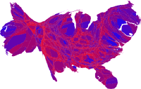
But looking at all the electoral maps and cartograms of the last election one can see the reverse is true as well. The Map Room has cataloged links to several maps: 1, 2, 3, 4.
I’ve read several accounts for the patterns on the map. One can examine north vs. south, heartland vs. fringe, urban vs. rural, plotting various demographics along the way.
Even if one assumes that a few million votes were stolen, a more general insight is unspoken — perhaps because it is a given? Despite increasing consolidated and homogenous media and increasingly pervasive Internet access, ideology exists spatially.
Pause
Am horrified, dejected, and depressed by the election returns.
Stepping out for a bit.
Your Logo, Mr. President
Via email:
“Dear John,
I publish a magazine that teaches graphic design, and last Friday we opened an online poll that asks, "Graphically speaking, who has the better campaign poster?" The poll will be open through election day.
http://www.bamagazine.com/BushKerry/
Response was immediate: Bush 4 to 1. We’ve posted a critique of our own.
Thought you might find this up your alley. Madison Avenue knows that good looks can change minds. In a close election, could design make the difference?
Thanks.”
![]()
![]()
A few weeks ago, the New York Times also published an Op-Ed and visual analysis on the subject, followed by subsequent letters to the editor.
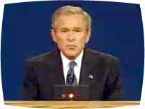
But then isn’t talking about a candidate’s poster style a lot like talking about who looks more “Presidential” in a televised debate? It privileges rhetoric over substance, and implies that the candidates are basically the same when they meet on the neutral playing field of design. Who has more “charisma”? Which is more “authentic”? Familiarity with a candidate’s record is irrelevant to look and feel and, subsequently, everyone’s subjective opinion is equally valid.
Which is not to say that rhetoric and impression are not relevant. In such a tight race, small differences do count.
Bush Party Mix
In their own words — some short, grassroots, video remix analysis of the debate, the RNC, and the media:
Have there ever been this many independent feature length films and video shorts produced for an election? I predict we’ll see even more in the next one.