

subway
Updates
Recent happenings on old blog posts:
|
More Public Schools: In March 2009, I wrote about The Public School a website where people propose, discuss, and coordinate free, offline classes taught by volunteers. The project has since expanded from Los Angeles to 6 more cities including New York, Paris, and San Juan. And still more coming soon! I taught a class on Mapping as Activism last month and had a great time. |

|
|
Listener Supported: In December 2008, I wrote about Spot.us, a site for crowd-funded news where anyone can pitch and help pay a journalist to produce a local story. Last week, Public Radio Exchange announced they will pick up the software to launch StoryMarket to bring the model to public radio. |

|
|
Guerilla Wayfinding in NYC: In March 2006, I proposed a compass rose stencil at the exits of New York City subway stations. Shortly after, stencils started appearing! A year later, City officials decided to implement a few test marks of their own, and I found out the idea had been proposed back in 1992. Now it’s 2010 and new compass stencils have popped up at downtown subway exits. |

|
|
The Trouble with Hippos: In February 2006, I wrote about the Hippo Water Roller, a rugged, round water container designed to be transport water on tough rural roads. Last year, Alissa Walker reported on some of the obstacles the project encountered with extended use, and when trying to scale up production. |

|
|
Public Designer: My first article for Communication Arts ran in February 2005 on citizens designing for better government. It included several examples orchestrated by Sylvia Harris. This month the AIGA published a great interview with her that’s worth checking out. Harris is a public designer if ever there was. |

|
|
Get the E out of NYC: In 2004, I wrote about New York City’s trial collection of electronic waste for recycling. On May 29, 2010, New York State decided it’s illegal to throw away your electronic waste in the regular trash. Governor Patterson just signed a producer responsibility law requiring manufacturers to pay for collection and recycling of e-waste from consumers (including individuals, schools, municipalities, small businesses and non-profits.) |

|
Previously from Shaw on this blog: typography and fascist architecture in Rome.
The King Never Smiles
 Excerpt on photography and nationalism in Thailand, from The King Never Smiles: A Biography of Thalians’s Bhumobol Adulyadej by Paul M. Handley:
“At each juncture his power and influence increased, rooted in his silent charisma and prestige. Thais, who believe it is their land’s fortune, their karma, to be blessed with such a king, saw a man who worked tirelessly for them without reward or pleasure. His sacrifice was readily visible: while Thais are known for their gracious smiles and bawdy humor, and a what-will-be fatalism, King Bhumibol alone is serious, gray, and almost tormented by the weighty matters of his realm. Ever since the day his brother mysteriously died [in 1946, when Bhumibol ascended to the throne], he seemed never to be seen smiling, instead displaying an apparent penitential pleasurelessness in the trappings and burdens of the throne.
For Thais, this was a sign of his spiritual greatness. In Buddhist culture, either a smile or a frown would indicate attachment to worldly pleasures or desires. Bhumibol’s public visage was unfailingly one of kindly benevolence and impassivity. In his equanimity he resembled the greatest kings of the past, the dhammarajas of the 13th-century Sukhothai kingdom who were called Chao Phaendin, Lord of the Land, and Chao Cheevit, Lord of Life. Increasingly many Thais compared his noble sacrifice to the Buddha’s own.”
Photo from a 2006 subway mural in Bangkok, part of the King‘s 60th anniversary celebrations.
To Where, From Whom
 Folks reading my most recent post about the New York City’s implementation of the compass rose by subway exits may have thought the Department of Transportation took its inspiration from my blog. Not so.
I came up with the idea in conversation with out-of-towner Micah Anderson over dinner with the folks from Eggplant Active Media back on March 4, 2006 and later posted it to this blog.
Graffiti roses showed up near downtown exits three weeks later, though I was never sure if my post inspired this. After kottke.org picked up my link, I received this email:

hey man,
i am NOMAD, I have been doing the compass rose graffiti, someone just showed me your post on it,
great minds think alike....
However, while this was all in March 2006, last week’s New York Times article on the DoT’s 2007 implementation of the compass, cites the new transportation commissioner who says she got the idea from “an Upper East Side man who was among about 20 New Yorkers quoted in The New York Times in January 2006 in an article about practical ways to improve the city.”
 But wait, there’s more!
After my post about the official NYC rose was picked up by a couple of blogs, I received an email from Mary Ciuffitelli who says she proposed the idea publicly back in 1992:
Hey John,
I like your website and design, but I have some news for you.
In 1992, I received an award from The Municipal Art Society for this compass rose idea. MAS ran a big competition called Design New York. There were seven winners out of 1500 entries, followed by an exhibit, an awards ceremony, a lot of press (including the New York Times), NBC TV News interviews, etc. I have my original sketch, award letter, ceremony program, tape of the TV interview, all the documents.
Fifteen years ago, there was talk of the city implementing the idea. In the meantime, friends and I talked about going guerrilla and just spray-painting compasses all over the subway system. I wish we had. I was working at a design studio back then, and there was plenty of enthusiasm. We designed a stencil for our plan based on the floor compass in the subway at Grand Central Station. If I keep digging through my stuff, I’ll find that drawing as well.
There were some pretty great ideas that came out of that contest. (Including a submission very close to mine.) Time to look back before setting down the history. This NY Times article boils down my idea to one sentence, but my submission included slightly more elaborate suggestions to reflect neighborhood character and landmarks.
Designing a Better New York, September 24, 1992 http://query.nytimes.com/gst/fullpage.html?res=9E0CE7DA1F3BF937A1575AC0A964958260
Since it looks like the idea is on the brink of becoming a permanent part of New York City design, I would like to set the record straight. Maybe you’d like to help me.Yours in brilliant ideas,
Mary
In the meantime, the folks at the Eyebeam OpenLab and Graffitti Research Lab generously let me use their laser cutter to produce a couple of stencils. I have 20 compass roses and 20 North arrows. Want to help put this up?
Send your postal address and PayPal me $2.00 for first class postage and I’ll send you one.
It's Official
Wow! Back in March 2006, I blogged an idea installing a compass rose at subway exits to help emerging travelers find their way. I posted a stencil design to help inspire action. Three weeks later, graffitti roses appeared in lower manhattan. And now a year-and-a-half later, the New York City Department of Transportation announces a plan to implement it.

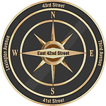
The DoT will test the designs in midtown, around the heavily touristed Grand Central area. The context specific labels are a nice innovation, not just pointing north, but naming the nearest street in each direction.
See the official DoT press release here and a NY Times article here.
Helvetica
On Friday, I caught a screening Helvetica, the film at the New School.
The film is a breezy valentine to type, typography, graphic design, and designers. The editing puts a nice leisurely pace to it, and I thought the sound design, which could have been disastrous in other hands, was suitably sensitive. It’s not a bad first film.
It consists mostly of two types of shots: interviews with bold-face name designers and scenes of type on the street — interspersed with occasional animated renderings of famous posters. The designers talk about the type, its use and origin, and their relationship to it, love or hate. It certainly helps to know who the players are, though most of the personalities sparkle through regardless.
On top of the brief historical survey, the broader question raised by the film seems to be, “How does this typeface come to dominate our visual environment? How did it come to be seen as so ‘neutral’?”
The answer provided by the parade of talking heads is of mostly a matter of taste, period fashion, and eventually a response to the momentum of a critical mass of usage.
But a look at counter-examples might have been illustrative: why does Gil Sans dominate in the UK? Why does a more condensed gothic sans seem so popular in France? I think a clue is in the usage by the state and the power of its projection. This is alluded to by many shots of the Helvetica-like sans serif on New York City subway signage, and by Paula Scher’s association between the powers that use Helvetica and the powers behind the Viet Nam war.
But mentioned only in passing is, I think, the most important point: bundling. Before desktop publishing, the font was widely available for linotype, as presstype, and for other printing methods. But now the font (and its twisted cousin Arial) comes pre-installed on every new computer sold. The film never really investigates why or how this came to be, or the consequences of it. It’s just assumed that Helvetica was a sufficiently “classic” and popular face. I think this is another case of designers ignoring systemic and structural forces. Its power is invisible, and well, what’s “normal” is just taken for granted. Further evidence of this systemic short sightedness is the fact that of the 21 designers interviewed on screen, nineteen are white men and two are white women.
Negative Campaigning
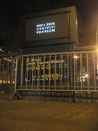
A great action in NYC, taping placards over those outdoor video billboards attached to subway entrances. The typography is composed of holes in the board, illuminated by the video ad beneath.
The project is Light Criticism, brought to you by the Anti-Advertising Agency and the Graffiti Research Lab.
In form, it reminds me of the work of Moose, writing his name on walls by cleaning them.
In context, it’s a lot like this guerilla wayfinding campaign, a grassroots, illegal action for civic improvement.
Guerilla Wayfinding, 2
Wow! Three weeks ago I posted a modest proposal for a guerilla wayfinding campaign, painting compass stencils at the exits of subway stations for disoriented commuters.
Today at the 8th Avenue L exit I found this:
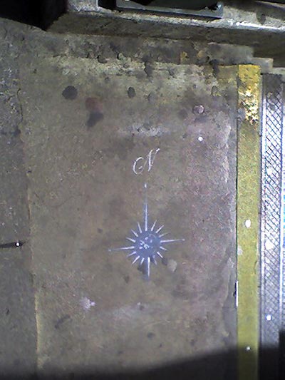
Here’s a hi-res photo someone posted to Flickr of the same compass at the Bleeker 6 exit. I found more at Astor Place and Union Square. Is someone reading this blog? And will they go all city?
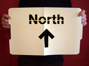
Guerilla Wayfinding
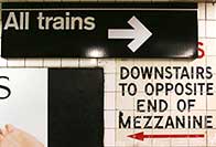
Last night, a friend from out of town commented on his disorientation when exiting subway stations in New York City. Which way is North? It always takes a minute or two (or more) to find a street sign, landmark, or other orienting information. In some cases it means walking a whole city block to find out you’re heading in the wrong direction. I’ve lived here for 15 years and I’m still disoriented at far-flung exits where the streets all have names and no numbers.
In midtown they have do little kiosks at street level with maps to nearby landmarks. But this seems like overkill for mostly mixed and residential neighborhoods. So how hard would it be for the MTA to paint a little direction indicator on the pavement near each subway exit?
Hell, how hard would it be to take matters into our own hands? To start a guerilla wayfinding campaign?
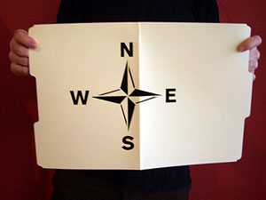
To that end, I’ve posted a few free stencils here. I’ve tried to keep it in the MTA style — with the exception of the compass rose. (But then who doesn’t love a compass rose?)
Click the thumbnails below to download a 20KB PDF.


Update 3/7/06: I’ve deprecated the uptown and downtown stencils, since it occurs to me that this could cause some confusion with the subway lines themselves often referred to uptown or downtown lines.
Update 3/28/06: Using their own fancy, two-color stencil, someone’s taken it on!.