

typography
Typographic Diplomacy
 AFP reports that the President of Taiwan today suggested that Taiwan adopt the simplified character set used in mainland China. The choice of script is clear political signal to Beijing towards reconciliation. The pro-Independence party is none too pleased. The Taiwanese-government funded Central News Agency is less alarmist, reporting that the President really encouraged learning simplified characters along side traditional characters.
In last summer’s article on Typography and Nationalism about countries switching scripts, I included this bit about the simplified script:
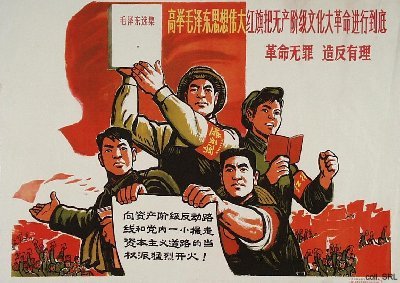
Chinese script reform has its roots in the 19th century, but Mao Zedong gave it the force of law. (Mao, a calligrapher himself, must have been keenly aware of the power of type.) A month after taking power in 1949, the Communist Party established the Language Reform Committee to simplify written Chinese. The move was intended to promote literacy and unify the nation, but it also worked to crush the many local languages within China’s borders.
The Nationalist-led government of Taiwan, however, never adopted the simplified characters preferring instead to continue using the traditional script. The choice of type has since marked a key cultural wedge between Taiwan and China.
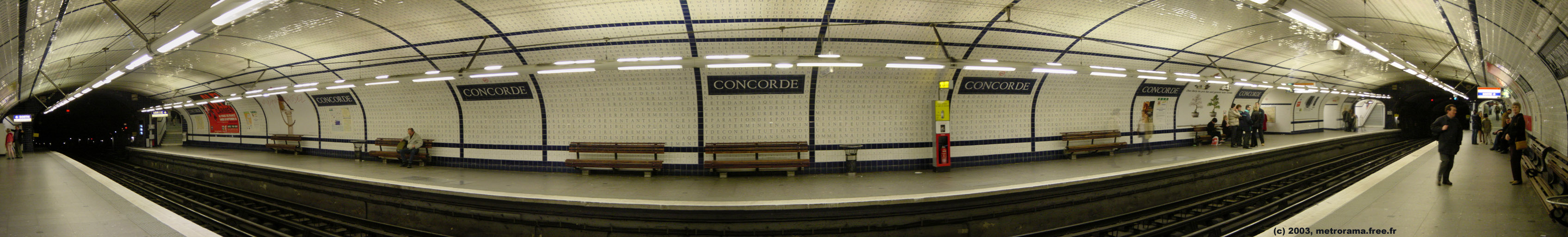
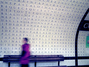
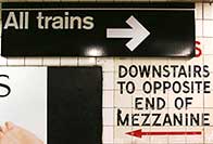
Code is Wall
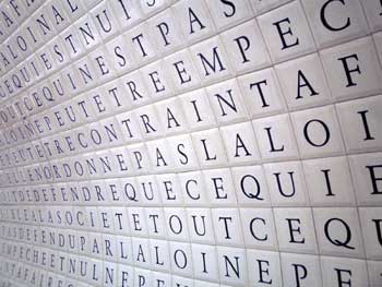
In the Concorde station of the Paris Métro, the tunnel for line 12 is decorated with tiles spelling out the text of the Déclaration des Droits de l’Homme et du Citoyen, the Declaration of the Rights of Man and Citizen, a foundational document of the French Revolution. See more photos on Flickr or this panorama.
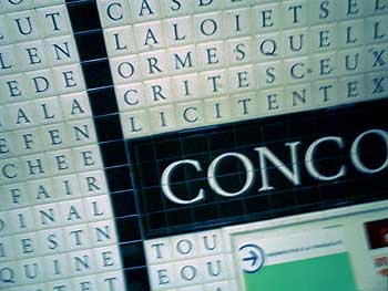
This works in so many ways: as a beautiful display of public typography; as a visualization of the correspondence between human rights and public transit, between policy and infrastructure, between theory, practice, and everyday life. In its deadpan presentation, there’s also something of a memorial to it which seems appropriate given its proximity to Place de la Concorde, previously Place de la Révolution, the site of the guillotine.
Not to mention a passing resemblance to The Matrix.
Previously from Shaw on this blog: typography and fascist architecture in Rome.
Typography and Nationalism
An article I wrote on typography and nationalism is out now in the July/August 2008 issue of PRINT. The full text is online here.
This is an idea I’ve had simmering for a couple of years, so it’s nice to finally see it in public. In the end, I only had 1,300 words to use so there’s some interesting material I had to cut. (One could write a dissertation on the subject.) But I think the arc of it comes across.
Some of that material and a few other points of reference are filed in the typography category of this blog.
Update 7/18/2009: The article is now available in Italian and Russian.
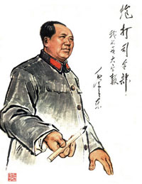 “During the twentieth century, the social and political uses of calligraphy have been radically changed. Calligraphy is no longer an art associated primarily with the traditional scholarly elite. Not only has calligraphy been employed as a tool of revolution, but it has become a popular amateur art practiced by people of all walks of life, and artists have found ways to use it to challenge traditions rather than perpetuate them.…
Even if block-like calligraphy had revolutionary overtones, Mao and other leading revolutionaries wrote in styles much closer to traditional calligraphy. Moreover, even after most people took up writing with pencils and ball-point pens, leading party members continued to do calligraphy with traditional brushes. They would give away pieces of their calligraphy and allowed their calligraphy to be widely displayed.… Mao Zedong’s calligraphy was more widely displayed than that of any other leader.”