

literacy

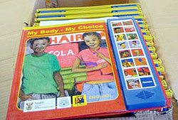 “Books of Hope partnered with the South African Depression and Anxiety Group, to design and produce interactive, multilingual Speaking Books that can be seen, read, heard and understood by the reader regardless of their reading ability.
The Speaking Book combines the latest sound chip technology featuring a sound track read by well-known local celebrities in the local language, with a durable laminated hard backed book, to take the reader on a step-by-step guide to wellness. Books of Hope has successfully created an effective means to present complex health care issues by adapting to the culture, skills and needs of communities while encouraging them to build self confidence with a simple action plan.”
Typographic Diplomacy
 AFP reports that the President of Taiwan today suggested that Taiwan adopt the simplified character set used in mainland China. The choice of script is clear political signal to Beijing towards reconciliation. The pro-Independence party is none too pleased. The Taiwanese-government funded Central News Agency is less alarmist, reporting that the President really encouraged learning simplified characters along side traditional characters.
In last summer’s article on Typography and Nationalism about countries switching scripts, I included this bit about the simplified script:
Chinese script reform has its roots in the 19th century, but Mao Zedong gave it the force of law. (Mao, a calligrapher himself, must have been keenly aware of the power of type.) A month after taking power in 1949, the Communist Party established the Language Reform Committee to simplify written Chinese. The move was intended to promote literacy and unify the nation, but it also worked to crush the many local languages within China’s borders.
The Nationalist-led government of Taiwan, however, never adopted the simplified characters preferring instead to continue using the traditional script. The choice of type has since marked a key cultural wedge between Taiwan and China.
 In Venezuela, four-legged mobile libraries, bibliomulas, help distribute books in the foothills of the Andes. (thanks)
Read Regular
Juanjo Seixas writes in about Read Regular, a typeface designed specifically to help people with dyslexia read more effectively.
From the Read Regular Web site:
“Britain has two million severely dyslexic individuals, including some 375,000 schoolchildren. 10% of people using ‘Romance’ languages are coping with a reading difficulty. Dyslexia is a combination of abilities and difficulties that affect the learning process, displaying a wide range of difficulties. Dyslexia can occur despite normal intellectual ability and teaching, and it is independent of socio-economic or language background. The British Dyslexia Association
 There has been growing innovation to combat dyslexia, especially for children, in the form of computer software. However, relatively little design research has been done in the area of typography and type design that might support dyslexics. Read Regular is a typeface designed specifically to help people with dyslexia read and write more effectively.
Read Regular aims at preventing a neglect of dyslexia, creating a more confident feeling regarding the problems that occur with dyslexia.
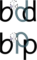
Read Regular is designed with an individual approach for each of the individual characters, creating difference in the actual characters of b & d itself (not mirroring the b to make the d), to create a large character differentiation.
The character shapes are simple and clear, creating consistency. The characters have been stripped down from all unnecessary details — such as a two storey a and a two eyed g.
The individual approach creates striking outlines that make sure that each character stands on its own and works together with its previous or next character. Used in the content of words, sentences and text, the following or the previous character does not try to interfere in its readability process. Ascenders (bdfhkl) and descenders (gjpqy) are long to ensure their legibility. Inner shapes for example within the o, e, a, u and openings in e and g are kept open to prevent from visually closing in. This makes Read Regular a friendly character and a pleasant balance between black and white.”
This story from Wired News talks a bit more about the genesis of the project.
Design for Literacy
“Dr. Juan Baughn, who oversees the [school] system for Edison [Schools Inc.], noted in a recent interview that some of his high school students were four to six years below grade level in reading....Those who were given books that appeared to be designed for grade school children were too embarrassed to use them effectively. Edison is now scrambling to find what Dr. Baughn describes as ‘age appropriate’ books that are written on a lower grade level but designed to be indistinguishable from books written for students who read well.”
From The New York Times.