

built
High Line Architects Selected
Congratulations to James Corner Field Operations and Diller Scofidio + Renfro for their selection as architects for the redesign of the High Line.
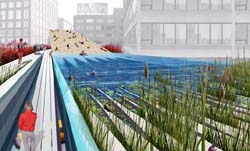 On July 15, I attended a presentation by the four finalist teams at the Center for Architecture, and it was clear that the Diller, Scofidio + Renfro team had done their research. More than any of the other teams, they had examined the relationship between the Line and the City. They presented the most nuanced sense of the pedestrian traffic in the many neighborhoods crossed by the line, and of the different types and degrees of usage the park would host. See their design boards here. While grounded in usability, the design was also aesthetically interesting — with a recurring pattern of linear struts flowing through the length of the park, and a visual vocabulary of plants chosen for their seasonal colors and textures. It was also one of the most imaginative, incorporating an elevated urban beach and swimming pond, ramps and walkways rising above and below the trees, and an elevator lowering a living tree to street level when summoned.
I was also struck by how little Zaha Hadid actually had to say. Her presentation mostly consisted of slides of her past work. It was clear her High Line proposal had less to do with the City than with her own vocabulary of attenuated forms. Her computer-generated video flyby of her High Line design was rendered through a ghostly, transparent Manhattan, hammering home her message: “We invite the City to change around the line.”
Though the winning plan was my favorite, I was sure that Steven Holl Architects would win. Their plan seemed the cheapest, their design the most conservative, and, most significantly, they emphasized public-private partnerships — stating repeatedly how the project would eventually pay for itself. This mainly involved weaving the park through various shops and cafes, anchored at the ends by a Starbucks and a Barnes and Noble. I thought surely this would capture the heart of our businessman Mayor and his administration, otherwise busy selling off branding and naming rights to our public infrastructure to fill the gaps in the city budget.
I’m happy to say I got it wrong.
Would You Like to Super Size That?
My own personal economic indicator is the number of vacant storefronts I pass on my way through New York City. Lately it seems worse than ever. Many of the stores that have been in my neighborhood since I moved here 13 years ago have closed in the last year or so.
But this turns out to have one unexpected benefit: vacant storefronts aplenty, available for short-term lease... to progressive groups during the Republican National Convention:
NYCLU Unveils Protecting Protest Storefront
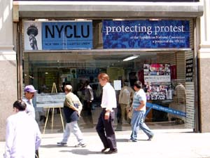 “The New York Civil Liberties Union today formally opens its Protecting Protest Storefront just two blocks from Madison Square Garden. The Storefront, at 520 Eighth Avenue (between 36th and 37th Streets) will serve as the NYCLU base of operations for monitoring protest activity during the Republican National Convention.
‘This location will be important for those who will witness democracy in action outside the Garden,’ said Donna Lieberman, Executive Director of the NYCLU. ‘As thousands of demonstrators take to the streets in peaceful protest, the NYCLU will be in constant negotiation with police to ensure that all problems are immediately resolved.’
In addition to housing the NYCLU Protecting Protest office, the Storefront will serve as a meeting place for our volunteers. The NYCLU will also host ‘Know Your Rights’ trainings and press briefings at the Storefront. Leaflets detailing the rights of protesters also will be distributed. The Storefront will also serve as the location for participants to submit information about policing tactics at the demonstrations.
‘We will be watching the NYPD night and day doing our very best to protect the right to protest,’ said Christopher Dunn, Associate Legal Director. ‘The NYCLU Storefront is the First Amendment’s beachhead to the Convention.’
During the week of the convention, the NYCLU will provide resources at the location for the media to file reports. The organization asks that those who are considering using the Storefront for this purpose contact the NYCLU at your earliest convenience. Overseeing all Storefront activities directly will be Steve Theberge, the NYCLU’s Protecting Protest Coordinator.
The NYCLU Protecting Protest Storefront is operated by the New York Civil Liberties Union, which is the New York State Affiliate of the American Civil Liberties Union (ACLU). The Storefront will serve many purposes between now and the end of the Republican National Convention (RNC):
- Source of printed information about the legal rights of groups and individuals planning to protest during the Convention;
- Location of ‘know your rights’ trainings for groups and individuals planning to protest during the Convention;
- Base of operations for NYCLU lawyers, staff, and volunteers who will be monitoring police activity leading up to and during the Convention;
- Place for people to file complaints or provide reports about police activity before and during the Convention;
- Location for approved members of the media to file stories during the Convention.
In the weeks leading up to the Convention, the NYCLU Protecting Protest Storefront generally will be open 10:00 a.m. to 6:00 p.m., Monday through Saturday. Starting on Thursday, August 26, the Storefront will be open daily from 8:00 a.m. to 10:00 p.m.”
The route for the big August 29th protest actually turns west on 34th Street so the Storefront is not directly on the march route, but two blocks from the Garden is pretty damn close. I just hope the NYPD doesn’t close off the street.
Delerious Beijing
You’re a architect who finally has a chance to build a masterpiece. For years, you’ve built your reputation publishing your theories and experimental models. But now you have a chance to really build it right. You get a big budget and creative control — and no need to worry about urban planning, sustainability, accessibility, community input, or those annoying environmental impact assessments. Existing homes and residents in the way? Not a problem. And plenty of cheap labor, too — let the client take care of that union stuff. Yep, it’s finally your big, big chance.
Except, the client is a repressive government.
Via reluct.com, I found this interview with Rem Koolhaas at Icon magazine.
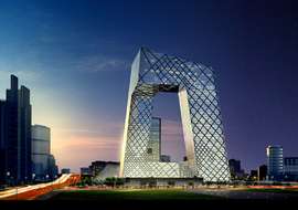 Rem seems to have a fine model going — mixing research, theory, and practice. But to design the center for state television in China? The chief propaganda outlet in a country that heavily censors its media? And imprisons and tortures its people for speaking out?
It sounds more like opportunism than constructive engagement.
Beijing is one of the densest cities in the world, and hundreds of thousands of people are being forcibly evicted from their homes to make way for new construction — much of it related to the 2008 Olympics. Developers literally send gangs of thugs into old neighborhoods to beat up elderly people and get them out. Risking arrest and prison, thousands of evicted families are protesting how they can: petitioning government officials, posting anonymously on the Internet, and in a last desperate effort, even setting themselves on fire in Tiananmen Square.
But Rem is not alone. Big name architects like Raimund Abraham, Zaha Hadid, Paul Andreu, Norman Foster, Michael Graves, Jacques Herzog and Pierre de Meuron are also taking advantage of China’s construction boom.
Like much of the party leadership in the former Soviet Union, much of China’s ruling elite have a background in engineering, giving extra caché to massive projects like the three gorges dam and the space program.
From Time Magazine, May 2004:
“Detractors cite the $730 million CCTV project as the ultimate example of the Chinese regime’s tendency to plunder state coffers to glorify its own iron authority and say Koolhaas is an opportunist taking advantage of the country’s unique combination of state power and state capital to realize his own artistic ambitions. Ian Buruma, a writer who is a friend of Koolhaas, wondered aloud in the Guardian, a British newspaper, how the world would have reacted if an architect of Koolhaas’ stature had in the 1970s designed a TV station for Chilean dictator Augusto Pinochet.
But Koolhaas, 59, who was one of the first Western architects to study and write about China’s urban explosion, revels in such intellectual tussles. CCTV, he insists, like the mainland itself, ‘is in mutation’ and the building represents an effort to complement the state-owned company’s desire to keep pace with the times. CCTV’s current headquarters is completely closed to the public. Koolhaas’ design, in contrast, includes a public ‘media park’ in and around the base of the building intended to foster more interaction between commissars and the masses. ‘We are engaged,’ he says, ‘with an effort to support within [China’s] current situation the forces that we think are progressive and well-intentioned... We’ve given them a building that will allow them to mutate.’”
Indeed, how people do mutate.
Envisioning Cities
Image manipulation software, like Adobe Photoshop, can be a powerful tool to involve communities in the process of urban development.
From the Local Government Commission:
Computer Simulation as a Public Participation Tool
 “Most of us have a hard time envisioning what two-dimensional plans or a development proposal will look like when built. Computer simulation translates such plans and descriptions into pictures that help us see what a proposed development will actually look like. This allows residents and policymakers alike to make more informed planning decisions.
Simulation exercises help settle complex planning issues and guide design and planning activities. As a mechanism to improve public communication concerning local planning and development issues, computer simulation can be used to
- Help develop design guidelines
- Evaluate controversial proposals
- Analyze urban design qualities before formal discussion begins on an actual proposal
- Develop choices about the appearance of a project
 Before the advent of personal computers, architects and urban designers were only able to show their clients what a proposed project would look like through artist’s renderings and/or by constructing elaborate three-dimensional models. Such models and renderings are expensive and time consuming to produce.
Today, advances in computer technology, such as computer aided drawing and design (CADD), global information systems (GIS), and advanced two and three-dimensional graphics software, have made it possible for design professionals to present their projects to clients or the public through computer simulation. Computers make it possible to produce highly accurate simulations faster and less expensively than do traditional methods. Furthermore, once computer simulations are produced, they can be easily adapted to design changes. An artist’s rendering, in contrast, may have to be completely redrawn.
Computer simulation begins with a scanned photograph of a building or area within a community. Using computer software, elements of the image are added, taken out, or otherwise reorganized into a new image representative of a proposed development design strategy. The result is a series of before and after images...
This technique allows all stakeholders to see the differences in proposed design styles and development patterns and allows decision-makers to evaluate the potential impacts of proposed developments.”
From the company Urban Advantage:
“Working with architects, planning staff, and citizen groups, we create visions of pedestrian-friendly, socially-interactive communities by transforming photographs with photo-editing software. In addition to the illustration skills necessary to make seamless montages, we also incorporate into the images an understanding of urban planning, architecture, arboriculture, and transportation. This results in informed collaboration with clients.”
Some of their before and after photo simulations are truly stunning — though after a while, the solutions do start to look a lot alike.
The LGC page lists serveral other specialist firms that provide illustration services, but with the increasing power of home computers and the increasing popularity of digital cameras and image manipulation software, I imagine that community residents themselves might also be able to render their own visions.
Spanish Castle Magic
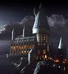 I just saw the latest Harry Potter installment and more than anything else, was struck by Hogwarts castle.
Having just spent the last weeks running around Spain looking at castles and fortresses, cathedrals and mosques, it was all so clear: who gets to build such things but people and institutions with enormous wealth and power? Wealth and power acquired and maintained primarily through inheritance and military force.
Much has been written about nostalgia for royalty, the restoration of noble blood, and inherited class privilege in Star Wars, The Lord of the Rings, and Harry Potter.
But I haven’t seen anything about this now painfully obvious clue — the politics of the architecture in fantasy literature.
To the Streets
I wrote the essay below for the Design Issues column in the May/June 2004 issue of Communication Arts. I profile a couple of folks using graphic design for advocacy. I didn’t call it out explicitly in the text, but it’s of some relevance that the projects here are generally not pro-bono projects “for charity,” but are organizations started by designers generally working with broader communities. Check it out.
Taking it to the Streets
Graphic design for advocacy
Walking the streets of New York City in February 2003, one couldn’t help but notice all these little blue stickers. Stuck to walls, phone booths, bus stops, scaffolding, mail boxes — they popped up everywhere to announce the February 15 march against President Bush’s invasion of Iraq.
The blue stickers were just one of the many anti-war graphics circulating at the time. Around the Web, activists were posting free, easy-to-print designs using a variety of techniques: clever slogans, typographic play, dramatic photos and the ironic use of vintage propaganda imagery.
But the February 15 stickers on the streets of New York were different — simple and bold, a little blue banner announcing the time and place of the march. They did not make an emotional appeal with pictures of scarred and armless Iraqi children or U.S. soldiers, nor was there any argument about why the war was wrong.
The February 15 posters were not intended to change people’s minds in a direct way, but to notify the public about the upcoming protest — and to make dissent visible. The mainstream media had entirely avoided covering the anti-war movement prior to February 15. In the face of this de facto censorship and police obstruction over the route of the march, the stickers acted as thousands of little acts of civil disobedience. And with the urban landscape as a medium, the stickers set the stage for even larger acts of defiance.
Crosswalk Usability
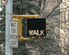
Everyone knows that New Yorkers pay attention to crosswalk signals... right?
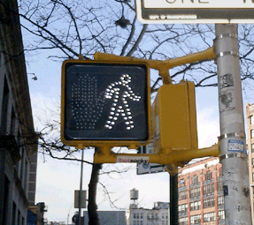
So if you live in New York City, you may or may not have noticed that all the old crosswalk signals are gone. Instead of the spelling out WALK and DON’T WALK in type, the new signals use pictograms of a big red hand and walking person in a dotted outline of bright LED’s.
The new signal displays fit into the old, existing signal housing. And, by switching from incandescent bulbs to light-emitting diodes, the City notes, the new signals will both last longer and use less energy.
This piece in the New Yorker provides some hard numbers:
“The city is changing all eighty-five-thousand signs, at a cost of $28.2 million. The job started in 2000, in Queens; by February [2004] the [job] should be complete....
The idea is that the new ones, which rely on dozens of light-emitting diodes, or LEDs, will last six times longer than the old ones, which relied on two bulbs, and will save two million dollars a year in maintenance and electricity costs....
The brighter signs should be more visible to persons with partial sight. But, the author notes, the signals do have detractors:
“Among them many children, who sense that there is something patronizing about the hieroglyphs....
‘First of all, they’re really bright,’ Jacob said. ‘They hurt my eyes, even from, like, a block away. They make my eyes water. And, also, the first thing my sister could read was Walk/Don’t Walk.’ The three of them came to a corner: across the street, an upraised hand. They took a look, then crossed anyway. ‘The old one is just more original,’ Jacob went on. ‘Almost every other place has the Man and the Hand. Whenever I go anywhere else, it’s the Man and the Hand. Italy, France—they always have that. It’s un-unique. So I don’t really like it. Actually, most of my friends don’t like it.’”
The NYC page also claims that switching to “internationally recognized symbols” will make the signs “easily recognized by non-English speaking pedestrians.” I applaud the recognition and accomodation of non-English speakers in such a massive, city-wide initiative, but while the symbols may be “internationally recognized” in Western Europe, an open palm has different meanings in different cultures. For instance:
- In Japan an open palm in front of one’s face means “I don’t know,” “I don’t understand,” or “I am undeserving,” [source]
- In Greece, “extending the arm and hand (palm open) as if pushing something away from you is an age-old form of insult. In wars, Greeks would humiliate their prisoners by rubbing mud or fecal matter into their faces.” [source]
- And in Nigeria, pushing the palm of the hand forward with fingers spread is a vulgar gesture. [source]
 With closs-cropped hair and boot-cut pants, the figure in white resembles other symbols used around here to indicate “male.”
The NYC page doesn’t mention it, but new crosswalk symbols are nationally mandated in the Manual of Uniform Control Devices published by the U.S. Department of Transportation. The Manual sets forth detailed design standards for traffic signage around the United States.
Recently, in San Francisco I discovered another variation I’d never seen before. In addition to the white man and red hand, the signals there feature a red countdown indicating the number of seconds remaining to cross the street. It turns out the countdown option was added to the Manual in 2000, and is slowly gaining popularity across the country. I was struck by the simple brilliance of it. The additional information is much more useful than the simple flashing hand or DON’T WALK. The latter always seemed to start flashing when one was halfway across the road. This calls to mind the scene from Rain Main when the austistic character stops walking in the middle of the road.
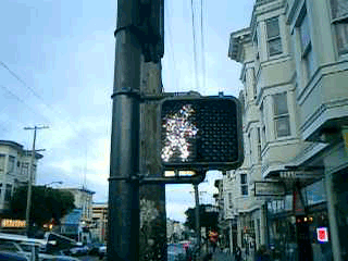
But that, apparently, is exactly when it is supposed to start flashing. The period of the countdown, flashing hand, and flashing DON’T WALK is known as the “pedestrian clearance interval”, the time for pedestrians to finish crossing, not to start crossing.
Local studies around the U.S. are finding that the countdown signals come at a price. While the countdown reduces the number of pedestrians who start running when the flashing DON’T WALK signal appears, the countdown seems to be interpreted to mean that it is OK to cross the street if there are enough seconds on the clock. Pedestrians are more likely to start crossing the street during the countdown than during the flashing DON’T WALK. This is contrary to the intent of the designers, and of the law.
Significant data has not yet been gathered on the countdown signal’s effect on the overall number of pedestrian fatalities.
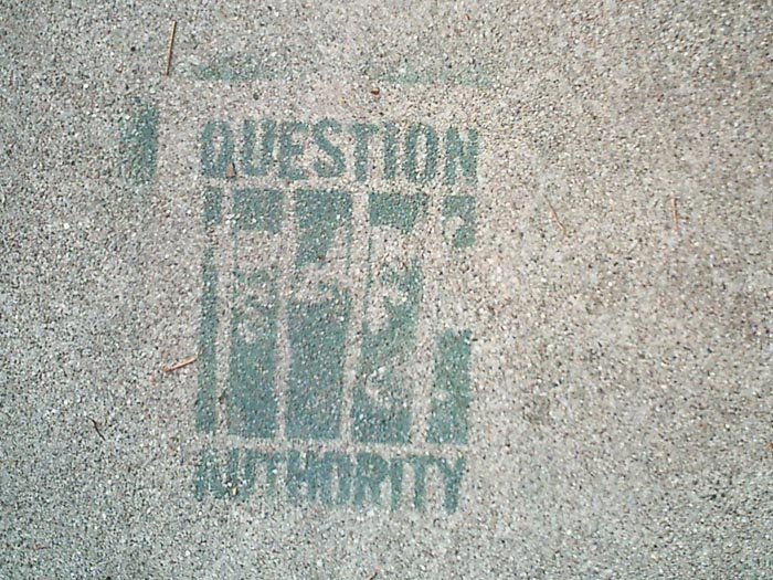
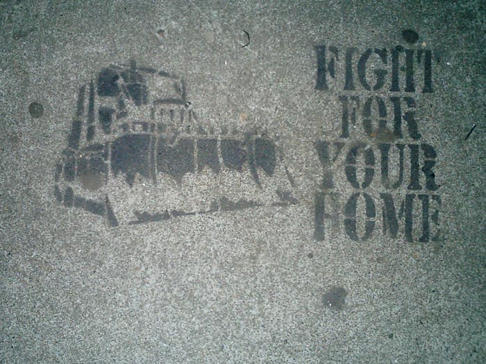
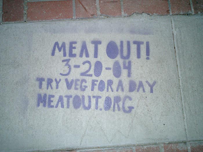
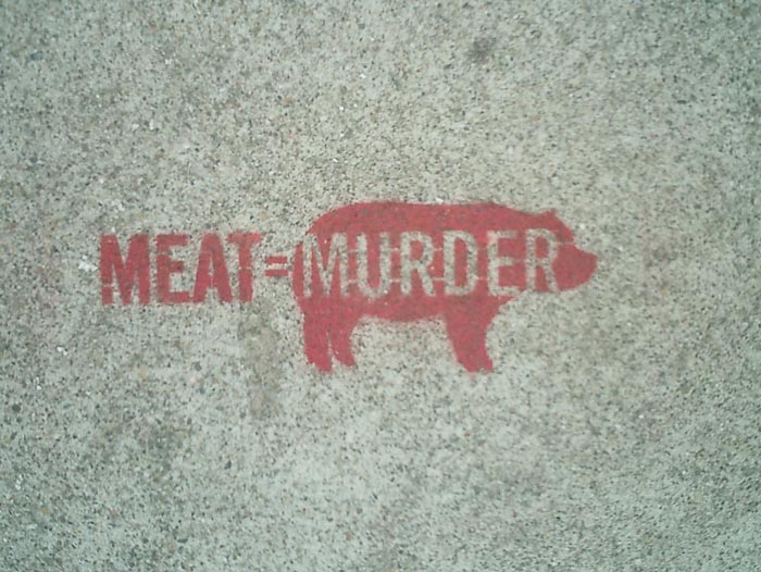
Stencil Graf, San Francisco
Some political stencil graffiti I spotted this weekend on the sidewalks of San Francisco and Oakland. Click an image below for a larger version.
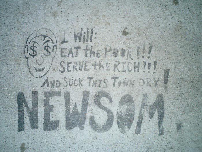
That’s Mayor Gavin Newsom to you.
Most buildings built before June 1979 are rent controlled. However, housing prices are so high that some landlords are willing to destroy their buildings to build new ones that can rent at the city’s incredible market price.
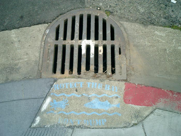
“PROTECT THE BAY / DON’T DUMP”
There’s lots more at http://www.stencilarchive.org/.
Whose Streets?
Drapetomaniac sends a link to this video clip of an interview with Casey Blake. Professor Blake is
“currently working on three book-length projects: Public Art and the Civic Imagination in Contemporary America... an edited volume titled The Arts of Democracy: Art, Civic Culture, and The State... and a collection of essays on the culture and politics of the 1970s.”
I’ve transcribed the clip below.
“In the early and mid-1960’s, the Federal Government initiated two significant programs for funding public art in the United States, and these programs in effect became the leaders in the public art field in this country during the 60’s and 70’s and in some ways beyond.
The first of these was the Art and Architecture Program of the General Services Administration which sponsors public art installations inside and outside federal office buildings and courthouses. And, the second is the Art in Public Places Program of the National Endowment for the Arts which was founded in 1965.
Both of these programs were very much the creation of liberals in the Kennedy administration and after that in the Johnson administration, and also within the Rockefeller wing of the Republican party. And, I think that the architects of these programs were all men who were steeped in European culture. They were knowledgeable about the history of European art and European Modernism in particular, and they wanted to see the United States — now a military and economic power — come of age as a kind of artistic power in the world and produce artwork that could bear comparison to the great works of high European Modernism.
 These were also anti-Communists and they believed that federally sponsored public art programs, and arts programs generally, could play a role in furthering the mission of the United States in its global campaign against the Soviet bloc, in large part by holding up the artistic achievements of the United States as an example of what a civilization devoted to individual freedom was capable of producing, and then, finally, a program that attempted to remake American cities along modernist lines.
I think that when you look at the federal programs that sponsored public art installations in the United States beginning in the mid-1960’s, and then developing further in the late 60’s and early 70’s, you see that these programs were all inspired by a set of assumptions and by a notion of cultural authority that came under attack almost immediately after these programs were put into place. In particular, the notion that artistic decisions and decisions about the uses and design of public spaces should be best left to experts, in particular experts in the visual arts, came under attack almost immediately first from the political left, in many cases from the political right, but I think more broadly from a kind of popular revolt at the local level. I think that on the whole, those people who were angry about public art in this period, in the 70’s and 80’s were asking a vitally important question, namely, ‘What was “public” about them? Who was the public that was going to decide what public art was going to appear in public spaces?’
I think that beyond the question of ‘who decides what art should appear in public spaces?’ and ‘what makes it public?’, the protests of the 1970’s had to do with questions about the fate of the American city in this period. In the 1960’s public art was very explicitly linked to a program of urban renewal that promised a kind of modernist revitalization and redesign of American cities. By the mid-1970’s with the fiscal crisis of American cities setting in in earnest, I think it became very difficult to believe that public art on its own could somehow remake urban culture. More to the point that you see beginning in the 70’s and certainly continuing through the 80’s, a kind of backlash against the idea of urban renewal that had been promulgated after World War II that relied so heavily on the bulldozing of traditional neighborhoods and their replacement by modernist forms of planning and architecture. So in many ways, by the mid-to-late 1970’s public art installations no longer seem like these vehicles of urban revitalization, but rather seem like the most visible symbols of a liberal urban project that had gone terribly wrong.”
Bombing Iraq
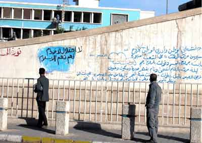
From Reuters, November 13, 2003:
“As political parties and businesses take advantage of a power vacuum in a country with as yet no elected government, constitution or parliament, Baghdad has become a city of graffiti.
Walls around the city of five million have been smothered with competing slogans since three decades of stifling state control and dictatorship ended in April with the ousting of Iraq’s president Saddam Hussein.”
From Al-Ahram Weekly via the Utne Reader:
“[Graffiti] has quickly become an important mode for Iraqis to freely express opinions of every nature. Nermeen Al-Mufti, reporting from Baghdad, writes that during the last two months the walls near her house have ‘been witness to the sentiments and longing of the Iraqi people.’ Before the fall of Baghdad to U.S. forces, the walls were entirely blank except for the face of Saddam Hussein. Now buildings throughout the city are covered with political and personal commentary from hugely differing perspectives.
Much of the writing is political in nature. After American troops entered Iraq many of the pictures of Saddam were defaced. A poster near Al Mufti’s house that had previously read ‘yes, yes to Saddam,’ was changed to ‘no, no to Saddam.’ Later someone added the word ‘criminal’ in front of Saddam’s name. However, anger and resentment is not, by any means, limited to the former leader of Iraq. One wall reads, ‘Americans, sooner or later we will kick you out.’ And at times the two opinions clash, ‘Thank you Mr. Bush,’ was later crossed out by someone else.
Ali Omer, a young writer in Baghdad, commented, ‘I discovered the draw-back of democracy, it dirties the walls!’ Metaphorically, the ‘dirty’ masses of opinions covering the walls reflects the greatly commingled ethnic and religious groups in the country. Shatha Hassan, a teacher in the Institute of Fine Arts, says that the walls reflect the massive instability of the country. Thus, some of the writing directed towards the future possibilities of an Iraqi government. Walls read, ‘Yes to a secular government,’ or, ‘There is no democratic Iraq without resolution of the Kurdish issue.’ On this note, there is also the positive outlook, ‘Arab and Kurds together will rebuild Iraq.’ Sadly, the walls are also representative of a war-torn country where positive steps forward are taken very slowly. One university student writing on the wall said, ‘We still don’t know if we’ll be taking our exams or not. Nobody reads the papers, so maybe our demands will be seen on the walls.’”
For a few more translations see Newsday.
page 20 19 18 17 16 15 14 13 12 11 10 9 8 7 6 5 4 3 2 1 Older »