

publishing
Manifesto del Sindicato de Obreros Tecnicos, Pintores y Escultores, 1922
Manifesto issued by the Union of Technical Workers, Painters, and Sculptors, 1922
“Social, Political, and Aesthetic Declaration from the Union of Technical Workers, Painters, and Sculptors to the indigenous races humiliated through centuries; to the soldiers converted into hangmen by their chiefs; to the workers and peasants who are oppressed by the rich; and to the intellectuals who are not servile to the bourgeoisie:
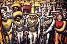 We are with those who seek to overthrow of an old and inhuman system within which you, worker of the soil, produce riches for the overseer and politician, while you starve. Within which you, worker in the city, move the wheels of industries, weave the cloth, and create with your hands the modern comforts enjoyed by the parasites and prostitutes, while your own body is numb and cold. Within which you, Indian soldier, heroically abandon your land and give your life in the eternal hope of liberating your race from the degradations and misery of centuries.
Not only the noble labor but even the smallest manifestations of the material and spiritual vitality of our race spring from our native midst. Its admirable, exceptional, and peculiar ability to create beauty — the art of the Mexican people — is the highest and greatest spiritual expression of the world-tradition which constitutes our most valued heritage. It is great because it surges from the people; it is collective, and our own aesthetic aim is to socialize artistic expression, to destroy bourgeois individualism.
We repudiate the so-called easel art and all such art which springs from ultra-intellectual circles, for it is essentially aristocratic.
We hail the monumental expression of art because such art is public property.
We proclaim that this being the moment of social transformation from a decrepit to a new order, the makers of beauty must invest their greatest efforts in the aim of materializing an art valuable to the people, and our supreme objective in art, which is today an expression for individual pleasure, is to create beauty for all, beauty that enlightens and stirs to struggle.”
David Siqueiros, et al., originally published as a broadside in Mexico City, 1922. Published again in El Machete, no. 7 (Barcelona, June 1924).
English translation from Laurence E. Schmeckebier Modern Mexican Art (Minneapolis: University of Minnesota, 1939), p. 31.
Dear John...
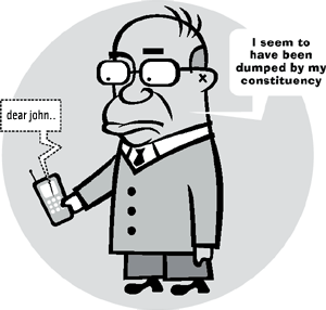
A collective of communication designers in Melbourne, Australia are working to defeat the current conservative government of Prime Minister John Howard.
The site dearjohn.org targets the youth vote, inviting them to download free T-shirt transfers, screen savers, badges, posters, and stickers.
Although united by a common agenda to defeat Howard, the designers do not highlight a specific issue or push an alternative party to vote for. This is left for the audience to fill in blanks.
Literally. In addition to readymade downloads, the site hosts a variety of do-it-yourself materials, including instructions on making your own collage posters or gaffers tape T-shirts, and downloadable political clipart and “dingbats” — image fragments and caricatures you can use to assemble your political messages and media.
If You Build It
jude sent me this link a while back. The page is part of a Frontline documentary on the life and death of “maverick humanitarian aid expert” Fred Cuny:
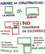
“These ‘Housing Pictographs’ are another example of how Fred Cuny was always looking for ways to use a calamity as a catalyst to improve people’s lives.
After Guatemala’s 1976 earthquake, Cuny went to the devastated central highlands to see what he could do. Working with two organizations, OxFam (U.K.) and World Neighbors, he posed a key question to both the NGO staff and the peasants whose adobe homes had been reduced to rubble:
‘How do you make safe a poor person’s house in the rural countryside?’
Fred set out to improve the design and construction of the local housing as it was about to be rebuilt. Mary McKay, the head of the World Neighbor’s Housing Education Office in Guatemala, explained to FRONTLINE how the new building program worked. The ideas were all Fred’s, she said, but ‘the local builders took those ideas and figured out what you actually did when you are out there with a hammer in your hand. Fred wasn’t a mason or a carpenter,’ but he could talk with those who were, and he loved doing that ‘especially with the guys in the sandals who really did the work.’
Cuny would draw pictures which a World Neighbor’s staff member then turned into artwork. The drawings then were silk-screened onto the backs of empty flour sacks, stitched together, rolled up and put on the back of a master carpenter’s moped. The skilled craftsmen, who had worked with Fred in developing these new building techniques, would then drive from village to village throughout the region using the ‘flip charts’ to spread the word.
Although many of those master carpenters were later killed or fled Guatemala as a result of the government’s crack down on people they thought might challenge their authority, many of the houses using Fred Cuny’s techniques are still standing. Guatemala has not yet suffered another earthquake the magnitude of the 1976 quake.”
The project sounds like a great example of design in the public interest, a low-tech, simple way to improve people’s lives for years to come — and a small note of hope within the brutality of the U.S.-backed military dictatorship.
But that last sentence is chilling. Particularly, within the context of the page’s patronizing tone.
Were the carpenters targeted because of their work with Cuny and the World Neighbors NGO?
One friend who works on Guatemala tells me:
“Often local ‘authorities’ (including non-elected community leaders) used the conflict as an excuse to settle scores. So maybe [the carpenters] were gaining too much authority in the community, and then were taken out by local thugs who may have been connected to the government, but were acting on their own in this. Or not. Hard to tell.”
Another tells me:
“One category of people who were killed are those who worked with foreigners.”
From here it’s hard to know exactly why the carpenters were killed, but it seems possibile that they were indeed a casualty of the naivete of humanitarian intervention that attempts to remain neutral or indifferent to the complexity of local political relationships and history.
Dirty Laundry
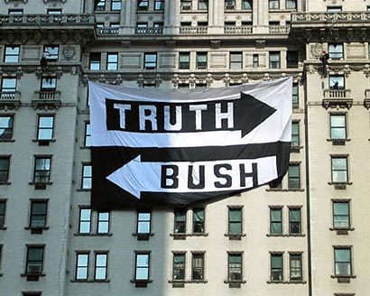
“A protestor lowers herself to a waiting police officer after she helped unfurl a banner on the facade of the Plaza Hotel in New York on August 26, 2004. The 60-foot banner reads ‘Truth’ and ‘Bush’ with arrows pointing in opposite directions. Two members of a protest group called Operation Sibyl rappelled down the facade to unfurl the banner.” (Peter Morgan/Reuters) The story behind the banner. More pictures.
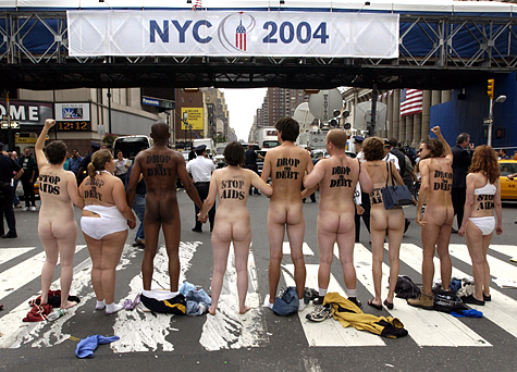
“Ten nude AIDS activists led by ACT UP New York stopped traffic on 33rd Street and 8th Avenue by Madison Square Garden at noon today, shedding their clothes to reveal ‘STOP AIDS’ and ‘DROP THE DEBT’ stenciled across their backs. As a crowd of hundreds gathered and news cameras rolled, the six women and four men chanted, ‘Bush, Stop AIDS — Drop the Debt Now!’ and were arrested in all their glory after standing their ground for ten minutes.” (Indymedia)
Direct Mail
From Associated Press, August 24, 2004:
South Carolina Democrats use draft images to sign up voters
“A state Democratic Party A state Democratic Party effort to sign up new voters mixes images of a military draft notice with a voter registration form, calling on people to make a choice between the two.
The first page of the mailing shows a draft notice with orders to report to a military induction center. The next shows a helicopter with troops in the foreground beneath a headline that says ‘Officials in Washington are calling for more troops in Iraq.’ Below, the mailing asks ‘Which form would you rather fill out?’”
Half Empty
Profile of Graphic Designer Tibor Kalman
by Thomas Frank, from ArtForum, February 1991:
“Tibor Kalman is a graphic designer, a crafter of corporate logos, a producer of presentation materials, a maker of menus and restaurant posters. But Tibor Kalman is so much mere than that.
 According to most of those who judge such things (with whom I concur, by the way), he is accomplished, even brilliant at what he does. He may even be the greatest graphic designer of his generation. Certainly his output of the last twenty years, just collected in the three-and-a-half-pound book Perverse Optimist (Princeton Architectural Press), sparkles with witty solutions to the problems typical of corporate presentation. But why stop there? Kalman is, we are told, a radical — a breaker of rules, a dealer in astonishment, a deft questioner of the corporate order. In a manifesto co-authored in 1990, he insisted that graphic designers be ‘bad,’ ‘disobedient,’ ‘insubordinate,’ that they refuse to be ‘a cog in the machine,’ that they must make clients ‘think about design that’s dangerous and unpredictable.’ It’s no surprise that accounts of Kalman’s oeuvre take pains to note his SDS exploits in the late ’60s.
The question that inevitably arises, though, is why a corporation should be so keen to hire a ‘radical’ graphic designer. What makes Kalman’s radicalism, such as it is, a desirable quality in what is possibly the most constrained branch of creative endeavor? What does ‘radicalism’ even mean in such a field? It certainly isn’t readily apparent from his work. What impresses one first about Perverse Optimist is not Kalman’s radicalism but his weird omnipresence in the most modish precincts of corporate-sponsored culture of the last two decades.
Election Design: Models for Improvement
While the push for verified, electronic voting rages on, in 2004 printed ballots and the ghost of the 2000 butterfly design still flutter through many districts. Activists, designers, and usability professionals are still working to redesign the process.
 In November 2002, I blogged about Design for Democracy, a project to bring graphic designers into the election design process. The project started as a class exercise at the University of Illinois, and is now a registered non-profit corporation backed by the AIGA.
Slate and the Chicago Tribune have both published articles about the effort.
Now, with a grant from Sappi, the Design for Democracy is publishing their findings and process, hoping to inspire action around the country.
From the archives of the AIGA somewhat-monthly newsletter, in the summer of 2003:
“Sappi Fine Papers has announced a major grant to Design for Democracy, AIGA’s initiative to improve the quality of election experience, in order to publish a book of graphic standards, with visual examples, to assist local officials in understanding the opportunities for clear communication. Marcia Lausen, former AIGA Chicago chapter president and design team leader for Design for Democracy, will be the principal author.
Marcia and Ric Grefé, AIGA executive director, presented concepts of election design to state election officials from all fifty states and selected secretaries of state in Portland, Maine in late July. A number of officials expressed an interest in contacting local chapters about how they could work with local designers. Marcia and Ric will send out a follow up letter to all the attendees encouraging them to become involved with a list of chapter presidents. If you are contacted, we can discuss different ways in which we have found it to be productive to work with state officials and will provide all chapters with copies of the templates of work done to date. The most recent states to seek AIGA assistance are Texas and Michigan.”
And from the March 2004 AGIA Communique:
“‘Election Design: Models for Improvement’ is a new, comprehensive graphic design system for improving the quality, legibility and effectiveness of election materials. In November 2000, a group of design professionals, educators and students began a dedicated effort to improve the voting experience. Organized as a program of “AIGA Design for Democracy,” this team worked in association with the University of Illinois at Chicago and directly for election officials in Cook County, Illinois and the State of Oregon. Project teams developed prototypes for improved ballot design, election administration, poll worker training and recruitment, voter registration, polling place signage, vote-by-mail, absentee voting, provisional voting and voter education and outreach.
This publication documents the resulting design system. It includes detailed information, guidelines, visual examples and templates that can be adapted for use by all states and counties. AIGA price: $100. Shipping charges $3 within U.S.A. Place your advance order.
It’s a great idea, but the $100 price tag is astonishing. That’s a big ticket for a grassroots advocacy manual. While the price might not bother AIGA members, it would certainly shut out many grassroots groups working on voting rights. What happened to all that Sappi money? Is the design of the book itself what makes printing so expensive?
Was that March?
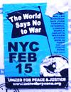
On a couple of occasions I’ve noted my admiriation for the design used by United for Peace and Justice to publicize anti-war events in New York City. The simple flag and globe motif on a bright blue ground and its bold sans-serif type are eye-catching, clear, and instantly recognizable.
However, the consistency and repetition of such a strong image in the same context (via stickers and flyers) over nearly three years may be diminishing its impact. As one UPfJ organizer notes:
“We love the blue flag standard, but have heard feedback that the design has been the same for too long... folks think it’s for an old demo.”
Contesting Power
In recent months, there have been several open calls to designers to help stir up the electorate.
Designs On The White House
![]() “Designs On The White House is a grassroots fund-raising organization in support of the John Kerry 2004 Presidential campaign. We aim to mobilize the creative community through an online design contest, judged by designers, celebrities, and activists. Winning designs will be available for resale on T-shirts and other products, and all proceeds after expenses will benefit the John Kerry Presidential campaign. Designs on the White House Organization (DOTWHO) is an independent political committee and is not authorized by any candidate or candidate’s committee.
“Designs On The White House is a grassroots fund-raising organization in support of the John Kerry 2004 Presidential campaign. We aim to mobilize the creative community through an online design contest, judged by designers, celebrities, and activists. Winning designs will be available for resale on T-shirts and other products, and all proceeds after expenses will benefit the John Kerry Presidential campaign. Designs on the White House Organization (DOTWHO) is an independent political committee and is not authorized by any candidate or candidate’s committee.
The Categories
- Best Pro-Kerry Shirt (positive spin, no mention of Bush)
- Best Anti-Bush Shirt (negative spin, must mention Bush)
- Best Issue Shirt - Domestic
- Best Issue Shirt - Foreign
- Funniest Shirt
- Best Retro Shirt
- Best Get Out The Vote Shirt
- Most stylish / Most likely to be featured on Queer Eye
Each design will be entered in only one category.”
Anyone with a valid email address can register with the site and cast their votes on the contributed designs.
The site also features blogs about the DOTWH campaign and the Kerry campaign. A recent entry encourages non-designers with design or slogan ideas to post them.
The deadline for entries is May 22, 2004.
Let Down By Labour
![]() “Want to see your film on national television? Want your poster idea on High Street billboards? Want to tell everyone how labour have let you down? We can make it happen for you.
“Want to see your film on national television? Want your poster idea on High Street billboards? Want to tell everyone how labour have let you down? We can make it happen for you.
‘Labour isn’t Working’ fast became one of the most famous posters in advertising history. Imagine if you had been able to have a crack at that brief? Just as in 1979 when Labour wasn’t working, today swathes of the population feel let down by Labour.”
The final date for submissions was April 23, 2004.
“We have received a massive response from the people of Great Britain and we would like to thank all of you for your contributions. We will be displaying the best ideas in a gallery so that everyone can see how let down by Labour the British people feel. The large number of submissions we have received means that it will take some time for us to sort through the ideas. But as soon as they are ready to be unveiled to the public we will be presenting a selection of them here. Once again thank you for your support.”
And from the comments of VoxPop:
One thing CCO isn’t shouting from the rooftops is that they opened this competition to the "creative industries" (i.e. trendy spec-wearing ripped jeans fans) the week before they opened it to the public.
Also, there’s absolutely no guarantee that they’ll use any of the entries.
Honestly, this scheme could not have been met by more incredulous stares had it been announced on April 1st - Saatchi coming up with a scheme whereby members of the public do his job for him? Shurely shome mishtake.”
Blogged here previously, that famous poster also turns out to be a fake.
AIGA Get Out the Vote
 From the AIGA Atlanta Web site:
“AIGA will again mount a campaign to demonstrate the power of design in the public arena by encouraging designers to contribute to a coordinated get-out-the-vote campaign for national elections in the fall of 2004. The objective is to demonstrate the value of design to the public, public officials and business by providing a clear call to action for an activity that is important to everyone.
The campaign will have two elements to it. The first will be a selection of designers who will be asked to create nonpartisan calls to action that will bear a national AIGA campaign identity. AIGA’s national coordinator will select six designers and each AIGA chapter will be encouraged to select a designer to develop a design, for a potential total of 53 different designs.
The second element will be an open gallery of member designs that will be posted on the website and available for local printing, specifically by our members and also available to any visitor to the website. Any member will be entitled to post a design in the open gallery. This will become the largest gallery of available designs in support of this critical civic function. Some of the unsolicited submissions may be selected to be included among the collection of posters that AIGA will print and will distribute to all chapters for posting locally.
After careful consideration of the success of the previous campaign, this year we are proposing a slightly smaller-scaled window card format rather than posters, since the potential for actual posting in public places increases substantially if the designs are of a scale that can be placed in small shop windows and on public bulletin boards (places where a larger poster would not be posted). The scale also allows for printing out on local color printers as well as commercial printing. Our intention is to demonstrate the strength of our communication design, regardless of the production values of the print. This is in the spirit of civic postings since Revolutionary times....
The purpose of this campaign is to encourage voter turnout. There is no single message, although the intent is a call to action, motivating people to register and to turn out to vote. The visuals and the text of the message must be nonpartisan—we are supporting the basic democratic premise of citizen participation, not a partisan position on candidates or issues. Messages or images that are likely to offend substantial numbers of citizens will not be selected nor included on the site, since they would be counter to our intention of developing messages that encourage voter participation through effective use of images, text and ideas.”
The deadline for submissions was April 1, 2004. You can view or download the posters here.
I also note that the designs must include the AIGA logo:
“All posters must incorporate the required branded band (this will be embedded in the supplied template). The band will include the AIGA logo and the tagline ‘Good design makes choices clear’ along with sponsor information.”
No RNC Poster Collective
 “No RNC Poster Collective is a small collective of friends with experience in graphic design and independent media. We came together with the goal of facilitating visual resistance for the anti-RNC activities in NYC this summer. We want to make protest beautiful and connect artists with organizations working against the RNC.
Our goal for the project is to create a visual blitz in New York City against Bush and the Convention, and to blend art with politics in the finest New York style.
We are putting together in a free book of posters relating to the Republican National Convention in New York City, August 29th -September 4th. We are mass producing these posters on newsprint for distribution across New York City and the country in bookstores, apartment windows, picket signs and pasted up on the street.
We are looking for artists who can make posters with themes anywhere in the range from anti-Republican to anti-RNC-being-held-in-NYC to anti-Bush to antiwar to anything else you think is relevant. The plan is to have some posters about specific marches and actions and others that communicate a general anti-RNC message.
We are printing the posters in early June so that we can circulate them all summer. Submissions should be in black and white. Dimensions are 14" x 21" (that’s 15" x 22" with a half inch border). Deadline for submissions is May 30th. If you are at all interested, please e-mail us at: [email protected].
In mid-June, we’ll head to the printers with the best designs we get, and then set up a distribution network to get thousands of them up on the streets, in storefronts, in apartment windows, on picket signs.... everywhere there’s room.
We’re also setting up an online gallery to display all the great work that people are sending in. In addition to that, we’re working on a gallery show-style event where we can show everything together, which will hopefully also act as a small fundraiser for the project.
We’ll also be doing stickers, stencils, pins, and more over the course of the summer, so please keep in touch if you have other designs or ideas.
Also, one of our goals in starting this project was to hook up artists with organizations — if you think you might be interested in designing a poster for a specific group or event, let us know, it’d definitely help. Info on all the events and groups is here: http://rncnotwelcome.org/logistics.html. Check it out and see if anything leaps out at you.
We hold regular meetings in Brooklyn every Wednesday night, which people are welcome to come to — e-mail us if you have any interest. We’re currently working on fundraising and other logistics,
We’re working closely with the fantastic folks at Arts in Action, who are planning all sorts of fun, creative, and challenging work in the city this summer. Check them out at http://www.thechangeyouwanttosee.org for more info on what they’re up to.”
The budgetary and printing limitations will also give the No RNC posters a consistent, low-tech aesthetic despite the variety of designs and designers.
You can view the final posters here.
...
Though the projects follow much the same format, the politics differ considerably. And though each is an open call for entries, distributed primarily through email and the Web, each seems to target participants much like the organizers themselves, though each in the end aspires to influence a broader public.
Designs On The White House is a grassroots initiative endorsing a major political party. They are rallying a younger crowd seeking to inject a sense of style and hipness into the stodgy, elitist political machine.
Let Down By Labour is a top-down initiative, probably financed by the political party. As noted by the commentor, they seem to be looking for free labor, particularly from other advertising professionals.
The AIGA, a national professional association of dues-paying designers, while explicitly non-partisan, is encouraging participation in the electoral process. The competition was only open to members, and is as much about promoting the AIGA and the public value of design as it is about getting out the vote.
The No RNC Poster Collective, an a grassroots, open, volunteer collective is explicitly partisan, and while challenging the Republican convention, is tied to the protest and civil disobedience to take place around the convention. They are accepting contributions from anyone.
Judging for Let Down By Labour is secret and closed. The judges are unknown. Judging for the AIGA and Designs on the White House are via celebrity panelists, though Designs on the White House does open some voting to the public through the Web. Judging for the No RNC Poster Collective project is open, though one has to physically travel to Brooklyn.
The motivation pitched by each also varies: Let Down By Labour promotes pure self-interest and the prospect of fame for oneself; The AIGA sells the high ideals of civic engagement; Designs on the White House pitches the fun of it; while the No RNC Poster Collective provides a place to focus one’s outrage.
I also note how the choice of media plays into the politics.
Designs On The White House focuses on T-shirt design, seem to implicitly target an audience in their 20’s and 30’s that would wear cheeky political T-Shirts. T-shirts with the winning designs will be put on sale for anyone to purhcase.
Let Down By Labour focuses on advertising, specifically national television and billboards, expensive media generally only accessible to wealthy corporations, advertising agencies, and the big political parties themselves. While this might seem to be an opportunity to the grassroots to gain access, it is still corporate spaces purchase by corporations in the service of a conservative, corporatist party.
The AIGA Get Out the Vote initiative and the No RNC Poster Collective both focus on poster design. Both will have open distribution via the Web, and printed posters will be distributed on an ad-hoc basis. The AIGA posters will probably have perennial use for future election campaigns, though the RNC posters are specifically located towards the convention in New York City, the walls and public surfaces of the City, setting the stage for the massive civil disobedience.
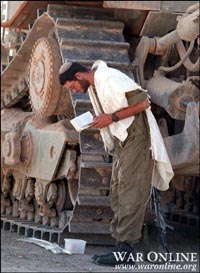
Objects in the Mirror
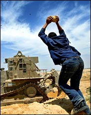
“A Palestinian threw a rock at an Israeli army bulldozer.”
This photo from Abid Katib/Getty Images appeared on the front page of today’s New York Times online. The image and caption linked to the article Israeli Tanks Enter Gaza; 4 Palestinians Die in Fighting.
In the photo, the Palestinian looms large above the bulldozer. He is a lanky, but determined and formidable force — a dark, faceless enemy poised to smash the small, apparently unarmed machine. The force of his attack is accented by patterns in the clouds, and exaggerated by the tilt of the camera (note the horizon line.) The bulldozer does not seem to be attacking the Palestinian or doing anything other than driving by, going about its business. The article reinforces this, making no mention of the purpose of the bulldozer or why it would need an escort of tanks.
From the photo, you’d have no idea that the bulldozer is 13 feet tall and well protected against his rock.
See the entry on the Caterpillar D9 from wikipedia.org:
“Armored bulldozers are a standard tool of Combat engineering battalions, and the IDF has gained some notoriety for their use of armored tractors in the Al-Aqsa Intifada, Operation Defensive Shield, and their involvement in the demolition of orchards and residences and the consequential death of [U.S. college student] Rachel Corrie....
The operator is protected by bulletproof glass to protect against bombs, machinegun and sniper fire. The fitted armor package adds roughly 10 additional tons to the weight to a so-equipped D9. Like many customized packages, individually modified D9s may be found with disparate features, such as crew-operated machine guns, smoke projectors, or grenade launchers....
The Israeli armor kit proved itself well, as no D9 operator was killed during the 3-year long al-Aqsa Intifada.”
The U.S.-based Caterpillar Corporation manufactures the D9. The Israeli Defence Force developed the armor kit. Last year, Israel’s Technion Institute of Technology, announced a remote controlled version of the D9.
The Israeli Committee Against House Demolitions reports that the IDF has demolished over 10,000 houses in the Occupied Territories since 1967. The Caterpillar D9 was used to demolish an entire neighborhood in the Jenin refugee camp in April 2002.
Other photos show a very different scale:
For more information, see Stop Caterpillar, a campaign to hold the Caterpillar Corporation accountable for the criminal use of its products by the Israeli army.