

Posters from the WPA
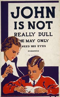
Posters from the By the People, For the People: Posters from the WPA, 1936-1943. 908 posters from the collection of the Library of Congress. Read about the exhibit, check the massive subject listing, or skip straight to the highlights.
Sydney’s Green(ish) Games
The 2000 Summer Olympics in Sydney were to be the first “Green Games” because of the comprehensive environmental plan included in the city’s successful bid to the International Olympic Committee. The city’s guidelines
“recognise the major environmental issues of global warming, loss of biodiversity, ozone depletion and air and water pollution. They contain commitments in five main areas: energy conservation; pollution avoidance; water conservation; protection of the natural environment, and waste minimisation and management.”
Green Games Watch 2000 has a detailed account of the successes and failures of the event.
“The main green wins include public transport access, solar power applications, good building material selection, recycling of construction waste, progressive tendering policies, energy and water conservation and wetland restoration. The main green losses include the failure of most sponsors to go green, poor quality Olympic merchandising, environmentally destructive refrigerant selection, loss of biodiversity in some projects, failure to clean up contaminated Homebush Bay sediments in time for the Games and the lack of transparency and effective public consultation by the Olympic Coordination Authority and Sydney Organising Committee for the Olympic Games.”
See also two critical articles published in Harper’s and Current Affairs.
Selling Soap with Stereotypes
Trade cards are a “single piece of medium weight paper slightly smaller than a post card, printed with decorative images which directly or indirectly promote a commercial product, service, or event. Trade cards were used widely from the 1870s to the end of the 1890s, and were commonly distributed to the public at store counters, expositions, and through the mail.” The Daniel K.E. Ching Collection of the Chinese Historical Society of America has over four hundred trade cards produced in the United States and Europe that contain racist depictions of Chinese and Chinese Americans. Several images have been posted online. For a bit of context read the essay.
Found via American Samizdat.
Designing for People with Partial Sight and Color Deficiencies
“This brochure contains basic guidelines for making effective color choices that work for nearly everyone. To understand them best, you need to understand the three perceptual attributes of color: hue, lightness and saturation, in the particular way that vision scientists use them. Full explanations of these terms are provided.”
From Lighthouse International. See also Making Text Legible: Designing for People with Partial Sight and The Campaign for Large Type.
Branding Beijing
“Beijing Organising Committee of the 2008 Olympic Games (BOCOG) opened a two-day Olympic Design Conference in Beijing on Tuesday in a bid to find the most appropriate ways to impress the world visually. Beijing Mayor Liu Qi said in the opening address that through the magnificent and unique ‘Olympic look’, Beijing will unfold the great charm of this global sporting event and the history of China. Meanwhile, Beijing will also ‘promote the concept of “New Beijing, Great Olympics”, and demonstrate and elevate the image of Beijing and China in the world’, added Liu, who is also BOCOG president.”
From the People’s Daily.
Palestinian Poster Project
“Liberation Graphics began actively collecting Palestinian posters in 1974 and now houses what many experts believe to be the world’s largest and most comprehensive collection of Palestinian-published and Palestinian solidarity poster art.”
The Typography of News
From Peter Hall:
“The news has become a worrisome visitor in our lives over the last few months, and it arrives in an ever-increasing variety of forms. TV news, according to one recent survey, still reaches most households, but text-based news provides the supplementary information — on web sites, newspapers, email, palmtop bulletins and even zipper signs. A cursory glance at this particularly rich array of printed and transmitted words reveals a genre of media in flux — the typography of news. Typography was never more important to us, and yet never less noticed.”
See also The News Aesthetic.
Found via xblog.
Posters of the Spanish Civil War
Posters of the Spanish Civil War from the University of San Diego Southworth Collection. Read the intro then skip right to the thumbnail index. See also drawings made by Spanish children during the war.
Community Mapping Assistance Project
The mission of the Community Mapping Assistance Project is:
“to strengthen nonprofit, philanthropic, and public service organizations by providing affordable access to computer mapping and other data visualization technologies. We launched CMAP in 1997 as a venture of the New York Public Interest Research Group Fund, Inc. (NYPIRG), New York State’s largest environmental and consumer research and advocacy organization.CMAP helps further NYPIRG’s goals of helping to inform the general public concerning topics such as consumer protection, social justice, the environment, and government reform. CMAP has provided mapping services since 1997 to more than 250 organizations, helping these groups to educate policymakers, board members, and the media; illustrate reports and outreach materials; secure funding; and provide interactive access to information about health care, the environment, transit, education, and more over the Internet.”
Posters of the “Fighting Pencil”
“The ‘Fighting Pencil,’ a group of graphic artists and poets, started as a real fighting unit during the war with Finland in 1939. Artists B. Semyonov, V. Galba and others, together with poet E. Ruzhanski, created the first poster-broadsheet for the troops at the front, targeting their satire against the enemy and its allies. Later, during the Great Patriotic War against Nazi Germany (World War II), more posters were made calling for defense of the Motherland, portraying heroic deeds of soldiers, inspiring courage and encouraging hatred toward the enemy. After the war, the ‘Fighting Pencil’ shifted its satire to ‘opening the boils on the body of Soviet society’ Their targets now were the vices of bureaucracy—negligence and abuse, red tape and indifference to clients, corruption and incompetence. They also addressed ‘negative phenomena’ encountered in the everyday behaviors of ordinary people, such as alcoholism, abuse at the workplace, family violence, and environmental pollution.”
Found via coudal partners.