

posters
Images from the Iranian Revolution
NYU’s Grey Art Gallery is showing some of its photos and posters from the Iranian Revolution in Between Word and Image: Modern Iranian Visual Culture.
“While the posters were produced by a wide range of political groups, most make direct appeals to action by defying power, subverting authority, and inverting icons as a means to authorize oppositional ways of thinking and behavior....
As social discontent increased throughout the 1970s, some of Iran’s leading contemporary artists assumed an active role in the production of political posters. Inspired by the French student movement of 1968, a group of Iranian artists opened a workshop at the University of Tehran in 1978. The workshop provided the materials and equipment for printing posters to members of various political groups. Professional artists worked alongside amateurs. Their results were displayed throughout Tehran — in schools, in factories, and on the walls of other buildings, often defacing public monuments built by the Pahlavi regime as symbols of its authority and grandeur. As government agents tore them down or covered them with paint, protesters would replace them with replenished supplies.”
The show juxtaposes some modern painting and sculpture from Iran in the 1960s and ’70s.
See other photos, murals and posters from Staging Revolution: The Art of Persuasion in the Islamic Republic of Iran. (Annotation but no thumbnails at the last link, just keep clicking ‘next image.’)
More posters (with a nice thumbnail index) at islamicdigest.net.
Grey link found via American Samizdat.
Art Attack
“I make satirical paintings of bureaucrats and political figures the old-fashioned way: oil paint on canvas. I then transform the paintings into thousands of street posters generated through a offset litho process. Basically I poke fun of ugly old men in suits and ties, like members of the Reagan administration and his cabinet who were abusing their power in the name of representative democracy....
Guerrilla volunteers plaster them onto construction site walls and other surfaces in major cities across the U.S. These poster-plasterings are midnight raids: non-sanctioned, nonscheduled rock-n-roll-garage-band-total-loss poster tours. The volunteers meet in the middle of the night in an all-night coffee shop and plaster my posters all around the streets to surprise people on their morning commute. The posters provide commuters ‘info-tainment’ about politicians that I feel are abusing their power. This allows me to put art in unexpected spaces....
I feel it is an art way to communicate directly to regular people on the street versus a mediated form of distribution, like showing in art galleries.... I am not trying to change people’s minds about issues important to them, instead I try to get people to think along with me and entertain them at the same time. It is not rocket science, I simply try to irritate the powers that be as much as possible without having them squash me like the bug that I am. But it’s the visual buzz on the street that I try to create, because my art is for the people who don’t have the power.”
From LA based guerilla poster artist Robbie Conal. Visit his Web site, check the poster archive, and guerrilla postering guide.
Grapus
“An offspring of the May ‘68 student revolt, Grapus design collective was founded in 1970 by Pierre Bernard, Gerard Paris-Clavel and Francois Miehe. They were joined in 1974-5 by Jean-Paul Bachollet and Alex Jordan; with Miehe’s departure in 1978, the main core was set.
All members of the French Communist Party (PCF), they concentrated their early efforts on the new society visions of the Left, producing cultural and political posters for experimental theatre groups, progressive town councils, the PCF itself, the CGT (Communist trade union), educational causes and social institutions. At the same time, they rejected the commercial advertising sphere....
For 20 years they provided inspiration to graphic design students all over the world, with their idealistic principles (of brining culture to politics, and politics to culture), and their highly distinctive form of image-making: an accessible and unpredictable mixture of child-like scrawl, bright colors, sensual forms and high-spirited visual pranks.
Throughout their history, Grapus remained Communists and idealists and continued to operated collectively: all work left the studio signed ‘Grapus’ even when their studio numbers had grown to around 20, operating in three separate collectives. They finally disbanded in January 1991, splitting into three independent design groups.”
From Liz McQuiston, Graphic Agitation: Social and Political Graphics since the Sixties, Phaidon, p. 56.
This article on the AIGA NY Web site emphasizes role of “the artistic” at the expense of “the political” in the breakup of the organization. Instead, I read it as the group wrestling with their relationship to the State and the establishment. Grapus member Pierre Bernard, on his design for the Louvre:
“‘I didn’t want to support the cliché that the Louvre was a place of order, reverence, and boredom,’ says fifty-six-year-old Bernard, ‘At the same time, I wanted to claim the wealth of the museum as the property of the French people, not the property of a cultural elite.’
Although he is a former member of the Communist party, this is not strident leftist rhetoric. Bernard’s approach to graphic design is more artistically than politically driven....
The Louvre assignment was a turning point in Bernard’s career. His fellow designers at Grapus believed the collective should turn down the job. ‘We used to argue all the time about who we should work for,’ he says. ‘Unlike other members of the group who only wanted to design for political causes, I believed that graphic communication could be an instrument of social change when applied to cultural institutions and so, in 1991, I went my way and formed the ACG, short for Atelier de Creation Graphique.’”
The piece further attributes the the downfall of the collective to the adoption of social design by the mainstream:
“The 1980’s were a time of cultural euphoria in socialist France. Jack Lang, minister of culture, supported a wide range of avant-garde art projects, and graphic expression was one of them. Every socialist city, town and village had to have its logo. All the government agencies felt compelled to acquire a graphic identity. And the Georges Pompidou Center had just mounted an exhibition called Images d’utilite publique (Images for Public Use) that defined, for the first time, the role of graphic design in modern democracies. Most important for French Designers, a coherent graphic design theory was beginning to emerge. But instead of helping Grapus mainstream its revolutionary message, this sudden surge of public interest in graphic design challenged their very raison d’etre. No longer in the opposition, the members of the collective felt that they were betraying their subversive mission. Like the [Situationist International], who disappeared as a group in the confusion of the student uprising they had fostered, Grapus dissolved when it’s confrontational ideology was successfully co-opted by the cultural establishment....
Today, the members of the Grapus collective are practicing their craft, each on their own terms. None have sold out. Paris Clavel designs award-winning, leftist posters under the Ne pas plier monkier (a pun on the "Do Not Fold" warning on mailing envelopes containing graphic material, the name suggests an inflexible state of mind), Miche teaches at the Ecole de Arts Décoratifs. Alex Jordan, who had joined Grapus in 1976, formed Nous travaillons ensemble (We Work Together), another design collective known for it’s social involvement. Fokke Draaijer and Dirk Debage, two Dutch graphic designers who stayed on with Pierre Bernard to form ACG, also eventually left to create their own studios.”
See also Hundreds of Grapus Posters Online!
Work Safely
56 posters on health and safety at work from 1910-2000, from the collections of the International Institute of Social History in Amsterdam. The posters warn, inform, and try to change worker behavior. The page is in Dutch, so here’s a crude translation of the four sections:
- Traditional safety posters, 1922-1963, primarily concerned with preventing accidents.
- Posters on safety and working conditions, 1955-2000, addressing broader working conditions such as those is laid down in the Working Conditions Act.
- Foreign safety posters from outside the Netherlands.
- Historical overview of industrial safety in the Netherlands. An essay in Dutch with links to a few posters.
The Poster that Won the Election
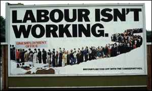
From The Guardian:
“The Conservative party’s 1978 poster of a snaking line of people queuing for the unemployment office under the slogan ‘Labour isn’t working’ has been voted the poster advertisement of the century [by the trade magazine Campaign].
Created by the Saatchi brothers, the poster is cited as instrumental in the downfall of James Callaghan’s Labour administration in the 1979 election and the rise of Margaret Thatcher, partly because he rose to the jibe and complained [about the poster in Parliament]. It also marked a sea-change in political advertising as, aiming at traditional Labour supporters who feared for their jobs, it was the first to adopt the aggressive marketing tactics which characterise modern elections.
The BBC has a story on the background of the Labour poster and how the photo was faked.
“News that people in the advert were ‘actors’ and not genuinely unemployed had leaked and Healed said the Conservatives were dishonest, reaching a new low by ‘selling politics like soap-powder’.
But Labour politicians were not hawk-eyed enough to spot that the basic ‘deceit’ was compounded by using the same few people over and over. Walsh had ensured that the volunteers’ faces were out of focus and could not be recognised.
Since then the tactic of putting up a deliberately controversial poster on a few bill-boards - and then reaping millions of pounds of free publicity as TV and newspapers report the fuss has become a standard and cost-effective tactic for advertisers.
When the election was delayed until the spring of 1979 the Saatchis brought out a second version of the poster with the legend ‘Labour still isn’t working’.
After the election Lord Thorneycroft, Tory party treasurer at the time, claimed that the poster had ‘won the election for the Conservatives’.”
Found via coudal partners.
Subvertise!
“This shared web-gallery of radical arts exists to document, develop and promote the artform of the post-corporate millennium - subvertising.
Subvertising is the Art of Cultural resistance. It is the ‘writing on the wall’, the sticker on the lamppost, the corrected rewording of Billboards, the spoof T-shirt; but it is also the mass act of defiance of a street party. The key process involves redefining or even reclaiming our environment from the corporate beast. Subvertising is allot like good modern art - they both involve finding idiots with too much power and wealth, and taxing them.”
A mixed collection of images from corporate logos to propaganda posters on issues from Animal Rights to War & Peace. Most of the images are “CopyLeft” or “Anti-Copyrighted.”
“CopyLeft means copyright except for non-profit making initiatives/organizations where the it is used to positively portray what it set out to do. If you are not sure what it originally set out to do you must ask its creator. This means that you can use the (graphics, article etc.) If you are not making money out or it and do not have the intention of doing go. If you are you must get permission from the creator to use it. This is a slightly reduced form of anti-copywrite.”
The concept resembles the more developed idea of Copyleft put forward by the Free Software Foundation. On the other hand:
“Anti-Copyright means use freely for whatever you want, and comes from the perspective that copyright should not exist at all or that there is no need to copyright the information/image as you wish it to be distributed freely and reused.”
Got any images to contribute?
Cuban Links
“Cuba has a long tradition of producing unique and powerful posters. After the revolution in 1959, posters took on a vital social role in promoting the wide range of issues facing a small country struggling for self-determination and identity. Three agencies emerged as the primary producers of an enormous output of visual material - OSPAAAL, the Organization in Solidarity with the People of Asia, Africa, and Latin America; ICAIC, the Cuban film industry, and Editora Politica, which was the publishing department of the Cuban Communist Party.”
From the Cuba Poster Project, a collaboration between the National Library of Cuba and the Bancroft Library at the University of California, Berkeley to catalogue, preserve, digitize, and exhibit printed material from Cuba. This essay on the history of Cuban poster art touches on OSPAAAL and its distribution of posters as a means of international solidarity:
“Among its many activities has been the publication of Tricontinental magazine since 1967. At its peak its circulation was 30,000 copies, produced in 4 different languages and mailed to 87 countries. Included in most issues were folded-up solidarity posters, thus establishing the most effective international poster distribution system in the world.”
Images:
- A huge collection of OSPAAAL posters organized by region.
- Posters for sale, organized by artist
- Another collection of OSPAAAL posters for sale
- A small collection from the International Institute of Social History in Amsterdam, with short bios of some of the artists.
- Posters of Cuban Cinema
La Lutte Continue
“The posters produced by the ATELIER POPULAIRE are weapons in the service of the struggle and are an inseparable part of it. Their rightful place is in the centers of conflict, that is to say, in the streets and on the walls of the Factories. To use them for decorative purposes, to display them in bourgeois places of culture or to consider them as objects of aesthetic interest is to impair both their function and their effect. This is why the ATELIER POPULAIRE has always refused to put them on sale. Even to keep them as historical evidence of a certain stage in the struggle is a betrayal, for the struggle itself is of such primary importance that the position of an ‘outside’ observer is a fiction which inevitably plays into the hands of the Ruling Class. That is why these works should not be taken as the final outcome of an experience, but as an inducement for finding, though contact with the masses, new levels of action, both on the cultural and the political plane.”
Statement by the Atelier Populaire, Paris, 1968.
Posters and Japanese Social Movements
The Ohara Institute for Social Research at Hosei University has an enormous collection of 20th century Japanese poster and propaganda art online: 2600 posters from before 1945, 400 posters of labor and social movements in the post-1945 period, posters and handbills from the 1930’s and an essay on the virbant history of the Japanese social movements between the two World Wars.
Found via coudal partners
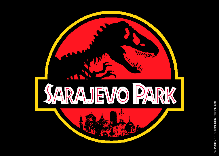
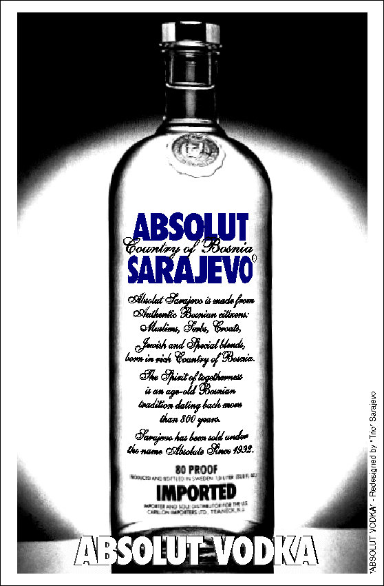
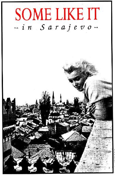
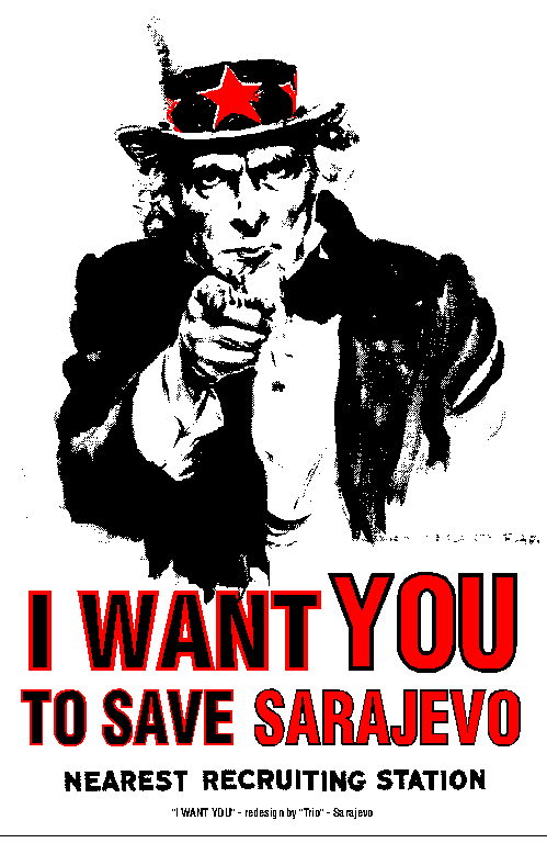
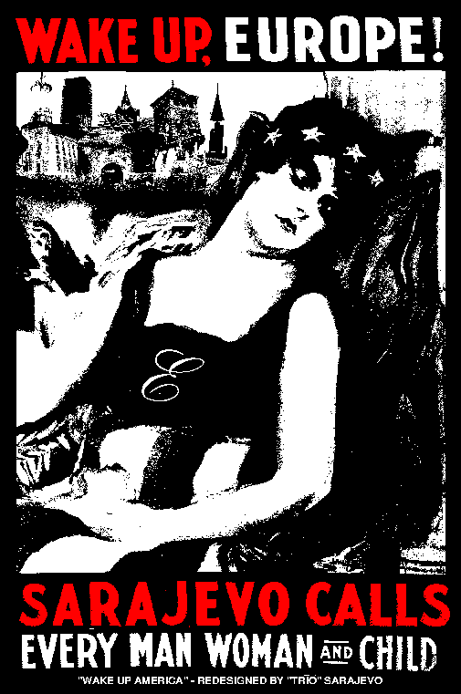
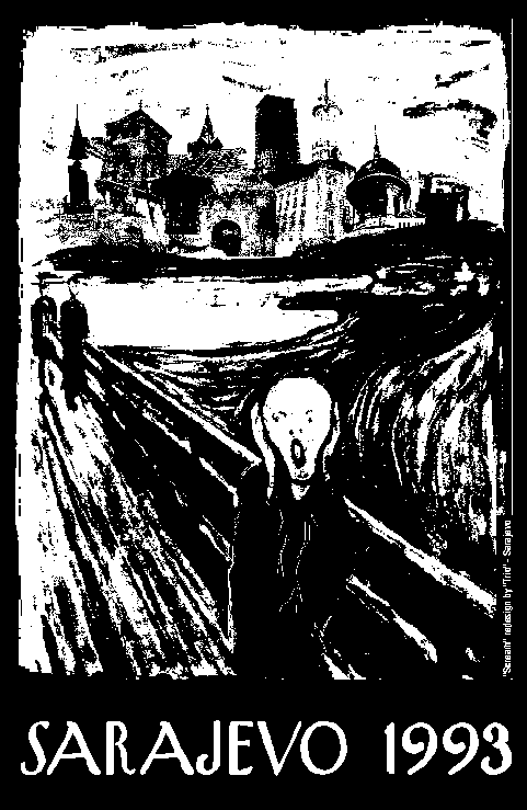
Enjoy Sara-jevo
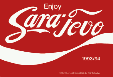
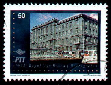
In 1985, three graduates from the Sarajevo faculty of fine arts formed the design team TRIO Sarajevo. The group created designs for bands, theatre companies and art and culture-based magazines.
“In April 1992 the Bosnian war began, and Sarajevo was besieged. Despite the obvious hardships of life in a city under siege for two and a half years, and although they had many opportunities to continue work outside Bosnia-Herzegovina, TRIO opted to remain in Sarajevo throughout the war. Faced with a market suddenly reduced to a 3km wide stretch of a city under siege, TRIO have nonetheless continued to earn a living as commercial designers, receiving payment for their work in food, cigarettes and (occasionally) small amounts of money. During the war TRIO have managed to assemble a computerised design office put together from various components which were borrowed or begged from friends and colleagues in Sarajevo.... In addition to their regular work, TRIO have also invested a great deal of time putting together a collection of graphic art aimed at raising awareness of the plight of their city throughout Europe. The work which has made them famous in western capitals is based on a series of reworkings of well-known advertising and pop-art images, such as the logos for Speilberg’s Jurassic Park, Coca-Cola, Absolut Vodka, Warhol’s famous Campbell’s Soup, and satirical adaptations of famous posters, such as Monroe’s Some Like it Hot, Your Country Needs You, Wake Up America!, Munch’s Scream, and many more.”
From The Design Group - TRIO SARAJEVO. The visual formula is direct and simplistic, but according to “Ironic Postcards from a City at War” the intent is to inject notice of the crisis into Western pop culture, to attach new associations to strongly recognized brands. My favorite is not one that uses the commercial brands, it is the stamp the group designed in 1995 with an image of one of destroyed post office buildings:
Found via OpenDemocracy