

mapping
GIS and the City
On February 6th, 2004, Al Leidner, former head of New York City’s Department of Information Technology and Telecommunications GIS Program, spoke to members of GISMO about the future of geographic information systems in New York City.
A version of this program was originally presented to the Municipal Data Processing Council. I’ve combined my own notes below with those taken by James Labate.
The GIS Utility: Key Integration of IT
- GIS marries information technology with the science of geography.
- The value of information has become the center point of the industry: the quality, amount, and how integrated it is.
- The technology is there, but the data is lacking. The more combinable data is, the more valuable it becomes. To that effect, the “stove piping” of information is a massive problem.
- From Data to Wisdom: Increasing the value of data should be the goal of the GIS Community.
- The “Where Field” - Geography as an ancient science vs. IT as a new industry. GIS people need to bring geography to IT people.
- We’re still in the early stages of understanding the integration of data. But all data is spatially enabled and therefore can be combined. For example, an automated mapping application can plot a database of 500,000 tree locations off of building and other feature locations.
- Five basic fields on NYCmap, the City government-maintained basemap, are: postal address, latitude and longitude, street segment, parcel, and building. These are all related and identified with a unique ID.
How Do We Create Value?
- With a “critical mass” of data support to NYCmap.
- The Department of Health used a “critical mass” of West Nile identifiers (e.g. infected birds) to created a predictive model of West Nile Disease. (A series of maps were shown depicting the spread of the virus.) Using the maps, they could quickly spray selected areas. Human cases are preempted. Predict death and stop it. GIS can save lives.
- In 9/11, the NYC Office of Emergency Management lost its office and data when the towers collapsed. Responders to the disaster needed combinations of data. GISMO volunteers and others provided data to responders from an ad-hoc office at Pier 92. Speed and ability to deal with complex interactions were key features.
- City’s 311 non-emergency hotline uses a GIS engine which geocodes all data that is taken in. With this, can look for patterns and trends in neighborhoods. (Do trash dumping complaints predict a rise in crime?) The City recently mapped cell phone outages using survey info from 311 and the DoITT Web site.
- My Neighborhood Statistics at nyc.gov, and CMAP’s myCiti expand the knowledge of GIS among non-GIS professionals.
- 40 City, 35 State Agencies create knowledge from GIS data. (See notes on Al’s GIS Coordination Program).
New Developments
- Massive sewer and water system mapping project underway.
- Dept. of City Planning releases geosupport desktop application.
- COGIS - developing better property tax lot outlines.
- Homeland security driving Federal, Local GIS integration.
- FDNY, EMS, NYPD integrating exchange of data for emergency response, sharing with State, FBI.
- Modeling building and subway systems for emergency response. 468 stations in MTA. PATH and Amtrak next.
- Aerial photos, from Pictometry, show all sides of every building in NYC. Free to City agencies.
Opposing the Future - Roadblocks to Progress
- Underfunded IT and GIS.
- Little understanding of the transformative process of IT.
- Contempt for Planning - Outmoded stereotyping.
Cultural Evolution
- What are the combinations of data across service and agency barriers that produce results?
- What are the analytic and predictive tools that can do it?
- Combine all capital projects - see where there are synergies, opportunities to overcome problems.
Benefits
- Revenue: better use of geography will create a higher level of billing accuracy, increasing City revenues.
Public Safety
- Develop an integrated 911. Fire Dept. and Police should be working off the best geocoding system possible to improve response time, plot fastest routes to sites.
- CompSTAT - Police Dept. Application - GIS saving lives. Info and analysis brought together with new way of organizing. (See this BBC article on mapping crime.)
- Hazardous materials and combustibles: combination of previously uncombined data to give firefighters more information before entering a building.
Predictions
- Every City agency will have GIS. Wireless connections to data applications from sites.
- 500% staffing increase in City GIS Personnel.
- Federal Govt. will need and seek out state and local data as it is more accurate and of a higher quality.
- Spatially enabled information will be the foundation of a 35% increase in productivity and 2% increase in revenues.
- All City strategic data will be available and the increase of shared valuable information will increase social cohesion and collaboration.
- Construction time will be reduced 10% and construction costs reduced 5%.
- Predictive models will reduce violent crime by another 50%.
Al noted that more and more City data is available online, though many in audience noted felt that the City does not share enough of its data. NYCMap is not available to the public for “security reasons,” but is licensed to a couple of Universities and corporations under strict terms.
See also “City Governments Map Trends” from Wired, February 1, 2004, and this 2002 interview with Al about GIS and the emergency response on September 11, 2001.
Mapping Feedback
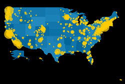 As far as centrally-coordinated online campaigns go, one technique I’ve particularly admired about MoveOn’s organizing is the way the coordinators gather feedback and circulate it back to the participants of a given action. Participants around the world can read about of what others are doing, and get a sense of the impact and scale of the action. Too many organizations simply fail to ask who is taking offline action. And many send out endless streams of urgent action alerts with little, if any, follow-up.
Usually MoveOn’s updates arrive as the text of an email, but this Flash driven map does the job visually and interactively. The map effectively presents both the macro and micro views of the many house parties organized across the U.S. on December 7, 2003 to view the documentary Uncovered: The Whole Truth about the Iraq War.
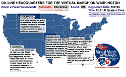 Despite the initial written instructions, the interface could be made a little more intuitive by giving shapes of the states some kind of rollover behavior.
Still, I find it more informative than MoveOn’s previous action map. This map of the February 26, 2003 phone-in rotates the display of only one tesimony per state. Instead of plotting data the map paints a more atmospheric picture of the plurality of voices and the outrage that rained upon the Capitol that day. The geographic shapes only provide a general spatial context to the ticking clock and growing tally of calls.
Between the two is a world map of candle light vigils organized on March 16, 2003. The map displays testimonies, photos, and the sites of vigils, but the user is unable to draw any actual numbers from it, only impressions. The zoom effect is gorgeous, but the testimonies quickly overwhelm, like hundreds of little pop-up windows you’re unable to move or close.
The maps were all designed and programmed by Stamen Design in San Francisco.
...
See also this Jully 2004 item about Stamen Design’s live, interactive conference call map.
Nonprofit Online Mapping in New York City
Steven Romalewski sends this growing list of nonprofit online mapping Web sites in New York City:
“We’ve noticed a kind of a critical mass of these mapping and data services recently.
 Most of these have been created by my project, NYPIRG’s Community Mapping Assistance Project (a team of six people, part of a nonprofit organization, that uses GIS to help other nonprofits achieve their missions). They’re all part and parcel of an effort to ‘democratize’ data and provide powerful new tools with a community-based focus. Each site uses GIS technologies that few other nonprofits have tapped into, but that government agencies and the private sector have used to great effect. The websites use government data in in new and innovative ways, often to provide services that most government agencies would never provide. And they give local neighborhoods and individuals a window on their world that would’ve been daunting, at best, and maybe impossible for the average citizen or block association to obtain. The sites have helped level the ‘playing field’ in New York to a great extent, so public agencies and large companies don’t have a monopoly on information.
Here are the links:
- http://www.MyCITI.org — the Community Information Technology Initiative (CITI) website that puts mapping tools in the hands of New York City’s local planning boards, in a way that they can avoid the need to spend limited resources and duplication if all 59 boards had to buy the software and invest in the data creation themselves;
- http://www.oasisnyc.net — a wealth of information about parks, wetlands, gardens, and other open spaces across New York, reaching across all levels of government and developed for all different aspects of the city’s ‘greening community’. This site was spearheaded and funded by the US Forest Service, and involves a steering committee of more than 40 nonprofits, government agencies, academics, and businesses;
- http://www.nonprofitmaps.org/netmaps/bedc/bedc.htm — the Brooklyn Economic Development Corp’s. ‘Destination Brooklyn’ service that offers detailed real estate and demographic information for every property and neighborhood in Brooklyn, geared toward small business owners and community development organizations;
- http://www.straphangers.org/cmap.php — the Straphangers Campaign’s ‘Get Where You’re Going’ site, providing precise location information about the subway stops closest to any street address in NYC (which the MTA’s maps can’t do, since they’re geographically distorted to fit on a printed page);
- http://www.MyGovernmentNYC.org — allows anyone with a New York City address to easily find and contact the public officials who represent them at all levels of government, and is used by thousands of people each month, regularly praising it for its simplicity and comprehensiveness;
- http://www.nonprofitmaps.org/netmaps/lac/lac.htm — how to locate family literacy programs based on a survey by the Literacy Assistance Center, mapped by category, borough, or ZIP Code. The site also shows nearby subway stops and public libraries;
- http://www.nonprofitmaps.org/nycnonprofits — the NYC Nonprofits Project Service Atlas. It extends a 3-year study of the nonprofit sector that was released in June 2002, by enabling you to locate any of more than 6,000 nonprofit groups in the city by ZIP Code, neighborhood, Community Board, or City Council district. Groups are listed in 17 major categories and lots of sub-categories. CMAP created the Atlas for the Nonprofits Project; and
- http://www.LowerManhattanMap.com — helping with the recovery and rebuilding efforts of lower Manhattan small businesses, tourist destinations, and cultural organizations. The site includes information maintained by 3 business improvement districts on almost 2,000 local businesses, retail stores, restaurants, community services, cultural sites, and tourist attractions.”
First Nations, Mapping
In an article for Wired News on activists using of video and imaging, Julia Scheeres notes:
“Around the globe, indigenous tribes are mapping their ancestral land boundaries using global satellite positioning systems to guard against depredations by local governments and private companies.”
The article points to the Aboriginal Mapping Network:
 “A collection of resource pages for First Nation mappers who are looking for answers to common questions regarding mapping, information management and GIS. It is a network where First Nation mappers can learn about what other native mappers are doing, and share their own experiences throughout the aboriginal community. The AMN has a British Columbia focus, but is not limited to this geographic region. It is intended to be used by any group who is active in aboriginal mapping, from the introductory level, to the advanced. It is a source for both technical information on GIS mapping, to general information relevant to decision makers.”
The main areas of activity are:
- The Web site and electronic newsletter with information on data sources, training resources, funding, and news.
- Publication of resources and “best practices.”
- Informal roundtable workshops and the annual international GIS conference where First Nations organize and present mapping issues on First Nations terms.
The site’s extensive gallery hosts maps illustrating traditional territories, current boundaries, boundary disputes, traditional place names, environmental classifications, and cultural and ethnographic data — including some from pre-contact eras. Some good links, too, pointing to other sites with maps and mapping resources by and for Aboriginal peoples.
In June, the International Forum on Globalization’s Indigenous Peoples and Globalization program published a map depicting the negative impacts of economic globalization on indigenous peoples.
For another overview of the AMN, see Benjamin David Johnson’s 1999 thesis, The Aboriginal Mapping Network: A Case Study In The Democratization of Mapping:
“Critical mapping theory suggests that maps are subjective documents that implicitly but powerfully articulate the agenda of the culture that created them... Further, the interests portrayed on conventional maps are almost exclusively those of the dominant groups in society. It will be argued in this thesis that the Aboriginal Mapping Network provides a means to develop mapping skills in First Nations communities, therefore leading to the creation of maps that convey alternative visions of reality. These maps can be used in the planning process to counterbalance what John Forester (1989) would suggest is the ‘misinformation’ inherent in conventional maps....
Capacity building in GIS technology, it is argued, will allow First Nations to produce unconventional maps that articulate local worldviews and perceptions of place. As embodiments of local knowledge, these maps will in turn be used in planning, negotiations and governance to empower First Nations on their own terms.”
Design against Corruption
Let’s say the president of your country is corrupt. Let’s just say.
 The legislature is corrupt. The court system, police, and military are all corrupt. The city officials? The big businesses? They’re corrupt, too.
They misuse their power. They thrive on favoritism and get rich on kickbacks while the rest the country slowly starves. What do you do?
Replacing one individual with another doesn’t change the broader system or take away any of the incentives for corruption.
So how do you reduce corruption throughout a given system?
Transparency International is a network of independent national chapters that work to curb “both the supply and demand of corruption.”
Some of the strategies they use are described in their annual Corruption Fighters’ Tool Kit. The manual is just one of the ways the TI chapters share ideas with each other and offer their experience to the world at large. In addition to the hard work of organizing and building coalitions, many of the corruption-reducing strategies incorporate graphic and interactive design. Some of them include:
- Awareness Raising - TI Korea produced posters, videos, and CD-ROMs to disseminate information about the effects of corruption and local initiatives against it. TI Morocco indexed, cataloged, and analyzed incidents of corruption that appeared in the media, published their findings and will soon make this database accessible online. As part of its campaign to promote access to information in Romania and the Federal Republic of Yugoslavia, TI Romania produced and actively updated a Web site on the issue, printed a pocket guide to inform citizens about their rights, and designed posters and flyers with their Serbian partner organization to promote the idea of free access to public information and raise public awareness about the project. The posters were printed in Romanian and Serbian and distributed through an international network of NGOs and local government offices.
 Monitoring Election Campaigns - TI Chile developed and distributed a report card to tabulate the quantity, subject, and context of media coverage devoted to each candidate. They distributed their analysis and data on CD-ROM.
- Opening Processes - Activists in Lebanon determined that construction was the most corrupt sector in the country and designed a manual on how to acquire a construction permit, “one of the most difficult bureaucratic transactions in the Lebanese administration.” In response to the government’s lack of reliable information on the process of public procurement, TI Ecuador created an Web site to inform the public (and the private sector), make government forms available, display past and current bidding processes, and host a forum for discussion and analysis.
- Implementing Diagnostics - TI chapters in Bangladesh, Kenya, and Japan developed surveys and metrics for corruption in government and the private sector that they then published locally. TI Lithuania created a database of institutional and geographic aspects of corruption and published a “Map of Corruption” as a foundation for future campaign work.
Mapping the State of the World
Myriad Editions specializes in one type of book: thematic atlases on economic, political, and social trends. The State of the World thematic atlases are full of maps, tables, cartograms, and other infographics that make global issues accessible at a glance.
The first State of The World Atlas was published in 1981 by Pluto Press. It was co-edited by Ronald Segal and Michael Kidron, until his death in March 2003. The book can be seen as part of his attempt to understand and write about capitalism on a global scale. The War Atlas followed in 1983.
Myriad’s list of titles includes:
- The State of the World Atlas (now in its 7th edition)
- The Atlas of War and Peace
- Atlas of Women in the World
- The State of Religion Atlas
- The State of the Environment Atlas
- The Atlas of Endangered Species
- The Atlas of Food
- The State of Health Atlas
- The Atlas of Human Sexual Behavior
- The Tobacco Atlas
- The Penguin Atlas of Media and Information
- and The Atlas of the Future
Individual countries atlases have been published on China, the USA, Germany, and France.
Coming soon: The Water Atlas and Atlas of the Middle East.
See some sample maps and their project for UNICEF illustrating the state of the world’s children.
They’ve done a couple of interactive, online maps for other organizations, too.
Mapping the Apocalypse
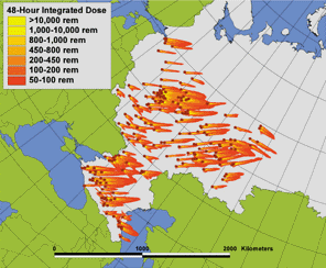
From the Bulletin of Atomic Scientists, July/August 2001:
“You might think that a senior U.S. senator — let’s say the ranking member of the Senate Intelligence Committee — would be able to get straight answers about the [Single Integrated Operational Plan, or SIOP]. But that wasn’t the case when Sen. Bob Kerrey of Nebraska asked for details about the targeting plan. Congress and the president are tasked by the Constitution with a vital role in determining national security policy, ‘but how can we provide the policy guidance that is needed,’ the former senator asked last October in a letter to then-Defense Secretary William Cohen, ‘if we are not given the information we need to decide if our current course of action is the correct one?’
Specifically, Kerrey wanted a peek at the SIOP, which directs how U.S. nuclear forces will be used in any number of crises. One might assume it includes targets, population figures, force numbers, weapon specs, and so forth. But that would be a guess, since nobody outside a small military circle has seen it.
What started Kerrey and other members of the Senate Democratic Caucus on their quest for information was the Joint Chiefs’ claim that the United States could not realistically reduce its number of nuclear warheads below 2,500. They asked: Why that magical number and not some other number? But their questions went unanswered....
‘Anyone who has been doing research in this area has to look at the war plan, the SIOP,’ said [Natural Resources Defense Council] Senior Staff Analyst Robert S. Norris. At an early point in the project, it dawned on him that the difficulty experts have with discussing lower numbers of nuclear weapons was directly related to the war plan itself. If you have a certain number of targets, the plan has to have a corresponding number of warheads to deal with them.... As the project progressed, Norris said they began to hope that they could use the model to show how a smaller number of nuclear weapons — a much smaller number — could be as effective a deterrent as the more than 10,000 we have today.
But rather than pulling some magic number out of a hat, NRDC ran a series of specific scenarios with their program — three of which are published in their report, ‘The U.S. Nuclear War Plan: A Time for Change’ — which allowed them to generate the pictures and maps that illustrate the outcomes visually.
‘We couldn’t have done this 10 years ago,’ Norris said. ‘Advances in satellite imagery and computers, greater information about Russia in general, and increased access to information have made it possible. We hope people can use this program to reflect more deeply about the SIOP problem, and we want to show how the SIOP prevented progress [in arms reductions] during the Clinton administration. Our goal is to change the circumstances that will allow us to live in a safer world.’...
In the earliest days of the Cold War, the United States mainly targeted large cities. But as the number of missiles grew, it eventually had enough warheads to target individual Soviet weapons and bases, and military targeteers took the position that a strategy targeting weapons and not people — counterforce — was more ‘moral.’
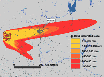 Just one problem. If you lob enough nukes to take out the Kozelsk missile fields more than 200 kilometers west of Moscow (to use one of the examples detailed in the NRDC report), you’re incidentally going to kill millions of people. So while counterforce doesn’t target people, per se, millions of civilians are still at risk.
‘After we did our analysis,’ Cochran said, ‘it raised some interesting issues about countervalue versus counterforce. For example, if you can hold at risk one-third of Russia’s population with a single submarine, you can go to very deep reductions without feeling naked in the absence of your deterrent capability.’
So when talking about the morality of any nuclear targeting strategy one thing quickly becomes clear: It’s all horrific. NRDC takes the extra step of presenting these scenarios graphically so the public, and not just experts, can understand the results....
According to Bruce Blair, while there are many models of strategic nuclear exchanges, they don’t take the step that the NRDC model has taken to provide graphic representations of targets and the consequences of an attack that you can appreciate visually. By putting a human face onto an abstraction, NRDC’s model helps people ‘understand the war plan and its consequences. Then they can decide for themselves if it represents proof of certain views,’ he said. ‘It is an important advance in both our ability to grasp the war plan and its consequences, because it converts abstraction into graphic consequences. And that’s very important, just to be able to see all those red dots on the map.’
Most strategic exchange models produce only numbers, not maps and graphic representations, Blair explained. The NRDC model ‘is the first one that’s in circulation in the arms control community that does this. It’s a flexible model that allows us to jigger the assumptions and test our hunches about alternative war plans.’
The impact on policy-makers could be profound, he noted. To see the plan unfold and the casualty numbers mount using a reliable model could give people a fuller grasp of the issue.
And armed with this kind of knowledge, Blair says, policy-makers could start demanding to learn more about the actual war plan, ‘to expose it to the light of day, at least within the vaults of Congress,’ and to push for reform and reduction....
For example, one of the striking calculations that Senator Kerrey noticed when he saw a demonstration of the NRDC program was the number of casualties that can be caused by a single Trident submarine firing its load at a Russian civilian population. Even though this is no longer how the United States targets its missiles, he could see that if the object was to kill people, one Trident submarine could kill more than 40 million. ‘That’s a striking result,’ Blair said. ‘And then you can pursue other variations that are interesting questions. It’s just a very practical, convenient, expedient tool — one that is as refined as it needs to be — to expose the many facets of nuclear targeting. It just reveals information, and there’s no real counter to it. There’s no antidote to the truth.’
 Janne Nolan hopes that the NRDC model will also be used by journalists, who often find the intricacies of nuclear targeting beyond their scope. She points out that if you look at the period of time spanning START I and START II, military planners have gone from an ‘absolute’ requirement for 6,700 weapons down to 4,500, then to 3,500, and now 2,500. ‘And very few reporters ask where these numbers come from and what they mean,’ she said. ‘The assumptions that guide the calculations of how many weapons you need on target haven’t been subject to any systematic policy oversight for decades.’...
Cochran believes the interactivity of their model will distinguish their project from the many other policy projects out there. He also believes that if they can replicate closely what Stratcom is doing, people will pay attention. ‘There’s a zillion people putting out policy papers that just stack up on your bookshelf,’ he says. Early on, NRDC established credibility in the arms control community by publishing its series of Nuclear Weapons Databooks, which detailed force numbers in way that had never before been revealed. ‘Until you pry open the secrecy it can be very hard to prevail in these arms control debates. This is the last big secret. We want to expose Stratcom’s calculations and numbers so the public and Congress can understand the war plan and its implications.’
They also hope their work will force the government and arms controllers to defend their numbers, so that if someone says the United States needs 1,000 warheads, they’re forced to back it up, especially when talking about a modern-day Russia that has seen a sharp decline in its military infrastructure. For example, Cochran asked, ‘Why do we still have to take out a war industry when it’s collapsed of its own accord?...’
In the end, Cochran wants the United States to treat Russia just like any other country and eliminate the day-to-day SIOP operations that keep U.S. missiles poised for a nuclear first strike. ‘We’re saying take a grand leap to get out of this counterforce mode — even in the interim — and see if the other side matches.’”
Repurposing Payphones
The Washington Post reports on the demise of the payphone:
“In Washington, as in other parts of the country, pay phones are disappearing from the landscape. The number of them across the country has dwindled from a high of 2.7 million in the mid-1990s to about 1.9 million now, supplanted by the more personal wireless phones that fit in a pocket. The small companies that maintain them are pulling out of the business. Even at the higher price of 50 cents a call, many phones run at a deficit — it costs more to clean, maintain and service them — so people like [technician Andres] Castro are yanking them from their sockets, cutting the lines, and pulling them from shopping centers, gasoline stations, restaurants and street corners where they used to turn a booming profit.”
The Globe and Mail reports that instead of dismantling its pay phones, Bell Canada has started adding WiFi capabilities:
“Aimed at business customers, the service is free until late March and available at several sites in Montreal, Kingston, Ont., and Toronto. The project will also include service at Air Canada airport lounges in Calgary, Montreal, Toronto and elsewhere. The pilot project is intended to measure how customers use the service and how much to charge for it, although some observers wonder if service providers will be able to make much money from so-called wireless fidelity or wi-fi hot spots. For Bell’s hot-spot trial, it’s mostly setting up wi-fi nodes where it has payphones, effectively ‘reinventing’ the payphone business.”
In the United States, massive amounts of cash are being thrown at building a nationwide wireless infrastructure. Adding WiFi to payphones is picks up on an exisitng infrastructure. From Bell Canada’s press release:
“The plan calls for payphones in high traffic areas to be fitted with Wi-Fi technology; typical locations include airports, train stations, hotels, convention centers and corporate campuses.”
Adding WiFi to payphones would be a good way of brining WiFi to underserved neighborhoods — the same neighborhoods that rely on pay phones rather than cell phones.
From the Post again:
“It is much easier — and cheaper — to dial from a cell phone for customers who can afford one. However, pay phones are still profitable in the lowest-income areas of a city, said Terry Rainey, president of the American Public Communications Council Inc., an industry group representing independent pay phone operators around the country.
‘There are a great number of people in this country without a phone,’ Rainey said — 4 and 5 percent, which is more than the 1 or 2 percent of the U.S. population that lacks television sets.
‘Some lower-income areas rely on [pay phones] for regular communications, as well as, in some cases, emergency calls,’ said Mason Harris, president of Robin Technologies and of the Atlantic Payphone Association.”
Compare this map of median household income from the 1990 U.S. Census with this 2002 map of WiFi hotspots in Manhattan. From the Public Internet Project:
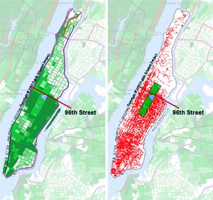
Click here for a larger version.
Update: On May 10, 2003, the New Jersey Star-Ledger reported that Verizon plans to put WiFi transmitters in pay phones across New York City. No mention of how much it will cost to use.
Also of note is this May 5 article from the International Herald Tribune which describes plans by the city of Paris to build a WiFi network along the subway system. Two or three antennas could be places outside each of Paris’s 372 Metro stations.
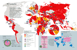
Incarcerated America
“More than two million men and women are now behind bars in the United States. The country that holds itself out as the ‘land of freedom’ incarcerates a higher percentage of its people than any other country....
Perhaps the single greatest force behind the growth of the prison population has been the national ‘war on drugs.’ The number of incarcerated drug offenders has increased twelvefold since 1980. In 2000, 22 percent of those in federal and state prisons were convicted on drug charges.
Even more troubling than the absolute number of persons in jail or prison is the extent to which those men and women are African-American. Although blacks account for only 12 percent of the U.S. population, 44 percent of all prisoners in the United States are black.
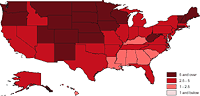 Census data for 2000, which included a count of the number and race of all individuals incarcerated in the United States, reveals the dramatic racial disproportion of the incarcerated population in each state: the proportion of blacks in prison populations exceeds the proportion among state residents in every single state. In twenty states, the percent of blacks incarcerated is at least five times greater than their share of resident population.”
Some experiments with GIS turned into a redesign of this Human Rights Watch backgrounder. Interesting to note the regional clusters that emerged from dumping various metrics into a spatial layout. Download the PDF here (192 Kb).
Routing
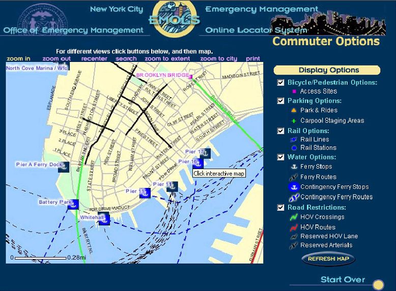 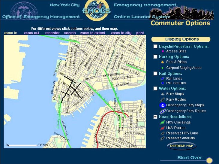 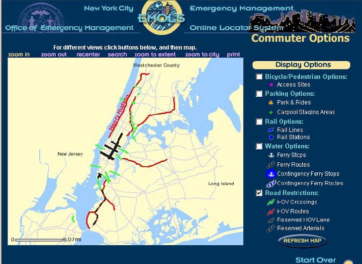 Click for a full size view. |
“New York City averted a public transit strike recently, saving commuters and residents a metropolitan-size headache of getting around. But if it had come to that, the city was ready to help idle people find their way.
A week before the scheduled strike, the city’s Office of Emergency Management, the Department of Information Technology and Telecommunications, and Frankfort, Ky.-based PlanGraphics Inc. designed and developed an interactive online map that enabled users to view various alternative transportation options and vehicular restrictions.
The application, which took about a half-day to design and a week to develop, was activated from Friday evening, Dec. 13, to Monday noon, Dec. 16, the deadline for the strike, said Mike Wiley, a project manager for PlanGraphics in New York City. During that time, users viewed more than 70,000 custom maps with a peak of about 6,000 maps served up Sunday evening. Although the application was subsequently deactivated, it’s available should a similar situation occur in the future.
The system can highlight bicycle and pedestrian access sites, carpool staging areas, rail lines and stations, ferry stops and routes, including contingencies, as well as carpool-only routes and other road restrictions.
The application is based on the city’s Emergency Management Online Locator System, which allows New Yorkers to find hurricane evacuation routes or cooling centers during a heat wave.
PlanGraphics, which has a seven-year working relationship with the city, also helped develop an online map of the area around the World Trade Center shortly after the Sept. 11, 2001, terrorist attacks. Sometimes twice daily, the company or the city would update what areas were accessible by motor vehicles or pedestrians in the area and provide other information.
The company is also planning to update the city’s “My Neighborhood Statistics” application, which allows users to view 14 selected performance statistics about their community, such as air and noise complaints, structural fires, infant mortality, clean sidewalks, felonies and certified teachers. By the end of January, the system, which went live in September 2002, will show 80 different metrics.
The city also recently awarded PlanGraphics a three-year, $15.4 million contract to continue to develop and upgrade the city’s GIS data repository, and provide greater access as well as more customized applications for the public and city agencies.”
Other non-interactive maps were posted, but the site vanished from the Web as quickly as it was posted.
MapQuest has driving instructions, Staphangers .org used to have a working subway route finder, and the Department of Transportation has PDF of NYC bicycle routes, but I’ve not found anything that ties together NYC’s many transportation alternatives into one online application.
In a struggle that shook the City, the Transport Workers Union stood up to the Mayor’s intimidation and successfully fought cuts. They also pushed the City into developing the most comprehensive New York City route finder I’ve seen. The screen shots I found indicate that the target audience were those who work in lower Manhattan and Wall Street, but such a tool would be useful for everyone — and would indicate which neighborhoods are underserved. I hope they put it back online, with subway and bus info added.
Update, 9/12/2003: The lack of a integrated route finding system in NYC has prompted one New York City resident to build his own. It needs work, but integrates bus and subway connections quite nicely.