

unions
Workers of the World Play Ball
The International Institute of Social History in The Netherlands has a brief text, a few posters, and a couple of photos from the Labour Olympiads, an counterevent to the Olympics between World War I and II:
“In the twenties, the Olympic games got their counterpart within the labour movement. Labour Olympiads took place in Frankfurt, Vienna and Antwerp. Workers played soccer, practised gymnastics and ran for world peace instead of the national honour.
As a result of the struggle for the 8 hour working day, workers had time for sport. Already in the beginning of the 20th century workers participated in games with comrades in neighbouring countries. Massive labour sport unions were founded in Germany, Austria, Czechoslovakia, Belgium and France. They strove to educate workers both physically and spiritually.
The Labour Olympiads, organised by the Socialist Workers’ Sport International (SASI), fit well with these ideals. Against the normal Olympic games, marked as ‘a war between nations gained by sportive means’, stood the solidarity of comrades in sport. The labour sport unions disapproved of idols and records. At the labour games the anthem of the socialist international replaced the national anthem of the winning country. And only the red flag flew. Participation was more important than winning.”
Nothing Like the Sun
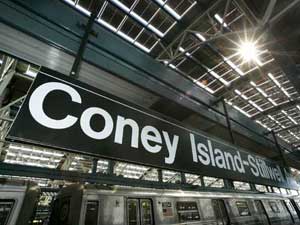
On October 28, Wired ran this bit on NYC’s new solar powered subway station:
“On a sunny day, 60,000 square feet of integrated solar paneling on its roof can generate 210 kilowatts of power, enough to meet two-thirds of the station’s energy requirements. The solar energy doesn’t run the trains, but is expected to contribute approximately 250,000 solar kilowatt hours per year to the station’s other energy needs — primarily lighting and air conditioning in the station and its attached offices and retail stores....
In addition to the Stillwell station, photovoltaic, or PV, cells help power a bus terminal and rail yard in Queens, as well as the Whitehall Ferry Terminal at the southern tip of Manhattan.”
OK, pretty cool. (But are we subsidizing those retail stores? Or are they paying the MTA for the juice?)
And of note is this little factoid:
“Total renovation costs approached $300 million, though it’s not clear how much of that came from expenses related to the solar roof.”
OK, pricey, but these things stick around a while. And of course, there’s the MTA’s $1 billion dollar surplus this year.
But it all puts into further context the MTA’s last minute demand that pushed the union to strike.
From today’s NY Times we learn that in the final minutes before the midnight deadline for negotations, the MTA changed their “final offer”, and pushed a demand to cut the wages of new workers by 4 percent. The plan would have the union win current benefits at the expense of future members (a classic tactic of employers negotiating with unions) and save less than $20 million over three years:
“less over the next three years than what the New York City Police Department will spend on extra overtime during the first two days of the strike.”
Carlos Cortez Presente!
From the Center for the Study of Political Graphics:
“Carlos Cortez was an extraordinary artist, poet, printmaker, photographer, songwriter and lifelong political activist. His mother was a German socialist pacifist, and his father was a Mexican Indian organizer for the Industrial Workers of the World (IWW), also known as the Wobblies. Carlos was a Wobblie until he died. He spent two years in prison for refusing to “shoot at fellow draftees” during World War II.
 After his release, Carlos took a series of jobs: in construction, in a small imported foods shop, in a chemical factory. He also started drawing cartoons in 1948 for the Industrial Worker, the IWW newspaper, but soon learned to do linoleum block prints.
‘Many radical papers—not having advertising, grants or angels who are rich radicals—operate on the brink of bankruptcy. So Industrial Worker couldn’t afford to make electric plates out of line drawings. I saw that one of the old-timers was doing linoleum blocks and sending them in because the paper was being printed on a flatbed press. I started doing the same thing, and each issue would have one of my linocuts.’
When the price of linoleum became too steep, Carlos started using wood. Used furniture was easy enough to find in any alley. ‘There’s a work of art waiting to be liberated inside every chunk of wood. I’m paying homage to the tree that was chopped down by making this piece of wood communicate something.’ Carlos later became an accomplished oil and acrylic painter, though he always preferred the woodcuts because they were reproducible and affordable.
When the Industrial Worker switched to offset in the 1960s, Carlos began drawing pen-and-ink cartoons. He has also served as editor of the newspaper and on the union’s General Executive Board, and was one of the IWW’s most popular public speakers. In 1985, to commemorate the union’s 80th anniversary, he organized an important exhibition, ‘Wobbly: 80 Years of Rebel Art,’ featuring original works by many IWW cartoonists. Carlos was probably the only IWW artist whose work was exhibited at the Museum of Modern Art in New York. His art is exhibited throughout the United States, Europe and Mexico.
In the 1960s, Carlos married Marianna Drogitis, and in 1965 they moved to Chicago where he became involved with the local Mexican and Chicano mural movement.
‘I’ve always identified myself as a Mexican. I guess this was a result of my early years in grammar school. Even though I resembled my German mother more than my Mexican father, being the only Mexican in a school full of whites made me mighty soon realize who I was. But it was my German mother who started my Mexican consciousness. She said, “Son, don’t let the children at school call you a foreigner. Through your father you are Indian, and that makes you more American than any of them.”’
Inspired above all by the work of José Guadalupe Posada, printmaker of the Mexican Revolution, and the German expressionist Käthe Kollwitz, Carlos blends the techniques and styles of the German expressionists with themes from the ancient Aztecs and modern Chicanos. He made countless images support striking workers, from miners in Bolivia to farm workers in California, though he is best known for large linocut poster-portraits of activists and labor organizers such as Joe Hill, Ricardo Flores Magón, Lucy Parsons and Ben Fletcher.
‘After some 40 years of construction labor, record salesman, bookseller, factory stiff and janitor, I no longer punch a clock for some employer and have entered the most productive phase of my life where I do what I want to do and not what some employer wants me to do for him... As I keep working out ideas, I keep getting more ideas. So I’m going to go out kicking and screaming.’
He passed away last month in Chicago at age 81.
CSPG has posted a couple of images.
See also this interview and remembrance.
A Place to Live, Breathe, and Work
The Center for the Study of Political Graphics has posted three new online exhibitions of posters from their archives. The collections are organized thematically, around a dozen posters per theme, spanning several decades, countries, and struggles.
Notice the tiny “next” links at the bottom of some of the pages. They’re very easy to miss.
Earth, Wind & Solar
International Ecology Posters
From the site:
 “Global Warming. Arsenic in drinking water. Pesticide Poisoning. Environmental Racism. Nuclear Waste Disposal. Irradiated and Genetically Modified Food. The list is endless. Where pollution is concerned, the world is a global village where no continent, country, or neighborhood is safe. Multinational corporations’ insatiable need for new markets and greater profits consistently overrides environmental concerns, and few governments oppose them. But these posters convey an increasing sense of urgency, as international artists continue to use the power of graphics to organize a frontline of defense against rapidly escalating pollution.”
The posters are organized as follows:
- Early Environmental Awareness
- Global Warming
- Water Pollution
- Air Pollution
- Deforestation
- Pesticides And G.M.O.s
- Nuclear Power And Waste
- Environmental Disasters
- Environmental Racism
- Martyrs
- Green Alternatives
- Visions For The Future
We Shall Not Be Moved
International Graphics on Gentrification and Homelessness
From the site:
 “A missed paycheck, a health crisis, or an unpaid bill are all that separate many people from homelessness. As America’s income gap widens, renters worry if they can ever buy homes of their own—or keep their rentals through retirement. The lack of affordable housing is not just a U.S. problem. We Shall Not Be Moved uses domestic and international posters to show that homelessness and gentrification are major issues throughout the world—and from the U.S. to Europe to Australia, posters remain the resisters’ tools of choice. Posters announce demonstrations to oppose demolitions, support squatters’ rights to move into abandoned buildings, and organize tenants’ unions. They document victories, defeats, and ongoing confrontations. Posters both record these struggles, and are central to them. They show that victory does not happen overnight—it can take years—but it is possible to fight city hall and the developers and win.”
The posters are organized as follows:
- Introduction
- Development & Speculation
- Homelessness & Poverty
- Organizing Resistance
- War & Displacement
- Conclusion
Solidarity Forever!
Graphics of the International Labor Movement
From the site:
 “Organized labor has consistently produced more political graphics than any other domestic movement for social change. Labor posters are often produced in the midst of a strike or boycott and convey the urgency of the times. Others are commemoratives, marking the anniversary of a victory or a martyred labor leader. They remind viewers of a too often hidden history, rally against dangerous conditions in the workplace, and warn that such injustices still occur. Although many of the posters are historical, the issues are not. The eight-hour day is no longer sacrosanct. More and more children are entering the workforce. Pesticides threaten farm workers and consumers. Sweatshops are proliferating domestically and internationally. These graphic expressions of international solidarity are a powerful combination of art and politics, crossing borders of time and place.”
The posters are organized as follows:
Women Set Type!
Being a historical account of women in printing, publishing, and typographical compositing in these United States of America and Western Europe.
The text below is assembled from Unseen Hands, Women Printers, Binders & Book Designers (Princeton University Library, 2003), Women in Printing & Publishing in California, 1850-1940 (California Historical Society, 1998), and Epochal History of the International Typographical Union (I.T.U., 1925.) Other sources are indicated where used.
“Women have been involved in printing and the making of books ever since these crafts were first developed. Even before the advent of movable type, there was a strong tradition of women producing manuscripts in western European religious houses. In the Convent of San Jacopo di Ripoli in Florence, we find the first documented evidence, in 1476, of women working as printers. Girls and women were often trained by their fathers or husbands to assist in printing businesses, and there are many instances from the fifteenth to the eighteenth centuries of women taking over and managing these enterprises upon the early demise of their male relatives.... Many, certainly, only managed the business, while others were more directly involved. Estellina, wife of the printer Abraham Conant, proudly stated in a Hebrew book, Behinat `olam (Mantua, ca. 1477) that ‘she, together with one man, did the typesetting.’ [source]
In the 19th century, a limited number of occupations were open to women — teaching, needlework, domestic service, etc. Male-only unions ruled the printing business. Women, where employed at all, were relegated to certain low-paying jobs considered best suited for the weaker sex, such as dressing (polishing imperfections) from metal type, folding printed sheets, and sewing bindings. Yet there were exceptions — a few women were also employed in typesetting. Women who were widows or daughters of printers often learned typesetting out of necessity.
James Franklin, brother of Benjamin Franklin, taught something of the art to his two daughters prior to his death in 1835, and when he died he left his printing plan at Newport, R.I. to his widow and family. They operated it successfully for many years.
A woman’s typographical union was formed in France with a journal entitled La Compositrice, and the first major woman’s journal edited by a woman, Godey’s Lady’s Book, was published in Philadelphia from 1830-1858, edited by Sarah Josepha Buell Hale. [source]
...
Women were employed in the Day Book office in New York in 1853, while a strike was in progress against that office. This inspired a determined campaign against women printers. Union leaders inveighed against employment of women and urged the National Typographical Union to do something about it. The National wisely disclaimed any desire to interfere in treatment of the issue by local unions. Horace Greely, celebrated editor of the New York Tribune and a former president of Typographical Union No. 6 of New York, took up his redoubtable pen....
‘Your fears that women will supplant you, or seriously reduce your wages, Messrs. Compositors, are neither wise nor manly. The girls who marry and have families to look after will stop setting type — never doubt that — unless they are so luckless as to get drunken, loafing, good-for-nothing husbands, who will do nothing to keep the pot boiling, and then they must work, and you ought not to be mean enough to stop them, or drive them back to making shirts or binding shoes at three or four shillings a day.
If you find yourselves troubled with too strong a competition from female workers just prove yourselves worthy to be their husbands; marry them, provide good homes and earn the means of living comfortably, and we’ll warrant them never to annoy you thereafter by insisting on spending their days at the printing office setting type. But waxing theologic and pious, you tell us of the sphere of action God designed women to occupy —of her ‘purity’ and of the ‘immorality and vice’ she must inevitably sink into, should she be admitted into the composing room to set type beside you. We feel the force of these suggestions — we admit the badness of the company into which unregulated typesetting would sometimes thro her — but did it ever occur to you that this is her lookout rather than yours? It is perfectly fair of you to apprise her beforehand of the moral atmosphere to which promiscuous typesetting would expose her, but when you virtually say she shan’t set type because if she did your society and conversation would corrupt her you carry the joke a little too far.’
By 1864, due in large part to the depletion of the male work force during the Civil War, additional workers were needed in trades which were previously thought of as ‘male’ trades — one of these being typesetting. The number of newspapers and the demand for printed materials was on the increase, and women began to step into jobs in both the printing and publishing fields.
The National Typographical Union permitted women to form unions and to join existing unions in 1869, the same year it was renamed the International Typographical Union. Augusta Lewis Troup, journalist and typesetter for Susan B. Anthony’s newspaper The Revolution, was elected corresponding secretary of the International Typographical Union in 1870. She became the first woman to hold any national union office. [source]
...
 After hearing of the role of women in the 15th century printing industry, Emily Faithful decided to set up her own firm in Edinburgh in 1857 employing women only. In 1859 she founded the Victoria Press in London and employed men to do the heavy work. This met with a lot of hostility with the print unions which said that it encouraged immorality. In 1862 she earned the title of Printer and Publisher in Ordinary to the Queen, moved to an office in Farringdon Street and then to Praed Street, Paddington, where she remained until 1881. She was also a writer and poet and was involved in some of the publications produced by her firm such as the feminist English Woman’s Journal and the Victoria Magazine. [source] While her journal was established as a general literary magazine it provided a strong feminist emphasis on suffrage, married women’s property, education, employment and all of the other feminist/women’s concerns of the day. [source]
During the late 19th century, women writers often moved into positions as editors of newspapers or small journals. At this same time, the Woman’s Suffrage Movement was gaining momentum and the women-edited journals were the obvious choices in which to further their cause. Spiritualism was also a popular movement at the turn of the century among women — largely because it did not discriminate by gender or ethnic background — and the women publishers felt a kinship because of this non-discriminatory nature. Journals such as The Carrier Dove, The Spiritualist, and The Golden Dawn were all journals edited by women and devoted to not only Spiritualism but in some cases, also to the Suffrage Movement.
Other women publishers and editors followed a more literary angle, publishing journals which featured articles on a wider variety of topics. In 1863, Lisle Lester took charge of the Pacific Monthly, a woman’s literary magazine previously known as the Hesperian. It had a rocky career as was the career of Ms. Lester — who was widely known for her strong opinions on many topics and her tussles with the male typographical unions. Another woman, Emily Pitts Stevens, gained prominence when she transformed the Sunday Evening Mercury — which was known as ‘a Journal of Romance and Literature’ — into the premier voice for woman’s suffrage in the West. She hired women to set type for her newspaper and in 1869 changed its name to The Pioneer — as ‘a name that more nearly covers our thought and tells the nature of our object and ambition.’ She became a major force in the founding of the California Woman Suffrage Association on January 28, 1870.
...
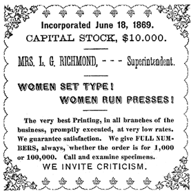
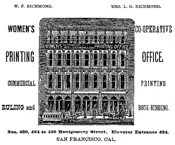 In San Francisco, which was becoming a center for printing and publishing in the West, women-run printing offices appeared in the 1870s and 1880s. The Women’s Union Job Printing Co., the Woman’s Publishing Company, Amanda B. Slocum and Jennie Patrick were a few either woman-run and/or -staffed printing offices of this period. The most prominent and prolific was The Women’s Co-Operative Printing Union, established in 1868 on Clay Street by Mrs. Agnes Peterson, followed in 1873 by Mrs. Lizzie G. Richmond. Early 1870 billheads produced by the WCPU proudly proclaimed, ‘Women set type! Women run presses!’ So confident was Lizzie Richmond that her billheads and advertisements often stated, ’We invite criticism.’ These printing offices produced a variety of printed materials for the public — books, commercial catalogs, corporate annual reports, legal briefs, [as well as] invitations, broadside advertisements, and handbills.
The many journals, newspapers, books, and even billheads that were printed during the late 19th and early 20th centuries used mainly one method of illustration — that of the wood engraving.... Leila S. Curtis and Eleanor P. Gibbons were two women who started up and ran successful engraving businesses in San Francisco. Both were trained in engraving and design. Their designs were found on billheads, business cards, and stationery, as well as in book illustrations, commercial catalogs, and innumerable other small printed items. Magazines published during this period often used the technique of the woodcut — rather than a wood engraving — to illustrate their pages. The technique used in producing a woodcut allowed for larger more fluid compositions. Lucia Mathews cut the designs for Philopolis (1906-1919) — a magazine published by Arthur, her husband, and herself during the early part of the 20th century. Florence Lundborg, an artist influenced by both Art Nouveau and the Arts and Crafts movement of the early part of this century, produced woodcut images for The Lark, the San Francisco literary magazine published by Bruce Porter and Gelett Burgess from 1895-1897. [source]
...
The turn of the century saw an increased interest in the aesthetic aspects of printing — now that women were an accepted part of the work force — and many fine presses sprang up throughout the state [of California]. A fine or ‘private press’ is generally understood to be a small printing house which issues for public sale limited editions of books which have been carefully made on the premises.
By the 1920s a tradition of fine printing was well under way in San Francisco, with Taylor and Taylor, John Henry Nash and the Grabhorns already fairly well established. These printing houses encouraged printing by women.... Other women with their own presses were Rosalind Keep of the Eucalyptus Press, Helen Gentry, and Jane Grabhorn at Colt Press, which was founded along with William Matson Roth and Jane Swinerton. In southern California, private presses were often a husband and wife team. The Saunders Studio Press of Claremont was founded in 1927 by Lynne and Ruth Thompson Saunders. The Plantin Press in Los Angeles was established in 1931 by Saul and Lillian Marks, Saul being in charge of design and layout and Lillian responsible for composition. Women such as Virginia Woolf and Elizabeth Yeats also founded private presses that produced handsome limited editions of the work of contemporary authors and artists. [source]
Women were notably successful at bookbinding, both ‘on the line’ — producing factory bindings — and in the creation of splendid examples of hand binding, particularly during the Arts and Crafts Revival of the late nineteenth and early twentieth centuries.
With the dawn of the 20th century and the emergence of women’s rights, women in printing and publishing entered more seamlessly into the work force. Finally, with the advent of fine press printing, the women printers in the 1920s and 1930s emerge as figures who achieved their goals to work at a skilled occupation that offered them not only an honest living but also a chance to use their creative instincts and skills.”
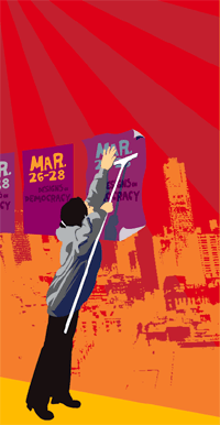
Impressions of Designs on Democracy
From March 26-28, I attended the Designs on Democracy conference on the UC Berekely Campus. I’ve been meaning to write up my impressions but have found it difficult to put words to those three incredible, densely-packed days of presentations, meetings, networking, and solidarity. Where to begin?
From the Bay Area Indymedia center:
“Designs on Democracy was a three day conference on design, advertising, public relations and marketing for social change.... The conference was organized by a crew of eight activists. Forty volunteers did the work that made it happen for the 350 who attended. Designs on Democracy, said Favianna Rodriguez, one of the organizers: ‘is not just for designers, it’s for people who are in the business of doing marketing and selling the image of the Left, to take it to a broader audience and make it more appealing.’”
 They’ve already posted two pages of notes and several audio files of the conference sessions in Ogg Vorbis format. More audio, video, and documentation is on the way.
The organizers from Tumi’s Design, the Ruckus Society, the Design Action collective, and Change the Game did an amazing job, clocking in months of preparation. The speakers, attendees, and volunteer tech crew were also incredibly flexible and generous.
The sumptuous, donated food also merits special mention, particularly from the Sankofa Kitchen Project, a black, vegan cooking collective in Oakland. The project is part of the East Side Arts Alliance and works with youth to build community gardens, teaches them how to grow and cook their own food, and promotes traditional cuisine, community spirit, and good nutrition — in part a response to the cheap, corporate, fast food crap showered on poor, urban neighborhoods.
Participants arrived from a range of organizations and backgrounds. Some were designers, organizers, techies, printers, media workers. Some from unions, others working on prisons, environmental justice, or genetically modified foods. Some worked in advertising, others on access, training, media justice, or getting out the vote. Some were just designers looking for a way to do more.
Some were veterans, active since the 1960’s, others just fresh out of school. Some owned their own businesses, some worked in collectives or in non-profits, and still others were freelance.
And, where other events of its kind might have fractured into quarrelling ideological factions, here there was common cause: Bush must go.
Many of the conference sessions focused on messaging, narrative, and framing to communicate effectively, move “the middle,” and build a stronger movement for social justice. The list of sessions and speakers makes for interesting reading.
I gravitated towards the more practical sessions, on fund raising and organizational structures. I won’t go into detail about individual sessions — will post more of my notes here soon — but here are a few other impressions and tidbits:
- Several speakers addressed the importance of focus groups and research, and within that the notion of using different messages for different cultural groups. An easy way to recruit for focus groups is to advertise on craigslist. (Offering pizza helps.)
- Favianna and the staff of Tumi’s see themselves within a tradition of radical graphic work in the Americas and on the West Coast: Siquieros, Rivera and the muralists of the Mexican revolution, artists and writers in Chile who created culture of resistance, the independent publishing of the Black Panther Party, the Chicano movement of the 70’s and their work with the United Farmworkers. Like the Young Lords, the Native American Movement, and the BPP, Tumi’s program is to serve the people. “Without the movement, without the grass roots, graphics work is not revolutionary.”
- Only one member of Congress has a child serving in the war.
- In the U.S., you can buy voter registration lists. It’s not cheap, but it is public information. You can cross reference the data with your membership list or demographic information to more effectively market to voters.
- If you’re an unaffiliated designer with a project idea and you want to raise funds, consider finding a non-profit organization willing to act as a fiscal sponsor. You can arrange for tax-deductible donations or foundation support through them, in exchange for a small percentage of the proceeds.
One topic of discussion that was missing from the conference was information design and mapping. This is not just marketing, but using design for analysis and making data accessible. See, for instance, the 2000 Palm Beach County ballot design.
In addition to meeting many new people, I had the chance to meet several people I’d previously known only online including Jason Justice, founder of the Graphic Alliance, an electronic network of progressive designers, and Alex Steffen of the community Web log worldchanging.com. It was also great to reconnect with a couple of folks I’d met at the Ruckus Tech Tools Action Camp in 2002.
Overall, the air crackled with excitement and energy. It was nice to recharge, to find out everyone was doing, and to find among them a progressive community of designers. Many, including myself, didn’t want this to end with the conference itself.
So what’s next? Another one in a couple of years? Perhaps local or regional conferences? An international federation of progressive designers? For now, a database of resources is in the works and will eventually be posted on the site. Watch this space for more.
Ill Communication
In the same sitting, I stumbled into two articles on the use of cellphones to coordinate street protest in real time. One in La Paz, the other in London, the former well organized, the latter ad-hoc. One from the country, the other from the city.
From Anarchogeek:
“The use of cell phones is interesting in how it relates to transforming the rural/urban power divide within the developing world. This isn’t something entirely new, rural community radio stations have played very large roll in communication and social transformation. In Bolivia, the revolution of 1952 lead by the miners unions, was coordinated by a network of rural community radio stations. With high illiteracy, little infrastructure, very poor communities these communities have relied on radio as the primary form of mass media.
In the last decade there has been an upsurge in the political power of indigenous movements in the Andes who have their power base in rural mostly disconnected communities. A lot of that upsurge is due to the many years of organizing by indigenous leaders, social movements, and NGO’s. That said, cell phones have acted as a major amplifier of their work. Increasing the ability for people to coordinate their actions and build robust social networks.
Unfortunately, I’ve not seen much written about the use of cell phones and other communications technology in the general strike and ‘Gas War’ in Bolivia last month. From my working with the rather small group of indymedia people in Bolivia I’ve heard some of how cell phones transformed the conflict. It helped people lay a more than week-long siege to La Paz. It also helped coordinate the marches of people from other parts of the country to the capital. When women went on hunger strike in churches the communications network made it a coordinated act, not simply the act of a few brave women in one location.
I think what happened in Bolivia is quite different than the much talked about ‘smart mobs’ as there were relatively few people will cell phones. The groups were not flexible, but rather quite well organized with cell phones used to coordinate between the leadership of existing organizations and networks. The use of cell phones facilitated the biggest indigenous siege of La Paz in almost 300 years.
Other important factors was Pios Doce and other community radio stations which played a vital mass media roll during the crisis. The Pios Doce transmitter in Oruro was bombed, by people who clearly didn’t expect the police to investigate anything. What the government didn’t figure out how to do was shut off the cell phones of known organizers, or towers which serve indigenous communities. My guess is the reason they didn’t shut them down was in part because cell phones were a vital communications tool for the police and army. Even the US Army in Iraq makes extensive use of consumer walkie talkies and unencrypted Instant Messenger. In India texting has been shut off at critical points to stem the spread of rumors and coordinated race riots during communalist uprisings in the last year. I expect as social movements turn to using cell phones and related technology as a tactical tool during protests and uprisings the governments will eventually learn how to turn off the ability to communicate at will.”
This last point is also noted in the BBC article about protestors chasing Bush in London:
“Some newspapers and websites were reporting mobile phone signals could be blocked for fear they could remote-control a bomb. But Scotland Yard has denied reports that police were considering shutting mobile phone masts during protests.”
In contrast to the Bolivia protest which shut down the capitol, the UK protests are intended to be a media hack and an adjunct to the big, organized, legally-sanctioned anti-war march on Thursday.
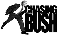 “The Chasing Bush campaign is asking people to ‘disrupt the PR’ of the visit by spoiling stage-managed photos.
They are being encouraged to send location reports and images by mobile to be posted on the Chasing Bush site....
Technologies like text messaging and weblogs have been successfully used in the past to co-ordinate routes and meet-up points for mass protests.
But the gadgets are now being used more proactively to make protests more visible and disrupt any potential stage-managing of the President’s visit.
‘We are trying to spoil the PR, so we are not doing anything directly, but encouraging people to protest by turning their backs in press photos so they can’t be used.’
The campaign organisers have also asked people to go into protest ‘exclusion zones’ to send SMS updates and on-location reports about his appearances, and events at protests.”
See this previous post for more notes on electornic advocacy.
Art, Organizing, and Memory
Ricardo Levins Morales, from an abstract of Art, Organizing, and Memory:
“The telling of history is more than an exercise in documentation. It has always been an important element in shaping history. Historical narrative provides important information about both specific tactics and strategies and broader possibilities for action. Consequently, the struggle to control the memory of events is an important element of social conflict.
 The Northland Poster Collective participates in this aspect of social (particularly workplace) struggles on three levels. Working with organizers and rank and filers we help them to identify and redefine the workplace narrative. To effectively organize, it makes a difference whether workers see themselves as part of a big, happy family; as engaged in a David vs. Goliath struggle; as rugged individuals who must each make their own way; as a community of interest in an exploitative environment, etc. Art, humor, and creative tactics can create a receptive atmosphere organizing and leadership development.
Telling untold (or miss-told) stories that can suggest avenues for action. Even when figures or events from social struggles are integrated into mainstream teaching they are presented in ways that emphasize individual heroics and chance. Our classroom posters focus on the collective action, planning, and community connection that offer a more reliable roadmap for creating change. By our choices of what stories to depict we help to challenge widely held notions about who is an actor in history.
Posterfolio sets help to bring more depth of knowledge (and curiosity) about events that people may know of only superficially. Posters that challenge deeply held assumptions. Less immediate in their impact, these may illustrate word definitions or the histories of everyday items, foods, etc. Seemingly innocuous, these posters contain layers of social history and suggest connections to other peoples that are absent from mainstream and commercial culture.
Making use of history as a lever for real change requires strategies for its dissemination. Our approach has been to use our relationships with schoolteachers, unions, and community organizations to distribute the work that we produce. These networks are also the source for information on the needs of the people at the front. Organizing seeds have a hard time growing in hostile soil. Tending to the cultural soil of the workplace, community, and broader society is a long-term and essential element in any strategy for change.”
Techniques of Electronic Advocacy
This entry has been updated and incorporated into An Introduction to Activism on the Internet.
I’ve been searching for a list of excellent examples of Internet activism. I couldn’t find one, so I made my own.
I’ve structured much of this list around categories outlined by Sasha Costanza-Chock in “Mapping the Repertoire of Electronic Contention,” in Representing Resistance: Media, Civil Disobedience and the Global Justice Movement, eds. Andrew Opel and Donnalyn Pompper. Greenwood, in press. Unless otherwise indicated, the quoted text below has been taken from him.
Though I’ve added some of my own commentary, this is not intended to be a full analysis of the campaigns and organizations mentioned. I disagree with the politics of many of the examples listed, but think there is something to be learned from each of the them.
United Farm Workers Logo
From Just Another Poster? Chicano Graphic Art in California:
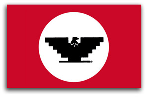
In 1962, Cesar Chávez and his cousin Manuel conceived of the U.F.W. logo as a way to ‘get some color into the movement, to give people something they could identify with.’ they chose the Aztec eagle on the Mexican flag as the logo’s main symbol and created a stylized version of it that was easy to reproduce. The U.F.W. logo became a highly recognizable icon in the union’s boycott efforts, legislative, proposition campaigns, and a victorious symbol of its successful contract negotiations.
The symbol and flag were unveiled at the first mass meeting of the newly formed union.
From Aztlannet:
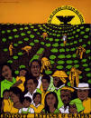 The evolution of Chicano poster art began in 1965 with the production of graphic images to support the organizing and boycotting efforts of the United Farm Workers. The U.F.W. logo — a black stylized eagle with wings shaped like an inverted Aztec pyramid — became a key symbol of the Chicano movement. It appeared prominently on all official U.F.W. graphics, and its inclusion on unrelated posters made by Chicano artists signaled support for the union. Posters also were utilized to promote other Chicano political causes, such as the 1968 Coors beer boycott in protest of the company’s discriminatory hiring practices.
page 2 1