

health
 “Here in the US, fruit often comes with stickers on it, sometimes telling you where it’s from and/or what it is. There’s also a number, but I never paid attention to that. But on p. 72 [of April’s Food & Wine] I spotted this interesting bit of information:
‘[T]he sticker labels on fruit: The numbers tell you how the fruit was grown. Conventionally grown fruit has four digits; organically grown fruit has five and starts with a nine; genetically engineered has five numbers and starts with an eight.’”(via)
War is Not Healthy
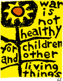 In 1965, Lorraine Schneider, an activist and mother, created the original art for “War is Not Healthy.” She entered the 4" by 4" print into a design contest. Her image was seen as too simplistic and did not win.
In an introduction to a book of Schneider’s art work, Barbara Avedon wrote:
“On February 8, 1967, fifteen friends met at our house to discuss ‘doing something’ about the war in Vietnam. We wanted to do something that would communicate our horror and disgust to our elected representatives in one concerted action. We were not ‘bearded sandaled youths,’ ‘wild-eyed radicals’ or dyed in the wool ‘old line freedom fighters’ and we wanted the Congress to know that they were dealing with an awakening and enraged middle class — voters, precinct workers, contributors. We decided to send a Mother’s Day card to Washington. We would print and distribute one thousand — one thousand letters of protest that said in a very ladylike fashion:
For my Mother’s Day gift of this year,
I don’t want candy or flowers.
I want an end to killing.
We who have given life
must be dedicated to preserving it.
Please talk peace.
Lorraine had given our family an etching of ‘Primer’ some months prior to that meeting. Its eloquent, irrefutable, sunflower truth said it all for us. I called Lorraine and asked if we could use ‘Primer’ on the face of the card. She said, yes, and one thousand became two hundred thousand cards. And because of her genius Another Mother for Peace was born.” [source]
Another Mother for Peace was founded to “educate women to take an active role in eliminating war as a means of solving disputes between nations, people and ideologies.”
The overwhelming success of the Mother’s Day card led to the creation of the AMP newsletter, filled with anti-war editorial and reports on the stances of lawmakers on issues related to war and peace. Each newsletter contained a number of action items called ‘Peace Homework’ that encouraged readers to make their voices heard by organizing, educating and communicating with other citizens and their elected representatives.
Thirty-six years later, concerned about the human costs of America’s “war on terror” Joshua Avedon, Barbara Avedon’s son, and Carol Schneider, Lorraine Schneider’s daughter, began to consider — separately — how to revive AMP.
Schneider’s image has become an international icon for the anti-war movement. Supporters of Another Mother for Peace display the image around the world. A simple yet powerful statement of conscience, the sunflower logo helped make Another Mother for Peace a visible anti-war voice.
In cooperation with Another Mother for Peace, the Center for the Study of Political Graphics has reproduced the War is Not Healthy poster, the first edition available since the Viet Nam War. Stickers, pins, and other materials are avaialble from Another Mother for Peace.
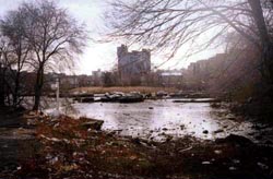
Mapping Environmental Racism
Six out of eight of Manhattan’s diesel bus depots are located in northern Manhattan. Two of the city’s largest sewage treatment plants are there, too — powered by huge diesel engines running 24 hours a day. The area is flanked by highways and two major bridges over which trucks (also running on diesel) deliver goods into city into Manhattan. And the two outdoor train yards and elevated rail lines serve diesel locomotives daily.
In addition to diesel exhaust, northern Manhattan contains brownfield sites, vacant lots, and abandoned buildings posing chemical and social hazards.
On April 19, 2003, the New York Times reported on a study that found that 25.5 percent of children in Harlem have asthma — “one of the highest rates ever documented for an American neighborhood.”
Residents of northern Manhattan are predominantly black and Latino.
...
West Harlem Environmental Action is:
“a non-profit, grassroots organization working to improve environmental quality and to secure environmental justice in predominately African-American and Latino communities.
Since 1988, WE ACT has worked with citizen groups, youth, community residents, environmentalists, local/state/federal governments, and educational & medical institutions.
Based in Northern Manhattan, WE ACT advances its mission through research, public education, advocacy, mobilization, litigation, legislative affairs & sustainable economic development.”
 One of their programs is a mapping initiative using GIS to map health trends, particularly child asthma hospital admissions, air quality, and polluting facilities, as well as waterfront development and access issues.
“The first step toward environmental justice must be an awareness of the hazards. WEACT has an ongoing commitment to enhance community awareness of environmental hazards in northern Manhattan. The maps and ‘tour of hazards’ presented here are an incremental step toward the fulfillment of WEACT’s mission. They are the result of a joint project between WEACT and students from the City and Regional Planning Department at Cornell University. Cornell students created this web page based on interviews with area residents about environmental hazards in their neighborhoods.”
“On January 30, 1999, eight students, part of an Environmental Justice and GIS Workshop class with the Department of City and Regional Planning at Cornell University in Ithaca, New York, met with WE ACT staff and several community leaders to ‘address the dire lack of useful environmental justice information accessible to communities in New York, New Jersey, and Puerto Rico.’ At the time, the nascent GIS system setup in the WE ACT office was a mere four months old, and their collaboration helped to shape its growth to where it stands today!”
Their Toxic Tour links points on the map to photos documenting toxic sites and their proximity to homes and schools.
Allergic Reactions
Next week the House of Representatives will vote On the evening of July 21, the House of Representatives approved a law requiring new package design standards that may save lives.
From The New York Times, July 10, 2004:
 “Each year, some 30,000 Americans are rushed to emergency rooms because of severe allergic reactions to food. Roughly 200 people die yearly from such reactions. Sound public health legislation passed by the Senate, and heading for House action before the Congressional recess, aims to lessen that toll by requiring that food labels clearly and accurately disclose the presence of the eight most common allergens in various additives: peanuts, eggs, milk, soy, tree nuts, fish, shellfish and wheat.
The bipartisan measure fills a hazardous gap in Food and Drug Administration rules, which do not require that these allergens in spices, flavorings, coloring and other additives be listed on labels even though ingesting the slightest amount can be fatal for some people. And the allergens that are listed on a label are frequently identified only by their formal names instead of in everyday English — as ‘whey’ instead of ‘milk product,’ for example.
The food industry adopted voluntary guidelines to try to fend off legislation. But although some companies now list allergens in clear terms, others still don’t. The government needs to make compliance universal.
First introduced four years ago by Representative Nita Lowey, Democrat of New York, and championed in the Senate by Edward Kennedy, a Massachusetts Democrat, and Judd Gregg, a New Hampshire Republican, the measure also has important backing from the Bush administration. Its expected passage by the House this week, and subsequent signing by the president, will give food manufacturers until 2006 to refashion their labels to list allergens more clearly. It will also give Americans an all too rare example in this election year of bipartisan cooperation to serve the public good.”
The FDA publicly recognized fatal food allergies in 1994, and in 1996 acknowledged the need to label foods containing allergenic substances. However, they were unable to require the labeling because
“Section 403(i) of the [Food, Drug, and Cosmetic Act] provides that spices, flavorings, and colorings may be declared collectively without naming each one. Secondly, FDA regulations (21 CFR 101.100(a)(3)) exempt from ingredient declaration incidental additives, such as processing aids, that are present in a food at insignificant levels and that do not have a technical or functional effect in the finished food.”
The new bill is the result of grassroots pressure and several medical and academic studies on the effects of allergens and interpretations of commercial food labeling.
This study on label interpretation is even cited in the text of House bill.
The Center for Science in the Public Interest also takes some credit, remarking that:
“A major impetus for the legislation was a 2001 article in CSPI’s Nutrition Action Healthletter that publicized a study by the Food and Drug Administration showing that about 25 percent of candy, ice cream, and baked goods from plants in Minnesota and Wisconsin had products with undeclared egg or peanut ingredients.”
I note that the CSPI’s influential document was in part a repackaging, redesign, and republishing of information already available from the FDA.
The Food Allergen Labeling and Consumer Protection Act (FALCPA, or S. 741) was approved by the House Energy and Commerce Committee on June 24, 2004. It was passed by the U.S. Senate on March 8, 2004. The bill now goes to President Bush for his signature.
The new allergen info is likely to be added to the Nutrition Facts label.
Updated July 21, 2004
The Bucket
A low-cost, powerful tool for environmental monitoring by communities poisoned by industrial facilities built near their homes.
“The EPA-approved ‘bucket’ is a simple, community friendly tool that fenceline neighbors use to take air samples. Taking air samples is a powerful experience for community members who are used to being ignored, overlooked, and disrespected by corporations and government. Dorothy Jenkins, President of Concerned Citizens of New Sarpy, used to call the refinery to complain about the odors. A low ranking operator would tell her not to worry, that the black plume of smoke that billowed for hours near her home was not harmful. Now Mrs. Jenkins has a bucket. When refinery managers and government regulators tell her that there is nothing to worry about, she answers, ‘Why, then, was there a benzene reading of 14 in my air sample, a reading that violates the state standards?’ The bucket gives community members power to hold institutions accountable to provide a safe and healthy environment.”

From the History of the Louisiana Bucket Brigade:
“The bucket brigades were started in 1995 by attorney Edward Masry (of Erin Brockovich fame) when both were made ill by fumes from a petroleum refinery he was suing on behalf of citizens of Contra Costa County, California. When he called the local, state and federal environmental authorities, they told him that their monitors detected no problem. This so angered Masry, whose clients were being exposed to these toxic releases daily, that he hired an environmental engineer to design a low cost device, the ‘bucket’, which the community could use to monitor their exposure for themselves. This set in motion a movement which would give communities living near refineries, chemical plants or other toxic air emitting sources, a chance to take on indifferent regulators and corporations who were telling them that there is no problem with the air they are breathing while they are choking and dying.
The ‘bucket’ is a low cost $75 version of the $2000 Suma canister used by government and industry and is simple to use. Suspect air is drawn into a Tedlar bag inside the bucket. The bag is then sealed and sent to a laboratory for analysis. The lab analysis is the most expensive part of the operation. For about $500 per sample, the contents of the bag are run through a GCMS (Gas Chromatograph Mass Spectrometer), which compares the ‘fingerprints’ of the sample with the fingerprints of about 100 toxic gases in the computer library. The bag is non-reusable and cost about $15. In practice, much of this cost has been borne by charitable and government grants.
Working closely with Masry, Denny Larson proceeded to promote the use of these buckets in other communities exposed to refinery and other toxic air emissions. Larson hired a student intern to re-engineer the buckets in order to produce a community manual to educate fenceline neighbors that they could build and operate their own air monitoring systems. When completed, the manual helped spread the buckets throughout the refinery belt of Contra Costa County to 7 communities.
The biggest hurdle was getting the authorities, who belittled the idea of citizen bucket brigades, to accept the results. Larson met with EPA Region 9 officials, including the administrator, Felicia Marcus, in 1996 and asked the agency to approve and fund bucket air sampling. To its credit, EPA Region 9 invested in a quality assurance evaluation of the bucket results and ended up accepting them. With the EPA acceptance, Denny was able to work with grass roots groups around the country to launch local bucket brigades.”
Update: Read more about the bucket in this Christian Science Monitor article from April 1, 2004.
Tailored Communication for Public Health
A doctor in St. Louis is improving public health with customized graphic design.
From the BBC:
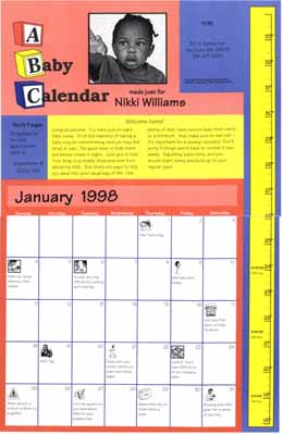 “A scheme which hands out a personalised calendar complete with pictures of your child is boosting vaccination rates in the US.
In St. Louis, where as few as a quarter of eligible children get all their [shots], uptake rose by 50% on average.
The calendars have key dates ringed so that parents find it easy to work out when to visit the doctor....
There are a plethora of different vaccinations offered to babies in their first two years of life, and the confusing sequence sometimes means that [shots] are missed.
St. Louis physician Dr. Matthew Kreuter came up with the idea of generating immunisation reminders tailored for each baby by computer.
To ensure that parents hung on to these calendars, they included a high quality image of their baby - as many patients in deprived inner-city St. Louis cannot afford to have professional photographs taken.
After one year, 82% of the ‘calendar babies’ were up to date with their immunisations — compared with 65% of children that did not receive calendars.
After two years, two-thirds of those with calendars were up to date, compared with 47% of those without....
Dr Kreuter said: ‘Getting babies immunised is very important for families and the community.
‘But it’s also difficult for many parents because of challenges with transportation, busy work schedules and finding childcare for other children.
‘We want to reward their efforts with this unique reminder to keep them coming back over time.’
Every time a child attends an immunisation session, the photograph is updated with a new one - so at the end of the process, the parents will have a varied selection of good quality photographs.
The whole process costs the public health system approximately $1,200 per child, but Dr Kreuter says this is worthwhile.”
Dr. Kreuter is the Director of the Health Communication Research Laboratory at St. Louis University. The program strives to “enhance the health of individuals and populations through the research, development, and dissemination of innovative and effective health communication programs.”
Dr. Kreuter has conducted extensive research in tailored communication, using new technologies to produce customized information for patients, both online and offline.
Captions, Television and its Double
The year 1960 marks a turning point in the history of technology and politics. The Kennedy-Nixon presidential debate was the first to be broadcast live on television. Kennedy’s telegenic composure and appeal is credited with tipping the vote in his favor. In 1960 ninety percent of U.S. households owned a television. For the first time, Americans in 1963 say that they get more of their news from television than newspapers. Television becomes an increasingly important source of information and enormous cultural force in the United States marking the assassination of President Kennedy, the rise of the Beatles, landing a man on the moon and returning him safely to Earth, I Love Lucy, Sesame Street, the Olympics, news of the war in Viet Nam, the Watergate hearings, the Watts riot, Star Trek, and the mini-series Roots. [source]
However, it would be at least another decade before millions of deaf and hard-of-hearing Americans could begin to participate.
From the National Captioning Institute:
 “The first innovators were not thinking about a captioning system for deaf and hard-of-hearing people. In 1970 the [U.S.] National Bureau of Standards began to investigate the possibility of using a portion of the network television signal to send precise time information on a nationwide basis. The Bureau believed that it could send digitally encoded information in a part of the television signal that is not used for picture information. The ABC-TV network agreed to cooperate. This project didn’t work, but ABC suggested that it might be possible to send captions instead.
This led to a preview of captioning at the First National Conference on Television for the Hearing Impaired in Nashville, Tennessee, in 1971. Two possible technologies for captioning television programs were demonstrated that would display the captions only on specially equipped sets for deaf and hard-of-hearing viewers.
A second demonstration of closed captioning was held at Gallaudet College on February 15, 1972. ABC and the National Bureau of Standards presented closed captions embedded within the normal broadcast of Mod Squad.
As a result of the enthusiasm these demonstrations created in the deaf and hard-of-hearing community, the National Association of Broadcasters studied the technical and economic factors involved in establishing a captioning service. The Association concluded that this captioning system was technically possible, but certain steps had to be taken before it could become a reality. The federal government then said it would fund the development and testing of this system. The engineering department of the Public Broadcasting System started to work on the project in 1973 under contract to the Bureau of Education for the Handicapped of the Department of Health, Education and Welfare (HEW).
While the closed-captioning service was being developed, there were some programs with ‘open’ captions airing on PBS. In 1971, The French Chef became the very first television program that was accessible to deaf and hard-of-hearing viewers. The ABC News was rebroadcast on PBS five hours after its broadcast on ABC-TV. From the time the captioned ABC News was first produced in 1973, it was the only timely newscast accessible to deaf and hard-of-hearing people until NCI’s real-time captioning service started in 1982....
Toward the end of the technical development project at PBS, it became clear that in order to get the cooperation of the commercial television networks, it would be necessary to establish a nonprofit, single-purpose organization to perform this captioning. And so in 1979, HEW announced the creation of the National Captioning Institute. The mission and importance of NCI was clear from the beginning. It was to promote and provide access to television programs for the deaf and hard-of-hearing community through the technology of closed captioning.
On March 16, 1980, NCI broadcast the first, closed-captioned television series. The captions were seen in households that had the first generation of closed caption decoder.
A silence had been broken. For the first time ever, deaf people across America could turn on their television sets — with a caption decoder — and finally understand what they had been missing on television.
The closed-captioned television service was an overnight sensation. Suddenly, thousands of people who had been living in a world of silence could enjoy television programs along with hearing people....
NCI ensured a bright future for closed-captioned television by partnering with ITT Corporation in 1989 to develop the first caption-decoding microchip, which could be built directly into new television sets at the manufacturing stage. This led to the introduction and subsequent passage of the Television Decoder Circuitry Act, which mandated that, by mid-1993, all new television sets 13 inches or larger manufactured for sale in the U.S. must contain caption-decoding technology. Now, millions of people have access to captions with the push of a button on their remote controls.”
From a more recent Captioning FAQ:
“On August 7, 1997, the FCC unanimously approved new regulations which will mandate captioning on virtually all television programming in the United States. Section 305 of the Telecommunication Act of 1996 is being implemented as a new section (Section 713) of the existing Communications Act. On September 17, 1998, the FCC modified their rules, in what can be considered a victory for caption viewers. The ruling took effect on January 1st, 1998, and it phases in requirements separately for ‘old’ and ‘new’ programming.”
Though numerous studies have shown that mixed-case text is easier to read than all uppercase, virtually all captioning in North America is done in uppercase only. The resolution of NCSA television and caption decoders generally results in ugly and illegible lowercase letters.
“[However,] mixed-case text is often used to indicate whispering, and is also often used for text that needs to be set apart, such as comments by an off-screen announcer (voice-over), or sound effects.
Caption decoders and televisions were not required by law to support lowercase letters at all until just a few years ago. There are, therefore, some televisions that will change mixed-case text to all uppercase.” [source]
Now, with the introduction of digital television, the design of the typeface for subtitling is no longer constrained by the technology of analog television.
This new digital environment provides for larger screens, higher screen resolutions, enhanced closed captions, and higher transmission data rates for closed-captioning.
 Enter Tiresias Screenfont, a typeface for television subtitling designed for maximum legibility. Development of the typeface included extensive user testing with viewers that had a wide range of visual abilities and viewing habits.
The Tiresias Screenfont was originally designed by a team led by Dr. John Gill, Chief Scientist for the Royal National Institute for the Blind.
“The typeface Tiresias Screenfont was originally designed for subtitling on UK digital television in 1998.... It has been specifically designed for screen display and has been adopted by the UK Digital Television Group as the resident font for interactive television. Screenfont is now being adopted for European digital television. Its use is also being considered in the USA.
Tiresias Screenfont has been designed to have characters that are easy to distinguish from each other. The design was carried out, with specific reference to persons with visual impairments, on the philosophy that good design for visually impaired persons is good design for everybody.”
Both font and philosophy have been taken from the television screen and applied to the public terminal, the built environment, and the printed page.
Other variations of Tiresias Screenfont have since been designed, each optimized for a specific purpose:
Tiresias PCfont is a typeface designed to display clearly on screen based systems, such the information displayed on TV monitors on public transport, at airports, railways or ferry terminals. Building societies and banks use screens to display information on cash dispensers. Many governments are now introducing screen-based public information systems in libraries and government offices. Tiresias PCfont makes these services and facilities more accessible.
Tiresias Infofont is designed to improve the legibility of information labels on public access terminals, ticket machines, telephone booths. The characters and letterforms have been designed to provide maximum legibility at a reading distance of around 30 to 100 cm. Infofont is not designed for large quantities of text.
Tiresias Signfont is for fixed (not internally illuminated) signage. The recommended usage is white or yellow characters on a dark background. Tiresias Signfont has a different level of boldness than Screenfont and PCfont, and has more open spacing than conventional type. Signfont is designed to provide maximum readability at longer distances.
Tiresias LPfont is designed for use in large print publications, and to be more legible than the standard typefaces that are currently in large print publications.
The Tiresias family of fonts are available for sale from Bitstream.
Update October 1, 2003: A couple of hard-of-hearing friends have brought up the petition campaigns that they, their friends, and parents participated in. The text above does understate the grassroots campaign.
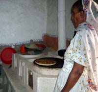
Cooking with Meme
Women in Eritrea are spreading a more efficient stove design across the country. The new design requires less fuel, retains more heat, and produces less smoke — dramatically reducing respiratory and eye diseases, conserving the forest, and requiring less time for gathering fuel and for cooking.
From IRIN:
“An innovative scheme to convert 500,000 traditional injera stoves across Eritrea will cut thousands of tons of carbon emissions each year and help to conserve the country’s precious supply of firewood.
For centuries, injera — a pancake-like food widely eaten in Eritrea — has been cooked on simple clay stoves, built over an open fire. However, the stoves are smoky, dangerous and require a substantial amount of firewood to burn effectively.
But scientists at the ministry of energy believe they have found a solution. By making a few simple design changes they have increased the efficiency and safety of the stoves — known as mogoggos — by over 100 percent.
 ‘We have added a chimney, so that smoke no longer fills the kitchen, and an insulated firebox to conserve heat,’ Afeworki Tesfazion, the ministry’s research director, told IRIN. ‘We have also improved ventilation, to allow the fire to burn better, so that it uses 50 percent less fuel.’ He said the new stove also burns a wider range of fuels, such as animal dung, twigs and leaves.
The ministry estimates that each new stove reduces carbon emissions by 0.6 of a ton annually and saves 366 kg of firewood per household each year. The government hopes that every one of the 500,000 households currently thought to own a stove in Eritrea will convert to the new style. If this happens the environmental savings would be enormous.
The health benefits are also significant. Without the thick smoke pouring into their kitchens, women and children are less likely to suffer from the respiratory diseases and eye problems that affected many who used the old stoves.
The new mogoggo is already proving popular. In a scheme run by the government and backed by small grants... dozens are being built in villages around the country every week. More than 5,000 households have already converted.
Under the scheme, village women are taught how to build the stoves themselves. They then teach other women, who teach others and so on. With free labour and free materials — the stoves are made of clay and rocks, which are easily available everywhere — the only cost is the accessories. Metal chimney caps, valves and doors, as well as clay fire grates and cement chimneys, are mostly made locally.
One village taking part is Mehiyaw, in Debub region, close to Eritrea’s southern border. Nearly half of the 160 households in Mehiyaw have already installed new mogoggos. Others in the village hope to do so soon.
Standing in her small, neat kitchen, Miriam Amman, proudly shows off her work. Miriam, a mother of six children, built the stove with help from women from another village one week ago. ‘I love it because there is no smoke in here anymore,’ she says. ‘My clothes are clean and the children can play in here while I cook. Before now nobody would come into the kitchen while the stove was lit. Also we use less wood, so I spend less time gathering it.’
The biggest challenge faced by the government now is to let people know about the new stoves — and persuade them to convert as soon as possible....
The government is setting up a credit plan, to enable families to borrow money to build the stoves now — about US $8 each — and repay the loan when they can afford it. It estimates that the next stage of the project, including training the women and the credit scheme, will cost a further $500,000.
But so far, customers appear satisfied. In Mehiyaw, a group of Miriam Amma’s neighbours and friends crowd into her kitchen to admire her stove . It is larger and more elevated than the old fireplace, which required women — who do all the cooking in traditional Eritrean households — to bend low while preparing food.
In the small outdoor kitchen the stove is alight, but the air is clear. One woman points out the smoke-blackened corrugated tin roof, a reminder of Miriam’s old stove.
‘At first nobody wanted these new mogoggos,’ said Miriam. ‘But now they have seen how well they work, everybody wants one.’”
via the Ashden Awards