

built
A Change for Plan

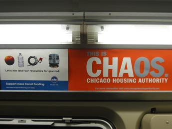
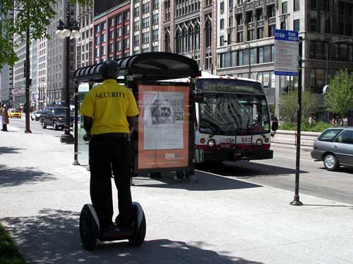
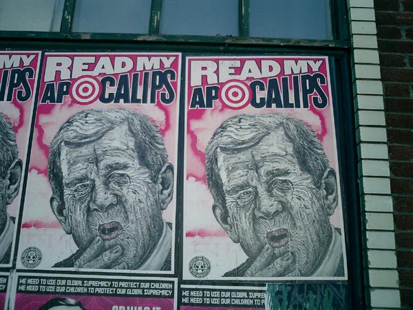
On May 27, a group of concerned citizens hijacked a million dollar Leo Burnett ad campaign designed for the Chicago Housing Authority, turning it into a scathing critique of Chicago’s public housing policy and privatization practices.
They created and changed out over a dozen large format bus shelter ads (5 in downtown Chicago in broad daylight!), put up thousands of ads on the trains, printed a newspaper of information and reproductions of the flipped ads, and created a mock Web site for the Chicago Housing Authority in the style of the official site.
See the old ads, download the new ads, and find out more about the campaign at ChicagoHousingAuthority.net:
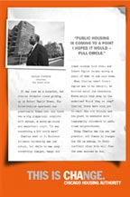
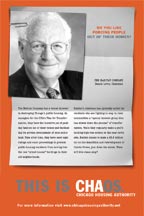
“In late 2004, the Chicago Housing Authority (CHA) initiated a public relations campaign to put a new face on their Plan for Transformation, a plan that drastically reshapes the state of public housing in Chicago.
This PR campaign, authored by the advertising giant Leo Burnett, fused Chicago Housing Authority's acronym ‘CHA’ with the word ‘change’, resulting in a new brand identity: CHAnge. There are undoubtedly big changes happening with public housing in Chicago, including massive organizational restructuring within CHA and the tearing down of all high-rise public housing buildings.
Unfortunately, the priorities of CHA haven’t changed at all, and public housing residents are still at the bottom of the list. While the CHAnge campaign has attempted to put a ‘resident empowerment’ spin on the Plan for Transformation, in reality the majority of public housing residents have been adversely affected by the massive restructuring. If you are a single working mother displaced by a home demolition, waiting over 6 months for a voucher to relocate as your children are shifted from school to school, CHAnge feels a lot more like CHAos....
The Plan for Transformation is a $1.6 billion blueprint that includes the demolition of 14,000 public housing units and the displacement of over 20,000 people. Not unlike the ‘urban renewal’ master plans of previous decades, the Plan For Transformation has linked motives. It is pushing poor people out of the now-coveted inner city neighborhoods and increasing the exchange value of existing public land through privatization. Developers such as Dan McLean are making millions building on the land adjacent to former CHA high-rises and getting huge city tax credits to subsidize their development. In addition, the city is making money by selling or leasing former CHA public land to private developers. In this way, large amounts of our city’s housing budget are being transferred into private hands. CHA CEO Terry Peterson was personally implicated in this when he was caught giving CHA bids to contractors like the Habitat Group in exchange for political contributions.”
Retool
Folks in Maine have a plan to fight the war by saving jobs — and the environment.
 Christie Toth reports in the April 1, Portland Phoenix about a statewide, grassroots campaign to convert Maine’s military manufacturing infrastructure to environmentally sustainable, non-military manufacturing:
“A year ago, Bath Iron Works, Maine’s largest private employer, had a contract to build seven DD(X) Destroyers for the United States Navy.
Now, the president’s budget proposal has slashed the destroyer order by more than half, and the Navy is considering giving the entire contract to a shipyard in Mississippi. As the Maine delegation fights what may be a losing battle on the Hill, economic conversion is beginning to look like more than an idealistic pipe dream. It is beginning to look necessary for Midcoast Maine’s economic survival.
With more than 6200 employees, BIW is Maine’s largest private employer; however, despite a robust shipbuilding schedule, the yard has been hemorrhaging jobs for years. Over the last six months, with 51 layoffs here, another 137 there, BIW has eliminated nearly 500 positions. And those layoffs barely register compared to what the company, a subsidiary of the Virginia-based General Dynamics Corporation, may be facing in the near future....
The Maine congressional delegation is doing everything in its power to push against the carrier-like momentum of Donald Rumsfeld’s vision for leaner, meaner armed forces. Senators Snowe and Collins warn of the grave dangers of single-source destroyer construction in Mississippi, citing everything from terrorist attacks to hurricanes. Congressman Tom Allen rails about the costs of the Iraq war, which he says could purchase a destroyer a week. None of Maine’s elected representatives has been above a little fear-mongering about China....
Peace Action Maine (PAM) is a nonprofit activist organization working to provide ‘a voice of education and a center for all people committed to disarmament and creative responses to conflict.’ On April 1, they will launch a two-year campaign to shift Maine’s manufacturing base away from reliance on military industry. While PAM would support the introduction of any socially responsible, ecologically sound nonmilitary manufacturing in Maine, their most treasured vision is to make Maine a national leader in the production of sustainable energy technologies, such as solar panels and wind turbines.
Domestic demand for windmill equipment is growing. ‘Maine’s going to be left behind,’ says Gagnon, ‘because the Maine delegation is clinging to a sinking boat.’”
The campaign kicked off with a parade in Portland, a traveling art exhibit, public presentations, and the commission of a feasibility study from Economists for Peace and Security.
Bruce Gagnon is blogging the campaign at Organizing Notes.
Central Heating
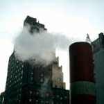 One of the few redeeming qualities of winter in New York City are those beautiful columns of steam that rise from the streets. Walking along, you catch these great clouds of vapor churning and billowing — particularly at twilight, through the headlights and street lights.
So what’s it all about?
Under the streets of New York City is the largest steam distribution system in the world.
On March 3, 1882, the first steam distribution plant of importance in the U.S. made its first distribution of steam from a central plant at to the United Bank Building on Broadway, sending steam to heat buildings in lower Manhattan.
The New York Steam Corporation, formed July 26, 1880, consolidated with the Steam Heating and Power Company of New York in September 1881. The company was sold in 1915, but when the parent company went bankrupt two years later it was reorganized as the New York Steam Corporation. It was merged into the Consolidated Edison system in the 1930s.
This article from the Gotham Gazette’s infrastructure series draws the broad contours of the current steam system.
Seven steam plants, five in Manhattan and one each in Queens and Brooklyn generate the millions of pounds steam that run under the city’s streets. The steam heats housing, offices, a few churches, and NYC landmarks like the Empire State Building, the Metropolitan Museum of Art, and the United Nations. It is used to press your shirts and in the central sterilization unit St. Vincent’s Hospital. I also note that the system stops south of 96th street.
 Those plumes in the street may be releasing pressure or perhaps just a leak. The system moves steam at high pressures to maintain the temperature and push it through the system.
Three of the plants simultaneously produce both steam and electricity through a process called co-generation. At the height of winter, the system sends out nearly 10 million pounds of steam per hour. Sales from ConEd’s Steam Business Unit account for about 7 percent of total Con Edison revenues.
And because the steam is mass-produced, it is more economical, efficient, and environmentally friendly than the hundred thousand individual oil or gas boilers it replaces. Centralized steam eliminates the need for boilers in individual buildings along with million gallons of heavy fuel oil and traffic from fuel delivery trucks. The steam plants use low sulfur oil or clean-burning natural gas to produce steam. High tech burners further lower nitrogen oxide emissions.
Update 1/9/2010: Here’s a great piece on Urban Omnibus about the NYC steam system.
Permeable Pavement

Permeable pavement allows rainwater to filter into the ground while providing a durable surface for vehicles to drive on. While gravel driveways and other pourous materials are a common form of this, other types composed of interlocking concrete blocks or plastic cell networks can allow vegetation to poke through.
Permeable systems can cost more to lay than asphalt or poured concrete and, depending on the material, may require more maintenance. But the results are more aesthetically pleasing, more environmentally responsible, and may save money in the long run.
By allowing rainwater to soak into the ground, permeable systems slow run-off and flooding the sewer systems. Allowing grass and plants to grow improves air quality and reduces the heat island effect.
Permeable paving works best in low traffic areas, like alleys, parking lots, or bus stops, and in some cases may have the additional bonus of calming traffic.
So why wait for an old railroad to be decommissioned before turning it into a greenway? Via Beyond Brilliance, Beyond Stupidity I found this post about permeable paving along the new tram line in Barcelona. The photos show what a lovely difference it makes.
The organization City Farmer worked with the government of Vancouver on three trial installations in their County Lanes project. Read more about the budget and process at the City of Vancouver Web site:
“After evaluating the three designs for their durability and performance, a standard Country Lanes design will be developed. Vancouver is also planning to develop a ‘Sustainable Street’ that incorporates many of the features of the Country Lanes.”
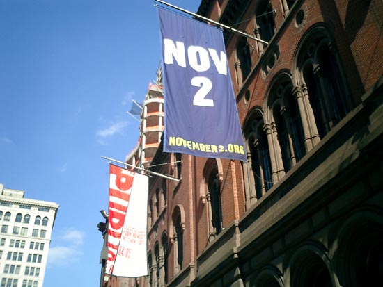
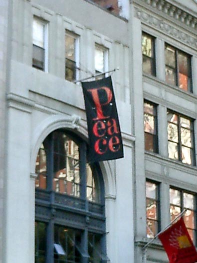
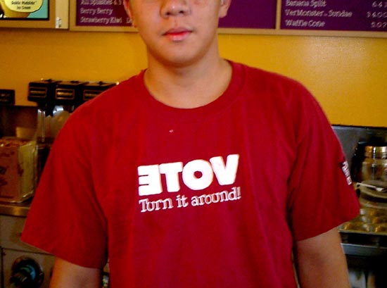
Commodify Your Dissent
Walking around downtown, I’m noticing a number of businesses flaunting their politics. Below are a few random snapshots.
In New York City, where registered Democrats outnumber registered Republicans by 5 to 1 it probably does not harm your business much to wave a Democratic flag.
But what’s notable is that these banners do not seem to be branding or trying to create a niche. I don’t think these businesses are trying to position themselves as responsible corporate citizens. It seems more like someone wearing a political pin, though for each the context is a bit different.
Click on a thumbnail to view a larger image.
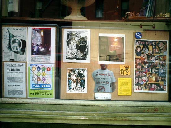 Via Della Pace, Italian café The T-shirt reads “Romani Contro Bush.” |
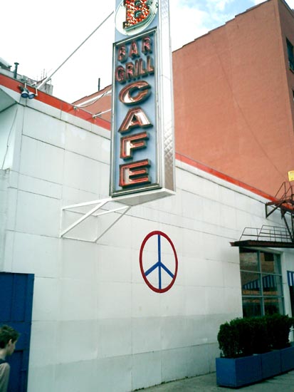 Bowery Bar and Grill Who also pioneered the gentrification around Cooper Square 10 years ago. |
|
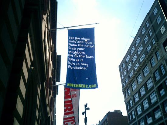 Banners outside the Public Theater |
 | |
 Pentagram, a design studio They usually hang a banner with a big red P. |
 Ben & Jerry’s They actually did have voter registration forms. | |
 Cookies at Once Upon a Tart “After all,” says the owner, “we’re French.” | ||
On a related note, a year ago a handful of lefty bloggers were abuzz about this:
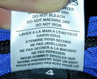
a label from a bag designed by Tom Bihn, an American company located in Port Angeles, Washington. The French repeats the English care and handling instructions, with an additional two lines:
Wash with warm water.
Use mild soap.
Dry flat.
Do not use bleach.
Do not dry in the dryer.
Do not iron.
We are sorry that Our President is an idiot.
We did not vote for him.
Few bloggers followed up to point out that the grassroots buzz actually produced record sales for the company.
From AFP, April 26, 2003:
Handbags insulting “president” in French sell like hot cakes in US
“There is no doubt that sales are hot for handbags bearing an insult — in French — aimed at ‘our president.’ The question is: Which president?
The bag’s designer Tom Bihn never guessed that purses with the message, ‘We’re sorry our president is an idiot. We didn’t vote for him’ — inscribed in French — would be blowing out of the stores.
‘It is a mystery, but since we launched the bags with the label sewn, sales have doubled,’ said Bihn, 43. ‘It is a record in the history of the company.’
He denies the message is targeting US President George W. Bush.
‘It depends on either your nationality, or the president you think is an idiot; you choose.’
Clients throughout the United States have flooded his offices in Seattle and Port Angeles with calls and e-mails to order for the bags, he said.
The company received ‘varied reactions’ including ‘hate mail from a French citizen who thought the label was addressed to (French President) Jacques Chirac.’
But 80 percent of the Americans think it is an amusing message, he said.
On his company’s website, he said: ‘Everyone seems to have a ‘president’ that they think is an idiot. Take your pick: Jacques Chirac, Bill Clinton, George Bush.’
Neither Bihn nor his 10 employees have yet taken the situation seriously, but have launched a series of T-shirts, selling at 20 dollars each, with the same message, with funds to go to a war veterans’ center in Seattle.”
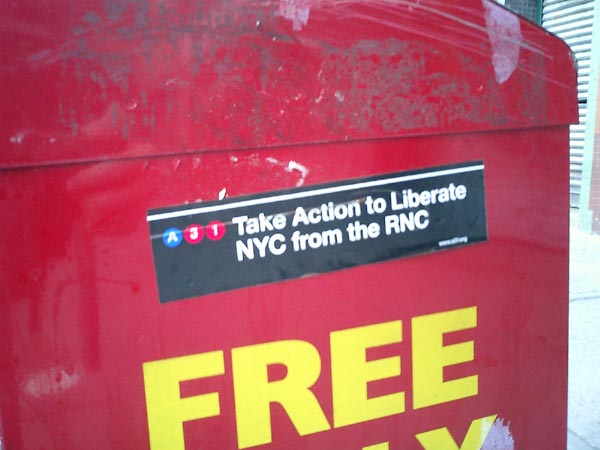
RNC Recap
A friend has graciously permitted me to post his recap of RNC week:
“My dears Al and Mrs. S., ever the social workers, were eager to join me on Friday night’s Critical Mass bike ride. At Union Square, several of the farm vendors decided, perhaps in leu of the overwhelming crowds, to give away their end-of-day produce and baked goods. So, as the numbers of cyclists grew exponentially, we enjoyed watching the kids, who looked more at home on an Earth First commune than in front of Republic, as they heartily chomped on the raw sweet corn and warily sniffed the fresh muffins for signs of dairy.
As we peddled off (reminding me of the gnarled-metal cycle-density of Shanghai biking), we received applause from plenty of 14th street bystanders. By the time we got to Houston, the sun had set, and the bike ranks had ribboned along Broadway so we had to be wary of cabs darting past and around us. But as we began to again amass up Sixth Ave, tensions (which i’ve known too well as an ACT UP marshall for so many years) from snarled and snarling motorists inconvenienced by the rally grew ugly. Clearly, no police arrangements had been made, making this a potentially dangerous action, further worsened by inexperienced young cyclists who were aggressively flinging their bikes (and only pair of legs) into the paths of vehicles. Enraged drivers bolted out of their vehicles, one block after another, and we elders intervened in several separate potentially violent confrontations. Fortunately serious violence was assuaged, but not without seeing the cyclists, in a number of incidents, being uglier and more aggressive than the SUV drivers. By the time we got to 23rd street, the random arrests had begun. The event had successfully vilified cyclists to many drivers and police
I missed NOW’s CODE RED March over the Bridge — the photos of my beloveds, the CHURCH LADIES FOR CHOICE looked great. I made it to City Hall for the end of the Rally; the most stunning rally sound-bite take-away for me was learning that 40 million women who were eligible to vote in 2000 didn’t.
As the NYC Sanitation trucks moved in, i could not fathom why the organizers didn’t insist that the many, many thousands of people at the rally take the many thousands of expensive printed protests signs, fold them into their bags and make damn sure they were visible up all over town the entire week, and in windows through November.
Saturday evening brought thousands of bells and their owners to “the socket” and the utter bewilderment of puzzled Ground Zero pilgrim/tourists and vendors [photos]. The Calatrava “temporary” entrance to the PATH trains became a pagoda for the bells, where volunteers gave us programs that looked like LIRR train schedules. intending to ‘orchestrate’ the event, with the occasional hissing of Buddhists who were angered by gentle nearby conversation, created a soundscape only defiled later by a guy who worked the city the whole week with a big Freddy Phelps-like scroll of a sign quoting some scripture confirming why we must vote for Bush. Upon his arrival, the press was no longer interested in Pauline Oliveros’s ambitious memorial: the jingle bells, Tibetan bells chimes, and at least one industrial lampshade being thumped like a muffled gong.
The THOUSAND COFFINS affinity group at the big march was in need of help. So we helped, finishing a few pre-fab die-cut cardboard coffins, draping them with flags (black bunting for unknown soldiers), then committing to the intense heat of the next six hours. It doesn’t take much crowd-estimation expertise to conclude that a mere 100,000 people would have taken over six hours to march the 42 block route. I yearned for a rally, chock-full of speakers (many with issues that, while unrelated to the war, would still not be even voiced if the Republicans had their way), But the gigantic rally was amazing, in it’s disjointed groups; and you couldn’t help but marvel at the thoughtully engineered, underestimated march attendee counts from the press ‘n’ state.. But silently walking the coffins was a meditative way to participate. No Central Park picnic for our procession, we got to Union Square around 6 p.m., quietly dissembling the coffins and folding the flags, looking more saddened than defiant.
Although looking out my window Tuesday night I couldn’t tell if anyone else intentionally illuminated their windows, I struggled to sleep under a “What’s My Line” airline sleep-visor in my brilliantly illuminated bedroom. I had dutifully followed Milton Glaser’s request and put a ‘light’ in my window. Having recently acquired one of the ubiquitous rainbow WE THE PEOPLE flags, I taped it up in my window over Broadway, with my art projector aimed at it all night : Spent Nuclear Fuel Rods for Peace...
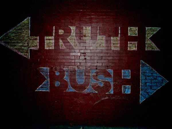
Throughout the week, every time i ventured outside, i wore a 8.5” x 11” repro of the great Plaza Hotel TRUTH -> <- BUSH banner mounted to foamcore and gold cord around my neck. I tended to avoid eye contact and wore a tie most days. Many people approached me all week, as inspired by the banner as i was.
Due to a work commitment, on Thursday, I was on the uptown (2) train pretty-much directly under Madison Square Garden while W was speaking: after all the overtime, there was zero security on the subway or platforms; people on the train laughing — having clearly just heard or participated in shouting “FUGEDDABOUTIT!” as Al Franken had proposed.
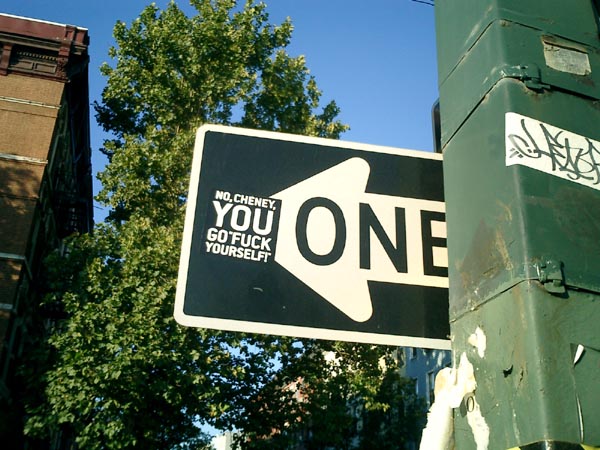
Friday morning, off to the GM building plaza, with an enlarged poster of the great Plaza TRUTH -> <- BUSH banner. CNN was interviewing what appeared to be high-school boys in tee shirts with “one-eyed pirates” for a liquor company. As i was manhandled off the property, they kept growling “No politics HERE, No politics HERE.” And I foolishly shrieked about how having young kids advertising booze was Highly Political.
During the week, the event that got the least press was the media march from the CBS building to FOX [photos]. I printed out a long tall (conventioneer’s) sign that read BAN 527’s / BEGIN WITH FOX. People laughed, but it was too cryptic to make the evening news. In fact, the only press i saw for the event was of Miss Understood and Lady Bunny who stormed the rally in Grand Drag... good for them! Motherfuckers.
Then, in a blink of the shutter, the RNC circus left town.
Jamie Leo, reporting.”
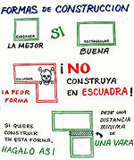
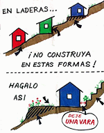
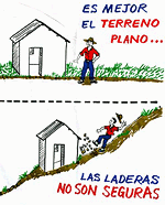
If You Build It
jude sent me this link a while back. The page is part of a Frontline documentary on the life and death of “maverick humanitarian aid expert” Fred Cuny:
“These ‘Housing Pictographs’ are another example of how Fred Cuny was always looking for ways to use a calamity as a catalyst to improve people’s lives.
After Guatemala’s 1976 earthquake, Cuny went to the devastated central highlands to see what he could do. Working with two organizations, OxFam (U.K.) and World Neighbors, he posed a key question to both the NGO staff and the peasants whose adobe homes had been reduced to rubble:
‘How do you make safe a poor person’s house in the rural countryside?’
Fred set out to improve the design and construction of the local housing as it was about to be rebuilt. Mary McKay, the head of the World Neighbor’s Housing Education Office in Guatemala, explained to FRONTLINE how the new building program worked. The ideas were all Fred’s, she said, but ‘the local builders took those ideas and figured out what you actually did when you are out there with a hammer in your hand. Fred wasn’t a mason or a carpenter,’ but he could talk with those who were, and he loved doing that ‘especially with the guys in the sandals who really did the work.’
Cuny would draw pictures which a World Neighbor’s staff member then turned into artwork. The drawings then were silk-screened onto the backs of empty flour sacks, stitched together, rolled up and put on the back of a master carpenter’s moped. The skilled craftsmen, who had worked with Fred in developing these new building techniques, would then drive from village to village throughout the region using the ‘flip charts’ to spread the word.
Although many of those master carpenters were later killed or fled Guatemala as a result of the government’s crack down on people they thought might challenge their authority, many of the houses using Fred Cuny’s techniques are still standing. Guatemala has not yet suffered another earthquake the magnitude of the 1976 quake.”
The project sounds like a great example of design in the public interest, a low-tech, simple way to improve people’s lives for years to come — and a small note of hope within the brutality of the U.S.-backed military dictatorship.
But that last sentence is chilling. Particularly, within the context of the page’s patronizing tone.
Were the carpenters targeted because of their work with Cuny and the World Neighbors NGO?
One friend who works on Guatemala tells me:
“Often local ‘authorities’ (including non-elected community leaders) used the conflict as an excuse to settle scores. So maybe [the carpenters] were gaining too much authority in the community, and then were taken out by local thugs who may have been connected to the government, but were acting on their own in this. Or not. Hard to tell.”
Another tells me:
“One category of people who were killed are those who worked with foreigners.”
From here it’s hard to know exactly why the carpenters were killed, but it seems possibile that they were indeed a casualty of the naivete of humanitarian intervention that attempts to remain neutral or indifferent to the complexity of local political relationships and history.
Don’t Let the Door Hit You On the Way Out
The convention is over, but the traces remain — the stories emerge and the protests continue.
Click on an image below to view a larger version.


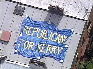
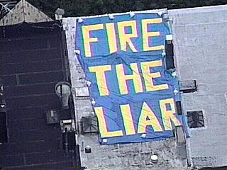
On the Roof
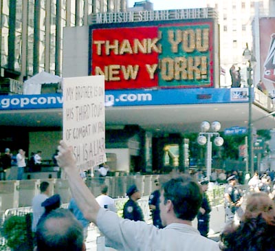
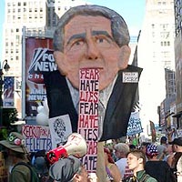
We March
What a day. There were so many images and messages out there — though by now so many have become familiar. There is no doubt that folks think Bush is a liar.
It probably goes without saying, but the most striking image was the sheer number of bodies.
That, and the fact that there were not many arrests before 8pm put coverage on the evening news into a favorable light.
On a smaller scale, I was struck the most by one man with a sign that read simply: “MY BROTHER IS ON HIS THIRD TOUR OF COMBAT IN IRAQ. BUSH IS A LIAR.” He stared down the cops and security reps at Madison Square Garden with such a look of intensity. It was an emotional moment.
 My favorite part, though, had to be when we reached 34th street. Rather than the usual ads for Lancôme or Nike Sport, the big screen on the side of Macy’s was showing Fox News. Just then, the coverage turned to the preparations for the convention inside the Garden and at Ellis Island where Cheney and friends were speaking. Having just passed the Garden, everyone was already riled up, but when Cheney came on the screen folks really got into it — booing, hollering, chanting, and waving their signs at the giant TV screen.
Other highlights:
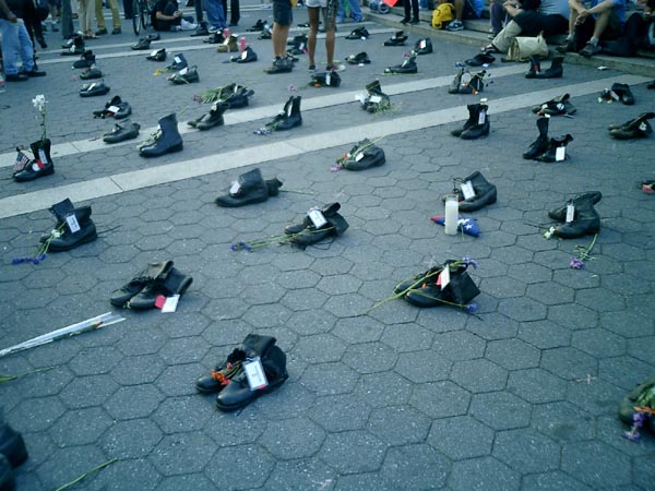
- The coffins. You’ve seen the photos. There were just so many of them. When I first heard the idea, it sounded a little goofy to me. But I think they pulled it off well. It was not a very somber mood on the ground, but in photos the impact is clear.
- When a marching band started playing “Crazy in Love” it was a real energy boost for folks who had been on their feet for 4 hours or so.
 - So many people wearing and selling political T-shirts.
- The puppet head of Bush with the tongue/speech that continually rolled out of his mouth in a big fabric loop. It was pretty clever.
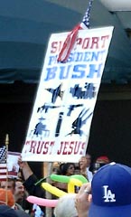
- The counter-protestor holding the sign that read “Support Bush. Trust Jesus”... interspersed with silhouettes of military vehicles of various kinds.
I’m increasingly realizing the importance of designers taking the initiative to put their messages out. I recognized several posters printed off of various Web sites. People had made their own posters with these, pinned the images to their shirts, their bags, etc. Folks were eager to use images and signs created by others. United for Peace and Justice had printed up a bunch of signs and flags available for people to pick up and use. People were happy to have something to hold up. I experienced this last March when I brought a few extra signs and folks snapped them up enthusiasitically.
The day ended for many with a picnic in Central Park — defying the Mayor’s refusal to permit a rally there, but also a nice, leisurely action against the politically motivated “elevated” terror alert.
page 20 19 18 17 16 15 14 13 12 11 10 9 8 7 6 5 4 3 2 1 Older »